Have you ever wondered why flags appear “backward” on one side of a uniform sleeve or military vehicle but look normal on the other? By convention, a worn U.S. flag is supposed to appear with its star field forward, which makes it look reversed on one (the right) side.

This configuration, while counter-intuitive, gives it the appearance of flying in the wind relative to the wearer — the star field is anchored forward (as it would be on a flag pole) while the rest trails behind.
In this second series of mini-stories from 99pi, we are once again tackling listener-submitted questions like these as well as other stories the staff found fascinating but that (for whatever reasons) didn’t warrant a full production. Meanwhile, thanks again to our listeners for submitting ideas — many of our episodes and articles are based on your suggestions!
Byker Wall by Katie Mingle
Producer Katie Mingle was surfing the web for story ideas when she came across something called the Byker Wall — a few clicks later she had stumbled on this old video about the wall on YouTube:
In the video, British writer Beatrix Campbell is walking around outside of the Byker Wall, also known as the Byker Estate, talking about it along the way. This video is why Mingle wanted to do this story, and is worth watching in full.
The Byker Wall actually replaced an entire neighborhood. In 1963 in New Castle, England, a 17,000-resident, working-class neighborhood (also) called Byker was demolished because it was considered a slum. Check out some amazing photos of the old Byker neighborhood here.

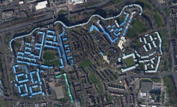
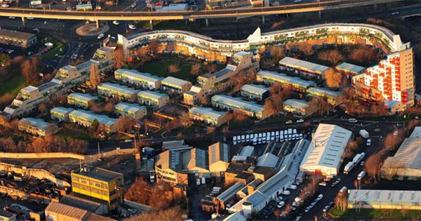
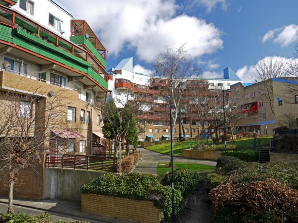
Street by street, the old neighborhood was cleared and a new community was built. Designed by architect Ralf Erskine, the new Byker is a cluster of buildings surrounded by a wall which also contains apartments.
The mile-and-a-half-long wall is meant to be a barrier to highway noise, and enclose the residents inside of a community.

Beatrix Campbell makes this (blush-worthy) observation about the structure Erskine designed:
“For sure it abolishes aggressively phallic architecture, all those grey erections that puncture the skyline. Maybe it’s vulval architecture—it’s round, it goes with the counters of the landscape. It’s an enclosure rather than a disclosure. Full of Nooks and crannies layers and levels and surprises.”

Erskine did succeed in enclosing the residents of his new community in a vulva-like structure, and he did actually make big efforts to include residents from the old neighborhood in the redesign of the new one. But whether it was a success is arguable. Many residents of the old Byker neighborhood did not end up being housed in the new estate, and in the 1980’s the new Byker community was ridden with crime and vacancies.
The Guardian had this to say about the outcome: “For all its faults, Byker Wall was an exemplar of both design and an attempt to involve the community in the changes planned for them by those in power. That it failed in so many ways reveals that it is rarely in the interests of communities to demolish the homes they live in.”
In 2014 the Byker Community Trust started a multi-million dollar revamp of the estate.


Comments (29)
Share
Very excited that you’re talking about my hometown but… it’s Newcastle, not New Castle!
What is the name of the the song at the end of this episode?
I would also LOVE to know! Thanks, and keep up the great work!
If you mean the Carl Orff piece at the end of the bit about the Byker Wall, it’s called “Carmina Burana”. The section they played which most people recognise is called “Oh Fortuna”
I’ve loved these mini-story episodes soooo much, partly because of the topics and partly because I get to hear from all of the other (normally) silent members of the 99pi team. Great work, y’all!
I would also LOVE to know. Thank you!
Hi–I started listening to your show a couple years ago after I gave a short talk in Northern England about a landscape park I’d restored–when I finished the organiser’s comment was ‘you sound like Roman Mars’! I thought I’d write with two things about the mini-stories–first, I worked for four years in Newcastle, and discovered among other things that the Geordies love their infrastructure almost as much as their beer and brass bands:
https://www.youtube.com/watch?v=V80Isj9JK1s
(Byker is even mentioned a couple of times–there’s a station there.)
Second, cities or developers nowadays may randomly name streets, roads, avenues, boulevards, etc. but each of these terms once had a very specific meaning. I recently read an article tracing the word ‘way’, indicating that its original meaning suggested a steep street–something useful for waggoners to know before they chose their routes.
The city where Byker is located is Newcastle (upon Tyne), not New Castle.
Surely the bigger problem with having a standardised chart for testing eyesight is that the person being tested may become familiar with the sequence of letters? Sometimes in these tests, I have been not sure whether I can really read the bottom row of letters, or whether I am just remembering what they are.
The eye chart story is better than the majority of topics you cover – would love to hear the full version.
Totally agree, I normally listen trough a podcast app, this was one of the few times I just had to google something because I wanted to know how it looked.
The copyright trap is given a sci-fi explanation as well as a practical one in the Doctor Who episode “Face The Raven”. It’s cool when a writer mixes a little bit of truth in with their fiction, no?
I totally love these mini story episodes. They are just so dang fun! I welcome the idea of doing more mini story episodes a few times a year. What about perhaps doing a dedicated short-format podcast devoted to single ministories? Something along the lines of Scientific American’s 60-Second science? Just a thought.
Love these short stories. A couple of points that occurred to me about the eye chart. First, if the Snellen chart is easy for the optometrist to memorize, isn’t another down side that it’s easy for the user to memorize. Kind of self defeating for the user, but it could even inadvertently create inaccurate results over time.
Second, isn’t another interesting aspect of this chart, the design issues related to the creation of the system for measuring eyesight (e.g. 20/20). Weren’t there other systems that were absolute rather than relative?
Thanks,
Craig
As a Canadian high school student, we studied the Snellen ratio in (accelerated) physics as part of the study of light, and used patterns of parallel lines (like a spatial frequency chart from old TV). I recall my lab partner (a provincially ranked baseball pitcher) had something like a 9/6 for his dominant eye.
So I have a way to get Katie’s eyechart into a full episode, cover a few different things that we use all the time that are hard to use like the qwerty keyboard.
Man, I’ve been waiting for this for what seems like forever! Thanks 99pi!
I’m with Avery! The design of charts and equipment for measuring vision and what it actually means to test 20/20 on a vision chart sounds like a fascinating concept to cover. I would be interested in hearing more about it. A majority of people wear vision correcting lenses and interact with optometrists, so it strikes me as something with a wide appeal as well.
Yes eye chart, eye chart, eye chart!
I found it strange that you felt the need to repeat Beatrix Campbell’s lines, not once but twice. I understand that it’s radio, and that the majority of the audience might not be overly familiar with the Geordie accent, but hers wasn’t particularly strong. You’ve had people from all over the world on the show before, without resorting to this, so to do it with a native English speaker is kind of jarring. I liked the episode, and I think that the mini stories concept is great, but I was really distracted by that choice.
I used to live near Byker and I agree that it is special. It is often cited as the start of community architecture in Britain. I dont know if that is the case – and neither do i know if two other stories about it are true – that the community consultees did not want tradition but pushed the designers to more inventive design once they saw what was being built in the first phase and what is possible. Newcastle has (or had recently) more architects per head of population than any other city in Britain. I sometimes wonder if this is because the architects who came to work on Byker with Ralph Erskine stayed there. The point is that its a place that is sufficiently interesting for people to make myths and poetic comments about. I admit that Bea Campbell’s attempts at architectural criticism are embarrassing but how good to have people who are not designers talking so generously about recent architecture in this way. If you want to know more there is a very good conservation plan written by Jules Brown at the North East Civic Trust.
Loved the section on the Byker Wall. Apparently it was originally intended for a main road to run much closer to it, matching the curve of the Wall, but the road was scrapped. The Wall was built in that shape anyway, then the idea of a road was resurrected, following the design that it has now (i.e. alongside the Wall, but much straighter).
Also, the streets that you were describing “like Billy Elliot” are known as terraced streets (often shortened to “terraces”) :-)
I want to hear a full episode on 20/20 vision still!!!!!!
Loved the mini stories!! Keep them coming throughout the year.
I was the firefighter who emailed you about the knox box. I had completely forgotten about it! Thanks for the awesome mini story.
The modern Byker Wall is kind of horrendous. The old 1970s (and before) Byker estate version seemed to waste a lot of space but seemed more like a neighborhood and community.
Urban planning is certainly challenging, I wouldn’t want to be in architect Ralph Erskine shoes.
I loved the story about the Snellen chart, and I think it would be interesting to look at visual acuity charts used in other countries, especially those where the written language doesn’t involve our roman alphabet.
I’ve lived in Taiwan for a couple of years and had to undergo a complete medical check-up for my student visa, which included an eyesight test. I was surprised to see that the chart used was different from our own; instead of letters, it featured a shape resembling a capital E, but oriented in four different ways. To pass the test, I had to name the direction that the three ‘legs’ of the E were facing, either left, right, top, or bottom. Simple enough, can be applied in all languages, but maybe not as easy to memorize as the Snellen. Anyway, I thought it might interest you – I think there are a few images online.
my eye dr does the chart digitally (in a dim room with a projector) she also switches up the letters for when she is fine-tuning your prescription.
i feel like the chart is a jumping off point, giving you the range of vision, not 100% precise. (or maybe that is my darkroom experience talking–doing 5 second increments on a negative then fine tuning from there)
also, i never knew that you could just get a majority right! i sit there and struggle with c/g e/f etc on the lower lines. glad to know i can just guess and if its wrong, i can still “pass” that level!
There’s gotta be a ministory to be told about Begich Towers and The Town Under One Roof!
First-time listener here! Why not resurrect the eye chart story now that it’s 2020?