If you’re not from California or missed this bit of news, the University of California has a new logo. Or rather had a new logo. To be more precise, they had a new “visual identity system,” which is the kind of entirely accurate but completely wonky description that gets met with sarcastic eye rolls from anyone who isn’t a designer. But they don’t have a new logo anymore. Because of a massive public backlash, the UC system actually suspended the entire new brand identity monogram while we were reporting this story.
In this episode, we talk to the Creative Director of the UC Office of the President, Vanessa Correa, who led the team that created this short-lived brand identity and Christopher Simmons, principal of MINE, who waded into the UC logo fight with a brilliant blog post called “Why the UC Rebrand is Better Than You Think.”
One of the factors that contributed to the negative public reaction was the fact that the UC monogram was often depicted side by side with the classic University seal in media reports.
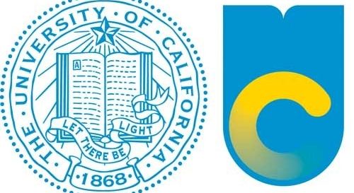
Christopher Simmons argues that this image, and the general ignorance of the press, implied that the UC monogram was replacing the seal. Actually, the seal was not going anywhere, but this fact was not always clear. And even if the text was accurate regarding the logo’s relationship with the seal, the visual language of the juxtaposition cemented people’s expectations instantly. The blog Brand New depicted a more accurate representation of the visual identity evolution.
![]()
Another piece of the marketing that misled the public was the University-produced video that graphically illustrated some of the design elements in the monogram being pulled out of the seal, followed by the old seal being brushed aside. As a stand-alone statement, the video reinforced a lot of the fears that people had about the new logo and what it might replace.
Fourth-generation UC Berkeley alum, Cyrus Farivar (see episodes #36 and #55, true believers) takes a look at the new UC logo and chronicles its tumultuous life and rapid death. We also use this opportunity to ruminate on the topic of how and when a design should be judged.
Important clarification from Vanessa Correa: “To be entirely accurate, the university didn’t suspend the entire new brand identity, but rather, just the monogram. (I’ve become a stickler for accuracy as of late. It’s a new thing with me.)”**
**We corrected the audio to reflect this clarification.
Comments (11)
Share
I know this goes against the whole message behind the program, but I unfortunately must comment on the logo. Whether intended for limited use or not, the version with the faded gold “C” looks pretty terrible. However, I do like the blue and white version.
Just a horrible logo. I first heard about the UC debacle while looking into the University of New Hampshire’s recent logo controversy. It produced a similarly silly design, and a similar backlash. Except a whole lot of people actually came up with better designs, over Facebook.
https://www.facebook.com/groups/unhlogo/
Regardless of anything else, It’s bad design & bad typography. Purely as a commercial or governmental logo of any kind, it would stink to high heaven.
The blue object is supposed to suggest an open book at the top and the letter U at the bottom. Instead it appears like a letter U that is of ridiculously thicker line width than the letter C, as if someone made a thoughtless typographical error and took an already bold font and then double-bolded it further. Something about it that’s difficult to verbalize, suggests a person’s rear-end, as if they are turned with their backside toward you, and have pulled down their pants to “moon” you by showing their bottom.
The rounded ends of the letter C look less-than-serious, as if it stands for Candy or Chewing gum or Cheesy-snacks. The C with the gradient doesn’t even suggest a C: but as your interviewee said, suggests a computer program loading. A “construction equipment yellow” version of the little twirly-ring thingie that appears in Windows 7.
How it could have been improved or even saved:
Keep the top of the logo as is, looking like a book. At the appropriate distance from the top, the blue area ends in a plain horizontal line. Below that line, the letter U is attached to it, in a darker color blue than the “book,” but not quite Navy blue.
Inside the open area of the letter “U” is the letter “C” in a color that’s more toward gold than the present “construction equipment yellow” in the failed logo. The letter C is not a circular aspect ratio, but is a bit taller and narrower, to harmonize with the taller aspect ratio of a capital U.
The ends of the letter C are not rounded, but are cut at angles that are not quite square but subtly suggest a font that’s almost hinting at having serifs, even though there are no serifs, as there are none in the letter U (never mix serif and sans serif fonts in a logo). The outer diameter of the letter C just touches the inner diameter of the curve in the letter U, and the line width of each letter is carefully crafted for balance between the letters. There’s a small amount of white space between the top of the curve of the C, and the bottom edge of the blue “book” element.
IMHO that would be tolerable, whereas the failed logo isn’t.
Too late. Bye-bye bad logo.
BTW, unlike the UC spokesperson, real branding agencies don’t get all arrogant, hubricious, and defensive about their creations, or they would lose their clients.
When it comes to logo designs, subjective opinion IS the rule of the day, and every existing or potential “customer” has an equal say, in the end, by voting with their dollars.
Dude, you just described an image with words to what I am assuming is an audience of designers…it’s like when I would stand in front of the review panel at architecture school and describe a phantom project that I intended to design but that was not represented anywhere in my project boards. As one of my professors said “If it’s not on the board, don’t mention it. Show it or shut it.”
Not to be mean, of course. But man, show us a link or something to this logo!
(Note: I haven’t listened to the interview yet.) Horrific design aside, the story here was really about an incompetent rollout. I recall one of the folks involved at systemwide – months later and still trying defend what they did – citing how the food truck they branded with the monogram was so well received. That’s how they thought. Ultimately they tried to blame the public for not being savvy enough to understand what they were trying to achieve, but the fault lies squarely on the systemwide folks. I wonder how much money they wasted on this.
Good morning; I love the series – thank you!
Rather than comment on the logo, I have a comment on some of the thinking in the programme.
Near the end the debate outlines the premise that design is a specialism (agreed) and that the process of critiquing design is misunderstood by the public. Parallels are drawn with particle physics and chefs. But the argument is poorly made and unresolved in your programme. One reason why aesthetics IS a public debate where particle physics is not, is that it is one of consumption and effect. We ‘consume’ design (but not particle physics) and are deeply affected by it in our built and visual environments. We are motivated by design, led to deeper understanding by good design or driven away from understanding, we are by it and we are adorned by it. Design matters to us on a minute by minute basis.
It’s NOT true that, as Cyrus Farivar suggests, you wouldn’t tell a chef his pizza needs more basil… well most people would – because they are the consumer of the pizza! If I don’t like a design, it is not valid to tell me I am not a design professional. I am the audience, the target consumer of the design and actually, in many cases, also a participant in the design’s use. This is especially true if that logo represents me, my college, my town, or some aspect of my extended public persona. I have interest and value vested in the design and its success. If, fundamentally, the design is not accepted by enough people, the idea will die or go away, because we live in a consumer-driven evolutionary defined world, where the fittest survive. (But fittest isn’t necessarily the best design from a pure design specialist’s POV.)
Fascinating programme – I work with designers a lot…!
Alex
this same thing happen at Case Western Reserve in Cleveland in the early 2000’s. They developed a logo of crisscrossing circular lines to emphasize its engendering and medical notoriety. It ended up looking like a fat guy holding a surfboard and quickly became the joke of the town.
I am an artist and not a design wonk, but I think that new logo is great. Once again, great program all around, everything was taken in to account and treated fairly.
The logo is a good start. I like the idea and the ‘book’ shield idea. But it seems like it isn’t done yet. The gradated C is not a good idea. I think if this was finished right there’d be less push back. And it is too bad that the way it was communicated has put the stops on it. What they are doing is valid, but clearly all parties need to step back, and rethink a little to move forward.
My college redesigned their logo and it was a flop with the students. They based it off one of the windows in the in one if the school’s historic buildings. It looked clean and modern and was personalized to the school. Students immediately pointed out that it looked like someone rubbing their face on a pair of breasts, an act otherwise known as “motor boating”.
The school insisted on keeping the logo and all of the Facebook groups and other social media posts pointing this fact out were gradually removed.
Somebody will always have an issue with everything you do. The blue and white version looks the best. But I think the problem is the U. It takes a few minutes to recognize it is a U. If the edges were similar to the rounded C it might be easier to see the U. Or if the C had a sharp edge and a rounded side like the U maybe it would make me think of two letters.
If I just focus on the U it also looks like a toilet bowl and the C looks like a mismatched toilet seat. They just doint look like letters to me. They look like vague shapes that ought to represent something… but I have no reference point for what that something is.
While this was happening I was a vocal opponent of the new branding imagery for other, more profound, reasons than those pointed out by designers and typographers. The theme of flower-related imagery, turning the book meme into a bloom meme, perpetuated the historical essentialization of the west coast as ‘the natural frontier’ and an alternative to the staid stale institutionalization of older academic enterprises in Europe and the east coast of the US — that semiotic move plays into exactly the kind of stereotypes that the early founders of the University were trying to avoid tangling with. We, the UCB community, are not just an alternative to the Ivy League and the nobs and dons of the UK, we are an evolutionary advancement and world-embracing development with our own centered subject-hood.
The designers of the failed theme did not have UCB backgrounds, they were mostly from UCLA, and they had a shallow understanding of what we are up to here.