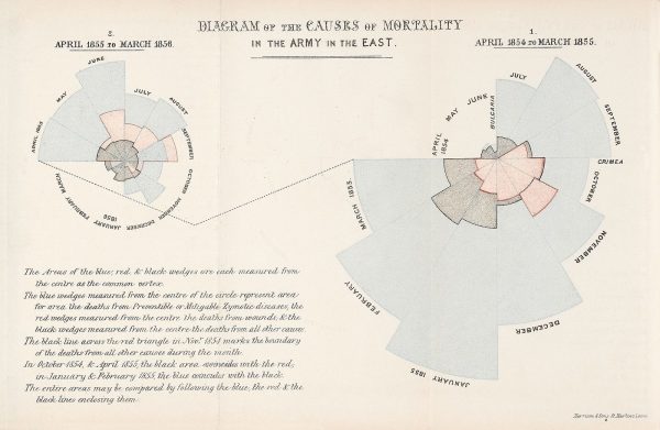
Victorian nurse Florence Nightingale (played in this episode by her distant cousin Helena Bonham Carter) is a hero of modern medicine – but her greatest contribution to combating disease and death resulted from the vivid graphs she made to back her public health campaigns.

Florence Nightingale led a small team of nurses to Istanbul in 1854 to assist in the care of British soldiers fighting in the Crimean war. They were promptly overwhelmed by the sheer volume of casualties, chaotic logistics (“no mops, no plates, no wooden trays”) and shambolic political leadership. “This is the Kingdom of Hell,” wrote Nightingale. But while she is most famous as a nurse, Nightingale was also a massive geek. She was the first female fellow of what became the Royal Statistical Society, and never happier than when poring over a table of public health statistics. For Nightingale, however, the data were not just a passion but a weapon.
Her charts convinced the great and the good that deaths due to filth and poor sanitation could be averted – saving countless lives. But did Nightingale open Pandora’s Box, showing that graphs persuade, whether or not they depict reality?

Cautionary Tales is a podcast by Tim Harford from Pushkin Industries.
You can read more about the remarkable legacy of Florence Nightingale and the perils of misinformation in Tim Harford’s new book The Data Detective (US/Canada) / How To Make The World Add Up (UK / International).


Comments (10)
Share
Where do I find the plots referred to in this episode?
Just finished listening and re-listening to this episode. I’m not clear exactly how the Rose Diagrams were falsely reporting or exaggerating or glossing over the data. Is there a place I can read more on this argument?
give us the bar chart!
@Kerri the Tim Harford website contains links to sources and graphs:
https://timharford.com/2021/03/cautionary-tales-florence-nightingale-and-her-geeks-declare-war-on-death/
One link in particular which shows both graphs mentioned is:
http://www.florence-nightingale-avenging-angel.co.uk/?page_id=2600
I second the request! I’ve found some of what’s mentioned in the episode online, but I haven’t yet uncovered the more modern presentation of the rose diagram’s data that is referred to at the end. Anyone know if and where that’s available?
Here’s a link to the shownotes of A Cautionary Tale
https://timharford.com/2021/03/cautionary-tales-florence-nightingale-and-her-geeks-declare-war-on-death/
He links to the following paper in regards to the Rose diagram
http://www.florence-nightingale-avenging-angel.co.uk/?page_id=2600
I must admit, after reading it, I’m still a bit confused!
“Preventable deaths from an outbreak of infectious disease…
Why does that sound familiar?”
…Said nursing homes in 2020.
#thankUgovenorcuomo
It would be good to show the bar chart that is claimed to be less biased in the pod. I think that’s what most are coming here for.
Of note is that Edward Tufte”s website is a design mess.
Not her “cousin” it’s “first cousin three times removed”