In 1933, a group of architects boarded a ship and set sail from Marseille, France to Athens, Greece. On board were several of the world’s most famous modernist architects and artists, including Erno Goldfinger, Le Corbusier, Alvar Alto, and dozens of others.
There was a silent film made of the voyage that shows the architects on the deck in short-sleeved white shirts and sunglasses. The cruise was the setting for the International Congress of Modern Architecture, commonly known by its French acronym, CIAM.
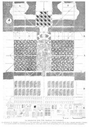
The subject of this particular congress was city-planning. The members of CIAM thought that cities were too congested, noisy, polluted and chaotic. And they believed some of these problems could be solved by separating out the functions of a city into distinct zones for housing, working, recreation, and traffic.
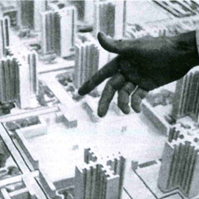
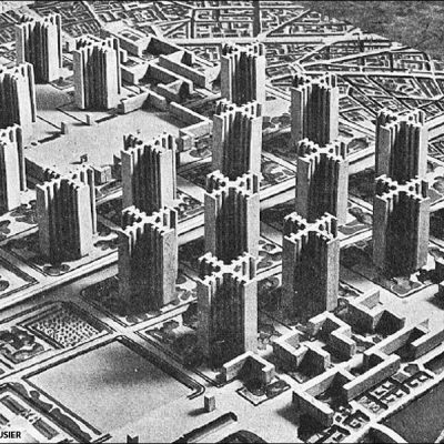
Zoning wasn’t a new idea, but the architects from CIAM wanted to take it farther. The living spaces would be in high-rise apartments so that the ground-level was open for recreation and collective spaces— live in the sky, play on the ground. Cars would even drive on elevated roads so that pedestrians could have the space below all to themselves. There would also be separate districts for industry and shopping. Where old European cities were winding, cluttered and polluted, this new one would be linear, open, and clean, with everything in its proper place.
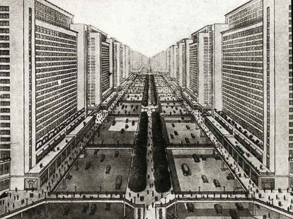
Modernists also saw this new kind of city as capable of providing more egalitarian conditions. They wanted beautiful housing that everyone could afford. They had big dreams, but the 1930s was a time of worldwide economic depression. But the rebuilding that followed the Second World War provided a chance to start over.
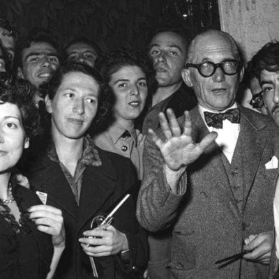
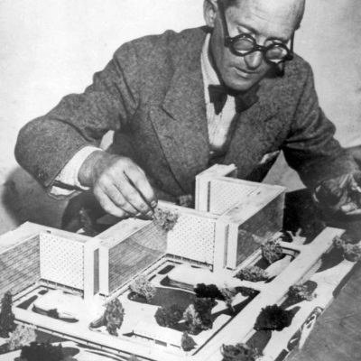
Le Corbusier with students and models of (unbuilt) urban design proposals
In 1943, the Swiss architect Charles-Édouard Jeanneret (better known as Le Corbusier) published a book called Charte d’Athènes (The Athens Charter). It outlined exactly how to build new cities in the way the architects from CIAM had talked about back in 1933. Le Corbusier traveled the world talking about these utopian ideas for city building, and governments liked what they heard — not so much for the utopian ideals, but rather for the price, because what Corbusier proposed was, in fact, very cheap. Concrete, the Modernist building material of choice, was inexpensive, and building apartments in high-rises required less land than building stand-alone homes.
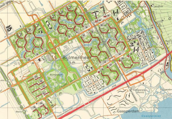
After the war, developments all over the world were built with CIAM’s modernist principles in mind, although they weren’t all pure expressions of CIAM and Le Corbusier’s ideas. Many cities took some of the ideas and left others. But the city planners of Amsterdam wanted to go further. They decided to build a new neighborhood, close to Amsterdam, that would be a CIAM blueprint — a perfect encapsulation of Modernist principles. It was called the Bijlmermeer, and it tested these ideas on a grand scale. When it was over, no one would ever try it again.
Pi de Bruijn was an architect in Amsterdam who, as a young man, was hired to help plan the Bijlmermeer. The utopian ideals of the project captured de Bruijn’s attention for seven years, as he worked as part of a team headed by an architect named Siegfried Nassuth. Nassuth was an idealist who felt the cities of the past had failed and needed to be rebuilt from scratch, using the modernist principles developed by CIAM.
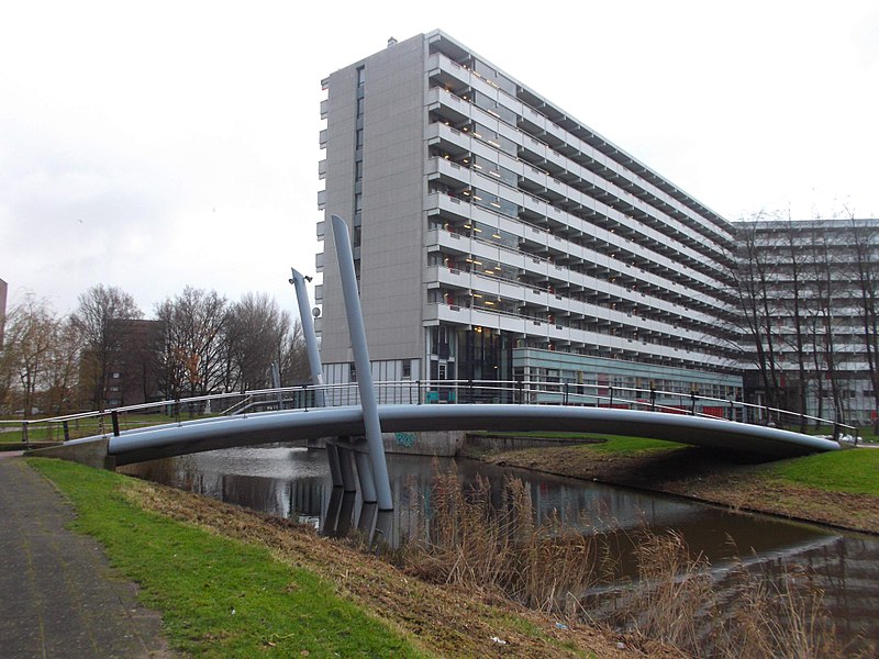
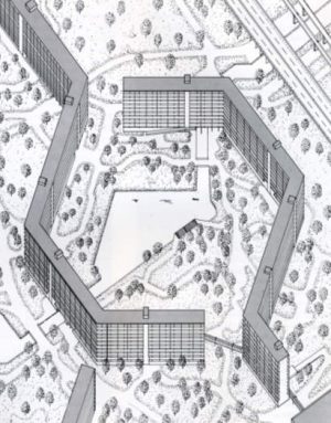
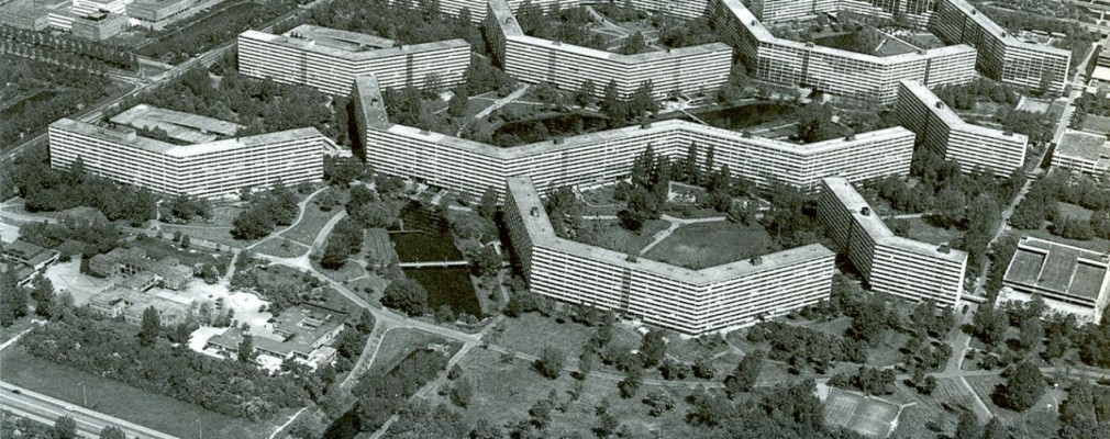
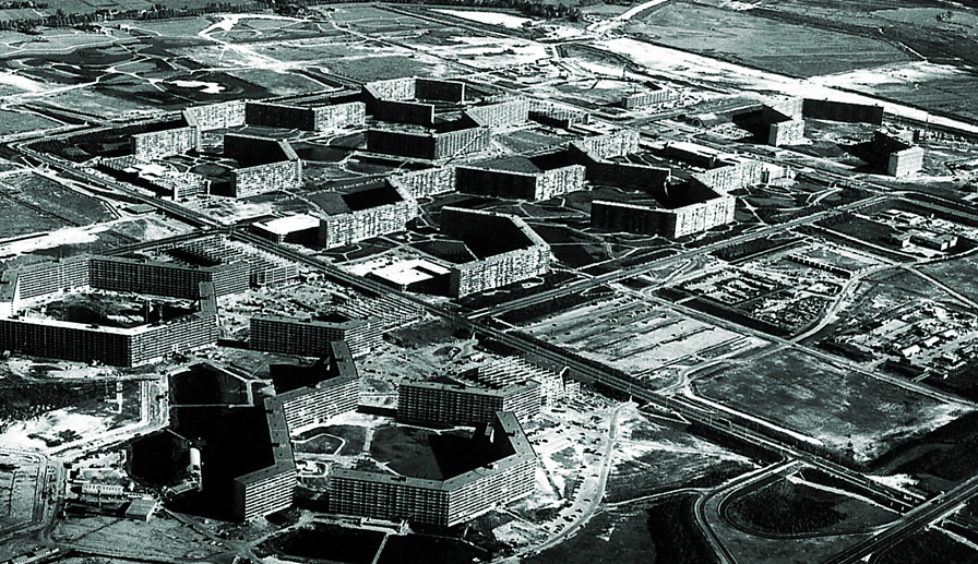
There was never any question that the so-called Bijlmer (short for Bijlmermeer) would be made of tall concrete housing towers, but they did choose to arrange them in the unique shape of a honeycomb.
The hexagonal grid would allow each apartment to get some sunlight every day. The apartments were meant for the middle class, and no apartment was designed to be “better” than another. Every man would be equal to his neighbor. At one point, Pi de Bruijn proposed to have apartments on the ground, but lead architect Siegfried Nassuth would have none of it. The ground was meant to be a collective space for everyone, according to the principles of modernism.
When the first few buildings were finished in the late 1960s, advertisements depicted a paradise with modern apartment towers, surrounded by lush green grass and trees. De Bruijn and his wife moved into the complex in 1969. “I lived on the 9th floor,” he recalls, and “I had a four-room apartment: three bedrooms, a living room, kitchen, beautiful bathroom, and a balcony that was two meters wide and twelve meters long. It was a paradise of a balcony.”
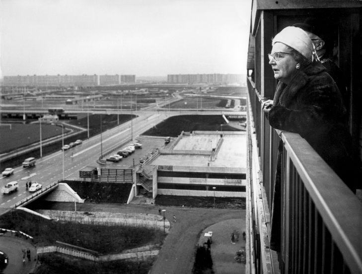
But there were also some immediate problems at the Bijlmer. A metro line was supposed to connect the new area with Amsterdam, but construction was delayed. For a while, there was only one dirt road leading out to the area. The designers had planned for a shopping area, but the shops didn’t come right away either, which meant there was nowhere to buy groceries.
Eventually the roads did begin to appear, and they were elevated above the ground, weaving in and out of the high rises. Driving through provided a spectacular view, but it was difficult to navigate or orient around a center, because there was nothing like a city center or town square — there were just identical concrete buildings arranged in a honeycomb formation. And there was no one to ask for directions, because there were no pedestrians on the elevated streets. De Bruijn complained about all of this, but his superiors told him to wait.
And so de Bruijn waited, and waited. Other residents were not as patient. Disillusion set in and the waiting lists disappeared.
By the early 1970’s, as the Bijlmer was still being built, much of the world was already turning against the massive concrete apartment towers that modernists had pushed for in the 30s and 40s.
Pruitt Igoe in St Louis, had also been an experiment in the modernist principles of CIAM — it was constructed in 1954, and by the mid 1970s it was already so overrun with vacancies and crime that the city tore it down. The American urban planner Oscar Newman had theorized that it was the vast amount of common spaces that had lead to Pruitt Igoe’s downfall — these neglected spaces had become hiding places for criminals. He worried that the Bijlmer was likely to suffer the same fate.
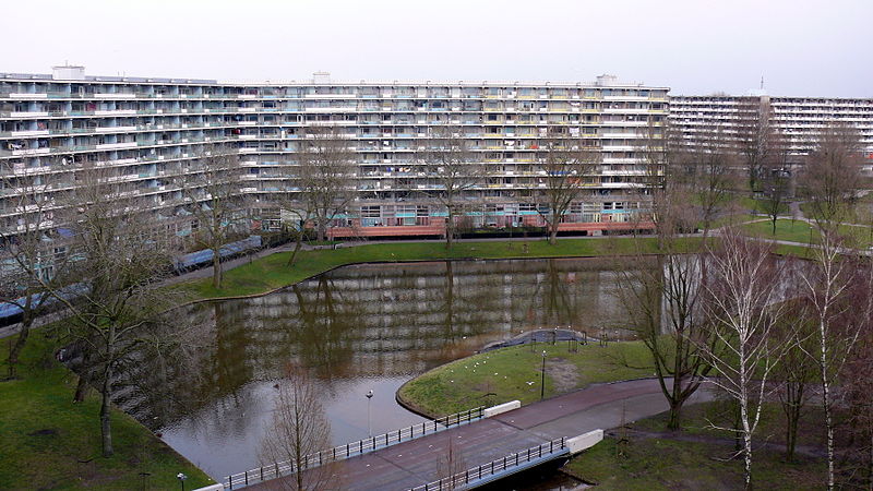
Even members of CIAM were starting to question and denounce this approach to building. The famous Dutch architect and CIAM member Aldo Van Eyck went on national TV and cried literal tears over what an awful concrete monstrosity Bijlmer was. Architect Rem Koolhaas said of the Bijlmermeer that it “offers boredom on heroic scale.”
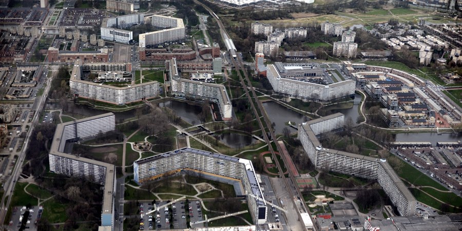
Still, more buildings went up — massive concrete structures with around 400 apartments in each one. The Bijlmer steadily grew, even as the housing association that controlled the buildings had trouble finding enough tenants. In the end, 31 buildings went up, holding 13,000 apartments, though hundreds sat empty.
In addition to all the buildings there were also 13,000 storage spaces on the ground level, 31 parking garages, hundreds of elevators and staircases and common spaces and 110 kilometers or 68 miles of indoor ground-level corridors. There was so much space, and not enough people to fill it up, or watch over it.
Yet there were still people who needed housing. In fact, there were thousands of newly arrived citizens, who had traveled across the Atlantic Ocean and needed a place to live.
The Bijlmer would be that place.


Comments (15)
Share
This is why we can’t have nice things . . .
in the eighties is was there often. Because the desperate tenants seeing the poor people destroyed the buildings ans surroundings were happy to rent the apartments to students that rented cheap with 4 in one flat.
people would shit in the elevators, throw their garbage and even complete furniture over the railing at the 11th floor. Without looking. So you could not let your kids play in the playground under the balconies…..
After the El-Al Boeing flew into one appartment. two friends of mine that witnessed it told me that only minutes after the crash a large number of people started to loot the shopping malls. Because they figured that the police would not catch them while they were evacuating burning victims from the crash site 400 meters away…..
Please do a live Columbus, Ohio show!
Thanks for this timely show as I am currently reading a very relevant book called “The Death and Life of Great American Cities” by Jane Jacobs. This book, published in 1961, rails against these modernist city planners like Le Corbusier for their total separation of living, working and recreational spaces. In her book she advocates the planning of balanced neighborhoods that are active at all times with constant use to ensure these spaces have eyes on them throughout the day. If anyone is looking for a methodical analysis on why the modernist planning principles don’t work, this is a must read.
Thanks for this show and the sequel. I’m looking forward to your Radiotopia Live show in DC.
Great podcast, but here’s an important addition. As I learned some years ago from architectural history gem Andrew Scott Dolkart at Columbia U, the first large-scale project using these design principles was Castle Village, built in the 1930s in New York City’s Washington Heights. One of the few private speculative developments projects build during the depression by cityscape-changing developer Charles Paterno with architect George Pelham, a man who would design buildings in any style you wanted – from brownstone row houses to modernist “Towers in the Park“ like Castle Village, to faux-British-country creations like nearby Hudson View Gardens (where Dolkart lives). See https://en.m.wikipedia.org/wiki/Castle_Village
If this shithole we call Bijlmer is the future, I will commit suicide. The Bijlmer is mostly know in the Netherlands for it’s high crime level. Is that really something we would like for the future?
So… Sim City.
“Best laid plans of mice and men…” Need I go on. This story is a great reminder to those “planners” out there that human interactions are a lot more complicated than can be “planned” for. The USA found out first-hand about public housing projects built in the 60’s and 70’s worked out. They didn’t. Many are now being torn down for similar reasons to the examples shown here.
Interestingly nothing was mentioned about the Soviet architecture, but in fact a lot of the modernist ideas were used very successfully in the Soviet Union. I lived for many years in a designed city that was a much better version of the Dutch place described in the podcast. Separation of the industrial part of the place from houses; a lot of space between buildings; wide roads; local shopping and a lot of green space. And no crime despite a lot of open space.
Here is a video about the place.
https://youtu.be/aJEQfQwDgEI
And here the place 50 years later:
https://youtu.be/UN72Z9_jThM
I’m also from the eastern block, and here in Hungary we also had quite a few new neighbourhoods – even cities – built with some elements of the modernist principles. Some were more successful than others. The key factor seems to be separation of dwelling and other functions, leading to decaying ghost towns. Where this was avoided, these modernist cities were and are quite pleasant, like your city.
It was not only the Bijlmer in Amsterdam > An other exempel is this
in the centre of the Netherlands : Zeist : “Vollenhove”
When it was bold 1968 it was the greates appartment bilding in Europe
500 meters long 40 meters high, 1500 people
https://nl.wikipedia.org/wiki/Vollenhove_(Zeist)
https://www.google.nl/search?q=vollenhove+flat+zeist&tbm=isch
Fascinating. Looking forward to Part 2.
Loved this article!! Very insightful case study with high educational value.
Was only recently introduced to your podcast via a Recode episode. Thanks for doing this.
This particular Episode reminded me of the HDB-concept of Singapore, which follows similar design principles. I think the HDB-concept solide a lot of the housing Problems for singapore without walking into the traps Europe and the US encountered. HDB flats are owned by the tenants, thus encouraging them to take care of their surroundings . And the ownership is payed for via mandatory retirement funds turned into seid capital.
Might be worth to look into this in the context of 401s, housing and the dilemma of social welfare handouts .
keep going !