Every year since 2006, the magazine Building Design has honored one special UK building with the architectural equivalent of a Razzy Award: the Carbuncle Cup. The title of the prize originates from an infamous quote made by noted architectural curmudgeon Charles, Prince of Wales, calling the proposed 1984 addition to the National Gallery a “monstrous carbuncle on the face of a much-loved and elegant friend.”
The award has been given to both UK and international architects, and was, until recently, partially democratic — readers could vote for the worst building on the magazine’s website. Since 2009, the winners have been selected by a small council of critics.
The Carbuncle Cup begs several questions: What does it mean for a building to be ugly, especially when designed by high-level architecture firms? How do people come to a consensus on what makes for an ugly building despite widely varying personal tastes? What can we learn from the winners of the Carbuncle Cup, and what do they have in common, architecturally or otherwise?


Drawings and charts of Carbuncle Cup winners and nominees by Kate Wagner
In order to answer these questions, this critique dives deep into and charts the aesthetics of the 56 Carbuncle Cup winners and nominees of the past decade. In the process, patterns emerge behind building nominations and award winners as well as an overall aesthetic picture of what people (at least in the UK) consider to be truly ugly.
Charting Dimensions of the Carbuncle Cup
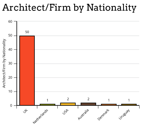 Most of the nominees and winners are UK architects and firms, with only one non-UK winner to date (Raphael Viñoly of Uruguay in 2015). Though there were a few starchitect and mega-firm interlopers from outside (Rem Koolhaas, SOM) in the nomination pool, the overwhelming majority of winners are UK designers who imitate them.
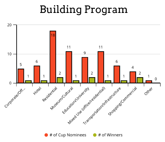 Many of the nominations are for high-end residential buildings (a much higher proportion than any other category). If mixed-use developments (commercial + residential, often skyscrapers) are included, the number jumps to 29, more than half of the total nominees. Various building programs, however, are found to be more broadly and evenly represented among the winners.
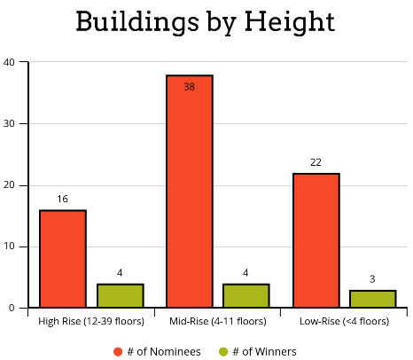 In terms of scale, while the vast majority of structures were mid-rise in height (4-12 floors), both low rise (<4 floors) and high rise (>12 floors) were evenly represented among the Cup winners. Again there is a skew in the nomination set that is not found in the more distributed final award winners.
The materials choices, colors, and architectural styles of these buildings illustrate, among other things, a deep dislike of trends that peaked around 2007, right before the financial crisis.
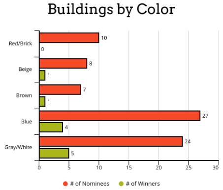 Examining buildings by color, there is an overwhelming trend towards blue and gray/white, reflecting a large number of glass-walled buildings (which are often reported as being mostly blue or varying shades of gray depending on what time of day the photo was taken). In short: this color analysis is in part a function of the materials being used.
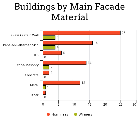 Indeed, about half of nominees used glass as the dominant facade material, but equally loathed in terms of winners were those buildings that used an exterior skin (often patterned) that alternates metal or other materials with glass. In a world of metal-and-glass towers, this is perhaps to be expected.
Of course, numbers alone only tell part of the story. A more detailed analysis of each nominee and winner reveals a stylistic spectrum that, in turn, charts bigger trends and themes in contemporary design.
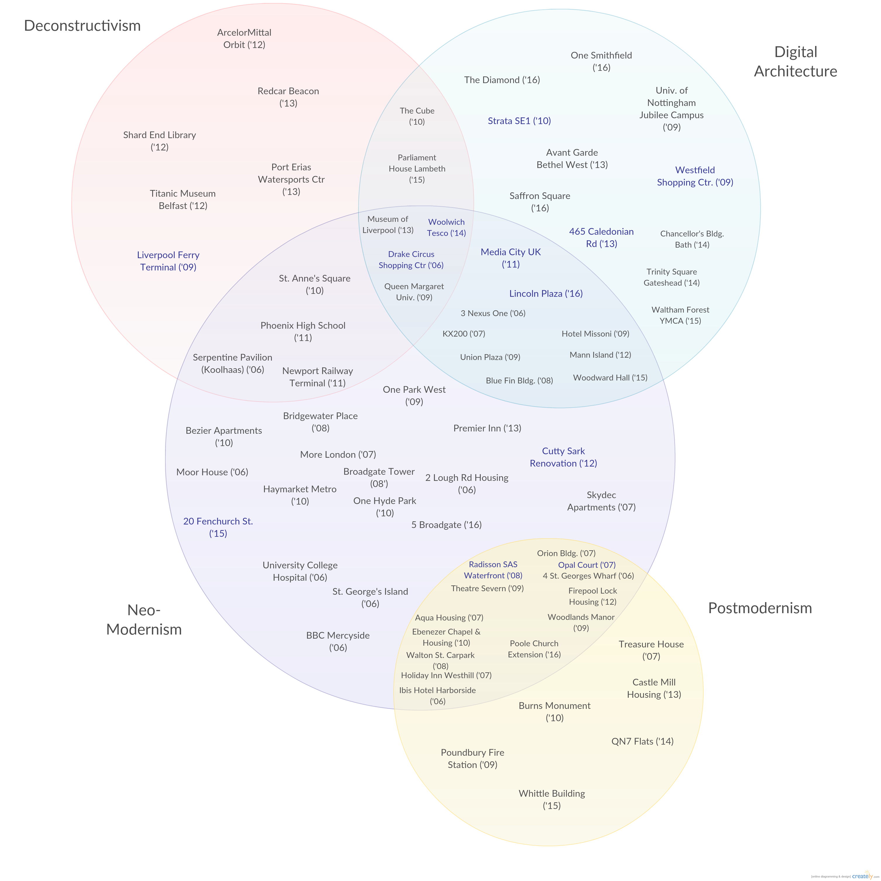
Overall, the winners of the Carbuncle Cup can be separated into four main architectural styles: Deconstructivism, Digital Architecture, Postmodernism, and Neo-Modernism. There are varying degrees of intersectionality between the nominees’ styles.
Notable Winners & Nominees by Style
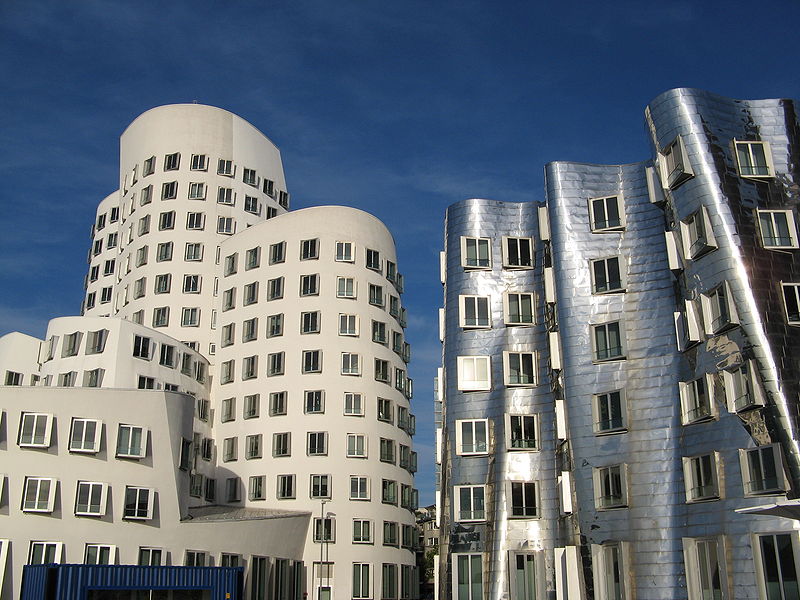
Deconstructivism, the architectural style made famous by architects such as Peter Eisenman, Daniel Libeskind and Frank Gehry, is categorized as having a fragmented appearance and absence of visual harmony, continuity or adherence to structural norms.
Deconstructivist architecture, based around the idea of deconstruction, distorts, fragments, exploits, and subverts existing architectural (and geometric) expectations. Buildings in this style appear chaotic, as their structural geometry subverts both aesthetic and physical expectations. A common theme of Deconstructivism is the idea of a formal expression of physical force — buildings often appear to be pulled apart, compressed, folded, twisted, wrung out, or exploded.
Digital Architecture refers to buildings whose exteriors express the use and influence of new technology in their physical form but especially through external ornament. Related to Deconstructivism, this style similarly results in buildings that appear unnatural or destabilized, but this expression is less centered in big structural manipulations.

Though examples of the style can be structurally askew, they tend to follow an internal logic of simple or slightly manipulated traditional structural forms, as seen in the examples above. Buildings in this style rely heavily on an exterior skin, often patterned, in order to achieve the “digital” look. For example the detailing of the University of Nottingham Jubilee Campus acts as kind of visual allegory for bits of data traveling along the new high-speed information superhighway.
The main difference between Deconstructivist architecture and Digital architecture is that the former relies on structural form for its chaotic appearance, while the latter relies on external ornament. To use the oft-cited dichotomy of the Postmodern theorist and architect Robert Venturi, a Deconstructivist building could be a “duck” while a Digital one is more of a “decorated shed.”

Postmodern architecture, simply put, is the integration of Modernist forms and structures with (often ironic) references to architecture’s pre-Modern past. For example, the Castle Mill Housing project combines the modern form of the minimal cubic housing block with the references to past architectural ornament, like: a roof line that is effectively a pared-down version of a broken pediment, similar to what one would find over a traditional doorway.
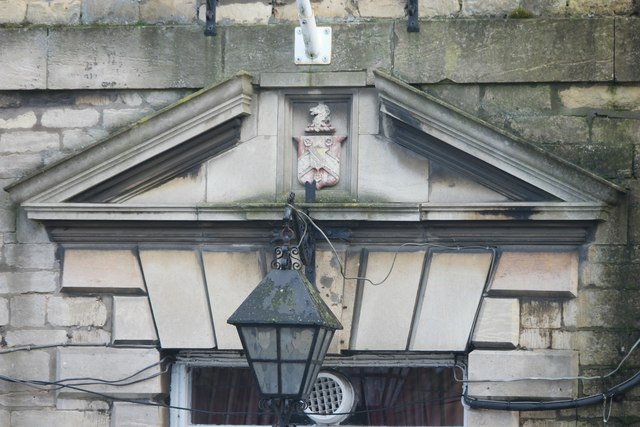
Postmodern architecture, epitomized by architects like Robert Venturi and Denise Scott Brown, Michael Graves, James Sterling, Charles Moore, and Robert A.M. Stern, was the predominant architectural style of the late 1970s, 1980s and 1990s. Postmodernism reintroduced external ornament into architecture, fostering playful aesthetic communication between the present and the past. By the early 1990s, Deconstructivism had taken over, and the (often campy) symbolism-laden language of Postmodernism had faded to the background as many non-Deconstructivist architects began to revisit and rework the aesthetics of Modernism.
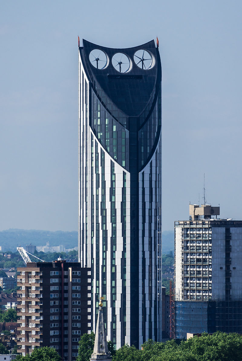
Neomodernism (or: New Modernism) is characterized by the reiteration of Modernist ideas (minimalism, machine-like sleekness, rational forms, lack of ornament) within a contemporary context.
At least in part because Postmodernism helped subvert taboos surrounding external ornament, architects from the Late Modernist “High Tech” period (like Norman Foster and Richard Rogers) felt liberated to integrate their unique forms of structural expressionism within a less esoteric and more decorative context. Much of this style involves revealing internal structure — like piping, structural supports, and other infrastructure — and expressing it on the exteriors of buildings.

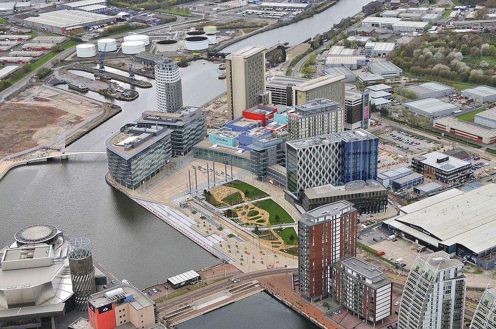
A perfect example of Neomodernism comes from Norman Foster, a multiple-year nominee of the Carbuncle Cup, in his London building dubbed The Gherkin.

Neomodernism borrows heavily from the same technology that made the chaotic forms of Deconstructivist architecture possible: computer-aided design, which helped allow buildings to become expressive through less conventional structural geometries — curves and oblique multiaxial polygons became possible.
The resulting sleek facades and forward-looking aesthetic quickly became the de facto language of both corporate mid-rises and famous towers such as One World Trade Center.
Architectural style alone, however, does not define what does and does not make a building ugly. The nominees for the Carbuncle Cup are selected for a variety of aesthetic, cultural, and economic reasons.
But Why Are They So Ugly?
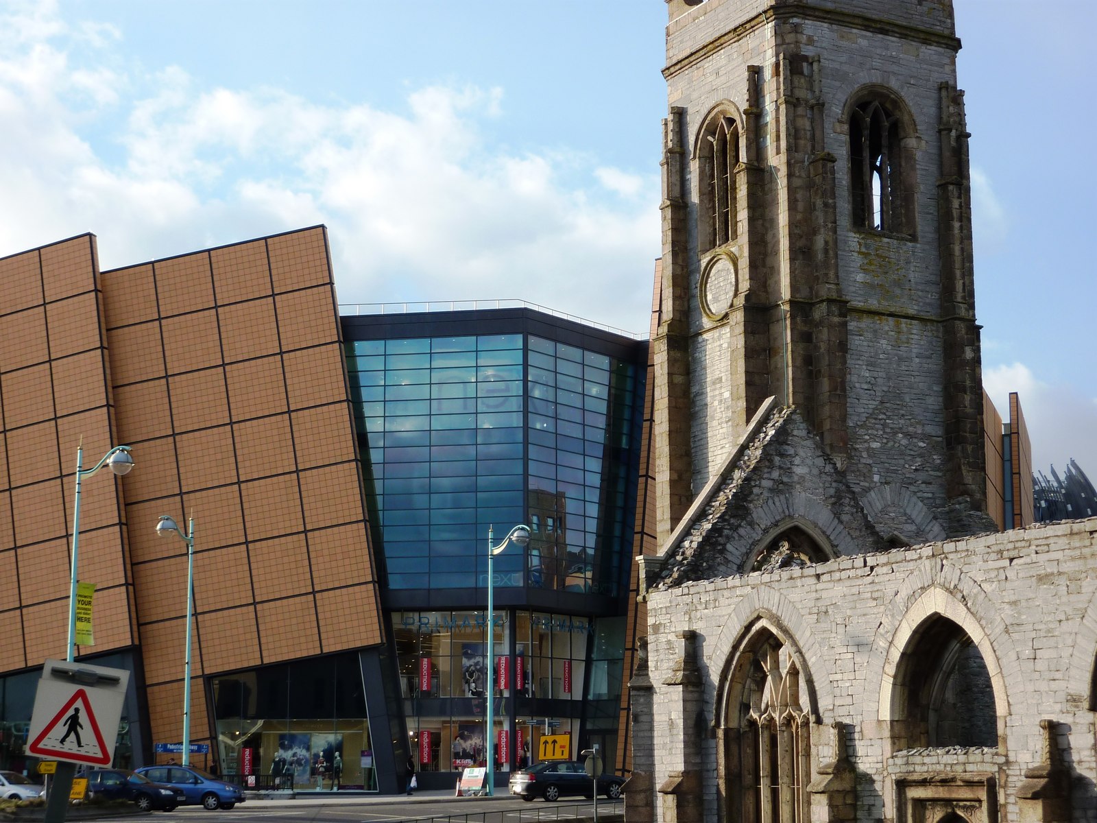
The boom in multi-million dollar developments is arguably out of tune with the UK, which, like many European countries, is less involved with the super-tower craze so popular in America and other places. Many of these buildings appear completely out of context in the built environment around them — even among Late Modernist housing estates, buildings like Strata SE1 looks completely foreign.
The 17th Century English architect Christopher Wren, in his Tract I on Architecture (1670s), said that buildings were the “ornament of the country” which “establishes a nation.”
Much of the outrage toward these buildings seems to stem from their globalist and place-less aesthetic that pays little homage to any particular location or time. The so-called Bilbao Effect spawned many failures, knockoffs, and disappointments — this craze emerged as beleaguered cities hired star architects to design iconic buildings, hoping to lure outsiders and usher in commerce from tourism, all following the success of Frank Gehry’s Guggenheim Museum in Bilbao.
As architecture critic Edwin Heathcote wrote in the Financial Times about the 2016 Carbuncle Cup nominees: “The irony is that…most of these structures are ugly because architects have tried to decorate them,” as evidenced by digital and other facade strategies. “These are buildings that try to hide their bulk behind features intended to reduce or at least enliven their visual impact with the application of garish colours, stick-on geometric glass, deliberately wonky cut-outs and balconies that are attempting to be sculptural and create a pattern across what would otherwise be vast, blank façades. These are bad buildings dressed in half-remembered imitations of ‘starchitect’ motifs that were briefly fashionable and now look hideously passé.”
Dramatic high-budget architecture draws frequent ire from weary citizens, in turn reflected in various Carbuncle Cup recipients. A trend is in motion — popular opinion is shifting away from the Gehrys and Zahas of the world. Prince Charles’ original tirade against the National Gallery extension echoes throughout each of these nominees and winners. Charles, speaking against Modernism, wanted an architecture that fits more within the English historical tradition rather than a placeless glass facade. In a world where digital media continually blurs borders and makes us more cosmopolitan, perhaps it is fair that architecture should work on a different, more nuanced and local level.
Breaking Down the Diagram

Carbuncle Cup nominees and winners show a number of common trends but also provide detailed revelations. Interesting isolated phenomena include buildings with an M-Shamed roof structure, botched renovations and additions to existing structures, bad attempts at Classicism, and a general hatred for consumer non-architecture such as tract hotels by Ibis and Holiday Inn, a car park, and two inexpensive apartment complexes and checkered-patterned skins.

Decorative skin in particular seemed to be the most loathed feature, showing up in half of the winners of the Carbuncle Cup. The imagery of such patterns often appears unnatural to observers and critics, both because of its inorganic digital origins but also because such dramatic exterior pattern does not have a place anywhere in UK architectural tradition. The loud and busy patterns may be eye-catching, but this is interpreted as being disruptive rather than brazenly innovative.
Some nominees, too, were relatively unoffensive and ordinary buildings — no different than any normal mid-quality development. For example, University College Hospital and BBC Radio Merseyside, two early nominees (both 2006) are both innocuous if a bit boring.

Frankly, more than a handful of the nominees are (while perhaps not the paragons of architecture) generally pleasing to the eye. These buildings and their nomination speak to the true Luddite undertones in Prince Charles’ carbuncle speech, with hints of anti-development, change-resistant fussiness inherent in NIMBYs the world over.

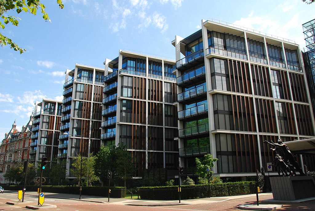
Norman Foster’s More London development, the nomination of which is infused with ire toward the exorbitant costs that tend to haunt high-profile urban architecture, is by no means aesthetically offensive. Its collection of buildings exhibit the broad range of Foster’s formal flexibility as an architect, integrating the biomorphic geometries of City Hall (the “object building” of the set) with the more subdued (and admittedly corporate) structures whose external decorations pay dutiful homage to Foster’s High Tech past. In a similar vein, the 2011 nomination of No. 1 Hyde Park apartments by Rogers Stirk Harbour (pictured earlier) is also aesthetically pleasing — its slick geometries, materials, and vertical ornamentation represent an interesting interpretation of current styles that still strongly echoes the visceral aesthetic from the firm that brought London its Lloyd’s Building. That latter structure, while almost universally loathed from the beginning, became an icon of (very) Late Modernism and one of the youngest buildings ever to be Grade I listed for historic preservation.
While a useful vehicle for shaming the worst of the worst (Drake Circus Shopping Center might be the ugliest building this author has ever seen), the Carbuncle Cup is perhaps too closely linked with the pithy statements offered by the disgruntled and nostalgic Classicist who gave it its name. Architecture has always produced ugly buildings, and the discourse on ugliness is as old as architecture itself.
Meanwhile, the field always moves forward, just more slowly than some others because it takes a considerable amount of time for a building to be constructed. A design that is of the times in 2006 may be very much passe by the time it is completed in 2008. In a digital world, trends move more quickly than ever before, and to design a building independent yet mindful of them becomes more and more difficult as cultural tastes shift as fast as one can push the refresh button.
While some of these buildings may not represent our tastes today, that does not mean that they should never have been built in the first place. A building is arguably supposed to be a product of its time while also lasting for long enough for people to reflect on it after its creators have passed. Projects like the Jubilee Campus or the Moor House may be loathed now but they may also be gazed upon differently by fresh new eyes in the future. After all, the Brutalist icons of Erno Goldfinger and Denys Lasdun were hated for decades but their strong, sculptural, monumental forms speak deeply to a younger generation that finds those qualities interesting and refreshing in today’s busy aesthetic language of glitzy glass boxes, impossible high-rises and flashy decorative skins. What can we really learn from Carbuncle? Perhaps the lesson is as simple as this: time passes, tastes change, and some folks in the UK are rather fussy about their buildings.
Leave a Comment
Share