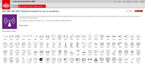
High beams, lower battery, on, off, play, pause, risk of electric shock and fragile: handle with care — what do these have in common? Most of the symbols you see on appliances, automobiles and other gadgets made since the mid-1970s can be traced back to a single document.

Published by the International Electrotechnical Commission, ISO 7000 / IEC 60417 (aka “graphical symbols for use on equipment”) appears at a glance to be as dense and technical as it sounds. Yet icons featured in the collection are designed to be simple and universal — a modern hieroglyphic system for the whole world. These standardized graphics were made to be understood across languages and cultures. Some (like play, pause and stop) predate the set and were simply gathered into it while others were designed specifically for inclusion.
As the excellent video above by Lazy Game Reviews highlights, the iconic “Power Symbol” (a line emerging from a circle) seems to enjoy a particularly high level of universal appeal within the set. It appears on shirts, logos, cuff links, album covers and even tattoos. Like other symbols developed by the IEC, this particular icon design evolved in response to the increasing globalization of various technologies.

Not only is “On/Off” an English-specific set of terms but it also takes up a lot of space on our ever-smaller devices. An abstracted combination of 1 and 0 (“on” and “off” in binary terms), the “Power Symbol” represents a simpler, smaller and language-independent alternative.
Ultimately, users don’t need to understand the origin story of to get what it means. Still, like learning Latin to better understand modern languages, a more fundamental grasp does help explain what other power-related buttons do.

For instance, the so-called “Power On” and “Heavy Circle” symbols (denoting “on” and “off” respectively) are likewise based in binary. While the “Power Symbol” signals a general shift in states (between on, off, standby, etc…) these other two symbols represent absolutes.
Similarly, the “Power On-Off Symbol” (a line within a circle) is a single button that toggles between fully on and fully off states. In 2015, a campaign was launched and proposal accepted to add this and other power-related characters to Unicode.

The aforementioned document contains a huge array of symbols used in everyday as well as niche settings. On the ISO website, the icons are displayed without descriptions, so for those inclined to make a game of it: try to guess each symbol before you click to learn more.
The LGR YouTube channel, meanwhile, features a lot of additional videos about games, but also some fun explainers (answering geeky retro tech questions such as: “Why did old PCS have key locks?”).


Comments (3)
Share
On a slightly related subject, does anyone find it odd that the magnifying glass symbol has come to stand for two very different functions in software systems – search and zoom? I realise that it’s almost always clear from context which function is being implied, but still it seems strange to me that nobody has found a better solution. I recently came across a website where a magnifying glass is used for both functions in close proximity: http://imgur.com/a/t03sQ
I’m amused that the ISO standards website specifies that a magnifying glass symbol represents a zoom function and does not mention search – even though the search function on that very website is represented by the same symbol: https://www.iso.org/obp/ui#iec:grs:60417:5792
Yes. I was a bit taken aback when I first saw the magnifying glass used for search. I would prefer the old binoculars used for search.
It makes so much sense though as every equipment human use to ease searching function includes magnifying or closing up function in order to see better.