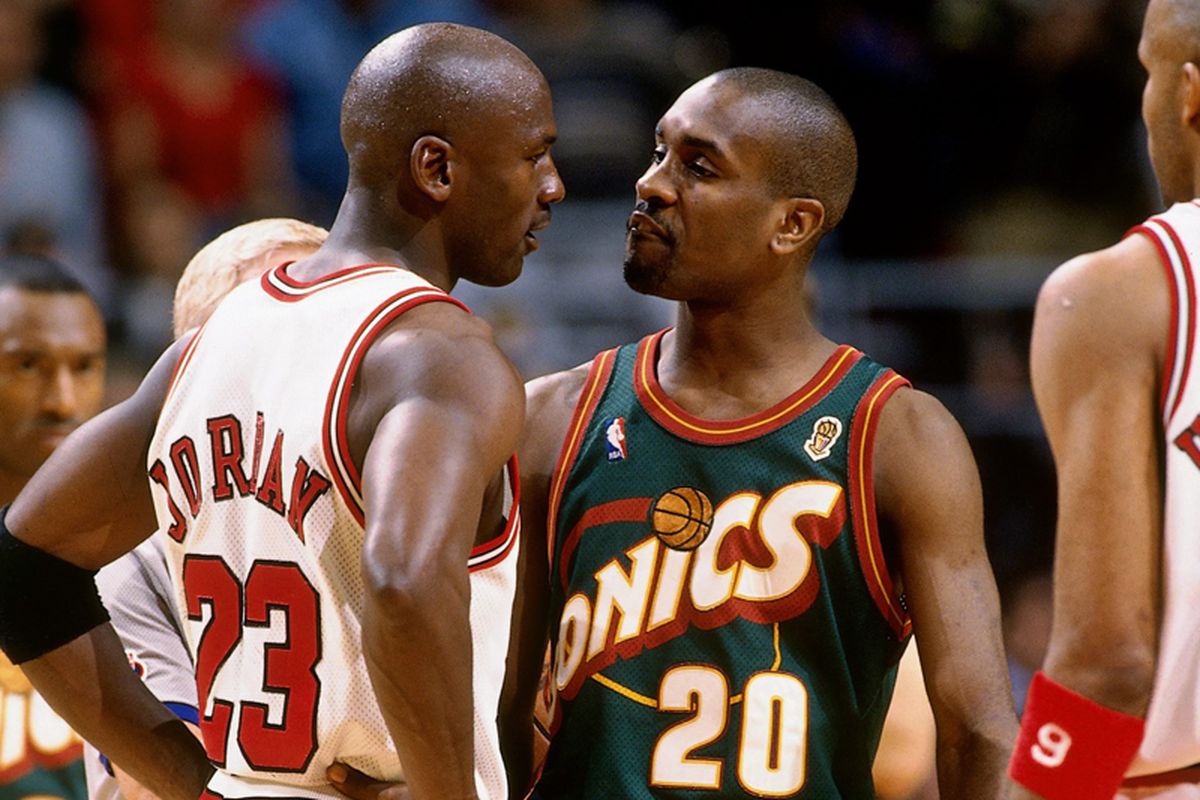
On a March afternoon in 1996, a brand new team NBA called the Toronto Raptors were playing the Chicago Bulls. This was the Michael Jordan era. The Bulls were the best team in the league, and the Raptors … not so much. The Raptors actually beat the Bulls that day, but it was a mostly meaningless game at the end of the season.
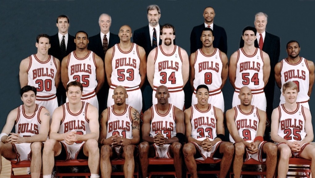
In hindsight, the notable part of the game wasn’t how the two teams played, but the way they looked. The Bulls were dressed in red jerseys with the word “Bulls” written in black and white lettering across the chest. Simple. Classic.
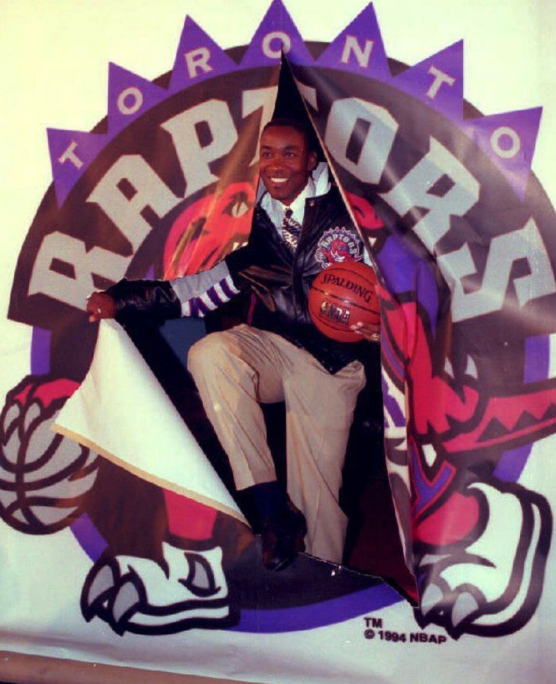

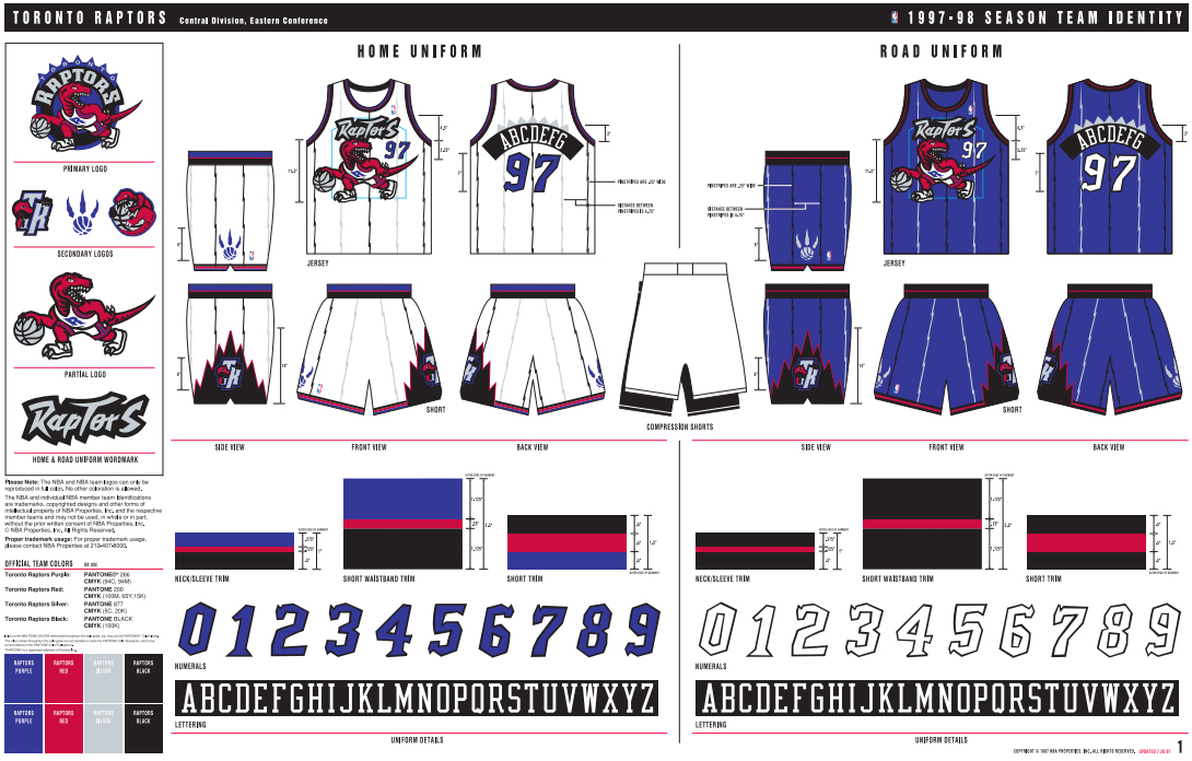
The Toronto Raptors jerseys were neither simple nor classic. Their white home uniforms had jagged silver and black pinstripes, as if they were cut by slashing raptor claws. And on the front was a giant, red basketball-playing dinosaur who was also wearing a uniform—a totally different one. The away jerseys were even wilder because they were purple. All of this, including the Raptor’s name, had been inspired by the velociraptors from the movie Jurassic Park.
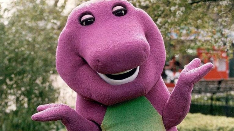
But the dinosaur on the Raptor’s jerseys ended up being compared to a different, much friendlier 90s dinosaur: Barney. They were, in the words of one critic, “cartoonish and ridiculous.”
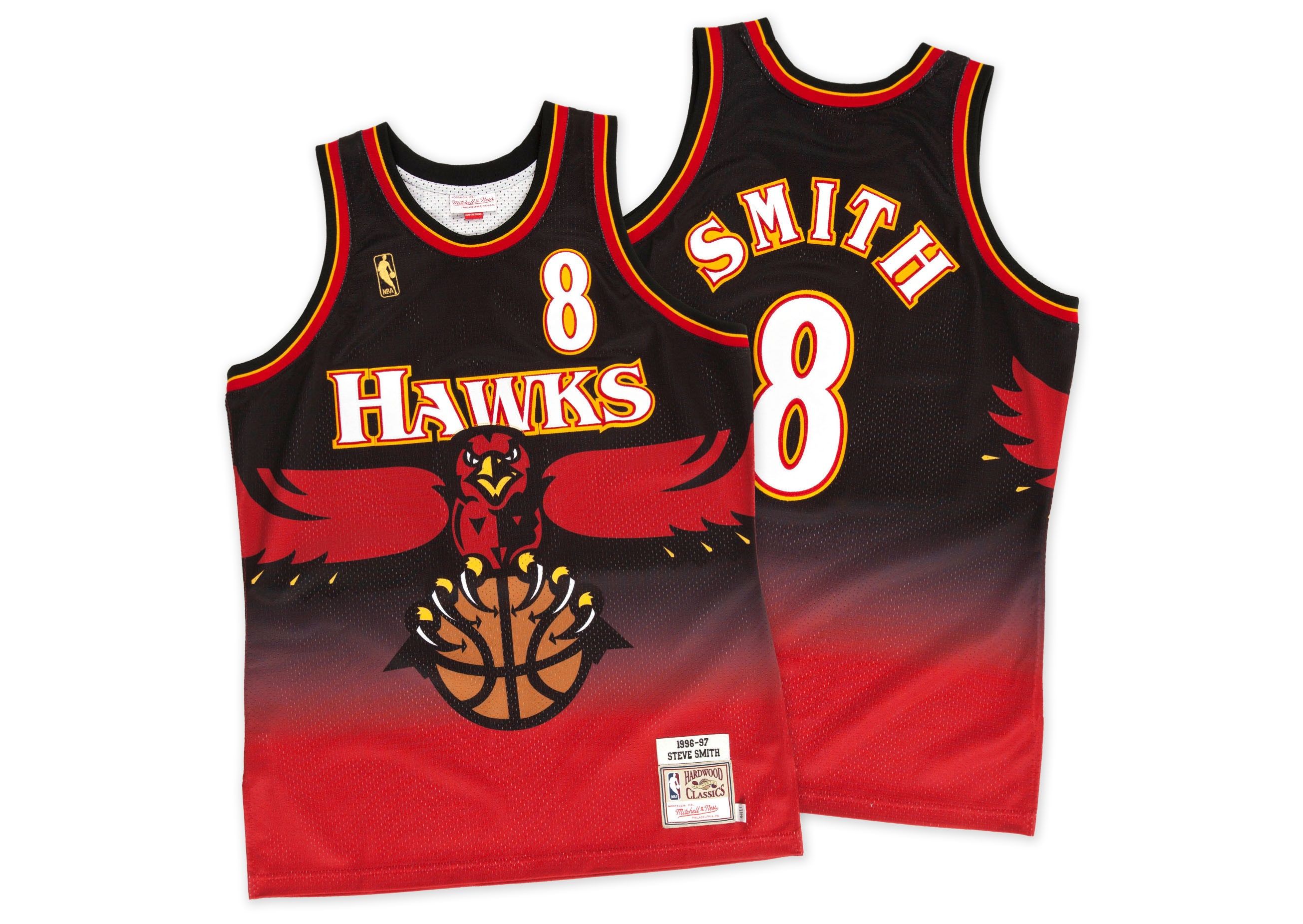
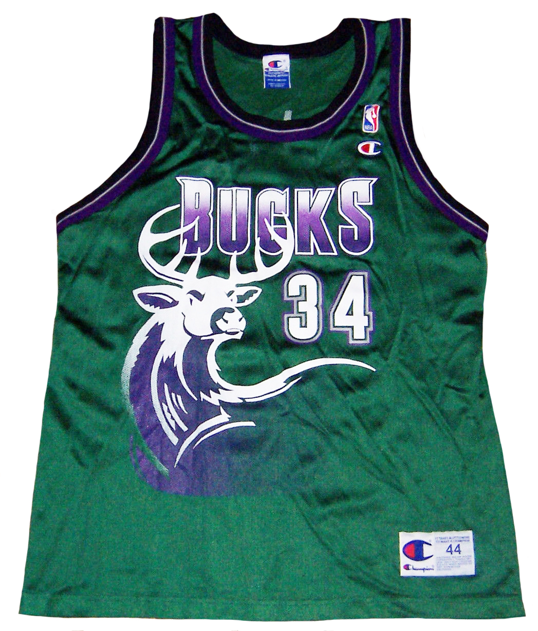
The Raptors jersey may have been particularly garish, but it wasn’t the only jersey of its kind. The 1990s produced some of the wildest, loudest, jerseys ever seen on a basketball court. Like the Atlanta Hawks’ red and black jersey with a fierce-looking Hawk swooping in across the entire front of it. Or the Milwaukee Bucks’ green uniform with a giant picture of a purple stag.
Many of these designs can be traced back to one man—Tom O’Grady, who, in 1990, became the league’s first creative director. Before O’Grady joined the league, most NBA jerseys looked something like that classic Bulls jersey. They had simple two or three color schemes, with the team name across the front. There might have been a stripe here or there, maybe a cool font, but that was about it. And they weren’t designed by…designers. Before O’Grady, the design of team uniforms was often left to equipment managers. It was, says O’Grady, “not a sophisticated business.”
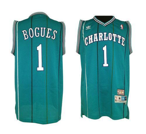 But that was all about to change. Because in 1988, the Charlotte Hornets introduced a radical new color to its uniforms: teal. Fans loved the teal Hornets jersey. It looked fresh and different. Tom O’Grady had nothing to do with the new Hornets uniform, but he took it as a sign that the league was ready for bolder designs.
Until the early 90s, there had been real limits to what could be done with jerseys. All the details—the numbers, the names, the logos—had to be sewed on. Complicated graphics would have taken a massive amount of embroidery, which would have added additional weight and made the jersey hotter to wear.

But soon after Tom O’Grady joined the NBA, he would get some new tools to work with. Computer programs like Photoshop and Illustrator helped him dream up new logo designs. And there was a new technique to get those drawings onto a jersey: dye sublimation.
Sublimation is a process of printing dye directly into the fabric. Now for the first time, you could design something in Photoshop, and make it as big and colorful as you wanted. Then with sublimation, you could print that design straight onto the material without any embroidery or extra weight.

Tom’s first big design was for the the Phoenix Suns, who were celebrating their 25th year in the league. They were moving into a new arena, and they wanted a new look. So Tom and his team came up with a redesign that included a big basketball that was also a sun with long red-to-orange sun-rays coming off it. They printed it on a bright purple background. As luck would have it, the Suns made it to the NBA Finals that year, and the whole country got to see that bright purple jersey, with its blazing basketball sun, all over national TV.
Over the course of the decade, two-thirds of the NBA teams got new uniforms with new logos and new color schemes. There was a lot of teal and purple and an abundance of 3D lettering and oversized graphics. The era of outlandish NBA uniforms reached its apex in 1995 with that Toronto Raptors jersey—the one that reminded people of the cartoon dinosaur, Barney.
Another big change occurred in the decade of the 1990s. Before that, the NBA wasn’t selling a lot of merchandise. If a fan wanted to buy a jersey, they had to pay the full cost of a genuine, stitched NBA game jersey, which was often over $200. But with dye sublimation, teams could now sell a replica jersey for about $50. There was soon a multi-million dollar business in NBA replica jerseys.
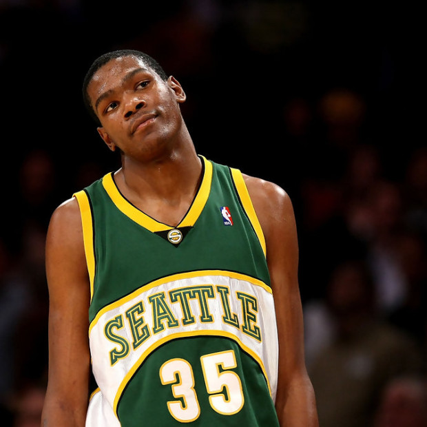
By the early 2000s, the National Basketball Association had become a booming global industry. Wealthy business people were suddenly interested in team ownership, including Howard Schultz of Starbucks fame. In 2001, Schultz bought the Seattle Supersonics, and came into the league with a laundry list of changes he wanted to make. He wanted to replace the hip hop that played in the arena with jazz. He wanted his team to “stick to the fundamentals”—less flashy dunks and showboating. He wanted more “team basketball” with less emphasis on individual stars.
And Schultz hated the Sonics 90s look (dark green and burnt orange uniforms with Sonics written in a Superman-inspired font) that had been designed by none other than Tom O’Grady. So Schultz turned to a Seattle design firm called Hornall Anderson. He directed them go back to the old classic green and gold color scheme and do something “iconic.” Schultz told the design team that he wanted something “that nobody would ever want to change.” He said he wanted it to be in the same classic category as the Chicago Cubs, the New York Yankees or the Green Bay Packers. He only wanted simple shapes and color palettes.
 By the start of the 2001-02 season, everything was in place. The Sonics uniforms were green and gold. No 3D anything. No giant logos across the chest. The uniforms looked like an update of the ones they’d started wearing in the late 70s.
Howard Schultz’s commitment to making the Sonics an iconic franchise with an iconic look didn’t last very long. In 2006 he sold the team, and the new owners moved the Sonics to Oklahoma City. But Schultz’s aesthetic vision rippled throughout the league. Throughout the aughts, one team and then another returned to the old color schemes and lost their big graphic jerseys. Even the Toronto Raptors gave up their purple dinosaur uniforms for red and white jerseys with “Raptors” written across the front in a nice, simple font. Tom O’Grady isn’t a fan. He says they’re “lifeless.”
Say what you want about Tom O’Grady’s jerseys but they weren’t lifeless. His designs are mostly gone from the NBA now, but they live on in blog posts and lists of people’s favorite jerseys from NBA history, or their least favorite. In their 2015 list of the ugliest basketball jerseys of all time, Sports Illustrated wrote “the Toronto Raptors cartoon dinosaur logo is one of the worst in all of sports. Thankfully, [it] will soon be extinct.”


But Tom doesn’t mind when people make fun of his design. He’s proud of that Raptors jersey. And the Raptors plan to hook fans (and their kids) on what the owner once called the “Happy Meal” design, may have worked. Today, Toronto has a loyal fan base and some of the highest attendance numbers in the league.
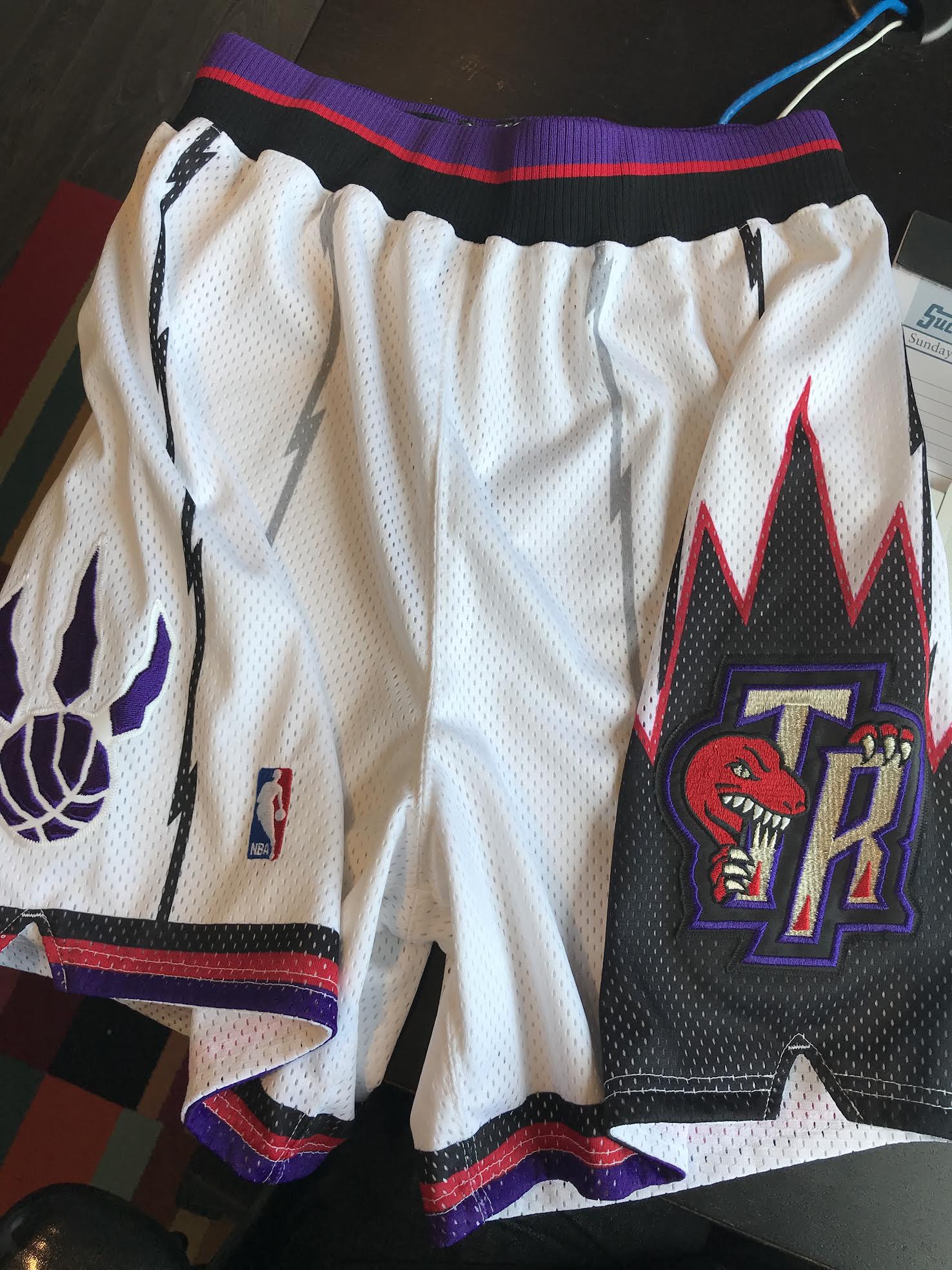
And all of those old jerseys from the 90s? They haven’t actually gone extinct. There are now entire companies that produce retro jerseys, and many of the designs Tom O’Grady and his team came up with are really popular. In fact, one of the top sellers is a bright purple jersey with the jagged claw-cut pinstripes and a red dinosaur dribbling a basketball.

Comments (1)
Share
The team is resurrecting the original dinosaur jersey for next season. WeTheNorth! (and it seems paleontologists as well).