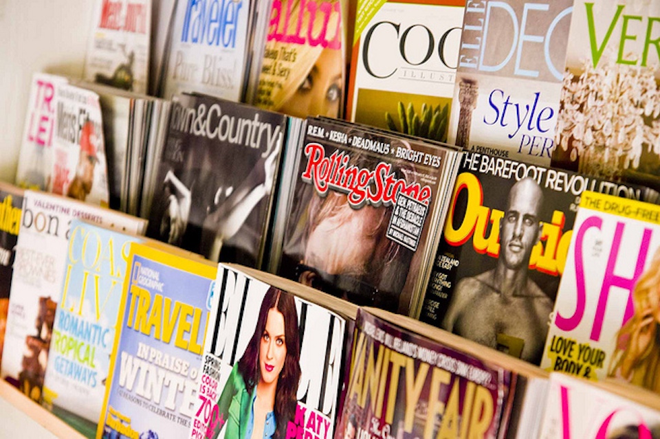
You know the saying: you can’t judge a book by its cover. With magazines, it’s pretty much the opposite. The cover of a magazine is the unified identity for a whole host of ideas, authors, and designers who have created the eclectic array of stories and articles and materials within each issue. And, some would argue, this identity extends to the reader as well. So if, say, you’re seen with an issue of Vogue, you’re don’t just own that copy — you become a Vogue reader.
Magazine covers are a challenge to design, since they have to be both ever-changing and also consistently recognizable. For this reason, most publications stick to a standard set practices.
This is the anatomy of a magazine cover, starting from the top. Literally.

The most obvious example is that the name of the publication is always plastered across the top, so that you can identify the brand from the get-go.
After the brand name, the second objective is to relay the new-ness of the latest issue. Magazines want to be sure that readers know they they don’t have this issue yet. There are a few ways to do this, but a good method is to use different colors month to month. Even if the covers look pretty much the same otherwise.

Then the photograph. The photograph aims to connect with the reader through eye contact and a recognizable celebrity face. But the photograph wasn’t always part of the equation. Early magazine covers were essentially illustrated.

And these illustrated covers usually did not feature celebrities. They were mostly scenes from fantasy or everyday life, or they featured the publication’s illustrated mascot. Some of these characters persist today, like the Playboy bunny, MAD‘s Alfred E. Neuman, and Eustace Tilley, the monocled ascot of the New Yorker.

Even UK Vogue had an illustrated mascot — Ms. Exeter, an elegant 50-something woman who had an advice column about being a classy, classy dame.

And Esquire had Esky, a mustachioed skirt-chaser in a fedora.

A lot of Esquire covers featured Esky. That is, until George Lois came along.
George Lois revolutionized the cover of Esquire, using big bold, eye-catching photographs. You’ve probably seen some of these covers, or at least homages to them.

The crazy thing was that Lois didn’t even work for Esquire. He was an ad man. He did commercial work.


In 1962, Harold Hayes, the newly hired head editor of Esquire, asked Lois to do a cover for him. As Lois tells it, Hayes was desperate and needed a cover in three days. Hayes gave Lois a description of 20 contents in the upcoming issue, including a spread of Floyd Patterson and Sonny Liston, who were about to go head to head in the upcoming heavyweight fight. Everyone was predicting that Patterson would win, and the magazine was going to be released before the fight.

Three days later, Lois delivered a cover of a Floyd Patterson doppelgänger laying flat on his back, dead in the ring. The message was clear: Esquire was calling the fight for Liston.
So there was a good chance that Esquire would be wrong, which would be completely embarrassing. But Harold Hayes let Lois go with it. And Lois actually got it right.
Lois went on to create 92 Esquire covers over the next 19 years, most of them just as eye-catching and controversial as his first. Many were one big stark image, with little or no text. They almost look like wall posters, and now many of them are in the permanent collection of the Museum of Modern Art in New York.

If you’ve seen any of Lois’s covers, or variations of his covers, it’s probably his photograph of Muhammad Ali, which is sometimes cited as the greatest magazine cover of all time. The cover is almost completely white, with Muhammad Ali, shirtless, pierced all over his body with arrows. Like a martyr.

Ali had refused military service, claiming conscientious objector status through his conversion to Islam. Ali was sentenced to jail, stripped of all his titles, and condemned as a draft dodger — some even called him a traitor. The idea of this cover was to suggest that he was a martyr to his religion, but George Lois chose a Christian martyr to represent him — specifically, Saint Sebastian.
Ali called up Nation of Islam leader Elijah Muhammad, and explained the painting on which this photo was based in excruciating detail, before finally putting George Lois on the phone. After a lengthy theological discussion, Elijah Muhammad gave George Lois his OK.
So Lois helped make photographs more or less standard on magazine covers. Then, in 1965, Cosmopolitan ushered in the era of the cover lines, a.k.a. words.

Cosmopolitan wasn’t the first to use text on the cover, but they were the first to use it really provocatively, and they set the standard template for what a newsstand magazine looks like today. Covers started to frame their photographs with words, creating a sort of “donut” of text around the featured image.

Even though magazines are covered in words, there’s tremendous debate among editors and art directors as to how to maximize the value of the key pieces of real estate on a magazine front cover. These key pieces of real estate vary depending on the kind of magazine.
Celebrity weeklies always have their big coverline across the middle of the magazine. And it’s always written in yellow, since it pops on the newsstand and has a very high caliber of color value. The whole weekly market relies on yellow.

For the more lifestyle-oriented magazines, the most captivating cover lines go in what’s called the hotspot, located immediately underneath the logo on the left. Unless it’s on the right. Magazines are racked differently in different countries, and racking patterns often shape page layout.
In the UK, a lot of the magazines are shuffled with their left edges overlaying each other, with only the left edge revealed. So in England you get most of your headlines on the left side, or “the leading left edge.”


In the United States, magazines are racked in a waterfall presentation, where you see the top third, so our publications stick their best cover lines high and close to the logo on either side.
US publications have many more coverlines than those in the UK. Purely because of the way they’re stacked up for retail.

Magazines that don’t rely on newsstand sales look very different from magazines that do. Titles like The Atlanic, TIME, and the New Yorker have the luxury of not needing to grab someone’s attention at the checkout line.
These are a little more Lois-esque, with big photographs and pictures and not as much text.

The New Yorker even reverts back to the pre 1960s illustration model:

…Except when you encounter The New Yorker on the newsstand, in which case there’s a little flap on the leading left edge with a list of contents.

Big pictures by themselves just don’t sell like they used to. It’s about volume of content. Magazines are expensive on newsstands, and readers want to be reassured that there’s plenty to read inside. Hence the illegible cornucopia of headlines on Esquire today.

This is the work of David Curcurito, current design director at Esquire. Curcurito’s style is so overloaded with words that it explodes the “donut.” The text is not just about communicating what information is in the issue, but showing you that there’s a lot of it.
The text and the image weave in and out of each other in such a way that the words almost act like an image. This is Esquire’s way of standing out from all the other magazines on the rack. But they don’t stand in the same way Lois’s covers did. Curcurito has messed with the standard magazine formula, but he tends to stick to it. Because this formula works. And it has been working for a long time.
But fear not, art directors everywhere, George Lois has a simple solution: mimic his covers.

(By the way, Cowles’s favorite covers today are on Bloomberg Businessweek).

Squarespace site of the week: The Message is Medium Rare
Comments (17)
Share
The information in this episode is great, and very interesting. However the whole ‘let’s be cute and make the segments sound like headlines’ makes me almost unable to listen to it. A few here and there are fine, to get an idea of what we are talking about, but this show is about magazine covers, it should be one itself. For example at 4 min in, Roman says ‘… these were shocking.’ Then there is an over-filtered voice saying the word ‘shocking’, because apparently we don’t understand what that word means? What is the point of that except to be annoying?
Ever since Radiolab it seems public radio shows / and podcast are getting into the habit of being highly produced with effects and voices and music, and generally it’s fine. This episode however seems overproduced just for the sake of being overproduced, and not because it really adds anything to the story.
Still a great show though, so I guess I’ll just deal with it.
Agreed.
Also that’s a typo, should say “but this show is about magazine covers, it shouldn’t be one itself”
To be fair, this has been a part of 99% Invisible’s production style from the beginning. A similar technique was used in episode 20 – though I’ll grant that episode used the technique a lil bit better, since it was used as a way of listing off the various messages etched into concrete by Nikko.
Love the episode – but does anyone else think that the Patterson/Liston fight cover wasn’t as dramatic as it was made out to be? Looking at the cover it’s kind of ambiguous who it’s meant to be, since the fighter is small and facing away from us. Nice shot though.
Also here’s the link to episode 20: Nikko Concrete Commando.
http://99percentinvisible.org/episode/episode-20-nikko-concrete-commando/
Reverts to … not reverts back. Overly redundant, from the Department of Redundancy Department.
I enjoyed the episode. It felt like it ended rather abruptly. I didn’t get the impression like it was wrapping up and then it faded out and was done. Most episodes have some kind of punctuation at the end but this one I just thought “that’s it”? Maybe it was so good I just didn’t want it to be over yet!
1. Personally, i liked the fade out on George Lois’ comments. An entertaining bit of editorial content.
2. Nearly all of the comments on this episode are about how the episode was put together, not its content. I wonder how much that has to do with Kickstarter support. In a sense it makes us the producers as much as we are consumers.
I also liked the fade out on the rant. I just wasn’t expecting it to coincide with the end of the episode.
Another great show. But Honestly as a fan of George Lois, I would have loved to listen to his full diatribe on magazines. Perhaps you can make a special segment out of just his interview?
I was disappointed that George Lois was once again allowed to take sole credit for work that was collaborative. I realize that this was not germane to the piece as a whole but it is well documented (This American Life Episode 383: Origin Story) that his photographer, Carl Fischer, was instrumental to the creation of many of the Esquire covers and that Lois has a history of claiming work that he did not do. At the very least, the piece could have said George Lois and his creative team, or partners, or collaborators. I admit, he is damn entertaining. More entertaining than the truth, unfortunately.
Totally agree with others saying George Lois should not have been allowed to repeat his untrue claims about being the sole creator of these iconic covers. The TAL story on this topic should be consulted: http://www.thisamericanlife.org/radio-archives/episode/383/origin-story I am guessing it would have been hard to fit this in, but important that he not take credit for things he either didn’t do or didn’t do alone.
I had never given magazine covers any thought, which is exactly what I love about this show; it makes me take notice. All through this episode I kept thinking how different these magazines are from Taproot, the only magazine I subscribe to. It comes out of New England and is only a couple years old. Each year they get a guest artist to do all the covers for the year. Take a look http://www.taprootmag.com/collections/shop
Roman, just wanted to say a) thanks to you & the team for continuing to create a great show, and b) thanks especially for the “Cover Story” episode. I’m teaching a university magazine publishing class this semester and that piece dropped just a couple weeks before our section on cover design—so, I created an illustrated powerpoint to accompany your episode and then played it for the class: over 100 slides illustrating every point, from images of George Lois at MoMA to a side-by-side comparison of Ali & St. Sebastien (etc). Made for a great class, and I’m sure created some new listeners as well.
You should post your presentation on Slideshare, so we can see it! Please?
Fantastic commentary ! I learned a lot from the facts ! Does someone know where my assistant might be able to grab a template DA 67-9-1 version to edit ?
I go to see daily a few websites and sites to read articles or reviews,
but this web site provides quality based posts.