There is a beauty to a universal standard. The idea that people across the world can agree that when they interact with one specific thing, everyone will be on the same page — regardless of language or culture or geographic locale. If you’re in Belgrade or Shanghai or São Paulo, you can look at a sign and know instantly, without speaking a word of the local language, that this floor is slippery. That the emergency exit is over there. That that substance is poisonous, and you should not eat it.
The group behind those internationally recognized logos is called the International Organization for Standardization.
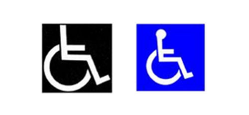
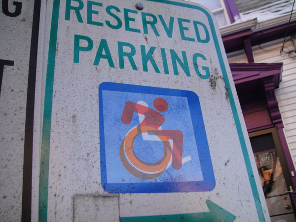
One of the most recognizable ISO symbols in the International Symbol of Access. You might not know it by that name, but you’ve seen it.
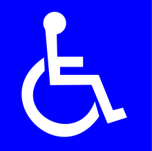
The International Symbol of Access is everywhere — on parking spaces, on buttons that operate automatic doors, in bathrooms, on seats on the bus or at movie theaters. Anywhere there’s an indication of special accommodations made for people with disabilities.
The logo was created through a design contest in 1968, coordinated by an organization now called Rehabilitation International. The logo would have to be readily identifiable from reasonable distance, self-descriptive, simple, unambiguous, and practical. The winner was a Danish designer named Susanne Koefed — though her original design didn’t have a head!
Within a decade, the logo — the one with a head — was endorsed by both the United Nations and ISO. And so over time, the International Symbol of Access became embedded in the urban fabric of cities and towns across the world. People began to pay attention to the kinds of special building accommodations that spaces need to be inviting for people with varying degrees of ability. And then in 1990, Congress passed the landmark Americans With Disabilities Act (ADA), which President George H. W. Bush signed into law. Modeled on the Civil Rights Act of 1964, the ADA…
“…prohibits discrimination and guarantees that people with disabilities have the same opportunities as everyone else to participate in the mainstream of American life — to enjoy employment opportunities, to purchase goods and services, and to participate in State and local government programs and services.”
The presence of this single, attractive logo to signify a universal right for access helped create an atmosphere in which the world could begin to adapt to new building parameters and regulations as specified per the ADA. In many ways, the adoption of the International Accessibility Icon is a success story in a simple design changing the world for the better.
But this isn’t the end of the story. Because as the logo got absorbed into the built environment, and the politics of (dis)ability became more nuanced, some people started finding it a little lacking.
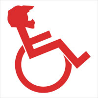
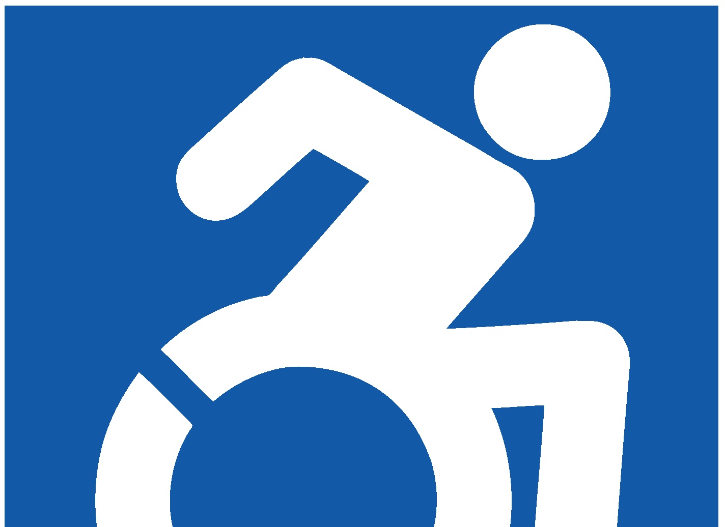
And so one group, the Accessible Icon Project, has created a new logo that they hope will ultimately replace the ISO standard.
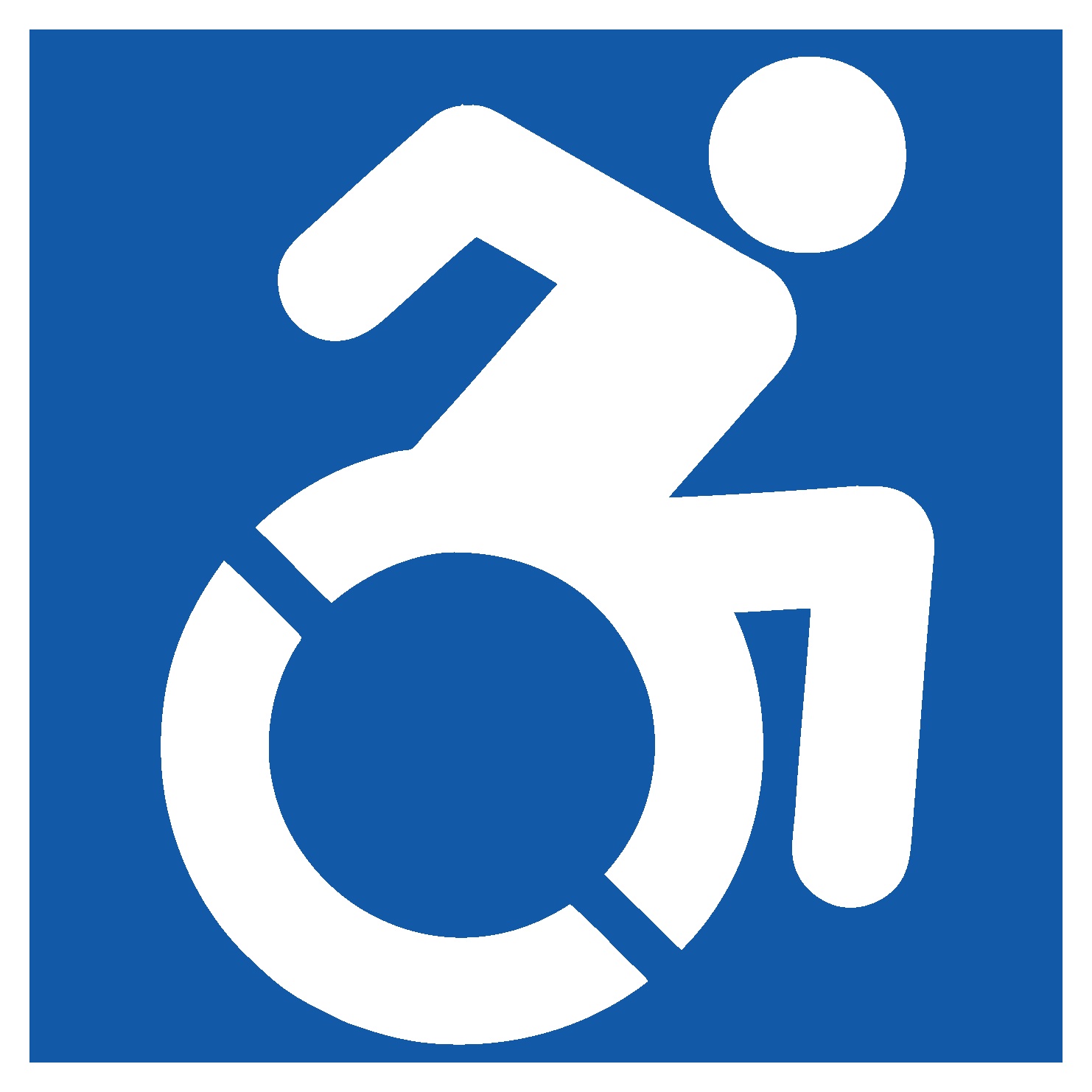
Here, in the Accessible Icon Project’s words, is what’s different:
- Head is forward to indicate the forward motion of the person through space. Here the person is the “driver” or decision maker about her mobility.
- Arm angle is pointing backward to suggest the dynamic mobility of a chair user, regardless of whether or not she uses her arms. Depicting the body in motion represents the symbolically active status of navigating the world.
- By including white angled knockouts the symbol presents the wheel as being in motion. These knockouts also work for creating stencils used in spray paint application of the icon. Having just one version of the logo keeps things more consistent and allows viewers to more clearly understand the intended message.
- The human depiction in this icon is consistent with other body representations found in the ISO 7001 – DOT Pictograms. Using a different portrayal of the human body would clash with these established and widely used icons and could lead to confusion.
- The leg has been moved forward to allow for more space between it and the wheel which allows for better readability and cleaner application of the icon as a stencil.
— Accessible Icon Project
Some people from the Accessible Icon Project have taken to altering signs with the current Universal Symbol of Access.
The DIY nature of this logo redesign project points to the fact that the process by which this new project is getting adopted is the complete opposite of how the Universal Symbol of Access became entrenched in global society. Rather than go for a universal buy-in from on high, the Accessible Icon Project has been entirely grassroots — which can be a problem. Because without starting life as a universally- and internationally-recognized symbol, there’s a lack of clarity as to whether this new sign meets the standards put into effect by the Americans With Disabilities Act.
So it all comes back to the question of what we are trying to accomplish through our symbols. Having one unified icon can tell one clear story all over the world. But sometimes stories change. After all, the original name for the group behind the International Symbol of Access — Rehabilitation International — used to be called the International Society for the Welfare of Cripples! The meanings and associations that words have shift over time. And sometimes the symbols need to as well.
But, you know, universality does have an upside. Especially if you’re in Belgrade and about to accidentally ingest poison.
This story was by reported by Lauren Ober (@OberandOut). Lauren spoke with Accessible Icon Project co-founder Sara Hendren, who is an artist, designer, RISD lecturer, and curator of Abler, a site about design and disability. Lauren also spoke with Gary Christenson, mayor of Malden, MA; Jeff Gentry, of Triangle; and disability rights activist Brendon Hildreth, all of whom have been working on bringing the Accessible Icon Project to their respective communities.
Lauren also got to chat with Barry Gray, who, as Chairman of ISO’s Technical Committee on Graphical Symbols, has the best job title ever.
BONUS! Check out Lauren’s story from Only A Game about “WCMX,” or “wheelchair motocross.”
This is Wheelz’s logo
Squarespace site of the week: Audio Dregs, “experimental music made by people equally in love with melody and invention.” You will love them.


Comments (34)
Share
The funny thing about international hazard symbols is that the Global Harmonised System (GHS) for chemicals is not implemented globally, and is not harmonized between the areas that implemented it. But Mercosur, Japan, the EU and a few other regions have decided to accept it… or at least parts of it.
And not always the same parts, or in the same ways.
Also, let’s not forget ISO 8601 which confirms the correct way to write today’s date: 2014-02-18
What is the name of the track playing as Roman concludes the story?
The song is “Walk in the Park” by Beach House, from the album Teen Dream, which is a really great album. Check it out!
When I studied universal design and access as an architecture student more than ten years ago, one of the things we discussed was how one symbol, while universally identifiable, doesn’t adequately represent the many different levels of ability that individuals have. Often we can fall into the trap of thinking that only people in wheelchairs have a ‘disability’…
How strange. Those ISO icons are designed to be easily identifiable and hard to confuse, and they describe environment, not persons, so your mind has to fill the blanks. This way those signs can be used in any environment and still apply to all people: They use stick figures for a purpose, not for aesthetics.
(As sid2.0 pointed out, the wheelchair itself is a problem, as it is very specific and makes you forget the endless number of possible disabilities where the sign should be applied, too, but I guess in a way it usually works out.)
The whole new design seems to be based upon the idea that the imaginary person in the wheelchair needs to be depicted in a positive, dynamic, “in charge” way, that a personality has to be loaded into that empty template. Therefor the new design is even more specific than the official icon, and while it looks cool, it sacrifices clarity and universality for a moral concern (aka “political correctness”). Which is bad for a purely utilitarian thing as a sign.
And: Just because they say it’s no sign-washing does not meant it’s no sign-washing.
That’s what happens when NON disabled presume to speak for the disabled community. They pick non-issues and waste press time and man hours on something that makes no difference in the lives of people with disabilities but brings accolades to themselves by diverting attention from the real concerns of people with disabilities because they have no idea what those are. http://unlimbited.com/read/left-turns-and-other-obstacles/item/pay-no-attention-to-the-man-behind-the-curtain
I think if they truly wanted to be consistent with other ISO standardized iconography, that the existing accessibility symbol would be used here too.
Reference for the ISO 7000:2012 mobility restricted access icon:
https://www.iso.org/obp/ui/?_escaped_fragment_=iso:grs:7000:4:0100
For comparison, the ISO 7001:2007 accessible public elevator/lift icon:
https://www.iso.org/obp/ui/?_escaped_fragment_=iso:grs:7001:3:PI_PF_031
Searching ‘wheelchair’ on the ISO OBP site shows the latter seems to be more common.
https://www.iso.org/obp/ui/
Hi guys,
If the logo is really really important to people affected by a disability, then I certainly wouldn’t fight them on such little change as having a different logo. But I did check out the logo and my personal general impression of it, to be honest, was not one of dynamism or activity, but rather that it looks a bit ridiculous.
At first I thought the leg was a second arm, and then got all confused about what the picture even was. It still kind of looks like a robot android with a wheel attached the the second half of the person’s body.
But I do also see the depection of motion, like in wheelchair racing, which is still odd. It makes me picture people “racing” into the bathrooms and parking spaces. It’s kindof like having a pedestrian crossing sign where the person is running, Of a men’s bathroom sign where the stickman is running. You’re going to naturally ask yourself “why the heck is this person running into the bathroom?”
In front of a wheelchair ramp, the icon would be especially hilarious since it would seem to say “you’re gonna have to really work hard to get up this one, buddy.”
But, like I said, as silly of an image as it would put into my own head, if it really matters to people than go nuts. I would probably test this image out on people who are not told what it is first, to make sure people would get the intended impression.
The message of the icon is not universally rainbows and lollipops. For a friend of mine, the change to the new icon is offensive–as if graphic design makes everything OK. Why not spend the tens of millions they would waste on design changes to make people feel magnanimous on actually helping to innovate real advances in mobility, e.g., bringing the iBot back into full production at an affordable price. Prioritization is an essential element of good design.
“bringing the iBot back into full production at an affordable price.”
Well, you’re talking about a very complicated, extremely specialized device. Then you add medical certifications and it being a huge liability risk.
I admire the Huey 091 project though, hopefully they can pull it off, but if it doesn’t happen, I can understand some of the reasons why, as unfortunate as it may be.
This is a very poor logo design. So many bad things about, some of which have been raised in the comments. Initial point that got me was about consistency, yet it fails at the first hurdle (sorry no pun intended). You say the line on the wheels are for “motion” but clearly they’re just them stuck on for connivence of stencils (they could be incorporated into the design far more aesthetically)… yet the images posted of it being stencilled and also a finished stencil don’t contain those lines?!
As raised by other people, the icon that is in use is already globally recognised and is “iconic” money & time shouldn’t be put into one designers poor attempt to get their badly designed logo “famous”, but into making places more universally accessible to those who rely on wheelchairs for mobility.
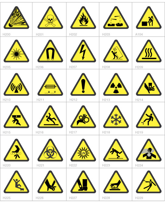
I’m sorry to potentially distract from the point of this podcast, but I can’t find any description for iso hazard symbol H211 in the first image. Anyone?
It’s “no playing Hangman here”. See, the gallows have been taken down, the puzzle incomplete, and the hangee led away.
I totally agree that it looks like some sort of wheelchair racing. I like the idea of making it more active… but maybe the design should be reconsidered as a whole, rather than just evolving the current one. Beside, this symbol represents a range of disabilities beyond wheelchair users right?
Also, the knockouts suggest ‘inaccessible’ more than ‘accessible’ in my opinion.
I see what you mean. It’s like he’s all agitated, “Damn, why’d the cops boot my wheelchair!?!?!!”
love the song at the end – I have been hearing it from my little guy too!
I don’t normally comment on these things, but this is just not a cause these well-meaning people should be exerting their efforts toward. So many other things to worry about. Not to be insensitive, but the icon is laughable and better suited as the icon for special olympics wheelchair racing. There’s no reason the icon should suggest motion. In the back of my mind it would suggest I should be watching out for rogue disabled people that may run me down or pop out on the street. The only sign I see that motion is appropriate is the one on the side of the highways of the family (I presume illegal aliens) holding hands and running.
Great podcast, but I will bite my tongue on how I think about this… Nope, can’t. This has to be one of dumbest projects a person has put themselves through, really pointless.
Why not make red a little redder because red isn’t quite red enough!?
Anyone notice that Susanne Koefed’s original design was not a person, but a chair? Someone just stuck a head on a wheelchair to get the icon we use now.
I do think it’s a little optimistic to think that redesigning an icon will somehow ‘start a conversation’ on issues of disability and accessibility, though. I’m a designer and I appreciate our intrinsic idealism, but the issue is far bigger than the icon we use. Besides, I think we are trying to get too much personal commentary from an icon – a picture which is purposely brutally oversimpified in order to communicate an abstract concept. It’s not telling your personal story, and you shouldn’t expect it to. That’s not what standards do.
This whole project seems profoundly misguided to me and this podcast made me angrier and angrier as it went along praising such nonsense. The point of the access symbol is not to make some powerful statement either for or against the independence of disabled persons but to simply, clearly and unambiguously identify accommodations for persons with disabilities. The current symbol is universally recognized and is doing that job. The emotions tied to issues of disability lead activists to attempt to convey much larger messages than what these symbols represent.
No sensible person looks at the symbols for radiation hazards and complains that they fail to make radiation look sufficiently hazardous, or that they are too ominous and fail to give credit for all the wonderful things radiation is used for in the modern world. The current symbol has achieved universal recognition and clearly identifies radiation hazards, which is all it should be expected to do. These symbols aren’t essays on the merits or faults of the ideas that they represent.
That’s what happens when able bodied people (read do-gooders) presume to speak for the disabled community. They pick non-issues and waste press time and man hours on something that makes no difference in the lives of people with disabilities but brings accolades to themselves by diverting attention from the real concerns of people with disabilities because they have no idea what those are. While I’m sure they put a lot of thought into why they did what they did, frankly it’s ugly, obvious and cheesy but no one wants to say that to them because it’s for handicapped people and anything at all should be good enough. http://unlimbited.com/read/left-turns-and-other-obstacles/item/pay-no-attention-to-the-man-behind-the-curtain
I’m amused that you found it necessary to repeat the same message, such that you put the same shaming twice, in the same thread.
I am glad you posted it twice. It allows a reply. Please see Taylor’s comments below. It seems like Taylor is the only one here qualified to comment. So please do not assume that your assertions are correct. Also, for you to say that “they” pick non-issues and divert attention from the real concerns of people with disabilities because they do not know what they are is ridiculous. ISO is not charged with that task.
I am tossing in my two cents because I deal with Safety Icons every day as a product safety manager. The reason changes are made is due to the fact that issues occur that mandate a change. I admit that I do not know any of the actual problems that the original has caused, but updates are based on feedback from accident reports or complaints to the ISO about the effectiveness of the icons.
As far as the link you provided, “Misdirected Fluff” should be the author’s tag line. To suggest that the ISO changed an icon because it “doesn’t represent a disabled person” to the artist who designed it or any other onlooker in attendance is laughable. The artist may have had that on their mind during design, but an artist would never drive a change at ISO.
I don’t like the “new” symbol, and how proponents of the redesign refer to the CURRENT symbol as the “old symbol. If you tilt your head a little to the right it starts to look strange. The leg and arm are too similar and close together and starts to look like a skitter alien from Falling Skies. The MOMA in New York had the symbol redesigned for their 2005 renovations to a more dynamic symbol that I think does a better job:
http://www.scottosphere.org/wp-content/uploads/2005/08/symbol-wheelchair-new.png
Thank you for noticing Nelson. I designed the icon system for the Museum of Modern Art in 2002 and I continue to design the new symbols as of Fall 2015.
http://dresserjohnson.com/museum-of-modern-art.html
As an active paraplegic, I actually really like the sign and recognized the mobility aspect of it and never had any confusion about what it represented when I first saw it. It’d be cool to see a change like this because it does depict better that people with disabilities are active. As far as the mention of other disabilities, I think the reason a wheelchair is used in the pics as its more identifiable than showing a person standing with a prosthetic or missing a limb, etc as it would take someone longer to figure out what they’re looking at and also difficult to accurately portray in stick figure form. I’ve never though that the wheelchair sign excluded others with disabilities even prior to being a paraplegic myself.
That said, while I do like the change I couldn’t really care less if the old sign stayed either. As far as the money people talk about, thats really a moot point because all money is earmarked for certain things and something like a sign change would likely fall to the something such as the DOT which isn’t going to be spending money on other disability issues.
Also… it was mentioned that the existing sign was recognizable everywhere and would be confusing. This is untrue. Many other countries have a very rounded looking sign as it is, this new icon would actually be closer to what I’ve seen than the current one. There are slight variations within the USA as well. Everything changes, I’d say a 50 year old pic has served well but a facelift to make more modern wouldn’t hurt. Autos don’t even look the same as they did 10 years ago, most companies have changed logos within the past 10 years as well to make more modern, this is not much different than that. Government wastes millions of dollars every year that people dont even realize so why not spend some of the money that goes to buying all new cars for government officials every year and use it to update signs, wouldn’t hurt for them to drive 2 year old cars. (Or one of the other thousands of things wasted money is spent on).
I love the post with one major suggestion. I mean no disrespect, however please have it proofed and then updated. There are numerous spelling errors. These issues seriously reduce the impact of the point you are trying to make.
I’m not a fan. The new emblem looks like a guy being torn apart by machinery & I can’t unsee it.
Personally I would like to see a sign that reflects more on what the space is for. Something that depicts using the access aisle. For it’s the extra space (hash area) associated with a disabled parking space that defines it as a special parking space. So a sign showing a lift/ramp deployed or a door fully swung open.
As a physically disabled person, I would like to share my thoughts on the whole “icon” drama (I understand that I cannot represent the entire community of PwDs alone, but I am far from the only disabled person who feels this way)
In short: please, please, please, please, PLEASE let the new icon die.
My reasons for my dislike of the new icon:
1) there is nothing wrong with the current ISA icon. Negative perceptions of the icon have less to do with the icon itself and more to do with the negative connotations of disability.
2) The founding members of the Icon for Access project, while active in the disability community and definitely experienced with designing for disability, are not actually disabled. It’s very dangerous to allow abled people to decide/claim to know what is and is not ableist. In fact, many disabled people have spoken out against this new logo, but the IfA project has ignored them.
3) the new icon itself is ableist. The reasoning given for changing the icon is that it is more sensitive/respectful/accurate to portray the disabled community as physically active. This explanation is inherently ABLEIST. Physically disabled people are often not active in a way that abled bodied people consider valid- and that’s okay. Trying to cast physically disabled people in a more “respectable”/palatable light ignores the fact that respectable/valid is defined by ableist assumptions and biases. Trying to improve the treatment or perception of disabled people by emphasizing that they aren’t that disabled is only playing with respectability politics and does nothing to address the societal discrimination and violence that disabled people unjustly face every single day.
4) the new icon represents an even smaller portion of the disabled community than the current icon. While the current icon only represents wheelchair users, the new icon only represents a small minority of wheelchair users (manual chair users). The new icon does not represent people with cerebral palsy, ALS, or a multitude of other disabilities that require an automatic wheelchair. These people are already some of the most marginalized members of the disabled community (they are often marginalized within the community itself) and erasing them from the access icon only worsens the lack of representation they see.
5) bickering over the logo takes time and resources away from actually addressing the needs of disabled people and improving their quality of life. This new icon is kind of like the euphemistic language surrounding disability that has popped up in the last decade- instead of addressing why “disabled” has harmful connotations, abled people created new terms like “special needs” and “differently abled” that did not-yet-have the same implications as the old terms. I worry that what has happened to terminology surrounding disability will happen to these icons too. As the new terms of disability become more and more pejorative, they are replaced, and an endless cycle forms while the stigma surrounding disability itself is never addressed or seriously acknowledged. I don’t want access icons to be an opportunity for an authority/employer/administrator to show off how inclusive and accepting and progressive they are while they allow ableist and harmful practices to continue. It would break my heart if ableism and ableist practices could be defended by saying “I’m not ableist! I use the politically correct icon so I can’t be discriminatory!”
Disabled people all around the world urgently need progress, and devoting resources to updating already adequate icons or to making cosmetic changes like terminology or definitions slows and sometimes obstructs actual, significant change.
*as a final side note, which was not mentioned in the article: crippled/crip/cripple is considered by many disabled people to be a slur when used by abled people. When used by disabled people and our agencies, it’s actually an act of pride/reclamation. This is why there are terms like “crip advocacy”, “crip humor”, and “crip fashion”. It’s not universal, but it’s certainly not uncommon (esp. in dated publications and agency names) to see the word used in a very different way than abled people use it. The closest analogy I could make would probably be the word “queer”?
Very true. And now replace “disabled” with “negro” and you get to the same conclusion: you have to treat the people, not the words.
What I clearly don’t understand is the project’s justification #3: “Having just one version of the logo keeps things more consistent and allows viewers to more clearly understand the intended message.” – Then why not sticking with the ONE version? Why introducing ANOTHER version? With decades needed of getting used to it, another decades to be aware of both of it and another decades to replace all the old signs.
Well, I anticipate the argument “The newer one is better”. And I debunk it instantly: Newer is not better. It is just newer. Only better is better. (general rule)
And here is why in particular:
The new sign doesn’t meet the needs of good communication design: being simple (abstract) as possible while being distinct as needed.
An icon is a symbol which REPRESENTS something, but IS NOT something. This one provides information to ALL KINDS of people who need to avoid stairs or thresholds: not only dynamically hand-driven wheelchairs, but also pushed and engine-driven wheelchairs; and even unwheeled walking people if they have a hip or knee damage; also for mothers with baby carriages, for delivery men with barrows and probably lots of other people which I (and the provider of such a sign) don’t even imagine. They all are clearly not included in the icon, but sure know to use it. Because again: it is not a depiction but an abstraction of reality.
The changing of the sign towards a more dynamic wheelchair user opens the door to follow-up questions: what about female wheelchair users? And what about non-white people? That (beginning with the Hendren sign) is whataboutism that leads to nowhere.
It is not that it should be generally prohibited to pimp up the sign here and there (under special circumstances) for the sake of artwork or humor, but the general sign should stay untouched.
To be honest, there are not many places imaginable to suit a fancy colored sign except the intersection Castro and 18th. But that’s a completely different story, named 99% obvious.
Maybe this attempt to change the sign is owed to the American confusion regarding the word ‘special’. By RENAMING ‘disabled people’ into ‘special peeole’ or ‘people with special needs’ the project guys obviously were distracted in their focus from the GENERAL purpose to a SPECIAL sign.
And finally, because I am a nasty person, to me the guy on the new sign looks as if he just suffers an epileptic seizure.
Maybe the project folks can put their effort and spare time out of the way and into improving other long-needed things like the square wheel or octagonal cereal boxes.