There are symbols all around us that we take for granted, like the lightning strike icon, which indicates that something is high voltage. Or a little campfire to indicate that something is flammable. Those icons are pretty obvious, but there are others that aren’t so straightforward. Like, why do a triangle and a stick in a circle indicate “peace”? Where does the smiley face actually come from? Or the power symbol? We sent out the 99PI team to dig into the backstory behind some of those images you see every day.
The Peace Symbol by Emmett FitzGerald
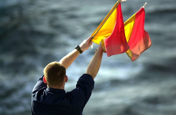
Flag semaphore is often associated with the military, but semaphores are actually at the root of one of our most ubiquitous icons—the peace symbol. Historically, it had associations with conflicts. During the French Revolution, complex semaphore rigs facilitated fast official communication across the nation. But it wasn’t until the Cold War that it became embedded as an iconic anti-war symbol.
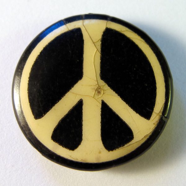
Born in England during the first year of World War I, Gerald Holtom would grow up to become a conscientious objector in World War II. While working at the Ministry of Education in 1958, he designed an icon as a side project aligned with his beliefs — a nuclear disarmament logo for a protest march organized by the newly-formed Direct Action Committee against Nuclear War (DAC), supported by the Campaign for Nuclear Disarmament (CND).
 The marchers would carry 500 copies of the new “peace symbol” along their 50-mile journey from London’s Trafalgar Square to Britain’s Atomic Weapons Research Establishment. In the first large-scale anti-nuclear march of its kind, protesters united under this symbol. They hoisted it on banners and placards and wore it on their clothing.
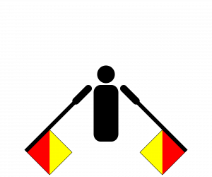
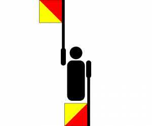
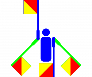
To those familiar with semaphore, the symbol would seem to contain a coded message — ‘N’ and ‘D’ standing for “nuclear” and “disarmament,” made up of vertical line for the D and two downward-angled lines for the N. These overlaid signs are set within a simple circle.
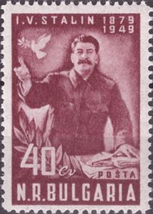
According to Andrew Rigby, Emeritus Professor of Peace Studies at Coventry University in the United Kingdom, this symbol wasn’t Holtom’s first attempt. He considered a dove, but that had been appropriated by the Stalin regime to legitimize their work on the hydrogen bomb. He also thought about the Christian cross but realized it could be associated with crusaders and, more recently: the Western nation that dropped nuclear weapons, devastating Japan.
Holtom wanted to create something that could be universally adopted, without the symbolic baggage of fraught iconography. So, in a state of “deep despair,” Holtom later wrote, “I drew myself: the representative of an individual in despair, with hands […] outstretched outwards and downwards. [….] I formalized the drawing into a line and put a circle round it. It was ridiculous at first and such a puny thing.” It was to him as much a gesture of desperation as it was a work of design.
Even then, he wasn’t sure it was the right solution, but he drew it out on a piece of paper then pinned it on his jacket and forgot about it. When a woman at the post office then asked him about it, he recalled, “I looked down in some surprise and saw the ND symbol pinned on my lapel. I felt rather strange and uneasy wearing a badge. ‘Oh, that is the new peace symbol,’ I said. ‘How interesting, are there many of them?’ ‘No, only one, but I expect there will be quite a lot before long.’” Early versions produced and circulated for the CND look a bit more like abstracted persons — approaching the circle, the lines widen, suggesting a head toward the top and forward-leaning arms. They were also made of clay and handed out with a dark message: in case of a nuclear war, these may be the only artifacts that outlast the person wearing them.
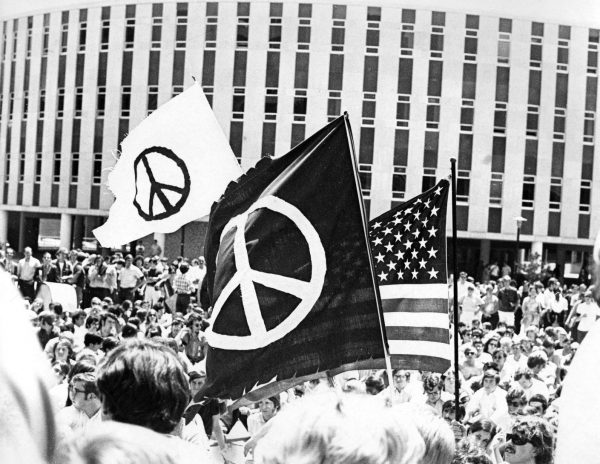
The CND continued to use the design in the U.K., but the symbol also made its way around the world, and it came to symbolize peace more broadly. In the United States, a pacifist protester shined a spotlight on the symbol in 1958, hoisting it up on a small boat he piloted into a nuclear test zone. A few years later, a delegate from America’s Student Peace Union (SPU) returned from a trip to Britain and convinced his group to adopt the symbol and distribute it on college campuses. Absent copyright, the symbol’s usage has continued to expand over time. It has since been described as “probably the most powerful, memorable and adaptable image ever designed for a secular cause.”
Holtom, though, came to question the negativity of the implied figure in his graphic, a reflection of his own mood at the time that also looked like the runic symbol for “death” (an inversion of the “life” rune). But he also realized something: if the symbol were inverted, it could look like a “tree of life,” representing hope and optimism — and the upward-reaching arms could signify the letter U in semaphore. Coupled with the D, this flipped figure could stand for “unilateral disarmament,” too, Holtom’s ultimate dream.


Comments (29)
Share
Love the show. Listen all the time. Another great episode.
My 9th grade English teacher–a self-proclaimed flower child of the ’60s–had told us that the peace symbol is the footprint of a dove (in a circle). Although that is apparently apocryphal, I do like that explanation. (Of course, that could be a footprint of any number of bird species…)
There’s actually another Mad Magazine connection in this episode. The Vietnam-era Al Jaffee strip Hawks & Doves centered on Private Doves finding different ways to display a peace symbol, much to the annoyance of Major Hawks.
And a bit more color on Bayard Rustin: Rustin was a native of West Chester, Pennsylvania. In 2006, he was finally made the namesake of a new high school in the district. Rumor is that he was in the running for naming an earlier high school in the district but it was blocked due to him being gay. Thus, the district ended up with the redundantly named “West Chester East High School.”
Errr since when has this been the Peace Symbol? It’s the CND badge and that’s it! Well it was growing up in 1970’s Britain, punk, Anti Nazi League and CND. Am I the only person who has only ever associated the icon with CND? Funny since the next item featured the DK s – didn’t they have a logo based on their initials? Love the podcast, Fresh Fruit for Rotting Vegetables :)
Dear fellow beautiful nerds
I love this episode and I’m taking Roman’s request to submit a ubiquitous icon for further diving.
I love the Biohazard symbol. I love that it looks like absolutely nothing but a bunch of circles and squiggly lines but also instantly conveys “this will fuck your shit up stay away”. I’d love to know how it was designed.
We actually did a couple of articles on this, so here you go:
https://99percentinvisible.org/article/biohazard-symbol-designed-to-be-memorable-but-meaningless/
https://99percentinvisible.org/article/beyond-biohazard-danger-symbols-cant-last-forever/
When I heard “semaphore” in the first segment my first association was how the lifeguards communicated with each other at Ocean City in the late 1960s and 1970s when we were there for family vacations.
I always thought that’s what all lifeguards did but the show implied it was a local thing.
Wonder if there is a name or episode for that idea, things you know local that you think are global and they are not. Growing up in Baltimore I thought all bowling was duckpins, but that too was regional. Likewise, from FM radio then I was sure Little Feat was a national band but turns out they were big in Baltimore and one other city.
Anyhow, great show. I was worried there would be no Gump reference in the Smiley Face segment, whew
Icons: the hamburger for website menus?
Somewhat related to icons: I recall reading that clocks for sale used to be stopped at something like 10:10, with what turned out to be an apocryphal explanation about representing the time of a historical event, but more likely just not obscuring the maker’s name. But no such logic applies to clock icons or clip art. However, it seems most of those show both hands at or above the 9-3 line, and almost none show more than one hand below it. Is my perception correct? And, if so, why?
Less related, but: a frustration in reading some blogs is inconsistency in directional page navigation. “Next” and “previous” may mean opposite things on different sites. Still others use a variety of word labels. (“Older” and “newer” make the most sense.) Providing a number line is the most clear, but often annoying because you get a limited set of numbers to click, and the only alternative to slowly clicking back, say, two at a time, is a double arrow sending you all the way to one end. As blogs live longer, that’s less and less useful. Also annoying: Providing a number line but also having single arrows to move one page at a time — why the redundancy? And number lines that are so tiny it’s difficult to consistently click the correct spot on phones or tablets. (Indeed, I’d be interested in any look at blog design changes — the death of blogrolls, the birth of continuous scroll, why Geocities sites had such hideous layouts and why most sites don’t now.)
An intersting case is the Burger Menu Icon, thought to be ubiquitous but is actually not. Have you perhaps talked about it before..?
I would love to know who is behind the images on the care tags for clothing. They are too small to discern, and even with a magnifying glass I can’t figure out the meaning.
Great episode. Thanks.
Thanks for another great episode.
Just wanted to add that the song »On The Road from Aldermaston« by Matt McGinn appears to be based on »The Ballad of Roddy McCorley« from the 1890s which tells the story of the Irish nationalist’s death after being allegedly involved in the the Battle of Antrim.
Your discussion about the trademark issues around the smiley face reminded me of a story that’s played out in Australia in recent months, with a trademark issued on the Aboriginal flag and a non-indigenous clothing company that holds the license to use it issuing cease and desist orders against businesses run by indigenous people. See for example https://www.sbs.com.au/news/indigenous-companies-told-they-can-t-use-the-aboriginal-flag-over-copyright-concerns
I greatly enjoyed this episode – but had no idea how much until a question popped up in Trivia last night. “If you were going to communicate in semaphore, what would you need?” Clearly our Trivia Host is as much of a fan as I am!
I’d love to hear some history behind some ubiquitous sound effects. Why does everyone KNOW what a spider sounds like despite them never actually making noise? Why do we NEED to throw the sound of actual bowling pins over top of people being knocked over. Why does every gun have several invisible metal D rings attached to it that make noise anytime they’re moved?
There are so many weird noises that we kind of require in media to make stuff “make sense” despite have zero basis in reality.
I thought the power symbol was supposed to be a 1 and a zero joined together to look like a stylised light switch (the old chrome ones with a protruding stick the can be either up or down). I am surprised the visual similarity was not noted.
Great show! Thanks. As a youngster in the 1970’s I heard an (apparently fictitious) origin story for the peace sign: Derived from the “Make Love Not War” slogan, it depicted a man and woman in the missionary position inside a circle.
Something on the shaver socket icon. It’s really dreadful -how did they get away with that one.
I grew up during the 1960s. To me, the name for the peace symbol is “the drooping cross.” I was surprised that this name was not mentioned in the episode. I can’t tell you anything about the background of this name, sorry.
I was struck for the call of icons at the end by two which are often used and yet are well out of date. I work as a locksmith and keep seeing businesses use keys which stopped being used in the 1800’s for advertising images. So called warded keys were used in European castles. However, now those same castle keep them as symbols not as working keys.
The other dated symbol is that of indicating to somebody that there is a phone call across too much distance to noise to say it. You will see people simulate dialing a rotary phone while holding up a handset to their face. Granted, those phones exist but probably more in museums than in use.
Enjoy the show every time.
Love the hidden binary message in the article. Nice touch. ✌️❤️♻️
Another excellent episode! I would add that Captain Frederick Marryat standardized the navy flag signals with A Code of Signals (1817) and went on to compose the most wild and obscure flower code book, The Floral Telegraph (1836). Shameless plug for those interested in Marryat or flowers-as-code
https://www.cambridge.org/core/journals/victorian-literature-and-culture/article/captain-frederick-marryat-and-the-floral-telegraph-or-a-forgotten-coder-and-his-floral-code/D0F8F84EC1FB389B5B9360EE7CC2BF26
Also, Symbol Sourcebook by Henry Dreyfuss is another great example of an attempt to universalize design and code across languages and disciplines in the 1960s.
I’m very curious about the male and female symbols. There’s got to be a good story there.
Hey, there’s an important typo in the transcript:
” Coupled with the D, this flipped figure could stand for “unilateral disarmament,” too, Holtom’s ultimate dream.”
The audio says his dream was ‘universal disarmament’.
Doing a tacky and leaving a negativism comment when 99% of the time I enjoy the podcast yet don’t comment.
It just seemed this was painfully self explanatory material / common knowledge.
What 99pi listener wouldn’t glance at an on off symbol and see the binary? The peace symbol has been explicated ad infinitum. The info on smiley faces: “Did you know this is a versatile symbol with different meanings depending on context?” Mind blowing.
IMO this was a weak sauce Wikipedia skim.
Sorry! Decided to embrace the horror of leaving a negative comment and just go for it. Hope it is apparent that this criticism on has any definition as I thought this episode stood in contrast to your usually excellent work. This was 99 lite.
@romanmars @99piorg
If you turn the peace symbol upside down, it looks like 10:09:35 This is the time that timepieces are set to in advertising
https://chamblee54.wordpress.com/2017/01/06/why-the-time-is-always-100936-4/
Am I the only one who can’t hold an elevator door open because the symbols for door open and door closed are confusing? In fact, I usually get them exactly mixed up because to me the closed symbol looks like the doors are opening, and vice versa.
Would love to see more in this series!
First off, love this pod cast and I’m still trying to get to the current episodes after starting all the way back at Episode 1. I hope you are able to keep going. I was also interested to hear this episode because of the power symbol, I knew where the symbolism came from, but I didn’t know the history, which I knew you would be able to research and share.
That’s why I was surprised to hear that the O and I related to binary code, which is not my understanding at all. Although the standby symbol combining the two is more recent and as reported relates to an intermediate power state, the O and I are much, much older than binary code.
It was my understanding that the O and I came from the relationship between electricity and plumbing. Think of cables as pipes, and the electricity as something that flows through those pipes. The O and I relate to a valve, and specifically a butterfly valve. If you look down a pipe, with a butterfly valve closed, it closes the pipe, stopping flow and turning it off, i.e. O. When the valve is open, it looks like a line running across the pipe, flow is enabled, or on, i.e. I. It would be great if this could be confirmed or debunked!
Keep up the good fight.
I have always thought the power symbols of O and I should be opposite. In my mind an O represents a completed electrical circuit (ON) and the I represents an interrupted circuit (OFF).