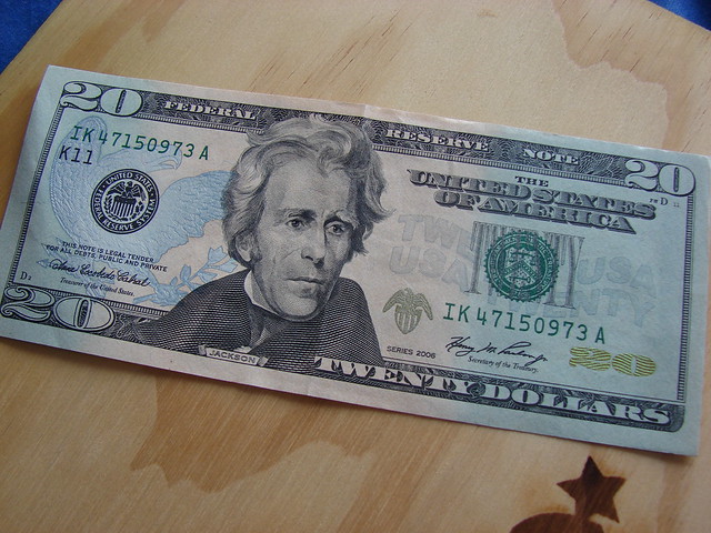
US paper currency is so ubiquitous that to really look at its graphic design with fresh eyes requires some deliberate and focused attention. So pull out a greenback from your wallet (or look at a picture online) and really take it in. All the fonts, the busy filigree, the micro patterns… it’s just dreadful.
Even though paper currency itself, just idea of money, is a massive, world-changing technology, the look and feel of US paper money is very stagnant. Richard Smith is the founder of the Dollar ReDe$ign Project and in an article in the New York Times, he pointed out five major areas where the design of US currency could improve: color, size, functionality, composition, and symbolism.
It just so happens that Australian currency addresses each and every one of the points made by Richard Smith. Tristan Cooke and Tom Nelson of the blog “Humans in Design” are big fans of all the design innovations in Australian money. Aussie polymer notes are varied in color, get larger with each denomination, are more durable, and are generally considered better and easier to use than US currency.
But there are some interesting reasons why the greenback is the way it is. David Wolman, author of The End of Money, explains that the legacy features that make US paper money look stale and anachronistic are meant to convey stability and timelessness. Since the US economy is so important in the world economy, why mess with it? Some fear that changing the design of the currency significantly (or eliminating the penny) could undermine the faith in the federal reserve note.
Even though Tristan and Tom are fans of the Australian polymer bills, they share Wolman’s view that the more interesting future innovations are not going to have anything to do with physical cash. Clever user interfaces that help us manage our money better, while providing even greater convenience, are getting more refined and accepted. So that ugly $20 in your wallet may never actually get prettier and more functional, it’ll just be gone.
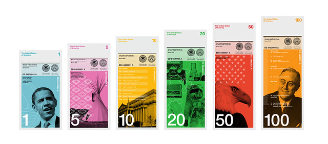
Extra: Below is the 2010 winner of Richard Smith’s Dollar ReDe$ign Project, submitted by Dowling Duncan.


Comments (2)
Share
I can’t believe there is no mention of Dutch banknote design in this program.
All of the ‘innovations’ (color, size, texture for the visually impaired etc – everything except the paper composition) proposed by Richard Smith and implemented in the Australian banknotes were already pioneered by RDE ‘Ootje’ Oxenaar in Dutch banknote design in the 1960’s and 70’s.
In later redesigns of the 100 guilder banknote, he convinced his clients to replace the stuffy admiral (who did kick some serious English butt) featured on the note with the image of an endangered bird.
The name of the bird ( a ‘Snip’) went on to become the English equivalent of ‘Grand’ (‘For a Snip it’s yours!’) in the process out-innovating Smith and the Aussies by innovating the imagery AND enriching the Dutch language. Rumor has it Oxenaar worked his own fingerprint in the detailed linework of the 1,000 guilder note.
Unfortunately Dutch banknotes were phased out with the introduction of the Euro (featuring …..non-existing bridges! Luckily these bridges are now build as part of an art project in the Netherlands but that is another story).
Respect is due!
Audio version of a talk by Oxenaar about the design process (i think this is a translation read by someone else):
http://www.youtube.com/watch?v=m5BlybJGiiU
image of the snip:
http://2.bp.blogspot.com/_UN7wPjdKdmc/THc7QlcKNwI/AAAAAAAACKU/nwCEmwOi6wo/s1600/ox100back.jpg
image of the earlier version (also by oxenaar):
http://people.zeelandnet.nl/acoomens/images/mdr100gulden.jpg
Image of other Oxenaar notes, the brightly colored ones with the Dutch ‘Founding Fathers’ where the original series from the 60’s and 70’s.
The flower, bird and lighthouse were redesigns from the 80’s & 90’s.
http://barryborsboom.files.wordpress.com/2008/10/dutch_banknotes.png?w=500&h=420
Canadian polymer banknotes are all the same size, so they include Braille markings to indicate the value of the bill.