The world is full of icons that warn us to be afraid — to stay away from this or not do that. And many of these are easy to understand because they represent something recognizable, like a fire, or a person slipping on a wet floor. But some concepts are hard to communicate visually, especially in a way that will work for generations to come. 99% Invisible teamed up with Vox to bring you this video about the challenges designers face in developing warning symbols that last:
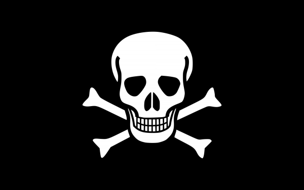
Take the Jolly Roger, for instance. It was once one of the most feared symbols in the world. It represented death, pirates, and poison. But today? A skull-and-crossbones is associated more with treasure, blockbuster movies, or Halloween than actual danger. Designing something that retains its meaning over time is a surprisingly difficult.
Back in the early 20th century, there was an urgent need for a new kind of warning symbol. At the time, there was no universal standard for communicating the presence of dangerous biological materials.
 Laboratories at the US Army used an inverted blue triangle. Those at the Navy used a pink rectangle. The Universal Postal Convention used a white staff-and-snake on a violet background. The lack of consistency put people at risk of exposure and infection.
So in 1966, a group of engineers and designers at Dow Chemical set out to create the best possible icon for biohazardous materials.
They laid out six design criteria. The solution had to be:
- Striking in form in order to draw immediate attention
- Unique and unambiguous to avoid confusion with other symbols
- Quickly recognizable and easily recalled
- Easily stenciled
- Symmetrical, in order to appear identical from all angles
- Acceptable to groups of varying ethnic backgrounds
Those criteria ruled out simple shapes in use at the time, like those from the Navy and Army, and ambiguous symbols, like the snake-and-staff, which has various medicinal associations.
Charles Baldwin, an environmental health engineer at Dow, sought to develop a visual icon fitting the criteria, “that was memorable but meaningless … so we could educate people as to what it means.”
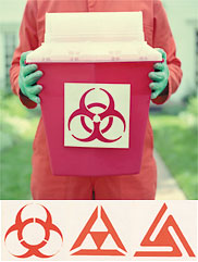
He and his team showed a set of 24 symbols to 300 people from 25 American cities. There were six newly-designed biohazard markers, and 18 common symbols — things like Mr. Peanut, the Texaco star, the Shell Oil symbol, the Red Cross, even a swastika.
Participants were asked to guess the meaning of each one, which was used to assign each one a “meaningfulness score.” A week later, the same participants were shown those original 24 symbols, plus 36 more and asked to identify which symbols they remembered seeing before.
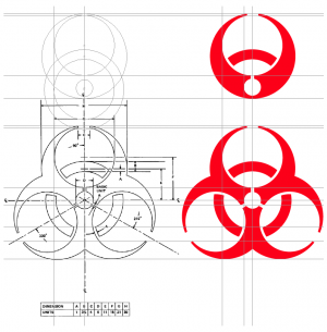
Among the six competing biohazard designs, one stood out. It scored the highest in memorability, but the lowest in meaningfulness. So it was unforgettable, but also a totally blank slate for designers who wanted to give it meaning. It became a national standard.
It’s easy to overlook how much visual communication work this kind of symbol is doing. The design is simple — you only need a straightedge and a compass to recreate it. And unlike most other hazard symbols, it doesn’t reference a visible object or idea. Yet it has remained iconic for decades, helping people recognize serious dangers that may remain a threat for thousands of years to come. And that raises the question: could the meaning of symbols like this one stand the test of time?
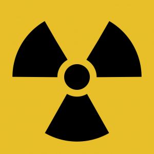
Few people have pondered that question quite like Gregory Benford, a physicist and science fiction author. In the 1990s, he was invited to work on the Waste Isolation Pilot Project, or WIPP, a massive storage site for radioactive waste in the southeastern plains of New Mexico, organized by the US Department of Energy.
Benford was brought in to help calculate the probability that someone or something would intrude on the site for as long as it remains dangerous — approximately the next 10,000 years. It turns out, few things (outside of organized religions and ritualized traditions) last that long. A symbol like the Jolly Roger, for instance, wouldn’t work for WIPP — people might not understand it, or think it marked buried treasure.
Since the 1970s, engineers, anthropologists, physicists, and behavioral scientists have proposed different design solutions to the problem.

One idea was to add context to the symbol. By illustrating cause and effect in a three-part cartoon, designers could communicate the danger even if the symbol lost its meaning. But this assumed people would read left to right and understand causality between frames.
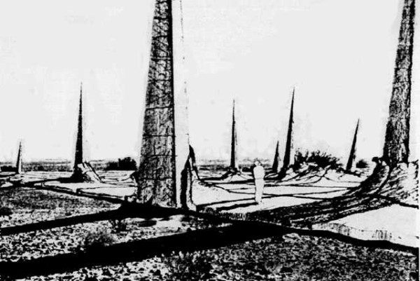
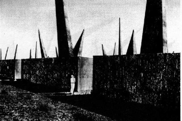
So other designers started to focus on creating a warning without inscribed communication, by altering the shape of the location itself. They drew up spike fields, forbidding blocks, giant pyramids — designs capitalizing on natural human instincts of fear and discomfort. Even then, though, designers couldn’t be sure whether these structures would be perceived as terrifying or fascinating.
So without symbols, or basic illustrations, or physical structures, how can a designer effectively communicate a warning? That’s where the more philosophical design solutions come in.
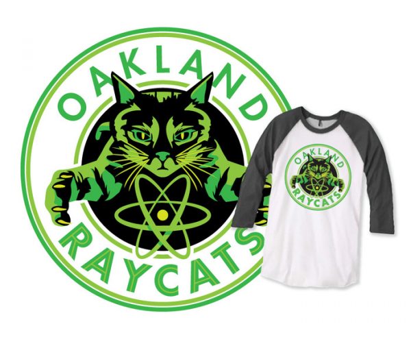
In 1984, the German Journal of Semiotics published a series of solutions from various scholars. Linguist Thomas Sebeok, for instance, proposed creating an atomic priesthood, where an exclusive political group would use its own rituals and myths to preserve knowledge of radioactive areas, like a church. Philosophers Françoise Bastide and Paolo Fabbri proposed to genetically engineer bioluminescent cats that would glow in the presence of radioactivity. By creating songs and traditions about the danger of glowing cats, the warning could last as long as the oldest relics of civilization we have: culture.
There’s no definitive solution for warning people far into the future.
But designing clear, inclusive symbols will continue to be a fundamental part of how we keep people safe, at least in the present. We will change, and so will the ways we communicate visually, and our warning symbols will have to change along with us.

Even now, the power the biohazard symbol once had to inspire awe and fear has begun to diminish. Today, it appears on everyday clothing and products, slowly becoming more ordinary than extraordinary.
Check out more collaborative design videos from 99pi and Vox:

Comments (8)
Share
The Arabic word in this clip “radsha” رادشه is typed wrong (the last two letters are supposed to join). It doesn’t even mean anything. It’s nonsense.
You want “khaTr” خطر or “intebah” انتبه which means danger or (pay) attention.
An example is this sign. “Danger” is in the red oval in the center.
https://images-na.ssl-images-amazon.com/images/I/513Tvs9AtoL._SY445_.jpg
I need to amend this a bit:
It looks like maybe they meant a direct phonetic translation of “Rads” for radiation units, though the results of this word sounded out is still “Radshh”. I don’t know if this is how it’s used in Arabic-speaking countries, though usually cognates are usually as close as possible phonetically to the word they come from. Maybe they translated from a man with adult braces?
I keep running across this problem, even in publications that are supposed to be somewhat professional.
I was at Walgreens and looked at the poster at the pharmacist window that tells people in different languages that they can have a phone translator if they need one. The Arabic was so horribly mangled. The letters were somehow backwards and unjoined but in the correct order. It looked like nonsense. I told the pharmacist there that it was really bad, and that while I realize they likely didn’t make the sign, if they wanted to improve it, typing it into Google Translate would produce a result that was at least legible.
People keep using translations into languages they utterly don’t know so much as the alphabet for, and I urge people that if they’re a professional who uses other languages they don’t know, they need to make sure they find someone who knows the language to look it it before it goes out, or use a professional translator.
I learned Arabic for my job, so I’m not terribly fluent, but seeing this just leaves me conflicted. I feel an initial thrill that Arabic (or any Arabic-script using language, like Farsi) is included. Then immediately afterwards, I notice that it’s mangled, and it deflates.
The very first time I noticed this was when I was learning Arabic and visited a local tattoo shop. I was like “Oh! Arabic tattoos!” … that were written wrong.
A guy studying Chinese at the school had arrived with Chinese tattoos–but they were wrong, and the students poked gentle fun at him for it. Instead of saying something like “rich” it said “rice”. Another (I’m guessing false) story was circulated that a woman wanted to get a tattoo of a butterfly with the Arabic word for butterfly فراشة “faraasha” below it, but she was told the wrong word by a cruel person, “sharmota”, which means b***. If I were a tattooist, I’d be very hesitant to offer any tattoos in languages I couldn’t read, and warn customers to make sure their words translate correctly if they bring in something they cannot read, either.
Thanks – our partners at Vox are updating the video to fix this!
Relevant to 99% Invisible themes, if you google “welsh road sign out of office”, you’ll find pictures and news stories about the time someone needed a Welsh translation for a “No Entry” road sign, which is how the road sign ended up reading (in Welsh) “I’m not in the office at the moment. Please send any work to be translated.”
We roll our eyes at biohazard sports drinks but I guarantee if you saw one on a rusty barrel in the woods you would give it a wide berth.
I admit that I totally initially thought the three panel cartoon was illustrating how people go from seeing a symbol to incorporating it in a kind of hipster way onto clothing, and then the symbol being divorced from the original as the person goes away from the original symbol.
this is all to say that I’m not sure there’s any way to convey messages using sequential art that isn’t prone to being badly misunderstood.
That said I also overthink things.
Great collaboration. I hope you get to do more together. Maybe an ongoing series? (Its so fun contributing to you guys every month, knowing I’m going to like the outcome. I wish everything was like that. )