That Jazzy Cup by Christopher Johnson

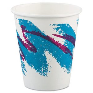
Back in the late 1980s, designs tended to be bright and wild. The Jazz cup was no exception. And somehow, the Jazz design didn’t disappear at the end of the 80s like so many other fad designs did. But for years, no one was able to figure out who designed it. Finally, in 2015, a reporter at the Springfield News-Leader in Missouri tracked down the woman believed to be the creator of this iconic piece of disposable tableware art. Her name is Gina Ekiss (GUY-nah E-kiss) and she lives in Aurora, Missouri.
 In the late 80s, Ekiss graduated from college with an art degree and she landed her first job at Sweetheart Cup Company in Springfield, Missouri. And she became what was called a general line artist — someone who designs the art for their disposable cups, bowls and plates.
Soon after Gina joined Sweetheart, the company decided it was time to update some of its tableware art. They

wanted something new to kick off the 1990s. The design had to be something fairly clean, easily reprinted, and able to work on curved surfaces like cups, plates and bowls. So they held an internal competition, and Ekiss won with her splashy jazz design, which stood out for both its flashy graphic quality and its bold bright colors. She says the official colors for the final design were, according to the Pantone Matching System, “326 Teal” and “253 Purple”.


For her part, Ekiss got a gift certificate, some swag, and of course bragging rights, because she did the work for Sweetheart and they owned the copyright for the design.
But to this day, she sees her work everywhere, perhaps in part because it grew up with the internet and has been so widely seen and shared online by nostalgic Millennials.
And for its part, the internet helped crack the case, leading the first reporter to find Ekiss and help tell her story. There was just one catch.

Another designer, Stephanie Miller, claims to be the original designer of the jazz pattern. When the story came out about Ekiss, Miller took to social media to defend her claim to its creation. Like Ekiss, Miller studied design in college. After graduation, she landed a graphic design job at Imperial Cup in Ohio. She says that in the late 1980s, Imperial asked her to help update its look. One of her designs – the one Imperial would print on its tableware – feature two paint brushed zigzags, similar to Jazz.
Miller contends that Sweetheart saw her Imperial cup art, had Ekiss copy it, then claimed it as their own and sent Imperial a cease and desist letter. The thing is: Miller hasn’t been able to provide any proof of her claims as yet. Sweetheart, for its part, continues to credit Ekiss. Meanwhile, she remains pleased to see the success of the Jazz pattern out in the world.


Comments (10)
Share
Re: Mini Stories episode 13. I hope the design of that dorm can be changed. The idea of living in a small space is bad enough but a small space with no window gives me physical shivers of claustrophobia! The other bad idea is that making the individual rooms so unappealing as to force the students into the common areas sounds logical but doesn’t work in practice. I had friends who lived in a subsidized co-housing community in Fairfax. It was designed for single moms and for elderly residents. (They were supposed to mix and be good for each other. That didn’t work. The elderly residents from the four buildings mutinied and banded together in one building.) The rooms for the individuals were tiny and once again the idea was to push everyone to use the common living room and kitchen. It didn’t really work well. I believe that good and thoughtful design can create spaces that can encourage certain human behaviors but this idea of making individual private rooms too small to force people out into the open is not good or thoughtful.
On the Jazz paper cup design, I just had to let you know that my high school graduating class of 1972 chose that turquoise-blue and purple as our colors.
More spacious and with more options to explore outside than my accommodation in Antarctica, Not sure what the problem is.
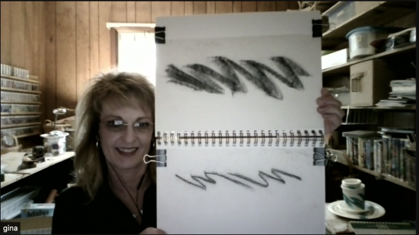
Looking at the jazzy cup design makes me wonder if Gina Ekiss is left-handed….
The strokes in the design seem difficult for me (a right handed person) to recreate!
Roman misunderstood the term “subway” to mean underground trains, which would have been incredibly inefficient for the short distances involved. It’s obvious that the “subway” was just and underground pedestrian tunnel. Besides the conventional contemporary meaning of the word, part of the confusion probably stemmed from the story reference to “move books at high speed,” but this was most likely done with carts.
that the record label lost money on blue monday isn’t correct–they just made VERY little. and the label quickly altered subsequent pressings to recoup costs more quickly. any record collector pretty much knows this story and has seen the iterations. the iterations are actually as much a part of the story, too.
you can find this info lots of places, but i will link you to the discogs listing as just one example.
You can see the subway in the movie “advise and consent”
Are there ANY building codes in USA / California? It’s easy to see that building is a death trap in a fire. Look at length of the exit paths from the central rooms to the stairwells. Then imagine the crowd of students trying to access a stairwell – but there are doors on both sides of the top landing, so opening a door pushes into people already on the stairs and coming into the stairwell on the other side. This design wouldn’t get approved in Australia. Oh, and habitable rooms (ie ones people use) have to have natural light, openable windows and natural ventilation in Oz too. Also, the complete lack of consideration for disabled. Will they miraculously carry their wheelchairs down the stairs in a fire? Can they even access the building at all?
I was surprised by the assertions about the 12-inch recording being the “most popular 12-inch of all time.” Maybe I misunderstood and it was said it was the most popular 12-inch “single,” or something like that. But having thrived through that era I can confidently say that neither I nor anyone I’ve checked with has any idea about “Blue Monday.” No one I know has ever heard of it or recognizes it. And saying it was the most popular…let’s say, 12-inch single…is like saying, well, like saying something that very very few people have ever heard of is the most popular thing in its class.
Oh, and I love the podcast…other than this one.
And although I’ve been in hundreds of coffee shops, I don’t think I’ve ever seen the “jazz cup.” Maybe I need to get out more.
When listening to the Jazz design segment I got excited when you mentioned my home town where Imperial cup was located. Imperial cup was in Kenton Ohio, not Canton. This is a common mixup sadly. The company is now named International paper. Great program though.
I’d love to hear a 1.2 version about the dorm, particularly the comparison to jails. There are actually minimum size requirements per state for single and double cells. And access to light and air. Lately, some of the larger jail systems (LA, Wayne, Cook County and NYC) are undergoing a reform with ew buildings. Recommendation and requirements reach the level of access to daylight and views (i.e. a window in the cell not just a view from the cell through a room to another window).
As a justice architect, I’d also love to see a crossover with Earhustle about jail and prison buildings. But that’s a whole new level of niche nerdiness.