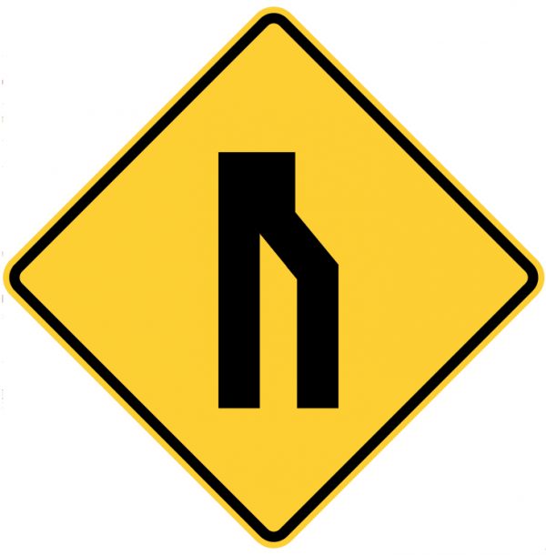
The W4-2, also known as the Lane Reduction Transition Sign, is one of the most ubiquitous road signs in the United States — historically, it has also been on of the most confusing. This “Lane Ends” sign often appears in places where a passing lane is eliminated along a rural highway or an entrance lane merges into the main lanes of a freeway.
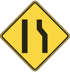 The old version of the sign features two lines running parallel at the bottom with one angling in toward the top. This design can be mirrored to indicate a merge from either the left or the right.
It is hard to tell, though, whether the lines represent lanes or their borders — if lanes, then it looks like two routes coming closer together (not merging). The existence of text-only supplements (“LANE ENDS MERGE LEFT”) also suggests a graphic-only approach can be baffling.
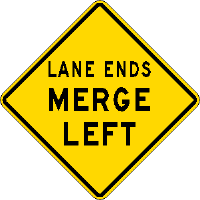 Indeed, an early 1990s study by the Texas Transportation Institute found that only 61% of surveyed motorists could correctly identify the purpose of the W4-2 sign. The surveyors “concluded that the difference between fewer lanes, one lane and narrow lanes ahead was not apparent,” writes Eric G. Feldblum of the Connecticut DoT. A subsequent survey of elderly drivers in the U.S. and Canada found that fewer than 40% of participants could properly understand the sign.
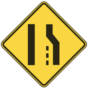 So in 2001, the Federal Highway Administration’s Office of Transportation Operations pitched an alternative based on the original with a small but critical change.
Approved in 2003 (with a compliance date set for 2013), the modified W4-2 now features a dashed line to add clarity without introducing any dramatic changes. The solid lines were left in place, but their function (bracketing roads) is more obvious. This new and improved version can now be found across the country (though old variants still exist as well).
The solution is elegant, simple and additive — it requires no fundamental reformatting, building instead on the existing sign. It is thus also recognizable to those familiar with its predecessor and visually similar to older signs that can still be found on the road.
W4-2: Two New Design Ideas
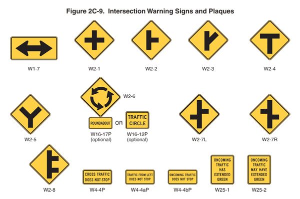
Despite its simplicity, the modified W4-2 solution seems incomplete. It is unclear, for instance, what the dashed line indicates — is it a separator that divides two lanes or the path of the car? If the dashes represent a lane division, then the ending lane is rendered comically narrow. If instead the dashes represent the vehicular path that is coming to an end, the W4-2 diverges from other W4-series signs (e.g. W4-3 and W4-6) in which dashed lines signify lane separations.

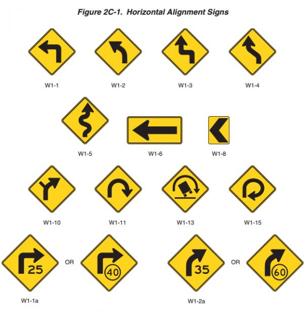
Also, for most signs in the W4 series (above) as well as other W-series signage (below), solid lines represent the paths of cars. The modified W4-2 breaks that convention by rendering lanes as voids rather than solids, regardless of how one interprets the dashed line (as divider or path). So, issues of continuity aside, what if a road sign designer were able to start from scratch?
Representing routes of travel as voids creates potential figure-ground confusion on the W4-2. Drivers used to seeing solids as routes on other signs could have trouble with this strange exception.
As illustrated above, the figure-ground issue can be addressed using the graphic language already established by other signage. In this design, the two main lines of the W4-2 are pushed together — they come to represent lanes rather than boundaries of lane space.
But solid lines alone are often used to show possibilities rather than imperatives — for instance, they let drivers know about forks and crossroads, but provide no instruction about which path to take. Arrows add an element of movement and are found across the W4 series (and other sign sets) denoting both routes and directions.
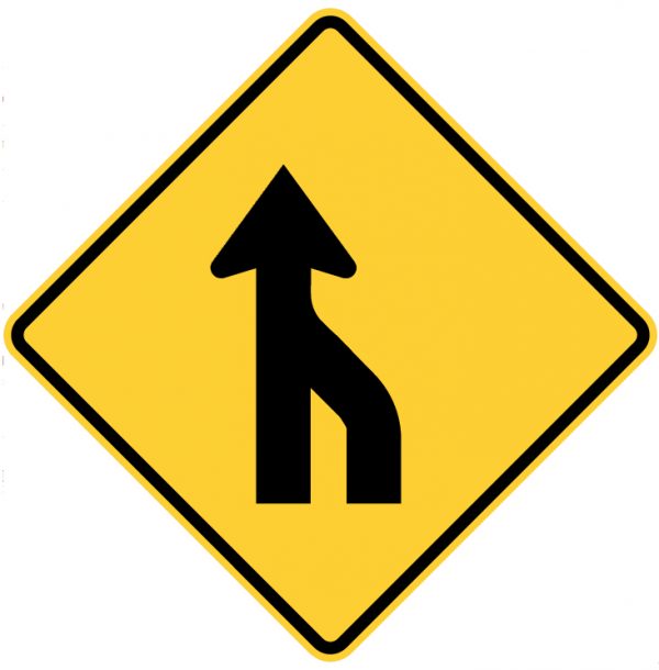
Accordingly, the above redesign takes things a step further, dealing with figure-ground confusion while also adding an imperative for drivers. This design fluidly joins two routes with an arrow, providing an active indication of change beyond just a static set of solid lines. It also employs a thicker line weight found on other W4-series signs.

While by no means intended to be definitive or exhaustive, both of these alternatives share a simple advantage: they use existing conventions to generate a result more consistent with other signage.
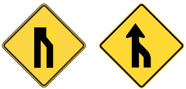
Alternative A maintains a degree of continuity by keeping (but merging) the main lines of the original W4-2. Alternative B represents more of a visual departure, but may be a better fit for the W4 series as a whole.
W4-2: Incremental Redesign Alternative
It could also be argued, though, that each of these constitute too much of a change from the recognizable W4-2s currently on roads, both old and new. In a world of iterative design, familiarity is a factor as well.
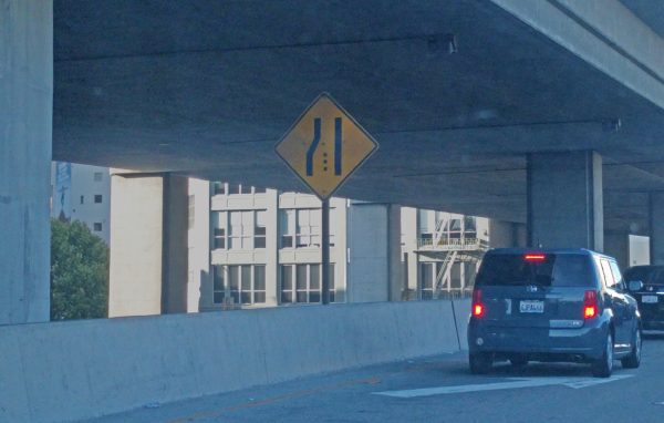
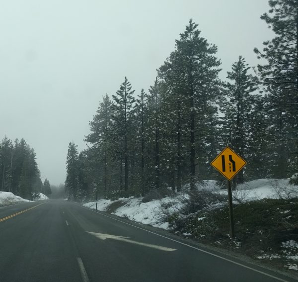
Keeping visual continuity in mind, the nonstandard W4-2 variant above (spotted near downtown San Francisco) suggests one more potential vector for a redesign. In this case, the sign’s dashes are shortened to dots and the dotted line is shifted more toward the center.
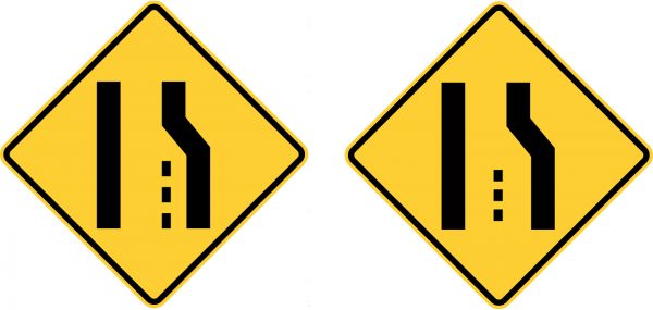
In the alternative above (right), voids between the lines once again represent road space. But by pulling back and centering the dotted line, the lanes are given equal area on either side — and the dotted line clearly acts as a divider, not a path of travel. In alignment with both of its predecessors, the thicker solid lines are left in place for continuity.
In the end, any alternative would have to go through a rigorous testing process featuring driver surveys and real-world road trials. Each is also meant to represent a design direction more than a finished sign. Given those conditions, though, which route makes the most sense to you?
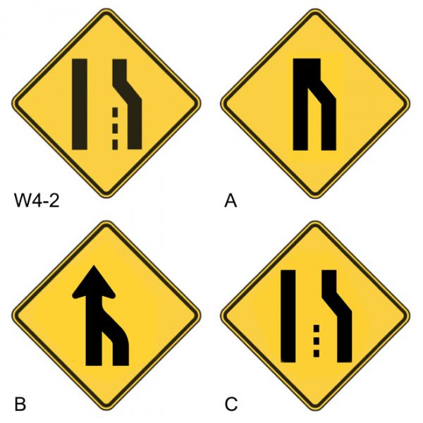
Update: the saga of this sign doesn’t end here – for more, including the poll results and other redesign ideas, click the link below:

Comments (39)
Share
Thank you for finally addressing a design problem that has bugged me for years. Love the podcast!
This has annoyed me ever since I figured out what this sign really meant. Thank you for articulating how the symbolism is different in these signs than other ones. It makes it more clear how infuriating these are.
“B” is commonplace in Quebec. One key problem with it is it can (and has been) construed as a parallel road merging in instead of a lane ending.
B with a dashed line between them to show that it is 2 lanes merging and not 2 roads merging.
Also, I’m 45 and still see that sign looking more like it’s showing “lanes narrow” rather than “lane ends”. I don’t think I ever looked at it as the lines representing the boarders of the road rather than the travel path like all other similar signs.
this is slightly off topic–but concerns signage around lane drops. In connecticut (at least) there is a separate sign that marks the actual point where the lane drops. So one sees first the w4-2, and then way off in the distance, if you know what to look for, the elongated sideways triangle that marks the end of the lane. This is especially useful for passing lanes that suddenly disappear half-way up the hill (rte 84, I’m looking at you) where all of a sudden there’ll be a semi w/flashers going 45 needing to merge into the high-speed lane and all the hot-shots are trying to be the last guy to get by…I wish more places had similar signage (passing lanes on rte 16 in NH, I’m looking at you)
Give the history of the sign, and how the lines indicate the border of the road instead of the lane of travel, I would go with ‘C’. The equal spacing of the two lanes gives a much better visual of what is actually happening. Option ‘B’ seems the most likely replacement, but the lanes appear to be two parallel, but completely separate roads that are merging together. I think if they were closer at the bottom, or had ‘negative space’ dashed lines, it might be easier to distinguish between this new W4-2 and W4-1.
The other problem I see with the existing W4-2 is that, even if you correctly interpret the black parts, it looks a bit like the shoulder is ending, rather than a lane.
I think it would be worth using the thin solid line from W4-3 and W4-6 in the shape of W4-2, the dashed line like C, and the heavy arrow of B. That’s still only got as much stuff on it as W4-6, and conveys that the paths of travel at the start are not separated by a hard barrier now, and the right lane will be blocked ahead.
Another alternative would be to take the current sign and put in a diagonal arrow either above the dashes or to the right of them. This has the advantage of matching the pavement.
Yeah Daniel, I was thinking the same thing of matching the pavement. As a stand alone, I think the sign is super unclear until I see it in a picture with the road. I need both to understand what it means. I wonder if more closely aligning the sign to micmic the road would be an advantage.
I think narrowing the lines, having a longer more gentle slope with an arrow in the middle would be more clear unless it takes away its clarity from a distance.
I’d be happy with either B or C. Alternative A looks like someone showing off their new pants.
That was my first thought about A!
One unintuitive option is to just spell it out: “LANE ENDING. MERGE LEFT”
it seems to me the choices above do not really work all that well. I have an alternate that I posted to a website that I am a member of called “practical machinist”. if you google “WAY OT, merge sign, improvement?” it comes up., it seems to address most of the problems, what do you think?
Alternate A looks like pants. Sign vandalism was prevalent in the rural area where I grew up, and that sign would definitely become a person, or be given specific anatomy.
I think something like this image is the most understandable: https://thumb1.shutterstock.com/display_pic_with_logo/2218643/358451804/stock-photo-road-sign-used-in-sweden-temporary-sign-left-most-lane-ends-358451804.jpg
Before I scrolled down the comments to your post, I pulled out a piece of paper and tried to draw a sign with the same markings the road itself had. I came up with something very similar to your link
“It is hard to tell, though, whether the lines represent lanes or their borders”
Bizarre. I have never, ever known anyone who was confused by this. The only person who might possibly be confused is a person who sees the sign for the very first time. After you drive through an area affected by this sign, you know exactly what it means from there on out. I’d love to see that survey and review it’s methodology.
I can’t help but like the Bay Area alternative, it’s clever how much difference the small adjustment makes
My gripe isn’t with the signs themselves. I’m one of those who can figure them out. My gripe is that they typically come too late. When the lane that drivers need to merge into is filled with cars, that is dangerous.
There needs to be versions of this sign for crowded highways that say “In Two Miles” and “In One Mile,” and “in One-Half Mile.” Give drivers time to move over.
The problem with A is that it wouldn’t take long before someone was adding the top half of John Travolta’s “Staying Alive” pose to the signs. Once you see that as a set of legs, there’s no going back.
People who can’t instantly comprehend W-2 should not be driving.
Agreed! To have the privilege to drive should mean knowledge of the rules. There is nothing inherent about a red octagon that says “stop” other then that is what we were taught. Same should go for all roadway signage. Also not only should everyone learn what W4-2 should mean they should also know what to do when they encounter one. It does NOT mean you have the right of way to change lanes at that moment, it means you must MERGE – engage turn signal, position next to and opening in the adjacent traffic and match adjacent traffic’s speed, then when clear change lanes. But back to topic, option ‘B’ seems to me to be the most graphically informative.
I think the problem is that there are two meanings for the other signs. In W4-1 the black is the road and the “yellow triangle” is non-drivable surface. In W4-3, the black arrow is the direction of travel, the “yellow” is the roadway, and the black dashed lines are pavement markings.
in the end, maybe ‘C’ would be used, but with a modification. Add the merge arrows in the “ending lane” like they have on the pavement (http://regulations.delaware.gov/register/july2011/final/mutcd/images/Part3.04.1.37.jpg)
or, if the lane is marked like the left hand in this image (https://safety.fhwa.dot.gov/older_users/handbook/images/fig_48lg.jpg) Make W4-2’s dashed line go all the way to the “end”
But then it becomes that the sign becomes very detailed, and defeats the purpose of a symbol.
Personally, I’ve known that W4-2 was “lane ends, merge”. And it didn’t bother me. Well i mean, i learned it when in drivers ed (and from the drivers licensing manual/book). So being told once what it was, I didn’t have to decipher it again. Maybe if we took an extra 3 minutes when learning to drive it really wouldn’t matter. I mean, W1-1, W1-2, W1-6, W1-8, W1-11 and W1-15 all show upcoming turns. I think 6 and 8 both mean sharp curves, so why have 2 different signs?. I think W1-8 is a bit ambiguous, compared to the others. But after studying the traffic manual I knew the sign, and was able to decode the meaning from memory, not deciphering the sign.
Love the negative space lane divider concept. It’s a little off topic, but in Newfoundland when a temporary passing lane was ending, the left lane was force to merge with the right lane (much like on the Bay Bridge). That establishes priority for the right lane so that the passing car must plan ahead.
I struggle to see why the redesign of the lane merger sign is such a problem when other countries have signs which work prefectly well…
One of the issues is matching the sign to other signs serving similar functions on roads (to increase its immediate legibility). Another is deciding the degree to which continuity between existing signs matters (i.e. having a new one be recognizably similar to its predecessor).
The reason is that other countries have elaborate rectangular signs which will not work in the United States. In the U.S., the sign must be a diamond-shaped sign as it is a warning sign indicating a hazard or road condition ahead. It does not convey any legal compulsion or prohibition. It is plausible that some European-inspired signs could be adapted to a U.S.-style design, but this has not happened yet.
I like B and C, but I think B encourages “zipper merging” more.
B
Fantastic article. W4-2 is particularly inconsistent and less intuitive than all the others. You only learn what it means by associating that sign with what the road and road markings do in that area.
I think placement of the sign itself matters, too. W4-1 works well when it can be placed between the lanes that are merging, so any driver knows where they are on that image. When placed on the right side (which is probably a safer place to put a sign), it’s hard to clearly communicate with arrows what’s going on. “Right Lane Ends” usually works pretty well if drivers are literate enough.
I believe the arrows show traffic flow, not the lane itself. I took a crack at the sign based on this understanding of the W4 series of signs but it’s difficult to represent the traffic flow and lanes merging with such a limited language. One thing I looked at, which I think helps, is softening the right line (left for left lane ending, merge right) so it curves inward instead of having sharp angles. This made the lans seem more like a merge for some reason and at least hinted at the softer lines common with the arrows on other W4 signs. After looking at the San Francisco sign again, I think a mix of the more centered dashes and a softer right line (left for left lane ending, merge right) might work better than any other suggestion so far. Personally, I just wish more people would heed these signs and not just whip over assuming everyone will just let them in. I can’t tell you how many time I’ve nearly been sideswiped by a jackass assuming merge right means they can just move over without looking first.
The offical sign is bad, and the logic behind replacing it with ‘B’ is compelling, but it does not work graphically: too similar to the on-ramp. The shutterstock link from Nickky is the clearest of the proposals. I think it picks up some of what Daniel Barkalow noted, although it needs to lose the extra lane and maybe fatter arrow for the continuing lane for consistency. Cynidekid has a great option I want to like, but echoing the lane markings wins me over.
C I think is pretty clear and isn’t too different from the current sign, it wins for me. In the UK we have one that looks very close to B which also makes sense and is in keeping with the design system here: http://www.drivingtesttips.biz/wp-content/uploads/2014/05/dual-carriageway-ends-300×301.jpg
I think the best ones we have are on the motorway (freeway) which are more complicated so are only used on big signs. I guess they’re used when the lane arrangement is more complicated than a simple lane merger: http://www.drivingtesttips.biz/wp-content/uploads/2014/05/dual-carriageway-ends-300×301.jpg
In the UK it was decided years ago that the standard signs we have would not do the job. Therefore they introduced huge diagrammatical signs, initially on motorways around the West Midlands but now they’re everywhere, on all classes of road: http://www.opsi.gov.uk/si/si2002/02311392.gif
The advantage is they can be adapted to the individual situation really easily. Is it a lane gain or drop at a junction? Is the lane just ending? Is it the left or right lane? Do some of the lanes end at a junction but some continue? https://www.google.co.uk/search?q=motorway+lane+ends+uk&espv=2&source=lnms&tbm=isch&sa=X&ved=0ahUKEwjc_deP2t3UAhXCKsAKHZfjCRAQ_AUIBygC&biw=710&bih=515#imgdii=Dzw7PnDlCZxMeM:&imgrc=ZC0DSl5EaIpQqM:
Even more complex junctions can be mapped out with a clear sign; like lane 1 for turning off, lane 3 for staying on, lane 2 for either: https://image.slidesharecdn.com/knowyourtrafficsigns-150105033340-conversion-gate02/95/know-your-traffic-signs-81-638.jpg?cb=1420450457
At face value, C makes the most visual sense to me, but I’d use the longer dashes from the current W4-2 instead of the dots. A and B look too much like on-ramps to me. But that thinking gets thrown on its head when you realize the heavy lines usually indicate the path of the vehicle. The current one seems to make the least sense now. Really fascinating story and a bit of a puzzle to figure out how to communicate a lane-end merge within the context of the existing graphical lexicon.
Totally had this nearly exact diatribe about this sign with a couple of people who were kind enough to last through my whole explanation. Option B is superior, in my opinion, for consistency and clarity.
However, I think we’ll settle this about the time that self-driving cars learn how to navigate and then it will just be a digital beacon with what exactly the road changes to anyways.
I find it very interesting in multiple ways. First of all, signs are meant to be ubiquitous and learned by heart. Any driver already familiar with a sign should be able to understand it’s meaning. Intuitively or otherwise, as stated by commenters above.
There is different kind of curiosity. In Poland, where I live, we have a very similar signs designated A-12a/b/c (ex. https://pl.wikipedia.org/wiki/Plik:Znak_A-12b.svg). These signs, however, do not represent a merge but rather narrowing on either side (A-12b and A-12c) or both (A-12a). Thus, the lines represent the edge of the road.
There is another set of informative signs to signal lane ending. See D-14 for example: https://pl.wikipedia.org/wiki/Plik:Znak_D-14.svg. Pretty much like some of the proposed improvements :)
I’m from New Brunswick in eastern Canada. My wife is from Maine. Both have lots of hills and two lane roads with passing lanes up the hills. But the way drivers use them, the way they are signed and described and possibly the way drivers are taught makes a big difference.
The Canadian approach is much more coherent. All the passing lanes in the province are marked and signed similarly. Passing lanes are only provided where there is actually space for overtaking to happen (in Maine, some are so short you would have to be right on top of the car in front and then floor it to get by within the space provided. One on US Rt 1 is less than 1/4 mile long – what’s the point?)
In Canada, the center line at the beginning of the passing lanes steers all drivers to the right or slow lane. They have to cross a broken center line to go into the passing lane. This means the “normal” traffic lane is the right-hand lane (as we I hope we’re all taught). The center lane is for passing – not driving (much less risk of a head-on collision if there is an empty lane between opposing traffic.)
Second, the signs say “Keep right”. In Maine, the passing lanes are a jog over, so you can just stay in the center passing lane if you’re half asleep. The signs also say “Slower traffic keep right” and of course no one thinks they are going slow, even if they are 10 mph under the limit. And finally, it appears Maine drivers have never been taught what a passing lane is or how it works. They are much more rare in Maine than in NB – Maine has its Interstates with divided travel lanes and even there lots of drivers don’t understand fast and slow lanes.
I drive in Maine a lot and find three types of drivers. The most common are those that never pull over in a passing lane – they just carry on at whatever speed they were going in the center/middle lane ignorant of any traffic behind them. I pass them on the inside after I give them a chance. Technically legal as the code allows passing on the inside on “multilane highways”. But not necessary if the driver was considerate.
Then there are the drivers that pull over but also speed up! Very common in Maine. Let’s say it is a 50mph zone and the guy (it’s usually a guy) is going 40mph. He comes to the passing lane, pulls over and speeds up to 60mph! Then he slows down again at the top. Maddening.
Finally, there are those who do it right and pull over to let you go by. Mostly trucks and other pros – rarely your average SUV driver.
I had never put the W4-2 sign among the other W4 signs so the idea of a solid black line as a path of travel never occurred to me. Now that I know its kin I agree it needs a change. I will admit that the comically small right lane that is ending in comparison to the left lane used to befuddle me, but I also realized that the sign doesn’t change whether 2 lanes become 1 or 5 lanes become 4. If the solid black lines are meant to show the edge of the road then having it look like two lanes are becoming one and only one lane in Option C is also misleading if there are in fact more than two lanes to start with. The difference in the left lane size on the original sign can also take into account that there might be more than one lane that isn’t ending. Though this is also confusing because there aren’t dotted lines separating them. And customizing signs for each situation would be cost prohibitive.
In the end I like option B the most but I might increase the size of the left most (or right most if it is a left lane ending) arrow to make it known that a merge into the main traffic flow is about to occur.
A small nitpick on the second paragraph and its associated image: the older version of the sign features the lines (signifying lanes!) much closer together than shown. e.g. https://farm3.staticflickr.com/2421/3927140763_99f65fa512_b.jpg
I’ve never had trouble understanding what this sign means (ala “MuTru” above), but I’ve always hated how these signs are visually ambiguous about what they’re saying. The re-design with the dashed line does not solve this problem. In fact, it’s actually worse. The lane lines are now farther apart, and the dashed line looks like someone picking up their leg to pee.
Until a solid symbolic version is developed, I think the text versions (there are several variations) of these signs should be used instead.