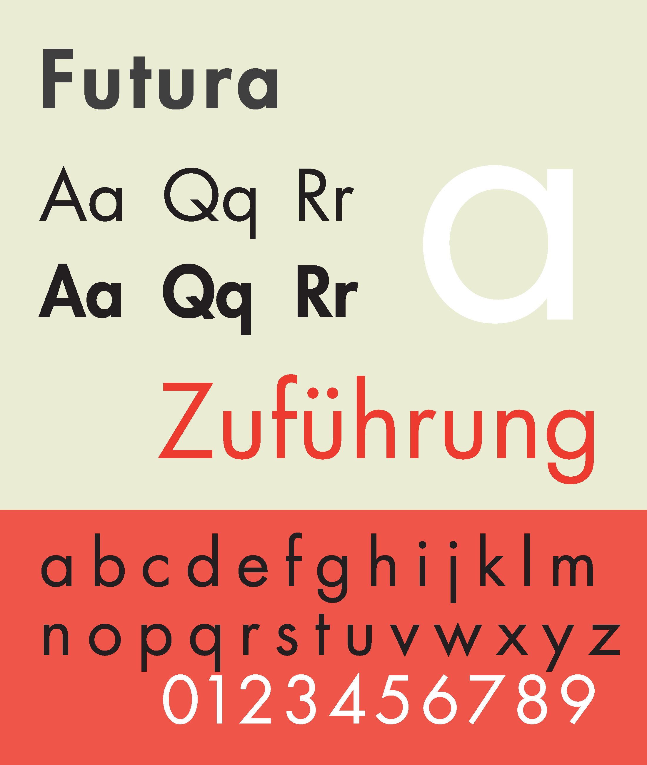
Unveiled as a font of the future, Futura has surprisingly a long history, dating back to the functionally focused Bauhaus era of design in the 1920s. It was clear and legible, virtually the opposite of typefaces like Fraktur, which was ornate and arguably quite hard to read as a result.
Indeed, Paul Renner, the German designer behind Futura, found himself at odds with a Nazi regime that rejected sans serif fonts and embraced Fraktur during the 1930s. At one point, Renner was even arrested by the Nazi leadership for speaking out against them.
In his book about the font’s history, graphic designer, historian and writer Douglas Thomas recounts how left-wing activists and communists actively used Futura in stark contrast with Fraktur-style Blackletter designs. Politics aside, the font’s creator had a deep appreciation for and interest in typography, writing multiple books on the subject over his lifetime. For its part, Futura persisted well beyond the era of its creation and spread over the decades in part simply because it worked well, designed as it was to be a highly readable font.
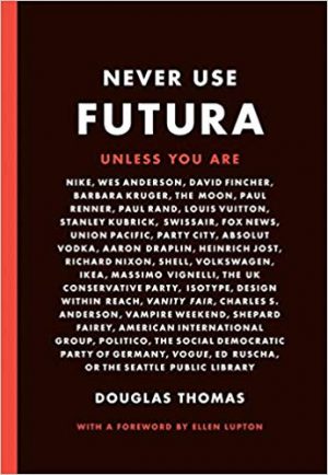 The legibility and simplicity of Futura bolstered its popularity but has also made it one of the most-copied fonts in history. Over the century following its release, typefaces like Vogue, Metro, Spartan and others borrowed from its aesthetic to various degrees. Today, Futura and variations on it can be found on signs, in movies and more — it was even the font selected for a plaque left by Apollo 11 astronauts on the moon.
According to Douglas Thomas, “every major type company of the last 20 years has its own licensed version: Bitstream Futura, Adobe Futura, Paratype Futura, Elser & Flake Futura, Neufville Digital Futura, Berthold Futura, and even Monotype Futura and Linotype Futura.”
Futura, argues Thomas, may look at a glance like other fonts, but is distinctive enough to warrant ongoing attention as “a self-assured geometric sans serif, not too rigid but still precise [with] simplified forms thoughtfully stripped of extraneous complexity, a marriage of hand and machine. It is an aesthetic idea about modernity–clean lines with a slight human touch, embodied in a name filled with hope.”
Special thanks to Ryan Addotta for writing in with this story idea!
Leave a Comment
Share