Early on in the design process of The 99% Invisible City book, coauthors Roman and Kurt brainstormed ideas for covers that balanced illustration and typography, art and information. To get to the final design, though, was a journey. Along the way, we learned what to keep, what to discard, and what to save for other parts of the book.
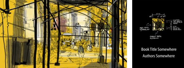
One of our first cover concepts was inspired by the 99pi logo, with a grid of black boxes on the book jacket and one die-cut square to offer a glimpse of a fully-illustrated cover beneath — typography on top of illustration. This seemed like the best of both worlds: a text-centric initial design coupled with compelling art underneath. There was also an idea to put meta-information on the back of the jacket, explaining different key book design elements like dust covers and barcodes.
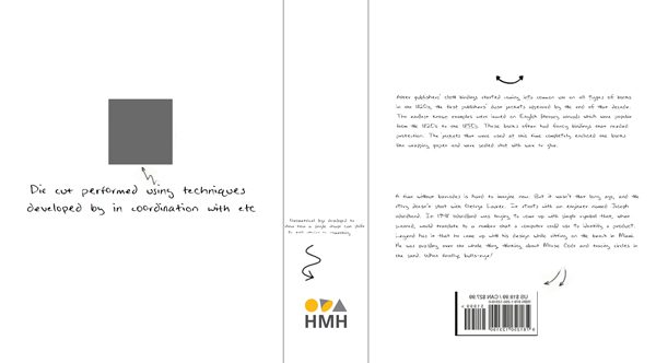
We quickly learned from our partners at HMH, though, that die cuts like these are hard to execute and easily torn, so we changed tactics while holding onto the spirit of the strategy. It turns out, sidelining that specific idea both paved the way for a better cover design but also gave us something that would become a design theme within the book itself.
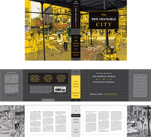
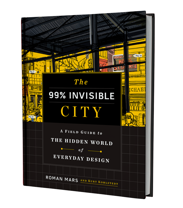
In the end, we went with a balance on the cover — the bottom half being primarily typographic and linear and the top half revealing a portion of the front-and-back drawing. But that was just part of the solution. For the HMH (US/CA) edition with a partial jacket, we wanted the cover to work with or without the half-jacket, but also to use the back of the band to explain elements found on the cover illustration — if the drawing is like a map, then the reverse of the jacket is its key.
On editions that don’t include the jacket (e.g. hardcover copies sold in the UK and Australia), a similar explanatory key appears on the endpapers inside the front and back covers of the book instead — essentially the same design idea with a slightly different execution.
As for the die-cut boxes discussed earlier, we revisited and ultimately carried that idea into the book, more specifically: to the two-page illustration spreads for each chapter. Like the cover, these scenes feature a variety of things to be covered in the coming pages, and the “cutouts” allowed us to zoom in on small parts of big images.
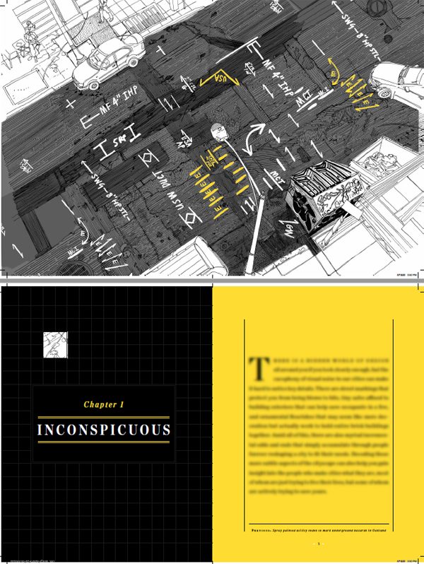
So for each chapter, there is a black title page (featuring a 99pi-style grid) with a simulated cutout that focuses on one aspect of the previous page’s illustration spread (in turn captioned on the adjacent page). The goal here was to do something clever but clear, guiding readers to ways each illustration relates to the chapter at hand and priming them for the stories to come in the pages that follow.
Together, the chapter illustrations and the virtual cut-outs offer windows into what each chapter is about — an idea originally imagined for the cover became part of the interior instead. So, in the end, some design ideas made it through the gauntlet but others got reworked collaboratively by the authors, HMH and the design team along the way, including illustrator Patrick Vale and designer Raphael Geroni (special thanks to our editor as well: Kate Napolitano, who helped not only by editing the book but also in design processes like this one!).
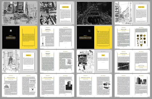
There are around 100 stories in the book and over 100 illustrations in total. As for the smaller, in-story vignettes: in the interest of clarity and legibility, the design team worked hard to place images adjacent to relevant text, in part to avoid adding redundant or distracting captions.
Ultimately, we sought to balance design, art and copy, telling stories and conveying visual hierarchies through both layouts and drawings. We also carefully focused on essential images — things that might be hard to visualize just from reading the text. Then, too, there were considerations to keep costs (and thus price) down — especially challenging with a 400-page volume. Most of all, we wanted to make this book accessible and engaging to 99pi fans and a broader audience!
At 99pi, we talk about “all the thought that goes into things you don’t think about” — in this case, the creative process was bound up in a volume both about design but also itself highly designed, and we hope you’ll appreciate some of our design thinking as you read the book!


Leave a Comment
Share