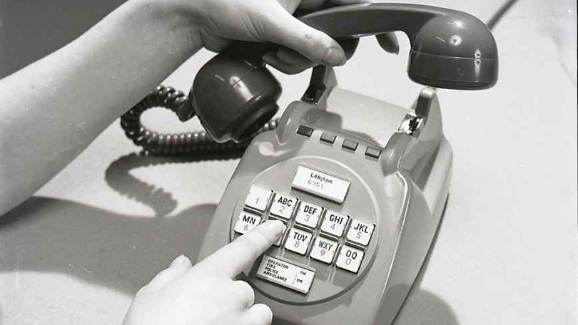
It might seem obvious or even inevitable that numbers on a telephone would be laid out from left to right and top to bottom in a gird. In fact, that familiar design configuration was the product of a great deal of thought and research done back in the 1950s at Bell Labs. In the video below, Numberphile goes through a brief history of this development process to show how human factors plays a big role in everyday design.
As rotary-dial phones began to be replaced by touch-tone variants, a design challenge (and opportunity) arose around how this new system would work. Rotary telephones could be time-consuming to operate — for those unfamiliar: you had to spin the dial for each number, then let the wheel spin back, repeating the process over and over again. Touch-tone phones would make dialing much faster and easier.

The first layout solution proposed was a carryover from existing phones: numbers laid out in a circle. It seemed from the start that this approach might win out in the end. Still, Bell saw this as an opportunity to start from scratch, going back to the drawing board and trying out all kinds of creative alternatives. As such, other variations were explored as well, including calculator-style grids, bowling-alley triangles, stair-like angles, cross-shaped configurations and more. Some may look impractical if not downright silly in hindsight, but Bell wanted to make sure to examine the problem from all possible angles. Their designers came up with sixteen distinct options shown below (eighteen total but two are duplicated: II-A + VI-B and IV-A + VI-A).

Bell Labs had a number of human factors experts, so they started bringing personnel in to brainstorm and test these different ideas. The researchers whittled down the list by seeing how fast and accurately people could type in numbers on different pad arrangements.
 In the end, they narrowed it down to five layouts, including: the familiar grid (which we still use to this day) two circular variants (inspired by existing rotary phones), one with two vertical columns and one with two horizontal rows (each row or column containing five numbers).
Testers expressed a preference for and were able to type faster on the familiar rotary-style ones. They disliked the vertical tower variant but actually made fewer mistakes on it (in part because they were going slower). Performance and preference differences, though, were deemed to be fairly small overall across the five finalists, so for engineering reasons Bell went with the layout we know today.
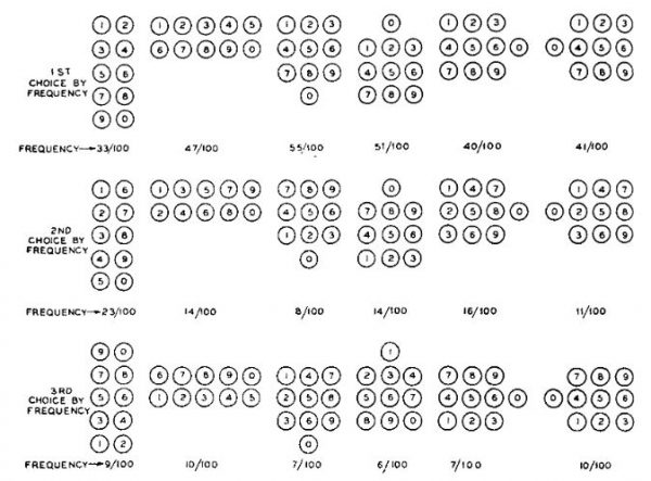
But there was still a question of where to put the numbers in the grid, so testers were given blank layouts asked to fill them in. What seems familiar to us now was entirely new territory for these people, except the few who had used calculators. Ultimately, 8% of people emulated a calculator layout (789,456,123,0). 7% of participants went down before going right (147,258,369,0). 55% of them went with what might seem the most obvious choice (at least in hindsight): counting from left to right and top down, putting the zero at the bottom (123,456,789,0).
Meanwhile, Numberphile has a great array of geeky math-related videos, some tied to design and others more abstract. You can check out a particularly popular one below or visit their YouTube channel.
Comments (3)
Share
Very interesting article.
I think the reason why we choose what the layout is nowadays, over that of calculator is because the speaker handle is positioned above instead of below the keyboard, at least then mostly. Thus the user of the telephone, whose generally standing up, will have there attention focused on the top of the keyboard and then go down.
For calculator it is a different story. The user is sitting down in front of a desk with calculator on the desk. The user’s attention is focused on the bottom of the keyboard and then go up/further.
Just an interesting conjecture I have.
That’s a smart insight, I think you might be right.
It’s confusing that telephone and ATM keypad layouts (IV-A in the diagram above: 123,456,789,0) are different from calculator and computer keyboard layouts (I-A: 789,456,123,0). When I went to the bank to replace my debit card and the teller asked me to type in my PIN on his computer, I found that the computer keyboard’s I-A layout was different from the IV-A layout I would encounter at an ATM. I mostly associate my PIN with the shape I make while typing it in at an ATM, debit card reader, etc. (all of which are IV-A), so typing it in on a computer keyboard (I-A) was a bit jarring. Ah well. Just one of the many things I notice in this flawed and inconsistent world.