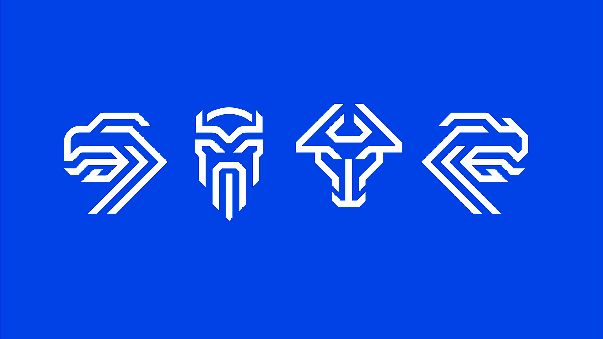
Four figures of Icelandic legend are embedded in a newly designed national sports team logo — an eagle, giant, bull, and dragon, each abstracted and then combined. Together, they form a sharp and elegant yet geometrically complex icon, like a paper-cut snowflake.

The designers released a video along with the soccer emblem, which can be viewed in English or Icelandic (below); arguably, though, due to its length and intense tone, the segment feels more like the preview for a dramatic fantasy story than a graphic design announcement:
The old logo for Iceland’s football association could hardly be more different, featuring a simple soccer ball rolling over the initials KSÍ — it’s the kind of graphic that would work for any number of nations. Designed by Reykjavík-based company Brandenburg, the new team icon both looks forward and reaches deeper into the country’s past.
![]()
Per the government of Iceland, the historic flag-based shield of the nation is borne by guardian spirits as “described in Heimskringla [by Snorri Sturluson, 13th century]: A bull on the right side of the shield; a giant, on the left; a vulture on the right above the bull; and a dragon on the left, above the giant.” But while these were rendered more literally on the coat of arms, they are angular and abstract in the new logo.
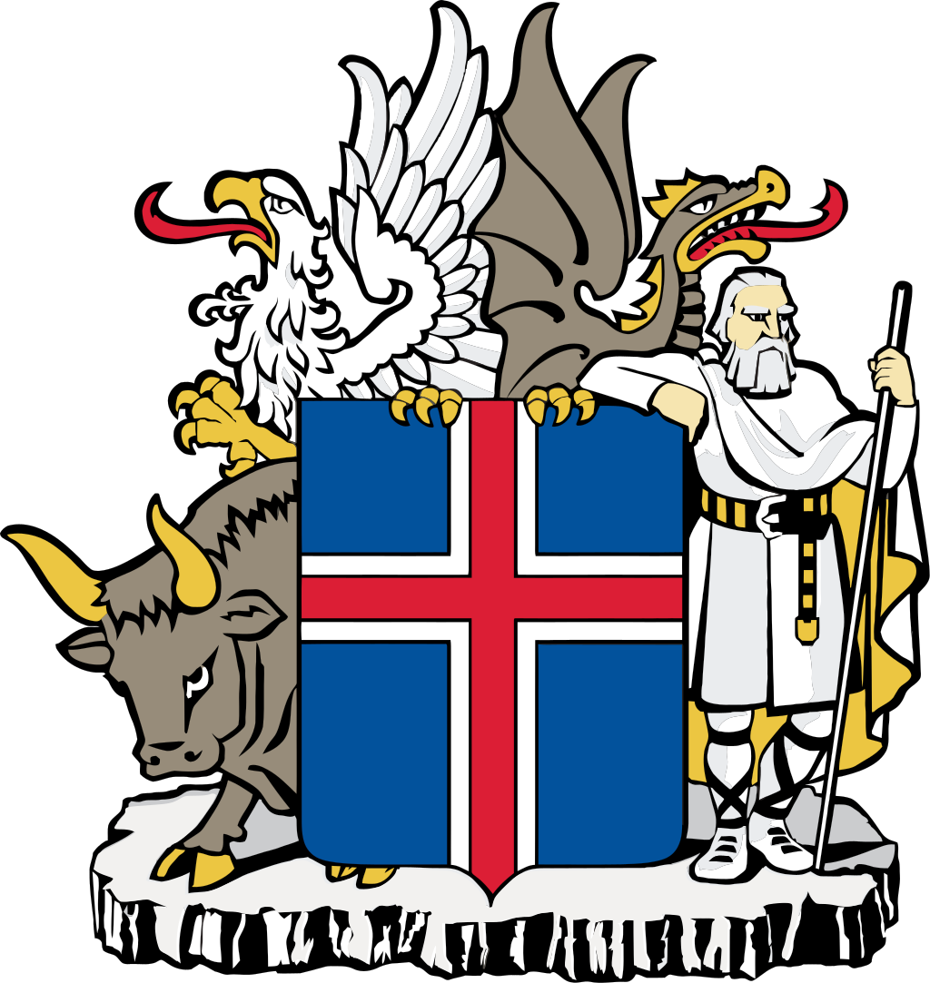
“A need has arisen for a logo that can better encompass the fundamental values and essence of the team spirit,” explain the designers. They wanted to make “a passionate symbol of unity, which draws on our strengths, history and fighting spirit,” hence the inclusion of these guardian — icons that have been on the Icelandic coat of arms for over 100 years and part of the collective imagination for centuries.
![]()
An added feature of this four-in-one design is its flexibility. The design can function at various scales and even work in pieces — the four mythical figures can be employed separately or together. In many ways, the logo is like a good flag design. It’s legible at different scales, uses simple colors, and consists of culturally relevant symbols.

Comments (1)
Share
Is this a traditional artistic style? The giant reminds me a lot like the Optimus Prime logo from Transformers, and I’m left wondering who was borrowing (possibly not intentionally) from who.