There is more than one way to pin a map, as evidenced by 27 pages devoted to the subject in Graphic Methods for Presenting Facts. Author Willard C. Brinton dedicated an entire chapter of this 1919 book to pins, which was was “undoubtedly everything that could be said about map pins at the time,” jokes contemporary cartography expert John Krygier.
For lack of an existing term, Krygier further suggests the word cartopinography “as the appropriate nomenclature for this deliciously narrow subset of the cartographic arts,” which has been the subject of a surprising amount of design thinking over the past century.
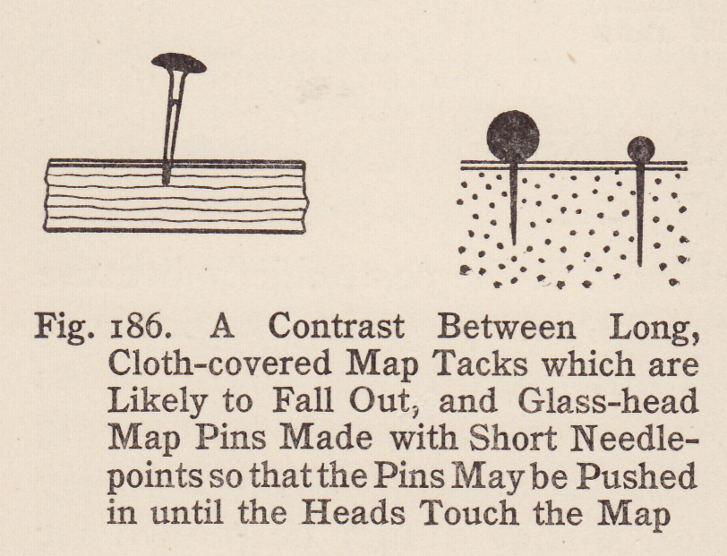
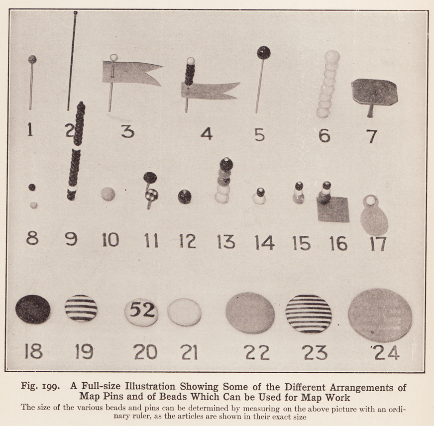
It is hard now to imagine a world of maps without purpose-made pins, but back in the early 1900s, Brinton argued that pins had not been commonly used historically because “until recently the map markers obtainable have been little more than old-fashioned carpet tacks having chisel-shaped points which cut the surface of any map into which they were pushed.” These, he points out, “cannot be pushed far into a map if the tacks are to be pulled out again. Also, rough steel is likely to rust so as to cause the whole tack to deteriorate rapidly.” In response to these shortcomings, he presented an array of pins, beads, flags, buttons and other markers to better suit the needs of map users.
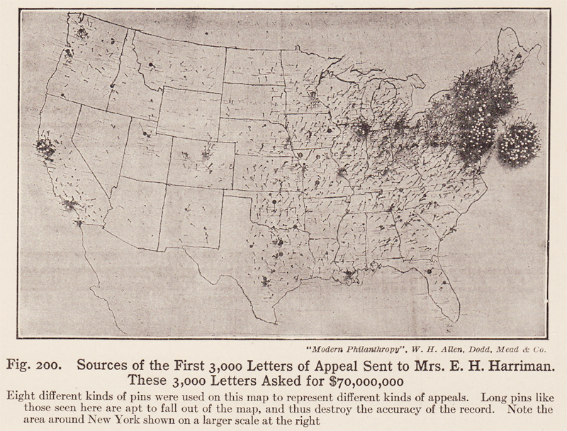
To illustrate the pitfalls of certain pinning approaches, Brinton cited the case of a map where sufficient pins simply couldn’t fit to represent the data its users were attempting to show. He also highlights a solution that came out of the illustrious Harvard University: stackable pins that could tower high above the surface of a map. Krygier, however, is a bit skeptical of this approach, noting that the “Harvard map might suffer a bit of map bead flaccidity if hung upon a wall, given gravity and all.”

He also wonders “about the hazards of such lengthy map beadings — a farsighted passer-by might, for example, receive a nasty map bead wire puncture-wound upon viewing the map too closely.” Meanwhile, a commenter on one of Krygier’s articles suggests that MIT, with its reputation for science and cleverness, “would have just defined a pin color for each power of 2 (black = 1, brown = 2, red = 4, orange = 8, etc) and pinned them together to define larger amounts.”

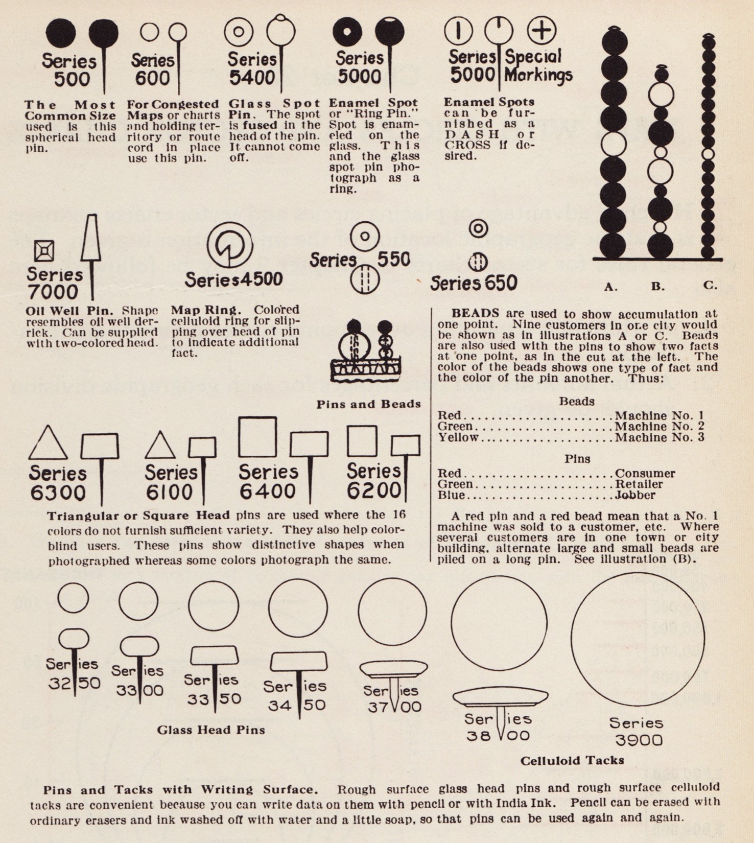
It is easy to make light of Brinton’s obsession with cartopinography in hindsight, but map pins have carried real weight. In a later volume titled Graphic Presentation, Brinton revisited real-world examples of important pin usage, including an image of J. Edgar Hoover pinning a map of FBI personnel critical to national security. He also shows the vast breadth of pin design from the first half of the 20th century, illustrating a great variety of materials, shapes and sizes.
In the early 1900s, pins were advertised as being useful for fire, health, school and police departments, which could use them to track risks, outbreaks, crimes and more. Pinned maps were dynamic, living documents, with layers of information that could be updated easily over time. In the digital world, this kind of information can of course be reordered as well, but the distinction between the underlying map and the pins set by users within it can become blurred. Now as then, it is important to distinguish between information built into a map and the expansive territory of subsequent additions.

Comments (2)
Share
Having just designed a new campus map for a University in the UK this is very relevant to me, and I think map pins (and or icons) deserves discussion as a contemporary subject too. Google maps have really prescribed a style of pins/icons and a colour scheme for roads etc which is now universally recognised but puts digital functions before how clearly a non zoomable printed map might read. I tried to focus on printed clarity but it is interesting how ingrained Google’s way of doing things has become. The main criticisms I have received suggest people really struggle to deviate from a Google Map graphic style even if that would lack specific localised information or just be generally less useable in a printed form. For instance on a digital map there is no issue with the number of pins or icons in one place as you can zoom or click around to display the map and the info clearly. However I had to limit the number of icons for map clarity and this seems to have really irked people who need to see everything!
Surely, MIT would have just used the pin colors the usual way, with a bead per decimal digit, so 1908 pins in the same place would be a pin with a brown bead, a white bead, a black bead, a grey bead, and another black bead. And 1.5 million pins would just be a brown bead and two green beads. Combining the black/brown/red/orange/etc color scheme with powers of two is clearly ridiculous.