In the beginning was the word, and the word was … well, actually, there was just one word … one long, endless word. For thousands of years, in some written languages, there was no space between words. People were expected figure out sentences and clauses while reading aloud.
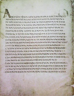
Scriptio continua was the dominant form of writing for the Greeks and the Romans. Sometimes, this never-ending string of letters would execute what was called an ox-turn, first reading left to right, then switching to read back from right to left.
In the 3rd century BCE, a librarian in Alexandria named Aristophanes introduced the idea of putting in dots to indicate pauses, like stage directions for people performing texts out loud. Dots of ink at the bottom, middle, or top of a given line served as subordinate, intermediate and full points, corresponding to pauses of increasing length.
Aristophanes’ system became the basis for Western punctuation. A partial thought — followed by the shortest pause — was called a comma. A fuller thought was called a kolon. And a complete thought — followed by the longest pause — was called a periodos. These rhetorical units eventually lent their names to the comma, colon and period we know today.
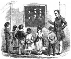
More punctuation followed. Medieval scribes gave us the earliest forms of the exclamation mark. And in the 8th century, Alcuin of York, an English scholar in the court of Charlemagne, quietly introduced a symbol that would evolve into the modern question mark. Ever since, we’ve ended our sentences with one of these three ancient marks, called end marks.
Questioning Exclamations
There have, however, been attempts to expand this typographical toolkit, and include other end marks. One such example has made it into dictionaries: the interrobang (‽).
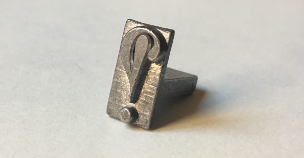
It was created by an ad man named Martin Speckter just over a half-century ago. In the 1950s and 60s, he repped some of the biggest names in publishing, such as Barron’s, Dow Jones, and the Wall Street Journal. Speckter was also a typography nerd, constantly reading books on punctuation and the English language. He and his wife, Penny, collected hundreds of printing presses of all kinds and sizes.
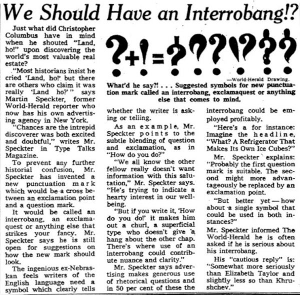
In the spring of 1962, Speckter was thinking about advertising when he realized something: many ads asked questions, but not just any questions — excited and exclamatory questions — a trend not unique to his time. Got milk?! Where’s the beef?! Can you hear me now?! So he asked himself: could there be a mark that made it clear (visually on a page) that something is both a question and an exclamation?!
Speckter was also the editor of the typography magazine TYPEtalks, so in March of 1962, in an article for the magazine titled “Making a New Point, Or How About That…”, Speckter proposed the first new mark of English language punctuation in 300 years: the interrobang.

The interrobang was a new kind of end mark. It denoted a question that expressed surprise or incredulity. This also made it useful for rhetorical questions, most of which are also incredulous. In his article, Speckter was already envisioning exclamatory-slash-rhetorical advertising slogans that could take advantage of the new mark, such as “What?! A Refrigerator That Makes Its Own Ice Cubes?!”

Speckter laid out a few different potential ideas for what the interrobang should look like, but quickly zeroed in on a favorite. His design collapsed the question mark and the exclamation point into a single glyph. The two marks, instead of being placed back to back, were now conjoined, sharing the same dot at the bottom.
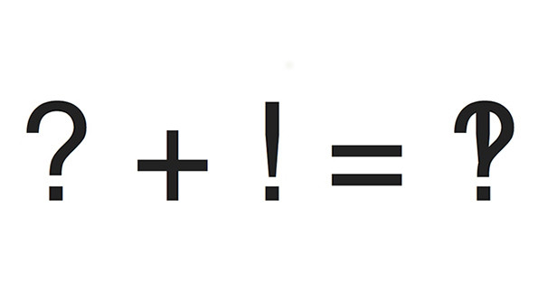
At Speckter’s request, readers of the article also wrote in with proposals for alternate names, including “emphaquest,” “interropoint” and “exclarogative.” But he stuck with the original name — “interro” for interrogate and “bang” for the proofreader’s word for the exclamation point. (When giving dictation, people didn’t use the phrase “exclamation point.” They would just say “bang.”)
But, as punctuation expert Keith Houston explains, “it’s not easy to invent a mark of punctuation that actually sticks.” Houston loves the interrobang, but notes that history is littered with failed attempts to create new end marks. “Around the 16th century,” for instance, “the percontation mark, this rhetorical question mark, lasted about fifty years before it disappeared. There was one invented by a kind of renaissance man called John Wilkins who proposed an irony mark and it went nowhere.”
And then there’s the interrobang, which, seemingly from the day it was born, faced a string of bad luck. For example, an article praising the interrobang appeared in the New York Herald Tribune in 1962. In the Tribune article, the writer called the interrobang true genius. Unfortunately, his article was published on the first of April and it may have been that the readers took it as an April Fool’s joke.
Still, this punctuation mark persevered. In 1966, a company called the American Type Founders — a legendary design firm that created some of the most widely used typefaces of the 20th century — unveiled a new typeface called Americana that included an interrobang, but the foundry was in decline, and Americana was the last type typeface they ever cut.
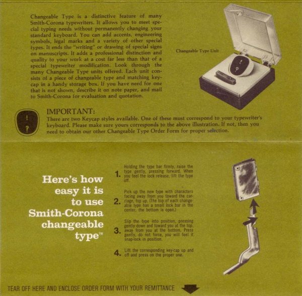
Then, in 1968, the iconic typewriter company Remington announced that their latest model typewriter would feature an optional intrerrobang key. Still, it was optional — an extra — costing extra money. It failed to catch on.
Today, the interrobang is just barely hanging in there. It has its own character in Unicode, the common directory of symbols which all computer fonts must reference. But Keith Houston points out that it still hasn’t cleared the biggest typographical obstacle of all: “I think that in order to really consider it to be a real mark of punctuation, people have to use it without thinking about it.” In other words: a truly remarkable mark of punctuation must be unremarkable.
Banality Inaction
Alas, banality is not one of the interrobang’s strong suits. After Remington’s brief attempt to give it a key, it never made it onto any standard keyboards. And, now, if it is included in a font, it’s accessible only within a nested series of menus and selections. So when people do use it, they’re deliberately going out of their way to do so. They’re using it to make a sort of statement, not because it’s needed. For it to truly succeed, ordinary people need to employ the interrobang for no other reason beyond the fact that the sentence at hand calls for its use.

Houston says these are rare, but has found at least one genuinely banal interrobang, used by a man named Frank Easterbrook. Chief Judge of the United States Court of Appeals for the 7th Circuit, Easterbrook used to be Deputy Solicitor General, arguing the interests of the United States in the Supreme Court. He is also a typophile, and has no patience for briefs written in Times New Roman, a newspaper typeface (he wants lawyers to use book typefaces).
In May of 2011 Easterbrook was writing a ruling for a case, the case of Sears vs. Crowley, when he realized he’d written himself into a corner. “I reached a point where I had written a rhetorical question where I was tempted to use, you know, “question mark, exclamation point, question mark, exclamation point,” he recalls. Then he remembered the interrobang. His clerks thought it was a typo, but he assured them it was quite intentional. It was also very, very banal — he wasn’t showing off and he didn’t publicize his usage.
 Shortly after Easterbrook issued his opinion, his quiet use of an obscure form of punctuation was spotted by a legal blog and added to the interrobang’s Wikipedia page. When Easterbrook learned this, he laughed. He said he never intended to draw attention to the interrobang. He just thought it was the right mark to use.
For more information, images and credits regarding the second part of this episode on the “octothorpe” click the link above!


Comments (27)
Share
For the love of god what font was Easterbrook about to say they actually use right before you cut him off‽ I was distracted the entire rest of the episode.
You get all the upvotes!
I agree! The whole “fade-out” effect seemed quite disrespectful to me (as if to imply that Easterbrook was ranting endlessly). And, yes, I wanted to know what font!
Here is the 7th Circuit Style Guide
http://www.ca7.uscourts.gov/forms/type.pdf
There is no single font they recommend, but they suggest several:
Century, New Baskerville, Book Antiqua, Calisto, Century, Century Schoolbook,
Bookman Old Style, Baskerville, Bembo, Caslon, Deepdene, Galliard, Jenson, Minion, Palatino, Pontifex, Stone Serif, Trump Mediäval, and Utopia
When i was listening to the part about naming the hash symbol, i though I should mention that in Hebrew the hash symbole is named the ladder sign, apparently named as a visual descriptor as well as to be audibly similar to the star key (in Hebrew)
I’ve set my phone to autocorrect !? or ?! to ‽ and I end up using it without even thinking about it.
I loved this episode!
May I suggest that you eliminate “comprised of. . . .” from your vocabulary?
You used that abominable construction twice within one minute around the 20’ mark.
Sorry to be such a nit-picker, but if I didn’t think you wanted to “be best”, I wouldn’t.
This really was my favorite podcast episode this year.
Respectfully,
Fred
Why is it an “abomination”? (Non native English speaker here).
There’s an unintentional interrobang in Cleveland’s Playhouse Square Logo
Yours is one of my favorite podcasts, and could that episode have been any better‽
I’m a computer programmer, and as to your statement that “hash” was the British name for the pound sign, I recall it being used by American programmers in the 1980s, and probably much earlier. This was along with “bang” for exclamation point, “splat” for the asterisk, and “snail” for the at sign, and I assume that most of those came from the typesetting industry.
One common use was in Unix shell scripts, in which an optional first line could begin with something like “#!/usr/bin/sh”. That line is often called a “shebang” by Unix shell programmers, sort of a portmanteau of “hash” and “bang”.
I never heard of the interrobang until now. It’s not even in my machine’s dictionary.
I can’t help thinking “if the interrobang was around when the Riddler first appeared (1948), could it have caught on‽”
As a linguist and second language acquisition professional, I can say that this would be more difficult for my students.
The current solution (!?) Works just fine. This is called a digraph. We already have digraphs in English, think of the word church or short. Here you have two letters that are spelled to make one sound. It works with vowels too. Laid. Pier.
Why have another thing I need to learn that I dont understand why? This mystery is very counterproductive for learners. Stick with what works.
There was a 1982 TV series named interbang that prominently displayed this glyph.
Silly teen show, but the symbol was everywhere!
https://m.imdb.com/title/tt1819949/
It’s simple to make Ctrl ? type in an interrobang in windows using Auto hot key app.
add this to the script
^/::‽
I am an experience designer and typophile. I embrace alternate punctuation and have been doing my best to encourage adoption of the middle dot as a much more elegant list item separator vs the vertical bar.
http://it4np.com/2017/08/use-middle-dots-to-separate-a-list-of-items-jquery-javascript-to-modify-css-to-hide-dots-at-the-end-.html
But I’m with Eli J Patton on this one. When your primary goal of written text is to as clearly and transparently as possible convey a thought, anything you do that pulls attention and causes the reader to “go meta” and contemplate the medium rather than the message just distracts from the goal. ?! gets the point across, is easy to type, and doesn’t cause the average reader any consternation. The same unfortunately cannot be said for ‽
There is a path to broader adoption, but it starts with some small subculture adopting it —probably BECAUSE it differentiates them—then having it picked up more broadly.
If you are interested in doing another story along these lines, I think this one is fascinating.
https://mashable.com/2018/04/02/millennials-written-english/#OOD6_flazmqw
What a fabulous episode team! I am now using the ‽ on the regular and explaining as needed. Everyone should be using it too…
I think the the interrobang is AMAZING and is in desperate need of some rebranding. It’s purpose is undeniable sound, today more than ever. Many/most of us humans communicate and emote as much or more via text than any other means. The fact that I need to type ?!, rather than ‽, which I know I can add to my keyboard is idiotic, and the definition of poor time management.
Rebranding…. People don’t say things that are A) hard to pronounce B) sound sexual. That is menu psychology 101, granted this is not a menu. The word intereobang is embarrassing to say, and certainly doesn’t sound like the symbol ‽ Interrobang sounds like something Haspel does to a terrorist’s love ones during an interrogation
Seems like a rebranding competition is in short order, no‽‽‽
Thanks. I have just spent hours trying to get Android to easily support the interrobang. The best I can figure is to cut and paste. What the‽
It’s “champing at the bit” not “chomping at the bit” I cant believe the judge didn’t correct it.
I have seen the interrobang regularly for years now, and it had long escaped my notice. Thinking about it now, I probably have experienced one of the unique situations where the use is common and normal. I often read Chinese web-novels that have been translated into English, and a setting such as this is prime for interrobang use. In the original works, before they are translated, there use of certain characters that are used as emoji rather than words that will make it across to the English translation, so there is already a precedence for a non-standard type to be used. Because of this, I have seen interrobangs littered across my readings for years without ever finding it strange. But now, a month after listening to this particular episode, and I now have a moment that I notice each interrobang, and I understand why when something is common and unnoticed it works, but once it draws attention it loses its usefulness.
Surely both the name and the visual mark let this movement down. It’s been shot in the foot by a fun-poking coining that sounds a bit like a joke word. And the mark looks unorderly, almost mistake-like. My opinion only, but that is a big reason this hasn’t taken off, and that’s due to banality and credibility – it’s been mentioned in the podcast. It can never be banal (and therefore in the good company of other regal punctuation marks) because it sounds about as serious as a kazoo. And it lacks credibility because of that. And the visual? It looks messy and irritating. Shapes need to be timeless and have their own voice, you can’t just transpose two shapes over the other. Start this movement again, fresh, with a new name and a worthy shape and we’ll have a beautiful, banal and regal mark that more than just judges use from time to time. 😊
As a type designer I also think a punctuation mark expressing !? can be helpfull in written communication. As you pointed out, the disadvantage of the interrobang is that it’s messy and looks like a printed mistake. In 2017, I designed an alternative sign, based on ‘jè’, a dialect word in my hometown Tilburg (https://www.tilburgsans.nl/en/news/tilburgsans-introduces-a-new-punctuation-mark/). This sign is a visual merge between exclamation point and question mark. In typefaces it can be put on the unicode position of the interrobang and/or as a ligature of !?. Another advantage is that it can easily be applied in handwriting. So, there it is: “a beautiful, banal and regal mark that more than just judges use from time to time”!
The interrobang was recently used in an Australian court ruling where an exasperated judge threw out a ridiculous defense in a defamation case. Immediately made me think of this episode
https://www.businessinsider.com.au/mark-latham-defamation-defence-struck-out-2018-8
the relevant section of text
https://pbs.twimg.com/media/Dlzovo2U8AAyNAL.jpg
See the State Library of New South Wales Australia Logo https://www.sl.nsw.gov.au/
Still listening to the episode, but had to comment, the Interrobang is Pearson Education’s logo!
Hey, I love this podcast!
I can’t help but think about the use of the question “right?!”. As an expression of agreement or confirmation, phrased as a question, it’s a perfect candidate for using the terrobang.
An example would be
Person one:
“Lizzo is so lit”
Person two:
“Right‽”
Back in my youth, at a time of punk, my Wednesday evenings were spent at the Interrobang Methodist Youthclub in Banbury (Oxfordshire,UK). About once a year, for the benefit of newbies the formal part of the evening would be to explain the interrobang and why the youth club had adopted it