Author of Understanding Comics: The Invisible Art, cartoonist and theorist Scott McCloud has been making and thinking about comics for decades. His classic volume explores formal aspects of comics, the historical development of the medium, its fundamental vocabulary, and various ways in which these elements have been used.
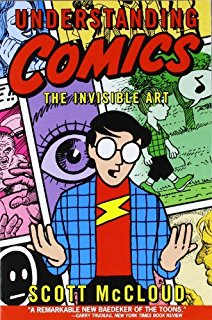
When pressed to give a full definition, McCloud explains that comics are a distinct art form of “juxtaposed pictorial and other images in deliberate sequence.”
But in everyday usage, there’s no need to get that formal or technical. McCloud believes calling them “comics” is fine, as long as people realize the medium has the potential to do more than just funny strips in the Sunday paper or action-packed graphic novels. When Scott started out, superheroes were in vogue, but today there are graphic memoirs and silent comics, folk tales and stories of magic (as in Sandman or Saga), plus a lot of less-conventional hero narratives (including some creative and groundbreaking recent runs of Hawkeye and Vision).
There are certain universals in comics, and one of those is choosing the moments to represent — any narrative can theoretically be broken down in infinite ways. An artist might choose to stretch a few seconds of activity into dozens (or thousands) of incremental panels.
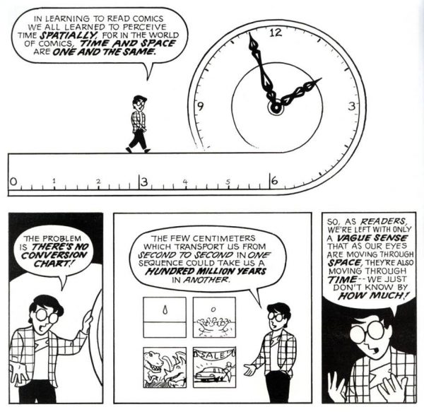
Or, at the other extreme, someone might make a two-panel sequence showing the history of the universe, beginning to end, illustrating the Big Bang and (perhaps) the Big Crunch.
Beyond picking moments to depict, artists also have to choose the framing — how close or far away will the viewer be? Will they see from an “eagle’s eye” or “worm’s eye” view?
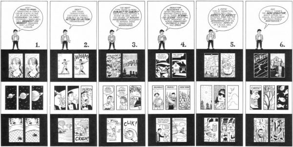
Then, of course, there is the balance of words and pictures, and how the story flows from one frame to the next. A lot of readers (and artists) take some of these things for granted, but they represent design decisions that are made and have evolved over time.
Speech bubbles, for instance, have a centuries-long legacy with antecedents in ancient art. Dialogue is part of life, and any medium that is going to represent life has to include it. But it’s also something that can feel like a “desperation device,” says McCloud — a product of necessity — and some “silent” comics can be very powerful, too.
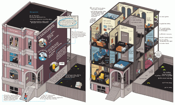
To see a range of approaches and how comics have changed over time, McCloud recommends checking out work by Art Spiegelman (including but also beyond Maus), Chris Ware’s Building Stories, silent comics by Jim Woodring, The Arrival by Shaun Tan, Persepolis by Marjane Satrapi, and City of Glass by Paul Karasik and David Mazzucchelli. Also discussed in this episode: Bingo Love and Smile. You can see more of Scott’s ongoing work and writing on his website and click here to buy his book.



Comments (19)
Share
I came here hoping to find a picture of that BIKE PATH sign that gets discussed in the episode.
Scott needs his own podcast. This was a great episode — and then in the ‘afterword’ where he was discussing his daughter and how her condition changes the way she perceives the world, that turned it into an awesome episode.
You get the feeling Scott could discuss anything and make it exciting and understandable. More please!
I came here to say the same thing. He could tell me what he had for lunch and I bet it would be captivating.
I’m going to read his book now, he seemed so interesting.
I agree – he was fantastic!
Just saw the roving exhibition Manga Hokusai Manga. This had a couple of panels on ‘speech bubbles ‘ in Tokugawa Era illustrations. The equivalent of a speech bubble ( which emerges from the neck ) contains an illustration of the mental state of the protagonist. Perhaps the dream they are having or an action they wish to accomplish. Any spoken words are written arbitrarily anywhere on the page.
I don’t understand what he’s complaining about the bike path. He didn’t describe the problem very well, and I don’t understand the mumbling metaphor. I came here looking for a picture.
I don’t get it, either, and his mumble part. That is the only reason I came to this website, which didn’t help me understand. Maybe because I’m so used to seeing that type of bike path sign? I agree with his spouse who told him to just drop it! Also, too, it’s not easy to talk about visual problems in an audio medium.
It’s about the way we interpret images. When things are close to eachother we group them, you see this in text as well: letters that are grouped from words or sentences grouped to form paragraphs.
the thing with the bike path is that the words “bike” and “path” are farther away from eachother than the words are away from the wheels. Visually the words are more associated with the wheels than with eachother, even though you know the words should be associated with eachother and not with the wheels. It’s like the visual equivalent of mumbling some thing after a sentence. There’s something extra that you wouldn’t really expect or that shouldnt be there.
Roman,
Such a cool episode! I’m not a big comic guy, but I still read them occasionally. Thinking beyond the classic superhero comic is really interesting to me. Although it’s constructed in a way not too different from this superhero style, I wanted to tip you off in regards to the menus at The Dead Rabbit Grocery and Grog (two year winner of best bar in the world); their menus are formatted in the form of a comic book, or at least there are menu pages scattered throughout the comic. The comic itself tells a story of the “Dead Rabbit” itself, and the characters are actually stylized depictions of the bartenders–or at least they looked extremely similar to the bartenders I saw in front of me.
Anyway, just a really unique way of expressing their identity as an NYC institution. Also, I’m a HUGE cocktail nerd–if that’s even a thing. 🤓
A link to their current menu (Issue 4) sans comics:
https://www.deadrabbitnyc.com/retribution
A link to their shop where you can buy the comic:
https://www.deadrabbitnyc.com/shop-online/the-mixed-drinks-menu-4th-edition-issue-4
A link to their awards page:
https://www.deadrabbitnyc.com/awards-press/
Cheers!
Stuart
A link to the comic PDF:
https://static1.squarespace.com/static/5804f105893fc02b80dbd9c4/t/5a4bda07652dea72c86bbbb1/1514920460731/444747+DR+MIXED+DRINKS+LIST+COMIC+ISSUE+INDIVIDUAL+LO-RES.pdf
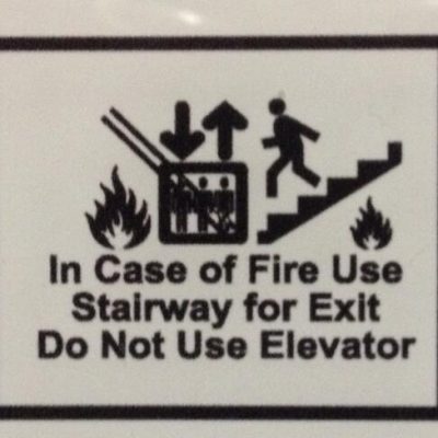
I’m not a visual artist, have never bought a single comic book and only two graphic novels, but I find stories like this one utterly riveting. Plus, it’s one of those occasional 99PI interviews that just cracks me up. Scott’s blunt-force critiques of bike path signage and building evacuation maps made my day.
Thanks, Roman. You and the 99PI team do great work.
I might be the only one that found this episode supremely boring. I listen to all the episodes. Where’s the story? I don’t get any of the energy from this episode that one would get from a comic, or from the folks at comic con. A medium that relies on pictures and few words– would have been nice to get the same experience from the episode itself.
This Bike Path murrr-murr-murr is now one of my favorite 99PI moments. People love a good rant about visual design. I envision a pin and or T-shirt.
I’m a relatively new listener (finally getting into podcasts in general), enjoying the quality of 99 PI quite a bit.
But I’m surprised that you don’t have transcripts available for any of the episodes. They’re scripted, so the text must be available somewhere.
Yes, it’s an auditory medium, but transcripts increase access to a lot of listeners, including Deaf/HoH people, those with lower language proficiency, and many others. Several lower production level podcasts make them available.
I hope you do soon, too, so I can share them widely, as I’d like to.
Here’s an interesting example of “speech bubbles” from a famours 15th-century French illuminated manuscript:
https://upload.wikimedia.org/wikipedia/commons/1/1f/Le_Mort_devant_son_juge%2C_Maitre_de_Rohan.jpg
The dead man addresses God formally, in Latin, but God speaks in French, with the writing upside-down from our point of view, but the right way up from his!
Dammit, I meant “famous”, not famours!
Now I notice all the wack signs around town! Yesterday we went for a walk on a river trail…the map at the trail head was oriented 180 degree wrong, so annoying!
Check out this beautiful graphic novel by Giacomo Patri from the Great Depression about white collar workers needing to organize (it’s a “silent comic” – there are no words). In addition to “White Collar” Patri did many wonderful illustrated pamphlets for unions that often used a classic comic book style to tell stories about the history of labor. Several of these pamphlets are being digitized and will soon be available online from the Labor Archives and Research Center at SFSU.
White Collar, a graphic novel by Giacomo Patri
http://digital-collections.library.sfsu.edu/cdm/compoundobject/collection/p16737coll1/id/386/rec/1
In the podcast there was a comment about how fire escape maps, floor plans, which are often oriented with north at top, would instead be clearer if oriented the way you are facing. But for me, I can only understand a map if it’s oriented north. Because then I can fit that map into my map of the world.
For example, one time a friend looked up directions on his phone and handed the phone to me. I was totally lost until I changed the map orientation to north. Then it was clear. I needed to go “over there”, and no longer needed directions. The map was in my head.
There are different ways to navigate the world. You can be told where to go or find your own path.