There’s a rumor about the 1987 film Outrageous Fortune, a rumor that has dogged producer Jacob Reed since his days in film school. The comedy, starring Bette Midler and Shelley Long, is mostly forgotten. But a feud between the two stars was legendary, a fact referenced on TV by Middler a year later.
The dispute between these stars is only a small part of the rumor. Apparently, both actors had been promised top billing on the film. To resolve the dispute, the film studio allegedly released two versions of the movie – one where Bette Middler was the top billed star, and the other where Long’s name comes first in the credits. And the two versions split America down the middle – on one side of the Mississippi River, audiences would see a film print with either Long or Middler’s name first.
This anecdote speaks to a bigger issue in title design, because deciding who gets top billing in a movie can be a delicate balancing act. Opening titles aren’t just a list of names. They’re also the product of intense negotiations by Hollywood stars and their agents playing out in text form. Title designers have to create something that’s entertaining to watch, while also presenting the names of all the creative people in a very particular order. It’s like a game of Tetris, to make sure everybody gets their due.
Art of the Title
Movie titles are an artform in their own right. Title sequences can be metaphors for the show or movie you’re about to watch, like in Mad Men, which depicts the show’s theme of decline, as a mysterious figure falls from the top of a Madison Avenue building, as the world crumbles around him.
Title sequences can also provide a detailed guide to the program, as in Game of Thrones, where the opening sequence doubles as an intricate map of the fictional world where the show takes place.
But above all, title sequences have to provide details about the production. “Title design is primarily a vessel for information,” says Lola Landekic, editor in chief of the beloved website Art of the Title. “That’s why it’s a design, rather than what we would consider a kind of standalone fine art. It’s a project created to serve a larger work.”
To accomplish this, title designers are given an exhaustive list of requirements at the start of every production. “When we get a title sequence project, there is a legal document or there’s a credit list that has all the specs of the credits,” says Karin Fong, an Emmy-winning title designer at the production house Imaginary Forces. The list includes the order different actors have been promised, font size that is contractually negotiated for certain creative people, and union requirements. For example, the Directors Guild of America requires that a director always get final billing in an opening credit sequence. “So when you see a main title, the director’s name is always last,” says Fong.
The Laverne and Shirley Card
The toughest design challenge for title cards is when two stars both want top billing, like in the case of Shelley Long and Bette Midler. For decades, this was kind of a holy grail of title design. No one could settle on the best way to do it, until a solution was found on a beloved 70s network comedy, Laverne & Shirley.
According to Nick Abdo, a producer for the show, both stars had been promised first billing in the credits. Originally, a plan was hatched to swap the first billing every week, but the producers feared this system could fail. “At some point there’s going to be a mistake, they’re going to put the wrong one, and then there’s going to be a big lawsuit,” says Abdo. “How can we solve this now? Let’s troubleshoot it before it’s trouble.”
According to Abdo, his colleague Eddie Milkis came up with a solution – putting both names on screen at the same time, with one star in the bottom left hand corner, and the other in the top right corner. This way, neither star is obviously higher billed. In English, we read text top to bottom and left to right. This kind of title card split means two names can be given roughly equal prominence.
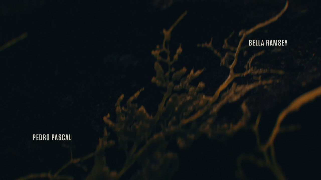
These days, it’s pretty common to see Laverne & Shirley titles. Some examples include Bella Ramsey and Pedro Pascal in The Last of Us, Damien Lewis and Paul Giamatti in Billions, Reese Witherspoon and Jennifer Aniston in The Morning Show, Matthew McConaughey and Woody Harrelson in True Detective, Martin Freeman and Benedict Cumberbatch in Sherlock.
“They’re splitting the difference,” says Karin Fong, who used this type of title card on one of her shows, Little Fires Everywhere. “One person’s lower but the first read on the left and one person is higher but is on the right side, which is the second position when you’re going left to right. So it’s evening it out.”
Giving two people top billing seems like it shouldn’t be possible. But the Laverne and Shirley title cards offer an elegant design solution for powerful Hollywood egos.
Edit note: The broadcast version of the story says the DGA requires a director’s name to be closest to the title of the film. In fact, the name has to be closest to the *body* of the film. We regret the error.


Leave a Comment
Share