It’s that time of year again! When 99pi producers and friends of the show join Roman to tell shorter stories, many of which have been sitting on our idea shelves, just waiting for this moment. Our first set of minis delves into the surprisingly controversial logo of a major sports league; a wild goose chase into erroneous statistics; the largely forgotten arts competitions of the Olympic Games; and a Modernist penguin pool that is beloved by preservationists but not so adored by actual penguins. And this is the first batch of our turn-of-the-year mini-stories. Tune back in for more minis at the beginning of 2022!
Chris Berube: The Man in the Logo
The logo for the National Basketball Association doesn’t look controversial at a glance. If anything, it’s fairly simple and generic. But it’s not the general design people get worked up about; rather, it’s the specific white silhouette of the individual figure framed in blue and red.
![]()
Many professional sports leagues opt for a simple logo, like a basic shape with some letters, but others feature the abstracted form of a player. The MLB was the first league to employ a silhouette-style logo in 1969. In the NBA’s case, a brand consultant named Alan Siegel was asked to come up with a similar design to baseball to give basketball an ‘all-American feel,’ and he produced the silhouette of a man dribbling a basketball. But there’s one big difference between the NBA’s logo and its predecessor from the MLB: in the NBA’s case, it’s not a generic silhouette. It’s based on a real guy — a player named Jerry West.
Jerry West was one of the greatest basketball players of the 1960s, and famously played for the LA Lakers. So it made sense for him to be the logo for that time, though the NBA has never acknowledged it’s him (presumably for legal reasons). Still, it’s obvious from looking at reference photos. West has even been nicknamed “The Logo.” People still come up to him in the street, calling him by this odd moniker.
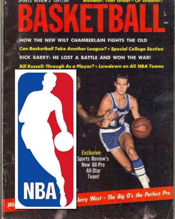
There are a couple of issues with the logo being Jerry West. First, Jerry West played in the 60s, which was a very different era of basketball. Some believe the silhouette doesn’t look like a modern NBA player, down to the shorter pant-length. Second, Jerry West is white, and today, three quarters of the league is Black, though a majority of NBA players were white during West’s playing career. And then there’s Jerry West himself, who hates being The Logo.
So why don’t they just change it up? In part, no one can agree on what player would replace Jerry West. There have been various suggestions, but many of these are controversial, either because of their personal histories or simply because their famous silhouettes are already in use elsewhere (like Michael Jordan’s, which has been used to sell sneakers).
Of course, the NBA could switch to a shield style logo, but fans of the current logo format balk at the idea of that sort of shift; they argue that this logo has more personality, like the sport of basketball itself. Sports journalist Morgan Campbell says that “the difference between the NBA and the NFL is that the NBA you can see the players’ bodies, you can see their faces, you can see their facial expressions mid-game.”
For now the logo remains in limbo, disliked by many but unchanged for lack of agreement about potential alternatives.

Comments (4)
Share
On the topic of Michael Phelps & sculpting, he has (or certainly had) sculpted his body to a degree that many would find very easy on the eye, for a given definition of ‘sculpt’ of course.
And on the topic of the NBA logo, I would think that democracy and some ground rules are the answer here.
a. The basic format of the logo stays the same, only the silhouette would vary.
b. Allow submissions of silhouettes from current players within the association.
c. The players upon whom the silhouettes are based must be dead.
d. Only the current players within the Association may vote.
e. They may vote for, say, 5 silhouettes in order of their choice and the single transferable vote is used.
f. The silhouette that eventually reaches the quota is chosen. If the quota is not reached and there are no more transferable votes, the silhouette with the highest rank is chosen. In the event of a tie, a coin is tossed.
g. The logo is changed once a decade on the same date (or xth weekend of a month).
Here we let the players choose and one of the great players of the past will be honoured. It is democratic and those who disagree will have to live with it.
Regarding the NBA logo, why don’t they use an image of a basketball entering the net? Do away with the player totally.
On the topic of the NBA Logo, why not just have the logo for the year be a silhouette of the previous year’s MVP? This way the logo would remain current and even provide a new, interesting revenue stream for the NBA.
In this episode, Mary Roach paints Canada Geese and their abundant feces as a harmless nuisance. This is false and a bit shocking to hear being asserted on this podcast without being fact checked. There are a number of associated pathogens in avian waste that can enter the water, soil, and air. This is permanently etched in my mind as construction at my medical school aerosolized particles of Great Egret droppings from a rookery on campus, resulting in several people becoming severely ill with pulmonary histoplasmosis. One person required a pulmonary lobectomy as a result.
There are several peer-reviewed articles written on the pathogens associated with Canada Geese in specific. The CDC has a more layman-oriented document on this: https://www.cdc.gov/niosh/docs/2005-109/pdfs/2005-109.pdf