As humans have developed cities and built environments, we have also needed to develop ways to find our way through them. Signage goes back at least as far as the Roman Empire where they constructed “milestones” along their roadways.
Today, signage and other cues to help you find your way come from the field of environmental graphic design, or “wayfinding.” Chances are that any signs in an airport, in a hospital, or on a freeway, were created by professional wayfinders.
But there’s more to wayfinding than signage. In fact, signage is the least effective tool of wayfinding. Good architecture is among the best.
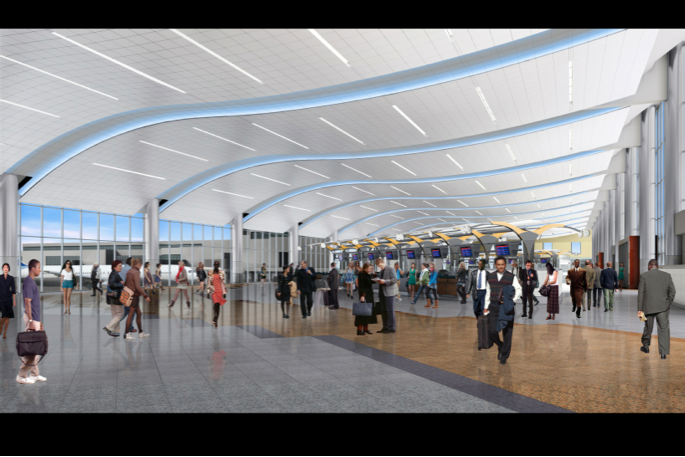
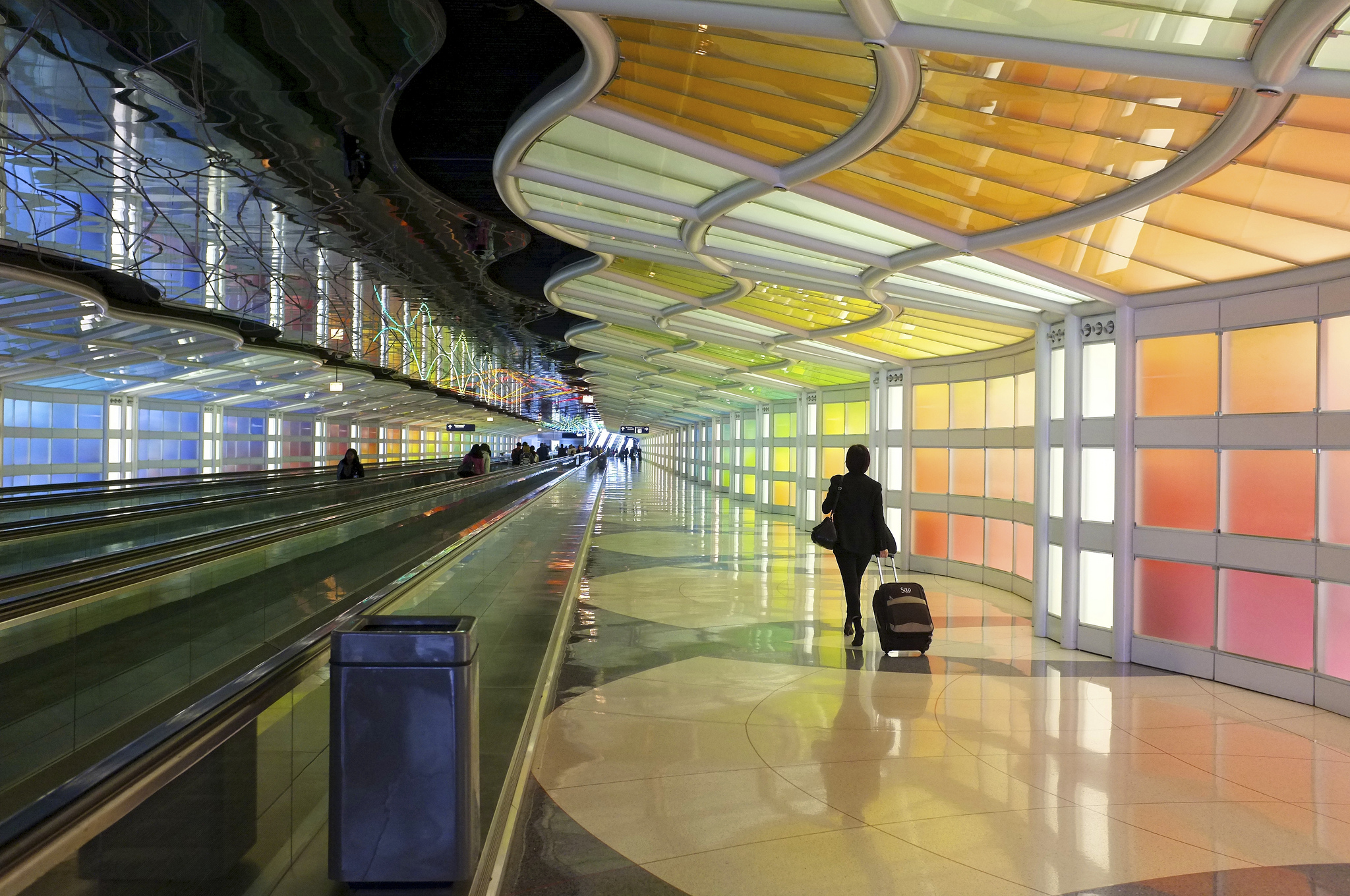
Consider the new International Terminal at Hartsfield-Jackson International Airport in Atlanta, Georgia. The physical space tells you everything you need to know about how to move through it, without you even realizing it.
The terminal maximizes “sight line,” because if you can see your destination, you don’t need signs.

Rather than meeting you head-on when you walk in, the ticket counters are angled.
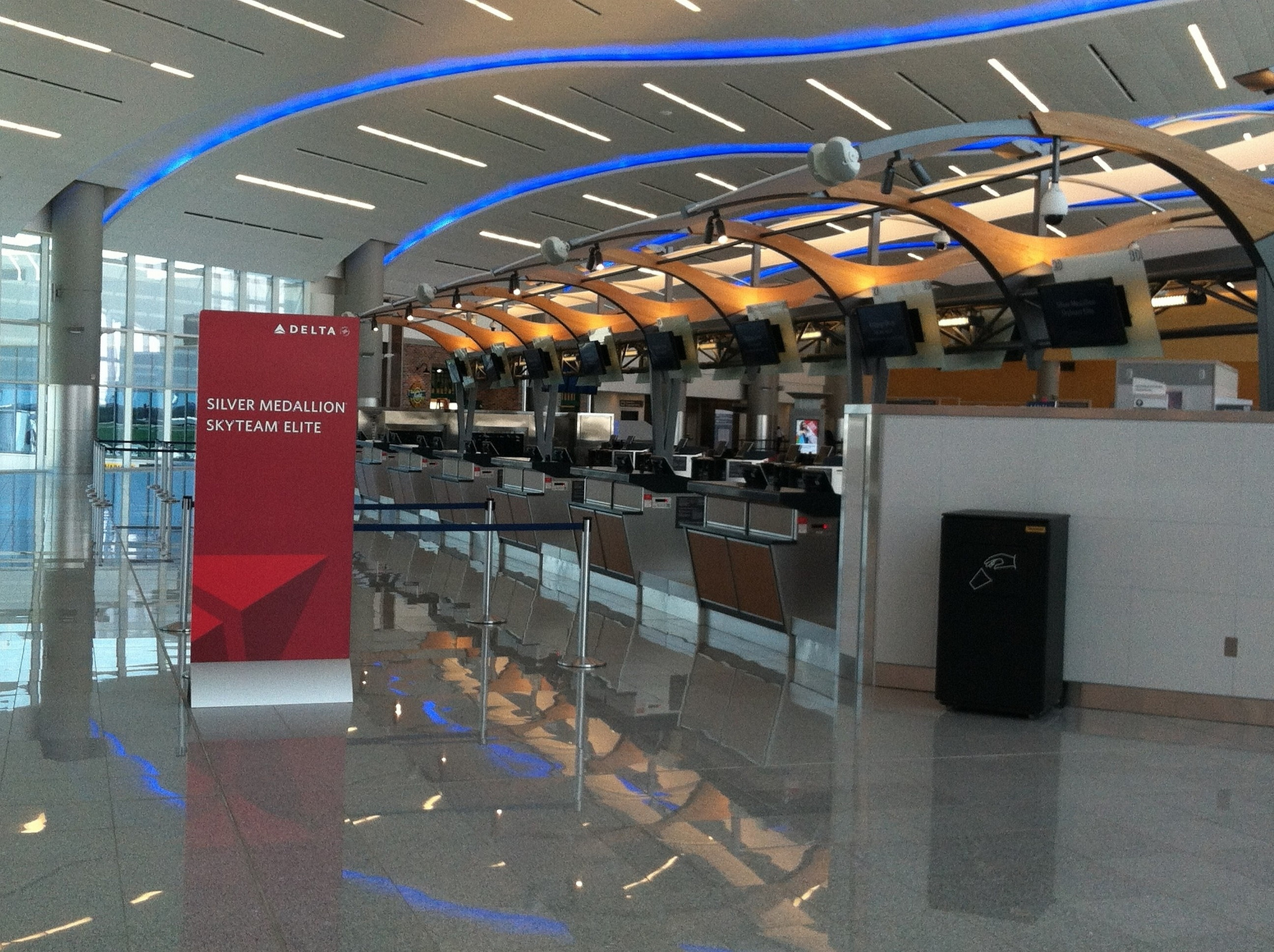
Once you get your tickets, these angled counters subtly push you in the right direction.
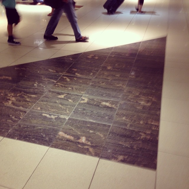
There are also subtle cues in the floor. The tiles are angled so as to point you towards the security checkpoint.
There’s another set of tiles inside the dominant grid pattern: a “yellow brick road” that cleaves out this corridor out of negative space going directly towards security.
Not all airports are this streamlined and minimal, however. Often, as a traveler, you’ll have to find your way as you’re being bombarded with all sorts of images that compete with the wayfinding. And so the key here is to make the signage stand out by being drab and plain, so you can tune out all the glitz.
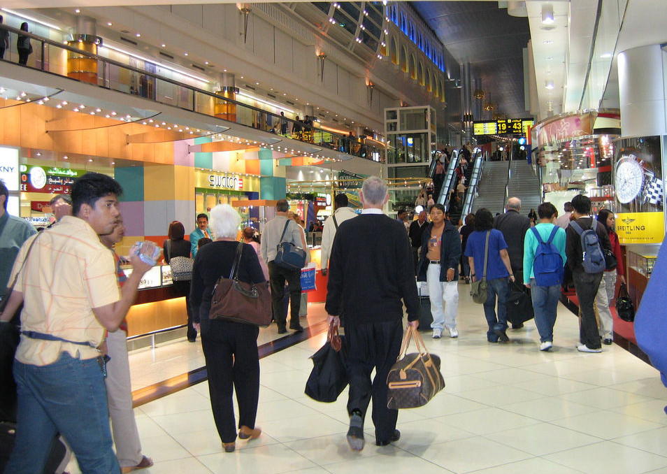
However, wayfinding and commerce aren’t necessarily in competition. In fact, often it’s the case that an airport’s wayfinding is there to give you a sense of calm as you navigate an unfamiliar environment with the hopes that, in that mindset, you’ll be more likely to buy stuff than if you were stressed and in a hurry. And sometimes, wayfinding will steer you towards opportunities for you to spend money.
In theory, wayfinding should work whether you’re literate in it or not, but learning to see the subtle wayfinding cues in the built landscape can help you understand how you make your decisions. It can also make you question if you’re the one even making your own decisions at all.
99% Invisible producer Sam Greenspan met wayfinding expert Jim Harding at the Hartsfield-Jackson International Airport in Atlanta, Georgia. Jim is the Director of Environmental Graphics for Gresham, Smith and Partners, and co-author of a massive document full of everything you’d ever want to know about airport wayfinding.
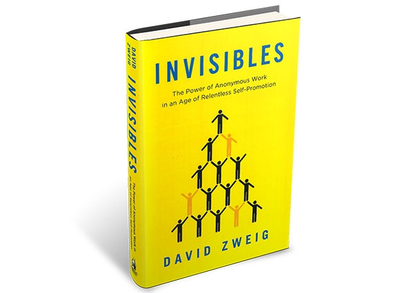
Sam also spoke with author David Zweig, who tipped us off to Jim Harding and his work. David interviewed Jim for his book Invisibles: The Power of Anonymous Work in an age of Relentless Self-Promotion. You can read the book chapter with Jim over at The Atlantic.


Comments (16)
Share
Oh this is going to be goooood.
I just want to say “kudos!” on using Phillip Glass (Koyaanisqatsi) as background to your opening on describing “The Grid”. Perfect match.
In my tiny hometown, it was a dry county. To find the liquor store that was a 45 minute drive, all you had to do was follow the blue hospital arrows. They started about a mile away from our own hospital and lead you straight to liquor. I always felt this was intentional. Thanks to this episode I know who to thank! ;)
I loved this episode. Great work everyone!
I think that acknowledging Michael HAYDEN = the creator of the “SKYS THE LIMIT” (Light + Music), installation between concourses ‘C’ and’B’ at United Airline’s ‘Terminal One’, at Chicago, O’Hare International Airport: would have been appropriate … since it was installed over a quarter Century ago; and intentionally has NO Signage NOR Public Address Announcements, within it’s ~800′ length: a respite from the advertising bombardment one encounters, almost everywhere else!
For an interesting article on a poor way finding experience see Why are the signs at New York’s Penn Station so confusing? – Slate
http://www.slate.com/articles/life/signs/2010/03/lost_in_penn_station.html
On the subject of environmental legibility I can’t recommend this book enough:
http://www.amazon.co.uk/Seeing-Like-State-Condition-Agrarian/dp/0300078153
Thank you for an episode near and dear to my heart.
I’m so glad wayfinding is thing now as well. I have a professional interest as a user experience designer and personal interest as a dyslexic who often ends up in the wrong direction when the wayfinding and signage break down for me.
A few months ago I started my own blog on the subject of bad wayfinding, confusing signage (that’s why it’s better to bake what you can into the architecture), and information design more generally.
I’m trying to coin the term “waylosing” (waylosing.com and @waylosing were both free!) and invite you to visit me at waylosing.com and submit or suggest some examples of bad and good wayfinding (gotta show good examples, can’t all be negative) and especially if you’ve got a story about what works, doesn’t, and what could be done.
Even with the best of intensions and some nice visual design, wayfinding signage is often has minor inconsistencies and slightly conflicting information that give people like me pause, or make a mistake, but often just needs a quick tweak. Things like changing the case (capitalized on one sign, all caps on another) punctuation, abbreviations, and especially inconsistent date formatting can easily trip me up.
Love the show!
I don’t know if this is a real thing or has a name (future episode?), but I’ve always been convinced that just the opposite goes on: Places designed so that you don’t know where you’re going or how to get out, so as to give up and impulse spend. Minor example: mega-box stores that provide no entrance map or internal maps and poor department signage. That can’t be just accidentally forgotten. I think the primo examples are Las Vegas casinos. I once had time to burn alone in LV, and not being particularly interested in gambling, I thought I’d just make my way down the Strip wandering from casino through casino and people-watch. Although I have a great sense of direction, I found that, invariably, upon getting about 20 yards into a casino, I was immediately disoriented and could neither find my way back out or to another exit or predict what direction was the opposite end of the casino. (Don’t know how they square this with the Fire Marshall, if indeed intentional.) Would be cool to know if these design suspicions are real.
Great show – this is one of my all time favorites. Now I can’t wait for my next multi-airport trip to see how they do compared to Atlanta. Also, spell-check: ‘queue’ should be ‘cue’. I love spelling too!
Just listened to “Walk This Way” the beginning about Roman moving to Chicago with its grid struck a chord with me. I grew up in Milwaukee and Chicago, both cities laid out on a perfect N/S, E/W grid. As a consequence I always knew what direction was north (and where Lake Michigan was relative to my present location). Some years ago I moved to Amsterdam where nothing is straight, my street runs in a vaguely northeast/southwest direction, its taken me years to get used to it!
Atlantan here, the International Terminal is so incredibly perfect. I never thought of the sign-less design being what made it so awesome.
Your kiddo has a good taste in books. Though personally I enjoy finding my way by Amber Spyglass.
This was a great episode – but I was a little disappointed that there was no mention of the interior architects/designers (myself being one of them) who are often the ones specifying the finish materials, flooring patterns, ceiling systems, lighting, etc. on most projects. The closing line of
“…check out the signage, the shape of the tiling, the height of the ceiling, the quality of the light. It may just be that you have an environmental graphic designer to blame.”
definitely stung a little bit!
I loved as much as you will receive carried out right
here. The sketch is tasteful, your authored subject matter stylish.
nonetheless, you command get got an shakiness over that you wish be delivering the following.
unwell unquestionably come more formerly
again since exactly the same nearly a lot often inside case you shield this increase.
I enjoyed this episode and to be honest this the first time I hear of this term wayfinding. I find it interesting because it is a way of directing the flow of traffic to a certain direction with out any congestion. I feel this is how our library works it has a friendly flow to it. Thanks