One year ago at the TED conference in Vancouver, 99% Invisible host Roman Mars sat down to give an unconventional talk, calling attention to the oft-overlooked world of flag design.
His presentation (above) highlighted some excellent flag designs that follow the simple and universal rules of good flag design. It also called into question some dubious designs in need of attention, including what expert vexillologists have determined to be the worst city flag in the United States.
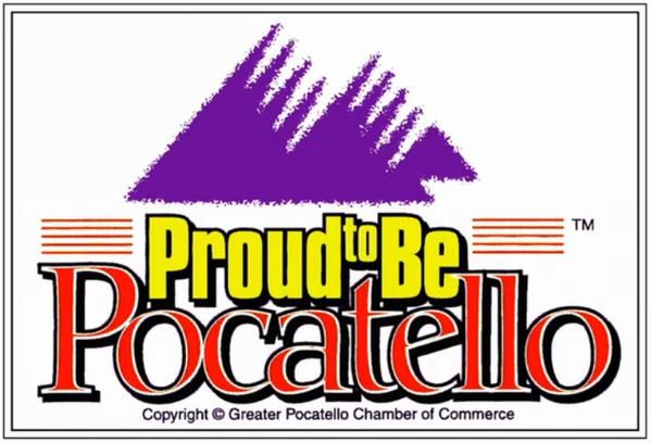
The North American Vexillological Association studies flags and their histories, but also ranks flags on a scale from 0 to 10. Based on their 2004 survey of 150 flags, the city of Pocatello, a small town in Idaho, holds the lowest rank: 1.48. The city’s current flag, complete with a mess of fonts plus trademark and copyright symbols, effectively fails on all of the following criteria for good flag design:
- Keep It Simple (The flag should be so simple that a child can draw it from memory)
- Use Meaningful Symbolism (The flag’s images, colors, or patterns should relate to what it symbolizes)
- Use 2 to 3 Basic Colors (Limit the number of colors on the flag to three, which contrast well and come from the standard color set)
- No Lettering or Seals (Never use writing of any kind or an organization’s seal)
- Be Distinctive or Be Related (Avoid duplicating other flags, but use similarities to show connections)
The city is taking this attention well, turning it into an opportunity to generate a better flag. A recent press release conveyed their response: “Over the past year, Pocatello has received national attention for our city flag design and according to experts, they believe it is the worst city flag in the United States. Consequently, community leaders and elected officials have taken note and a new City of Pocatello ad hoc committee will be working to create a new flag for Pocatello.”
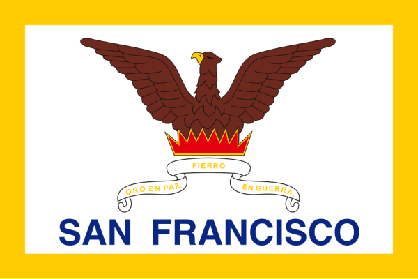
Around the country and the world, people are starting to take more notice of their flags. In many cases, they are also doing something to change them, starting with the city of San Francisco, right across the bay from the downtown Oakland offices of 99% Invisible.
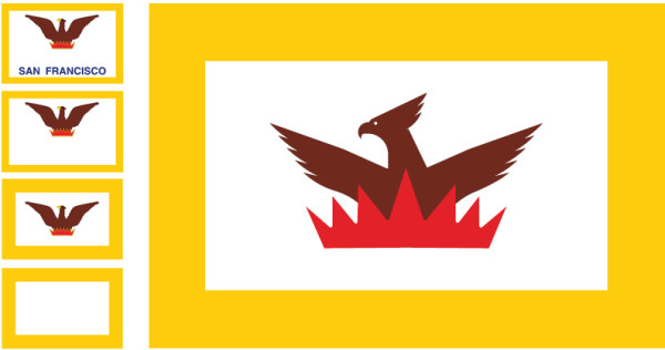
There are worse flags, to be sure, but this one has some clear issues. The city name can be removed from the flag The phoenix as a symbol is compelling, but requires refinement. The border is neither here nor there, and could either be eliminated or enlarged. Already, fans of the show and supportive flag enthusiasts are proposing better options.
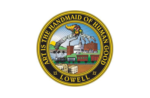
The flag of Lowell, Massachusetts, is essentially a white backdrop with a complex city seal in its center. That seal features smoke from stacks rising to hold a cornucopia in midair above the town, packing in an array overlapping and overly-detailed imagery.

Mark van Der Hyde has a new vision: a red, white and blue flag with upside-down V-shape representing the curve of the Merrimack River around the city. Eight white stripes represent eight major canals, and nine red stripes represent the nine Lowell neighborhoods. While its creator sees it as just one option, and not necessarily the only solution, it does neatly fit within all of the rules for good flag design.
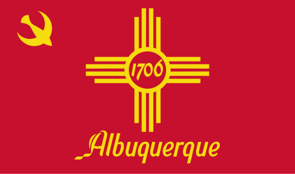
In Albuquerque, New Mexico, the current flag does keep to somewhat simpler color schemes and basic symbols legible at a distance, but local advocates think the design could still be improved upon.
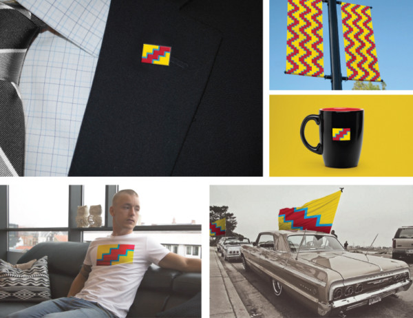
A proposed redesign by Gabe Re incorporates elements of regional folk art, references the natural landscape and red clay of the Rio Grande. The zigzag pattern ties in both recognizable patterns made by humans as well as the peaked shapes of nearby mountains. His proposal shows yet another dimension of ideal flag design: the ability to deploy the flag in different scenarios and at various scales.
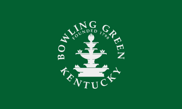
Bowling Green, Kentucky, once again features lettering and a seal-derived layout. Half the time, the words are backward when seen from behind. Also, if you put it on a car, for instance, confusion arises: a driver showing civic pride could be mistaken for a city official.
Nate Morguelan credits 99% Invisible with inspiring him to create a better solution. The green background symbolizes the city’s agricultural origins. Three lower two lines represent the railway and the Barren River, topped by a gold stripe symbolizing the prosperity these commercial transportation connectors have brought to the city.

Billings, Montana, currently features a flag bogged down by too much detail in the center and excessive text all around. A suggested alternative boasts a yellow background, for Yellowstone County, with a star to indicate Billings’ role as the ‘star’ of Big Sky county, with five points for the five wards.
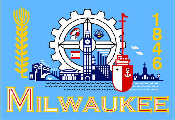
Strangely enough, Milwaukee, Wisconsin, has a perfectly reasonable-looking miniature flag embedded within its larger and more chaotic actual flag. Residents know something needs to be done: “Adopted in 1955, our flag evokes more questions than answers. It has never been flown as a symbol of pride …. Worst of all our flag has been called out nationally as an example of one of the ‘worst designed flags in the entire nation’ but, it doesn’t have to be.” The website MilwaukeeFlag.com is accepting submissions for alternatives.
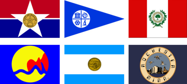
Other places in various stages of flag reconsideration or redesign include Dallas, Texas; Minneapolis, Minnesota; Birmingham, Alabama; Grand Rapids, Michigan; Syracuse, New York; Rochester, Minnesota; Columbia, Missouri; South Bend, Indiana; Raleigh, North Carolina; Tampa, Florida; Columbus, Ohio; San Marco, Texas; Lancaster, Pennsylvania; Austin, Texas; as well as the state of New Jersey.
Some cities without flags have also been inspired to create them from scratch, including Fargo, North Dakota and Manlius, New York.

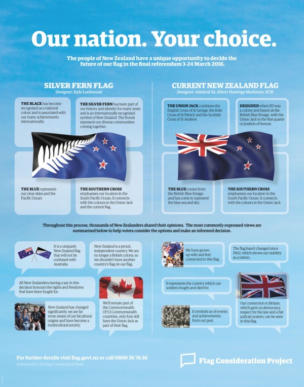
Even entire countries sometimes take a stab at reworking their national flags. In New Zealand, 40 semi-finalist designs (below) represent a range of possible new directions to replace the current design (above).
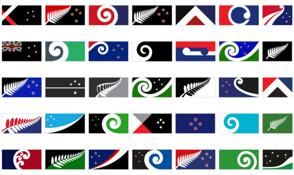
A recent vote on five finalists further narrowed the field; the “red peak” lost handily to one of the two options containing a fern.
A final vote to either move forward with the new flag or remain with the old is set for March. Critics of the vote note the cost and loss of history associated with the potential change, while advocates would like a flag less easily confused with that of their neighbor to the west.
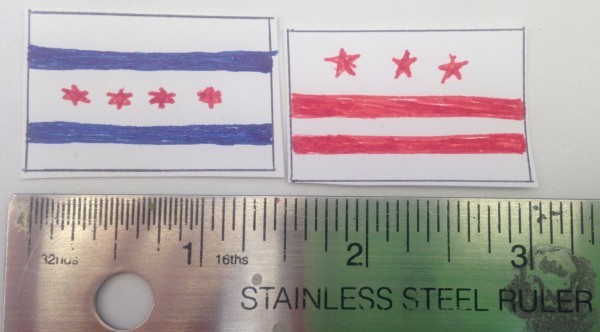
Tempted to try your own hand at flag design? Here is a trick: start by drawing a one-by-one-and-a half inch rectangle on a piece of paper. A design at these dimensions held 15 inches from your eye looks about the same as a three-by-five foot flag on a flagpole a hundred feet away. If it does not work at this scale, it will not work at any scale.
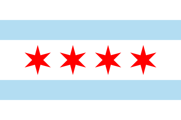 If you are unhappy with your own city, state or even country flag: start rallying your fellow citizens to come up with something better. A flag should be something meaningful, a point of pride worth flying high.



Comments (18)
Share
At least it doesn’t say #Pocatello.
The new New Zealand flag referendum was lost. They’re sticking with the Union Jack/Southern Cross combo.
Love this story. Thank you. Was reading product hunt today and found this related bit. http://flagstories.co/
There have been over 1000 submissions from the public to redesign Milwaukee’s flag. I’m honored that I’m one of the 5 finalists up for vote. You can learn more about the symbolism in my flag design here: http://robertlenz.com/mkeflag – and don’t forget to vote! Milwaukee is a great city that deserves a truly great flag!
The city of Laconia, New Hampshire is also redesigning their city flag. The current flag is overly complex and underused. I am fortunate enough to be on the committee charged with organizing the contest to find a new flag. We hope to find our new flag and have it adopted before the end of 2016. This endeavor is thanks, in large part, to the TEDtalk from last year. Thank you!
The state of Minnesota right now has a larger active social effort than the city of Minneapolis to change the flag. There’s a FB group with over a 120 members and many submissions to boot. A little shout out from Roman would certainly help the cause!
https://www.facebook.com/groups/60969148707/permalink/10154281494838708/
Looking at the largest city in each of the 10 largest U.S. metropolitan areas, 8 of the 10 have flags with the city seal on them: New York, Los Angeles, Dallas, Houston, Philadelphia, Miami, Atlanta, and Boston. Speaking as an Atlantan, ours is the ugliest.
We’re starting work on the Oklahoma City flag!
okcflag.org
Just watched the segment on your work on CBS Sunday Morning with Mo Roca. Great segment. I am a recent transplant to Wichita, KS. For all that Wichita doesn’t have, it has recently taken great pride in its flag. You now see the flag everywhere – it has become a huge fashion statement to have creative versions of the flag on clothes, signs, etc. And it is a worthy design.
With Trumps presidency perhaps people could be mole receptive to the idea of competitions and/or commissions for new state flags. This needs to be campaigned
Never did hear back from Mr. Mars about this SF flag redesign I came up with. If you revisit this topic again, I’d love some feedback:
http://imgur.com/58vl1uZ
http://imgur.com/IeJUhpJ
http://imgur.com/s4XJ4Qh
http://imgur.com/7nVdLut
The Bowling Green folks are overthinking it. The fountain device in their current flag is unique and attractive and should be the element used in the flag. The rayed stripe look is derivative without being classic, and looks both dated and disposable.
The Lowell design is beautiful but a bit too much like a July 4th festival banner. Why the clean sheet redesign? Plenty to work with in that very busy city seal; just choose an element or two and a couple of the colors and make something cleaner. Mountains, river, vaults, sunburst, trains smokestacks, cornucopia, etc.; lots to choose from for either abstracted geometric or streamlined heraldic charge. And clear, bolder, more unusal colors then the same old red/white/blue stars and stripes .
My city rode the wave on interest in vexillology and came out with a city flag a couple of years ago. At first glance it seems to follow the rules, but one big thing bugs me, and once you see it, it can’t be unseen.
https://upload.wikimedia.org/wikipedia/en/thumb/2/2d/Flag_of_Lafayette_Indiana.svg/1280px-Flag_of_Lafayette_Indiana.svg.png
My issue is the two red triangles on either side. They’d be fine and dandy… if they were only parallel! The diverging angle bugs me to no end! I have no idea if it was meant to be like that on purpose, but surely someone noticed!
Pocatello’s flag design finalist polls just closed! http://flag.pocatello.us/
Roman Mars has influenced a city!
http://digital.vpr.net/post/montpelier-unveils-new-flag-after-old-design-shamed-ted-talk#stream/0
Funny video about the potential Confusion about flags
https://youtu.be/TuliPrHmyjU
I kind of like most of the “ugly” flags; they have a lot of personality. I hope Milwaukee doesn’t let themselves get stampeded into changing theirs.
Yeah, yeah, it’s busy and not easily identifiable at a distance and all that stuff. And if Milwaukee was currently fighting a war with Minneapolis and needed to make sure their troops and vehicles were distinctly marked, that would mean something.
Nonsense. San Francisco’s flag looked better before, the new one is way too… meh. It’s ugly, plain and simple. Same in general for the others. Less is a bore.
A flag of Mexico without a seal is an Italian Flag. Russia is basically Slovakia or even Slovenia without a shield. And there are far too many other examples.