In late 2015, we began the process of redesigning the 99% Invisible website. The new site needed to be beautiful, functional and mobile-friendly. This relaunch was also part of a larger plan to branch out beyond episodes (and companion content) to articles, videos and other media. Below, you can take an inside look at the process we followed, design options we considered and new features of the site, all developed in collaboration with the talented Duck Brigade. At the end, we also have some suggestions for your own future web projects.
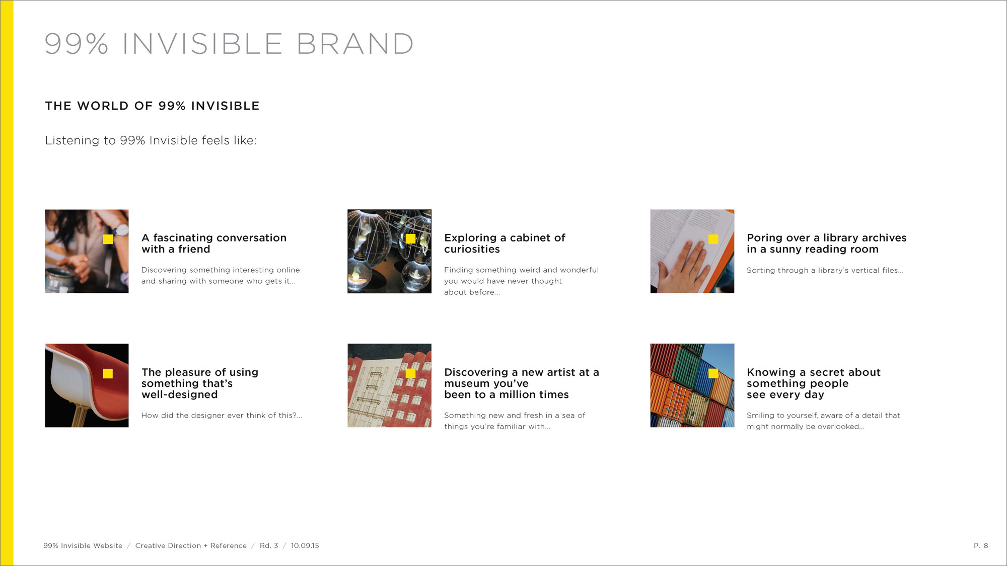
With the creative team of Duck Brigade, we dove into discussions about creative direction, visual identity, user experience and site organization. Establishing a foundation before tackling visual layouts or designs, these conversations formed a touchstone for the rest of the project.
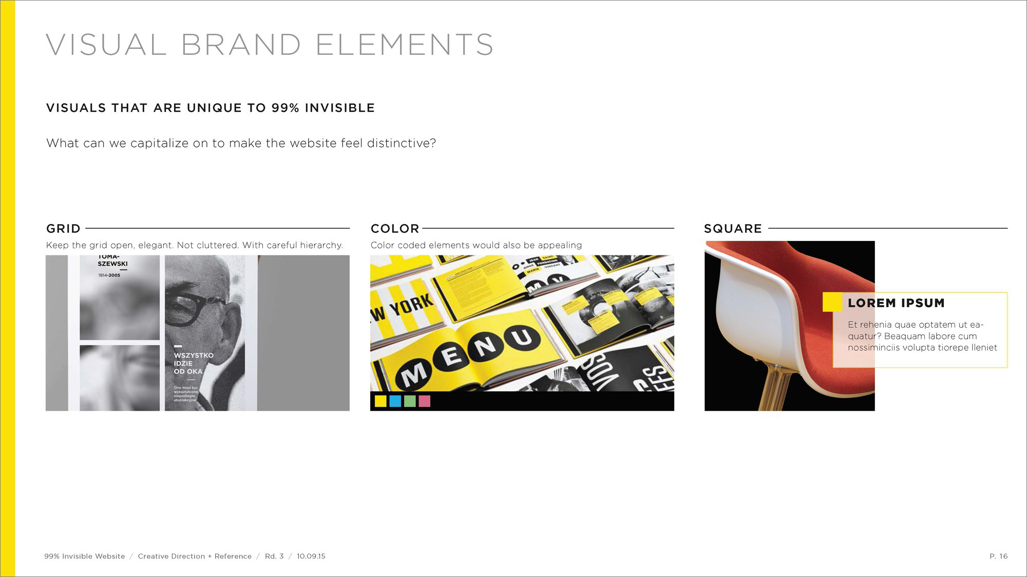
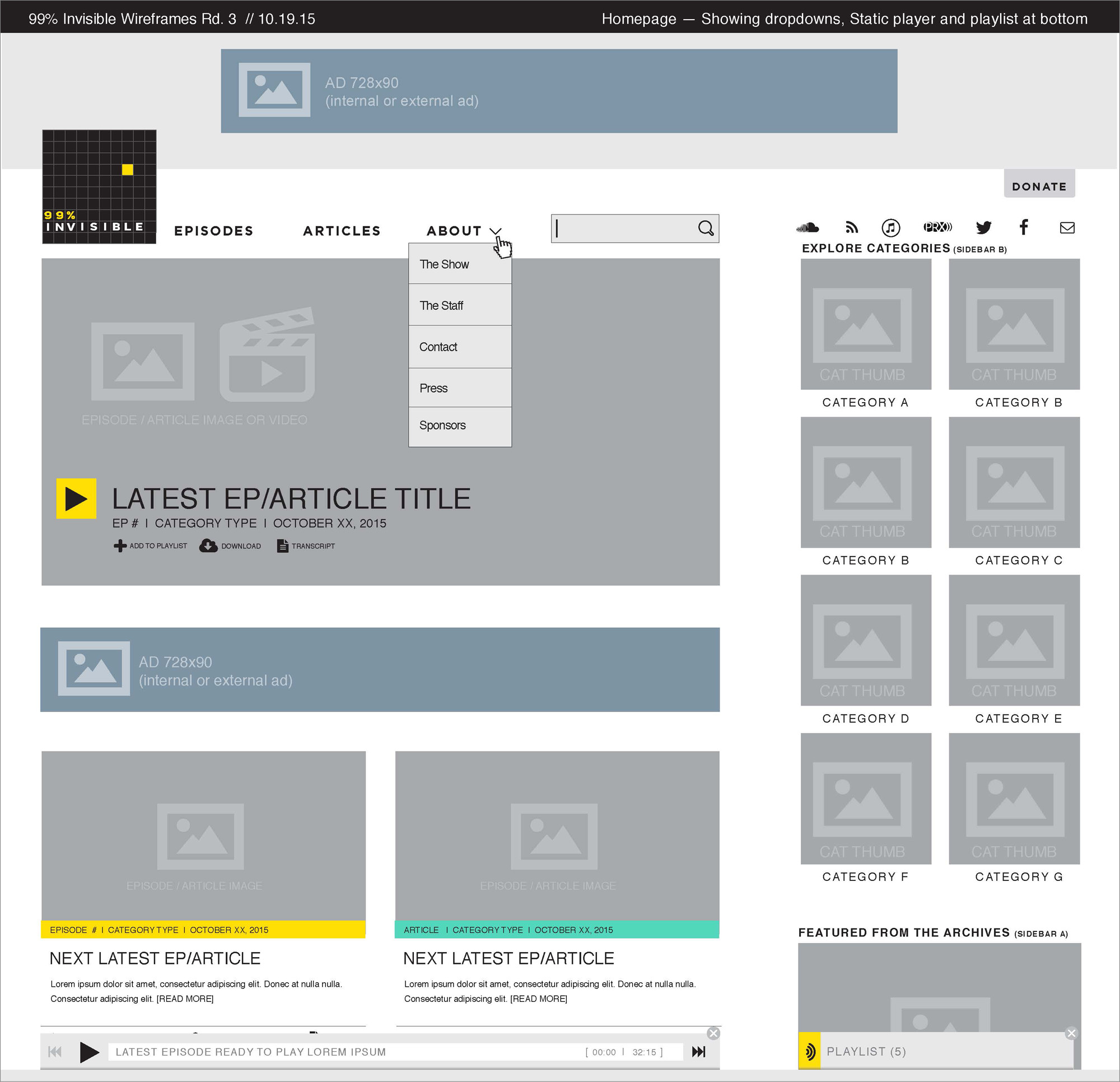
By the time we started developing wireframes, we had a strong sense of what general direction to take things in, though much would still change across numerous rounds of development and iteration. Indeed, what you see here is a small fraction of these steps at critical junctures.
With wireframes in place, we engaged in further design exploration, experimenting with a range of options, including the following:
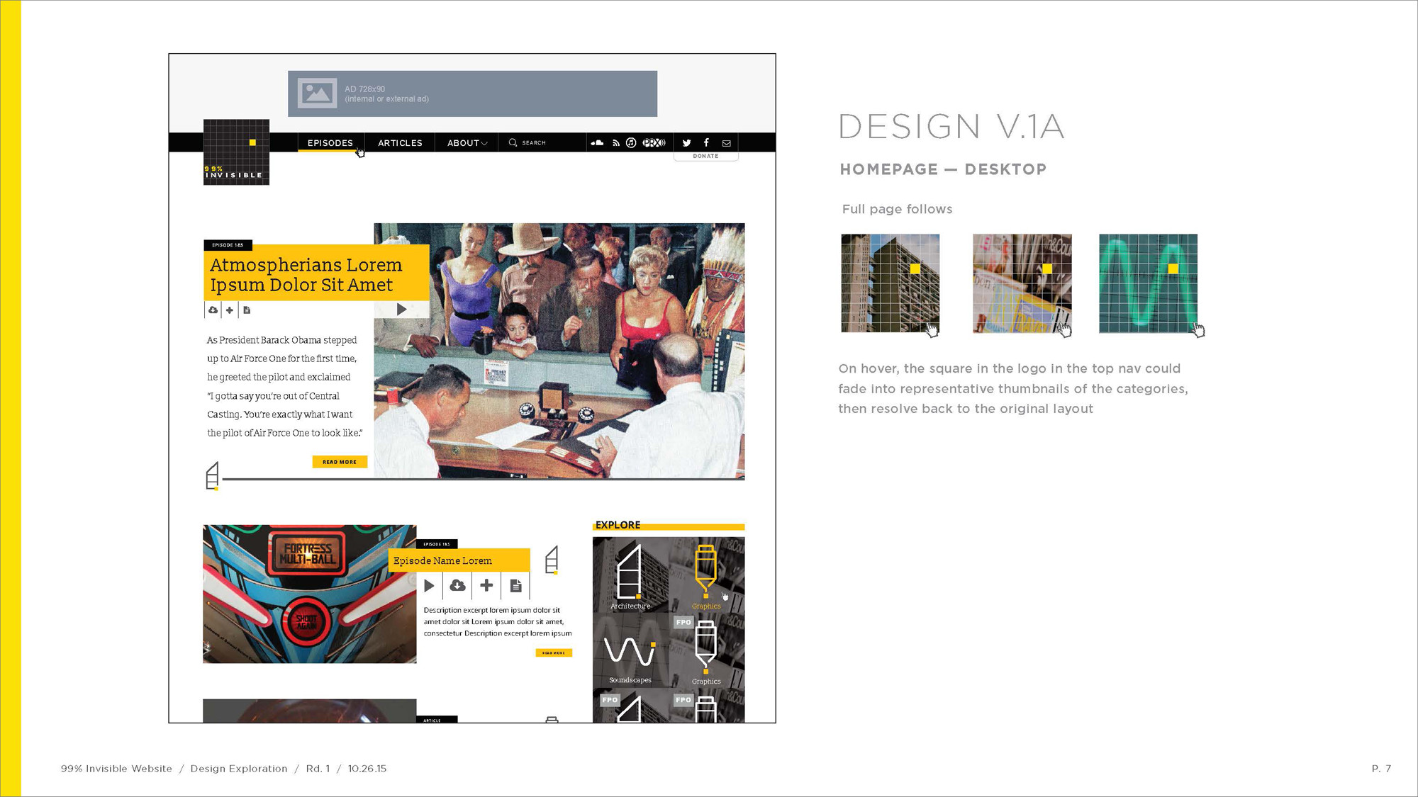
Design Version 1
In many ways the most straightforward of the initial designs, this option kept to a simple color scheme and used elements like grids and icons to liven up the design without compromising usability.
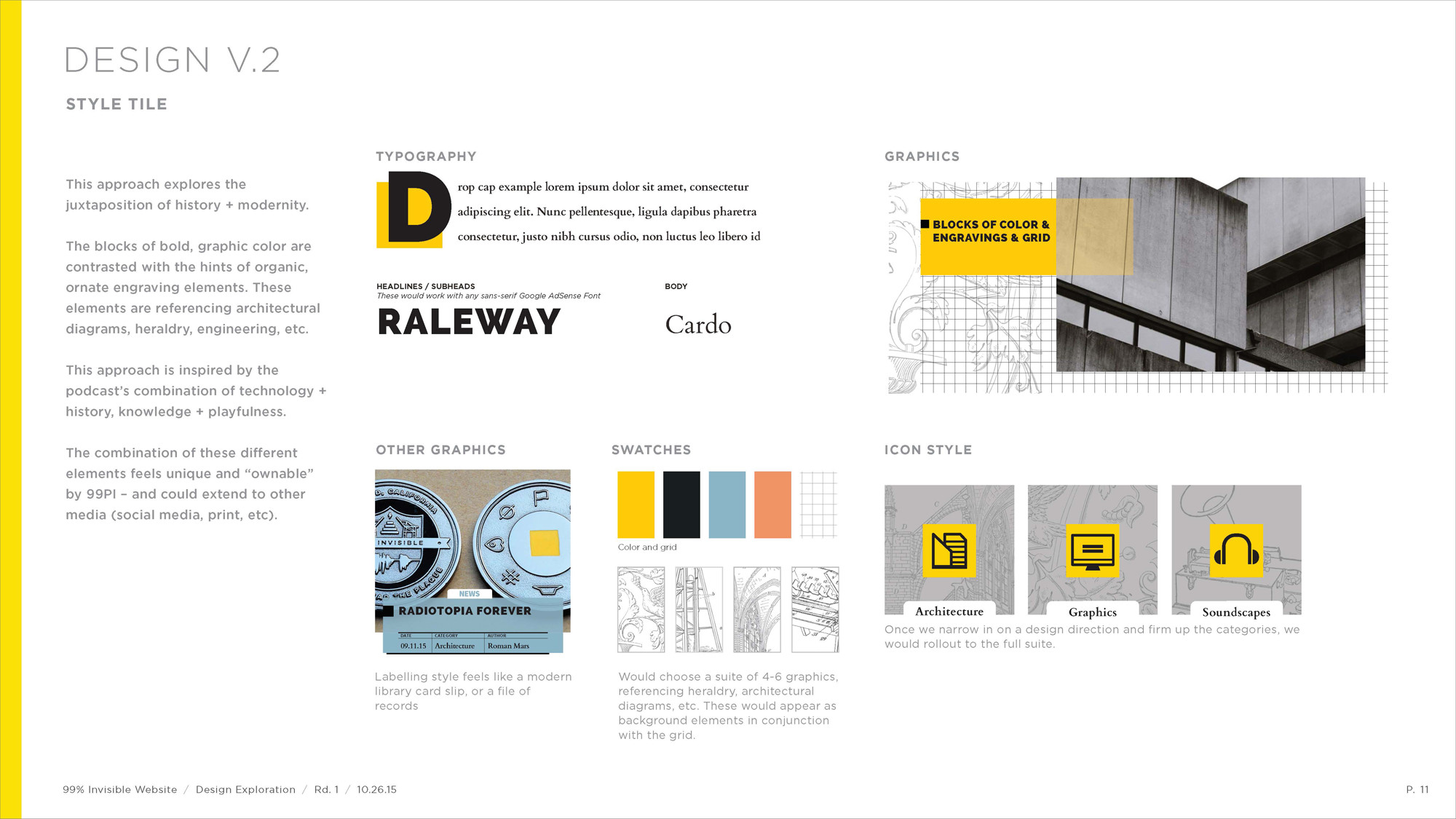
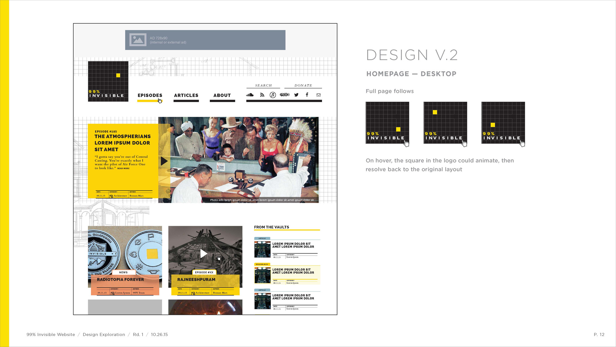
Design Version 2
The second option explored more intricate details and a slightly more complex color scheme, including a typographic strategy and image overlay approach that would be incorporated in the final design.
Design Version 3
The third direction was bold and crisp but also very playful, pushing the limits with rich and complex icons as well as bright color options.

After multiple rounds of evaluation and refinement, we arrived at a semi-finalized design, subject to small changes in development.
At this point, we began developing the site’s architecture in parallel with further design refinement. Along the way, we arrived at creative solutions to address site-specific usability challenges.
A persistent player was developed with an associated playlist, allowing visitors to collect episodes for current and future web listening.
A custom navigation system was created to let visitors browse the archives by producer, year, category and combinations thereof.
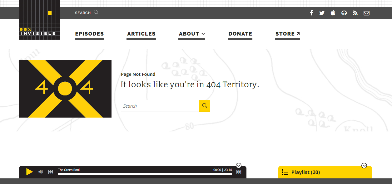
We also created “Easter eggs” for die-hard fans of the show, including a module featuring the voices of Mazlo and Carver (hit the donate button at the bottom of the page to hear it!) and a 404 page flag.
And, of course, the site is a work in progress as we continue to fix and improve things. For instance, we recently developed a new direct-embed feature that allows authors to post old episodes in new articles. This feature conveniently ties into the site-wide persistent audio player.
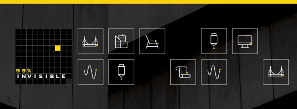
Launched in early 2016 (but continuing to evolve), the new site offers fresh ways to navigate and new kinds of content to explore. The resulting design has been highly praised and helped win some awards.
As with any big design project, a lot of thought and work went into everything you see on 99pi today, so we do hope you enjoy the site!






Comments (4)
Share
I don’t see any discussion whatsoever of code quality, Web standards, or accessibility. All you talk about is making things look pretty and reinventing wheels.
What did you build it on?
Not many secrets here.
…I just looked it up.
Wordpress. If this is true, nice job. It does not come across as a wordpress template.
The secrets was just a reference to the ‘Easter eggs’ and 404 page which might go unnoticed. And yes, WordPress! Many of the top sites on the web use it and I highly recommend it: https://techcrunch.com/2012/04/11/study-half-of-the-top-100-blogs-now-use-wordpress/