Here at 99% Invisible, we think about color a lot, so it was really exciting when we came across a beautiful book called The Secret Lives of Color by Kassia St. Clair. It’s this amazing collection of stories about different colors, the way they’ve been made through history, and the lengths to which people will go to get the brightest splash of color.
Red

Starting with the color red is fitting because it seems to be the most universally loved color throughout history. It’s probably the most heavily studied color of the spectrum, and although the data is shaky, it’s thought of as the color with the most measurable impact on our lives. One classic example of how red possibly influences our behavior is in sports. If you look specifically at soccer teams in the United Kingdom since World War II, teams that wore red during matches statistically did better than they should have. Similar studies have been done at Olympic games and in combat sports with similar results.
One of the oldest red pigments is called hematite, and it comes from the mineral form of iron oxide–essentially rust. It’s very common in the earth’s crust and found throughout the world. It’s so prevalent that an anthropologist once claimed that the two consistent markers of human evolution were toolmaking and wearing hematite red. But hematite eventually fell out of fashion as humans pursued brighter versions of the color red.

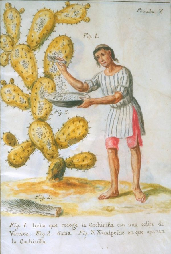
Cochineal is another pigment of red that’s derived from a scale insect of the same name. It’s typically found in South and Central America, so it was widely used in Aztec and Inca culture. It took around 70,000 of these bugs to get one pound of raw cochineal dye. This pigment is actually still used today in food and cosmetics under the label E120, meaning there’s a good chance that your strawberry yogurt was made with bugs!
Purple

People have long associated the color purple with royalty. This is especially true when you look at the origin of a dye called Tyrian purple. It was originally derived from two varieties of shellfish found in the Mediterranean, produced by a pale gland in its body. When squeezed or prodded, this gland produces a single drop of clear garlic-smelling liquid that when exposed to sunlight, turns from green to blue, and then finally to a dark reddish purple. It took 250,000 shellfish to produce one ounce of dye, and these shellfish were hunted to the point of near extinction. This dye was beloved throughout the ancient world, and because it was so expensive and hard to come by, it was automatically associated with power and royalty. There was even legislation that dictated who could or couldn’t wear the color.
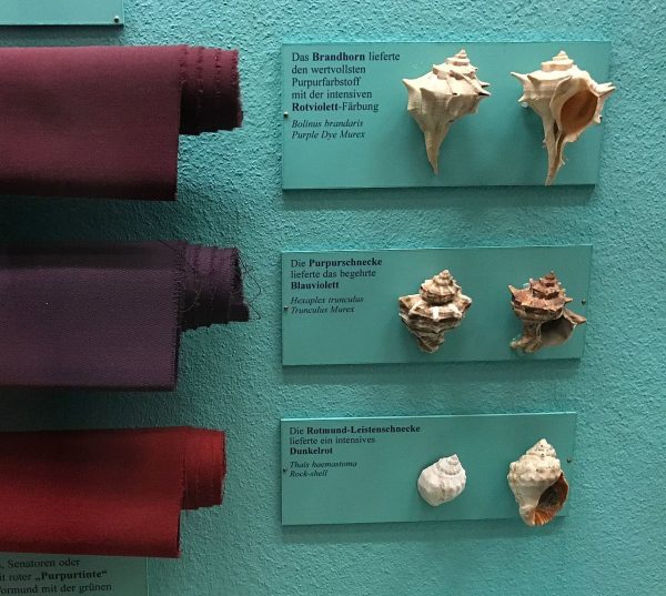

There is a famous story in which Emperor Nero attended a recital and spotted a woman wearing Tyrian purple. She belonged to the wrong class, so he ordered her removed from the room, whipped, and her lands confiscated because he saw her clothes as an act of usurping his power.
The color purple eventually went into decline due to the scarcity of the shellfish used to produce the dye, and also because of political turmoil in the Mediterranean where it was manufactured. It wasn’t until the mid-1800s when purple came back into fashion due to an accidental discovery. A young scientist named William Henry Perkin had been trying to create a synthetic version of quinine (which was then used to treat malaria). In the process of trying to create synthetic quinine, the scientist accidentally produced a purple sludge. Rather than throwing away the failed attempt, he added a bit of water and dipped some cloth into it. Turns out he had accidentally created a colorfast synthetic mauve dye. This kicked off an entire revolution of producing synthetic dyes that didn’t require killing hundreds of thousands of insects or shellfish.

Green

Although green is everywhere in nature, making a green dye was historically very difficult. But in 1775 a Swedish scientist named Wilhelm Scheele created a synthetic pigment that he called Scheele’s green. There was a large market for the pigment, and because it was relatively cheap it was used very widely in fabrics, wallpapers, artificial flowers, etc.
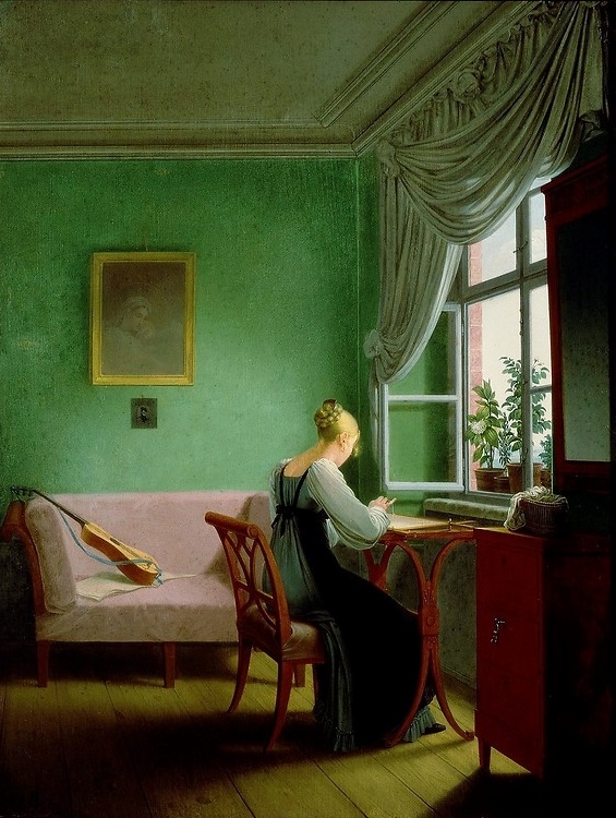
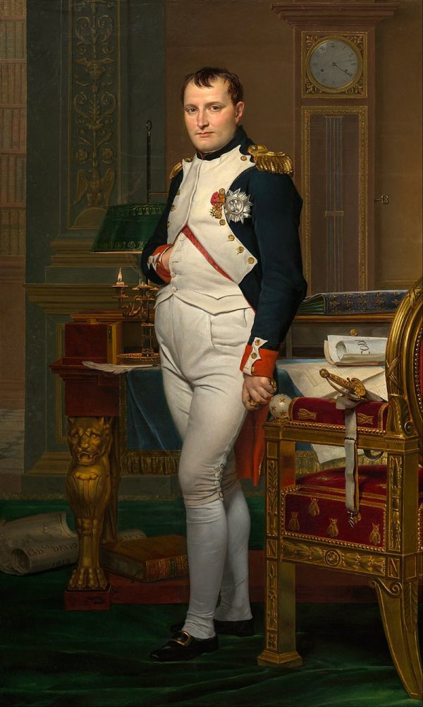
This green pigment was derived from a compound copper arsenite which is incredibly toxic — and that a piece of Scheele’s green wallpaper that was only a few inches long had enough arsenic to kill two adults. It’s been rumored that Scheele’s green’s most famous victim could have been Napoleon. The French leader had a lot of arsenic in his system when he died. However, after his death, samples of hair showed that he had elevated arsenic levels in his blood throughout his life. While his green wallpaper probably didn’t kill him, it couldn’t have been good for his overall health.
Blue

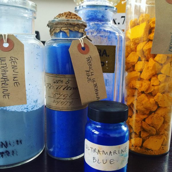
Blue is one of the most popular colors in the world, but up until the 14th century, it was not nearly so beloved. It was only with the rise of Christianity and the cult of the Virgin Mary that blue became fashionable in the West. Around this time the Virgin Mary was becoming a more important Christian symbol, and she was often portrayed wearing blue robes. The color blue became associated with Mary and rose in prominence. Mary’s robes were often dyed with a blue pigment called ultramarine. Ultramarine is made from a semi-precious stone called lapis lazuli which is mainly found in mines in northeastern Afghanistan.
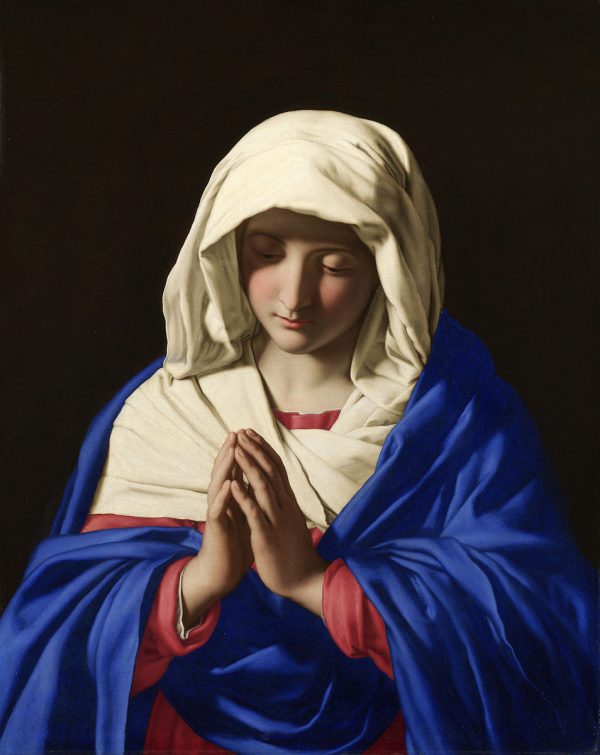
Ultramarine is a beautiful deep dark blue that looks almost like the night sky. In modern culture, we tend to think of blue as associated with boys and pink associated with girls, but if you go back a century and a half, it was quite the opposite. Blue was viewed as a feminine color because of its association with the Virgin Mary while pink was seen as a lighter shade of red, and viewed as a more masculine color.
Black


Black is a complex color that comes in many different shades, although we don’t always think of it that way. We have so many different words for white, but we don’t quite have the vocabulary to talk about the subtleties of black. But there is one type of black that stands out from the rest: Vantablack. It’s an acronym for vertically aligned carbon nanotube arrays, and technically it is not really a color at all. Instead, it’s a substance that absorbs more light than anything else in the world.
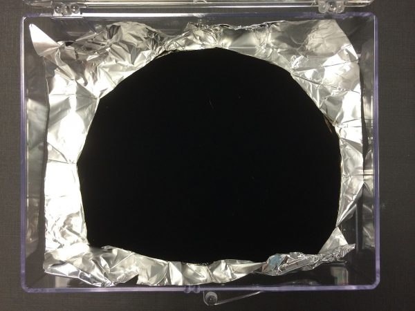
The substance is composed of vertically aligned carbon fiber tubes, and when the light hits it, rather than bouncing off and going back into our eyes, the light is trapped and absorbed amongst these tubes. As you stare at it, it’s almost like looking into a hole of nothingness, because in essence what you are seeing is an absence of light. Kassia St. Clair says it’s an uncanny experience. A scientist involved with creating Vantablack even said that he received calls from people who had seen it who believed that this creation must somehow be the work of the devil. It goes to show the primal reactions that colors still have on us regardless of how much they’ve evolved over time.

As Kassia St. Clair says, “Colors are cultural creations and they’re kind of shifting all the time, sort of like tectonic plates. Color is not a precise thing. It’s changing, it’s living, it’s constantly being redefined and argued over and that’s part of the magic of it!”


Comments (10)
Share
As an elementary art teacher I loved this podcast. I wish I could ask Ms St Clair about rainbows in children’s art. To the child artist each rainbow has meaning, and I’d caution adults against dismissing these kid-creations as trite.
I enjoyed the opening comments about your twin boys and color preferences. I am a twin. While my Mother and father could tell us apart, most people could not. So my Mom dressed my sister in shades of pink and red and I wore shades of blue. This continued even once we started choosing more of our own clothes. It was until we went to separate colleges and had more separate lives that we began to wear what pleased ourselves. Now in our 60s I cans tell you i don’t have any pink/reds in my closet. However, my sister often wears blues.
People always mention how Russian has different terms for light blue and dark blue, as if that is something really strange. But in English, we have 3 terms for shades of red and we often consider them to be 3 separate colors, rather than 3 shades of the same color. Red, Pink, Maroon. We don’t really say “light red” or “dark red” as we do with blue or green. Gary, also, is considered a separate color, no one calls it “light black.”
What color is the sky? Blue. What color is the ocean? Blue. What are Michigan’s colors? Blue and maize. What are the Carolinas Panther’s colors? Blue and black. All different shades of blue. Sometimes referred to as: light blue, dark blue, navy blue, carolina blue, royal blue, sky blue. But all ‘blue.’
What color is blood? Red. What color is cotton candy? Pink. What are TX A&M Colors? Maroon and white. All shades of red, but never “light red, dark red”
Considering made me think of Mr. Jones from Counting Crows
“I will paint my picture
Paint myself in blue and red and black and gray
All of the beautiful colors are very very meaningful
Grey is my favorite color
I felt so symbolic yesterday
If I knew Picasso
I would buy myself a gray guitar and play”
Vantablack should be called “fuligin.” Shout out to Gene Wolfe.
Makes me think of Counting Crows’ Mr. Jones
“I will paint my picture
Paint myself in blue and red and black and gray
All of the beautiful colors are very very meaningful
Grey is my favorite color”
I enjoyed this episode, but with a certain wistfulness. I am red/green colorblind, and my inability to distinguish colors means that I tend to stay out of conversations about them, and the passion that people feel about colors largely passes me by. I can’t tell red from amber traffic lights without looking at position, and the green lights are white. Many other greens appear indistinguishable from grey for me, and I can never really be sure if a color is blue or purple because I can’t see the reds.
I’d love to hear you do a follow-up episode on design for colorblindness. I really appreciate games on my phone that offer a colorblind mode or allow me to label colors in another way, and the bane of my existence is bicolor LEDs that show whether a device is on or in standby mode with red and green. Wireless mics are particularly bad about this.
Thank you for everything you do.
Hi,
Just listened to the part where you talk about Red. As a Brazilian, I find that you missed a very important one. Brazil’s name is because of a tree, Paubrasilia echinata, which has a very beautiful red tint to its wood. The portuguese colonizers and explorers boiled the trunk to extract the pigment to tint clothing. It was so profitable that they named the country after the tree and exploited the indigenous population to extract the tree from the otherwise impenetrable Atlantic Rain Forest. The tree almost went extinct and it is now protected in Brazil.
And what about the brown color?
There’s an art exhibit in meow wolf convergence station that had me come to this website with an artistic hashtag, really interesting! I also wrote a kid’s show about color theory and always love learning more, I’ll have to check out this book