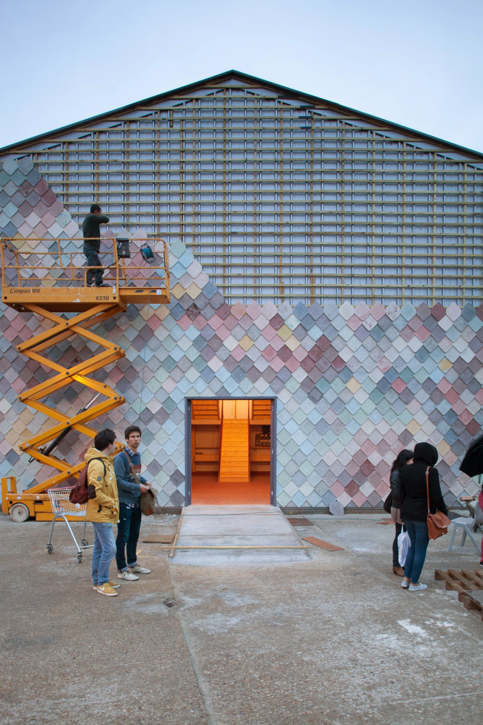
If you’re on Instagram there’s a decent chance you’ve seen a picture of this particular building called the Yardhouse. The Yardhouse was designed by the London-based architecture collective Assemble. The designers had just moved into their first studio in the Stratford neighborhood and they wanted to build something on the empty yard out front, a collaborative workshop for designers and artists. It was intended to be the new model of affordable workspace.
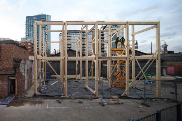
The problem was that they only had a short-term lease. The property was going to be redeveloped after the Olympics, and so they knew they needed to build a cheap structure that could be disassembled in a couple of years. The designers focused on things that made the building functional and inexpensive. They used a simple timber-framed structure and cheap mass-produced components. The building was like an urban barn, with high ceilings and lots of open workspaces.
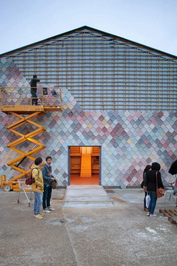
But the reason you may have seen this building has nothing to do with any of that. The Yardhouse isn’t Instagram-famous for its DIY design or its off-the-shelf affordability. It’s famous for one design decision that had very little to do with Assemble’s larger vision. The architects knew they were going to have to look at this building all day long, so they allowed themselves what seemed at the time like one small concession to beauty—a bespoke facade made of hand-poured, multicolored cement shingles. After making thousands of these shingles, they ended up with this gradient of different pastel colors. They looked like the scales of some magical tropical fish.
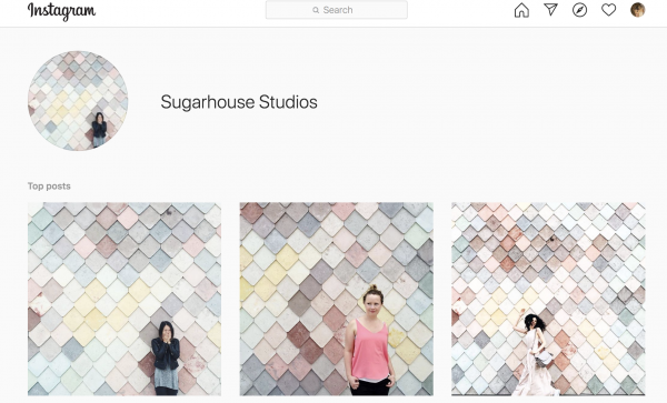
“In the summertime, we would eat our lunch outside in the yard and we started to notice groups of people kind of wandering in and then getting their photograph taken in front of the building in—in front of the wall really,” says Joe Halligan, a designer at Assemble. Soon photos of the wall started circulating on Instagram with the hashtag #sugarhousestudios, and a geotag of the exact location of the Assemble offices, which only increased the Instagram traffic.
These photographers weren’t interested in the affordable workspace for artists or that Assemble had managed to build something so cheap and functional, they were only interested in that beautiful facade. Professional photo crews started calling the office to try and “book the wall.” And people were showing up from all over the world. People would take photos of couples kissing, babies crawling, and kids doing handstands in front of the wall. The architects at Assemble weren’t trying to lure people to the backlands of East London, but they accidentally designed the perfect Instagram fly trap—a wall that met all the criteria of what stands out on the app. Whether we like it or not, Instagram is creating new rules about what kind of design looks good and what deserves our attention.

Do It For The ‘Gram
Design critic Alexandra Lange says that the visuals required to look good on Instagram are quite simple—bold colors and patterns are good, like a colored wall. “It has to be relatively few elements, centering is good, a pop of color is good. And the lighting has to be good enough so that the colors stand out,” Lange explains.

Lange says that hotel and restaurant interiors, in particular, are being affected by Instagram. Increasingly these spaces have been designed to lure you with their Instagrammabilty. “You know, one architect told me that it’s really important to have an Instagrammable bathroom,” Lange recalls, “So good lighting, [and] a cool feature wall behind the mirror. People want to pop into the bathroom and take their selfie and sort of say, ‘I was here.’” These days “Instagram moments” are common in design briefs. Verda Alexander is co-founder of an interior design firm, O+A, and she says they were hired to create many of these moments. Even when clients aren’t demanding it, Alexander says platforms like Instagram are impacting the design process.
Alexander was a judge this past year at a few design competitions, and it felt like everyone was just copying what was cool on Pinterest—which at the time was “Memphis,” a style of colorful postmodern design from the 80s. It was full of pastel colors and round mirrors with arched doorways.

Alexander says that when designers rely too heavily on platforms like Pinterest for inspiration, they can get stuck in this derivative loop. By focusing on digital trends designers lose track of livability, workability, and climate—the kinds of things you can’t capture with simply a photo. Joe Halligan from Assemble says that as a designer it’s impossible not to think about how something you make will be photographed saying, “I think you have to be aware that when you’ve finished [a] building […] most people will view it through the image. And so do you then pander to that? Or do you still ensure … the kind of main focus is on the person who visits the building and experiences it?”
Instagram Playgrounds
If you want to see full-on Instagram pandering, just check out one of these “Instagram playgrounds” that have popped up around the world in recent years. These are collections of rooms designed to serve as backdrops for your photos. You aren’t really supposed to play in them at all, just take a few pictures and move on to the next room. “It turns architecture into a photo-op basically a flat experience,” explains Lange. Right now this flat, photo-op architecture feels pretty contained to the cafes and the boutique hotels and the Instagram playgrounds, although it’s not hard to imagine it escaping from the color factory and slipping out into the broader city.
But Alexandra Lange doesn’t want to say Instagram has been ruining architecture. About ten years ago when Instagram was just getting going, Lange took a trip to an under-appreciated site for bizarre postmodern architecture: Melbourne Australia. “I’m just completely wowed by these buildings because they’re spiky, they’re covered in neon… and they’re like nothing I’ve ever seen before. And I suddenly have this overwhelming desire to share!” A visual platform like Instagram was the perfect place to share these slices of architecture that she was appreciating. Lange’s time using Instagram led her to believe that the app can have a positive effect on architecture—a place where you could offer a window into the built world and encourage people to notice overlooked buildings.
Designing for the Camera
Lange doesn’t think that those “Instagram moments” get in the way of good design because it is possible for a building to be well designed and also have all of the factors of a good “Instagram moment.” Moreover, designing for the camera is really nothing new. “From the 1920s and 30s onward, any ambitious architect has been conscious of and very attentive to the role of photography in conveying his or her work to a broader public,” explains architectural historian Keith Eggener from the University of Oregon. Eggener says that most modernist architects were very aware of how photography could bring their work to a wider audience. Big names like Richard Neutra, Le Corbusier, and Luis Barragán all embraced architectural photography.
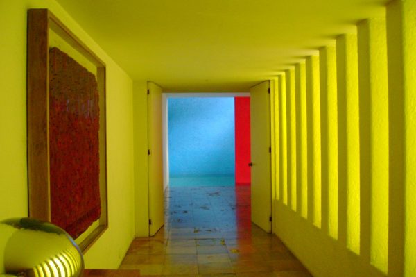
Barragán worked closely with one photographer, in particular, a man named Armando Salas Portugal, and the most famous photos of his work are really a collaboration between two visual artists. Keith Eggener doesn’t think that Barragán designed his buildings for the photographs, but “he was an architect who was supremely interested in the way things looked—not just in fully dimensional lived experience, but also on a two-dimensional photographic surface [….] I would not doubt that he would consider the way these were going to look later on.” Those photos played a pivotal role in his career. When Barragán won the Pritzker Prize for architecture in 1980, he wasn’t very well-known outside of Mexico. Eggener actually wrote to the members of the Pritzker jury to ask how they had decided on Barragán. Most of the jurors declined to comment, but one revealed that many of them hadn’t actually seen Barragan’s buildings in person, only the photographs.
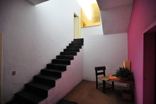
Today Luis Barragán’s buildings are actually really popular on Instagram. The Barragán house in Mexico City even charges extra if you want to take photos on your tour, and people gladly pay the fee to get onto the roof of Casa Barragán with its pink Instagram-friendly walls. Those flat plains of color are consumed by thousands of people on an app, who may or may not have any idea about the real-world context. That picture of your friend in front of a pink wall could be at the Barragan house in Mexico City, or it could be in front of the bright pink wall at the Paul Smith’s store in Los Angeles.
Full Circle
People aren’t always posting a photo on Instagram because they’re interested in telling the world about some cool buildings, sometimes they’re using a building to create a cool image. And it doesn’t necessarily even matter which building they use to do it. And when people copy those cool pictures, and the number of digital images grows, they start to lose their connection with the physical world. Just like what happened to the colorful Assemble wall. As more and more people came to the offices, thousands of images of their colorful wall started to circulate online. And if their building’s unexpected popularity wasn’t strange enough, the architects started noticing the cement tiles appearing as a stock photo like a generic wallpaper you might use for your desktop. Then that stock photo was being printed onto other things like laptop cases, rugs, and picture frames.

Joe Halligan from Assemble remembers being in Copenhagen and seeing someone sitting on the bus with a phone case based on the wall that they designed, “And they have no idea […] of the context of where that image has come from. And that’s super weird.” But it got even weirder because the photo of their wall that had become a stock photo had suddenly become a wall again. A shopping mall in China had turned the stock photograph back into a wall so that people could take selfies in front of it. The wall had made a strange journey from being architecture to an Instagram phenomenon, to a stock photo, back to being architecture again.
As for the real wall, the Yardhouse eventually had to come down. That had always been the plan. Assemble sold the structure. The Yardhouse is currently sitting in pieces in storage somewhere in London.
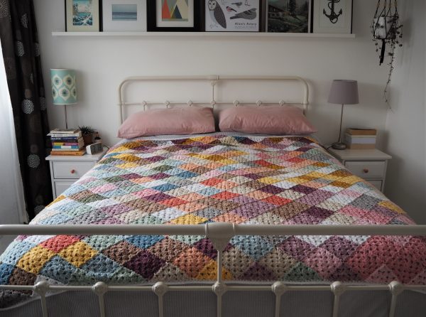
Tales from a Happy House
By popular demand, below are photos of Gillian Roe’s Sugarhouse blanket. You can follow Gillian on her blog and, of course, on Instagram.


Comments (8)
Share
Never cringed so hard at the anglofication of Barragán. Couldn’t bother to google the pronunciation?
Hey, that’s a pretty rude way to express yourself. Having a bad day?
Hey. I am a huge 99PI fan. Disclosure- I have not listened yet but I am excited to hear your latest offering.
I dislike social media in every way. I think its existence makes people unhappy, jealous and Instagram has encouraged people to brand themselves, oftentimes making everyone all the worse for the experience not to mention more fake.
So, while you are using your social media to virtue signal, vent snarky observations or just self importantly broadcast “hey! look at what I’m standing in front of”…pour a little bit out for that tweenage girl who needs to find the perfect lighting and suck in her belly before taking 20 pics before finding the perfect one to post.
99PI opened my eyes to design and awakened an absolute passion for it. The norman door, Thomasons, flags and even teddy bears have taught me not only about design but about myself.
when they designed the “like” button it created an endless feedback loop of gratification. The first hit was free.
I couldn’t help but ask, “why is this wall so attractive?” “Why do people want to take photos in front of it?” Yes, it’s flatness, repetition, and colorfulness all play a part. I’d argue that its mix of angular (diamond shapes) and round forms (the rounded corners producing a scalloped effect) also play a part. But most importantly – as anyone who paints portraits will know – these colors/tonal values are found in human skin and in the play of light and shadow on the skin, truly making the wall the perfect backdrop for a portrait.
Thanks for this wonderful insight. I know you address this was recorded pre-COVID but it was so good to listen to now amidst COVID and unrest. I enjoy listening to stories like this as creative outlets and mental breaks from the news of the current world. Thanks for sharing unique stories!
Pedantry alert! I’m sure that 99pi has mentioned this in a show before, but the tiles are made of concrete, not cement, as is shown in the video. Cement is almost never used on its own; when you mix it with sand or gravel and water, it becomes concrete.
Hey Roman and team, thanks for another great episode. It reminded me (some counterpoint, some congruence) of Stewart Brand’s “How Buildings Learn”. If you haven’t read it, you are in for *such* a treat. And surely there’s the germ of an episode waiting to be discovered in Brand’s dark black loam?
This is the first episode I’ve really disliked on 99PI. It felt so unnecessarily negative, snobbish, removed, and one sided. It sounds like what Assembly is doing is amazing and it was their choice not to turn public interest in their architecture and design into something more easily consumed by the general public in a way that would get their message and intention out there even if through a beautiful wall they built- and could have put up somewhere else or reproduced as a way of putting creative design out there for more people to use. And then on top of all that to speak about Instagram from an entirely outsider perspective and to pass judgements about people who want to capture moments of their life and share it with their friends and community, even if sometimes that sharing can be surface-level or wrapped up in the misogyny of our society, as if you’re better than them or they’re anything but harmless and simply intended. We’re learning about the internet and social media as we go which is fascinating, it changes so quickly and is influenced by so much and to shit on that in the name of the integrity of architecture which is in no way harmed by people taking pictures or liking pretty things feels like the sort of negativity I thought we left behind in 2010. Maybe if you had done the episode about Assembly and sustainable, artist-focused architecture and had the Instagram wall as the addendum, or truly focused on the intricacies of Instagram culture and history it would have come across as less pedantic and whiny. That being said I absolutely love the show, the topics, the reporting styles, the content. This was just a miss.