The 1968 Olympics took place in Mexico City, Mexico. It was the first Games ever hosted in a Latin American country. And for Mexico City, the event was an opportunity to show the world that they were a metropolis as worthy as London, Berlin, Rome or Tokyo to host this huge international affair.
Among other ground-breaking aspects of the Mexico 68 Games, the graphic design campaign (including the logo, posters and other graphics) would become one of the most famous in Olympic history. It would go on to set a whole new standard for future Games.
And these government-commissioned designs would also be co-opted by local activists, who wanted to reveal the darker political reality in Mexico — a reality that they felt was being covered up behind the beautiful glossy imagery of the 1968 Games.
Mexican Miracle
In the decades leading up to the 1968 Olympics, Mexico had gone through a period of major economic growth, which would come to be known as the “Mexican Miracle.” The country had rapidly industrialized, rapidly urbanized, and its capital, Mexico City, had grown into an enormous metropolis.
Due to its size and layout, Mexico City was a challenging place to host a major international event like the Olympics. The city itself was sprawling and spreading, still at the height of its “Miracle.”
The Olympic organizers needed to show their metropolis was not just exciting, but also safe and navigable. They wanted to create a visual identity to tie together everything that was going on during the Games, and to really sell Mexico City to all these visitors seeing it for the first time.
So they decided to hold an international competition to find a designer who would create a logo and graphic design campaign for the Games — they wanted a new look that was cosmopolitan and contemporary, and also distinctly Mexican.
Mexican Tradition Meets Op Art
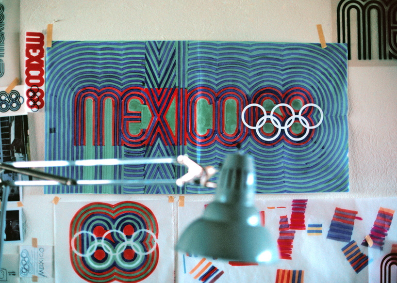
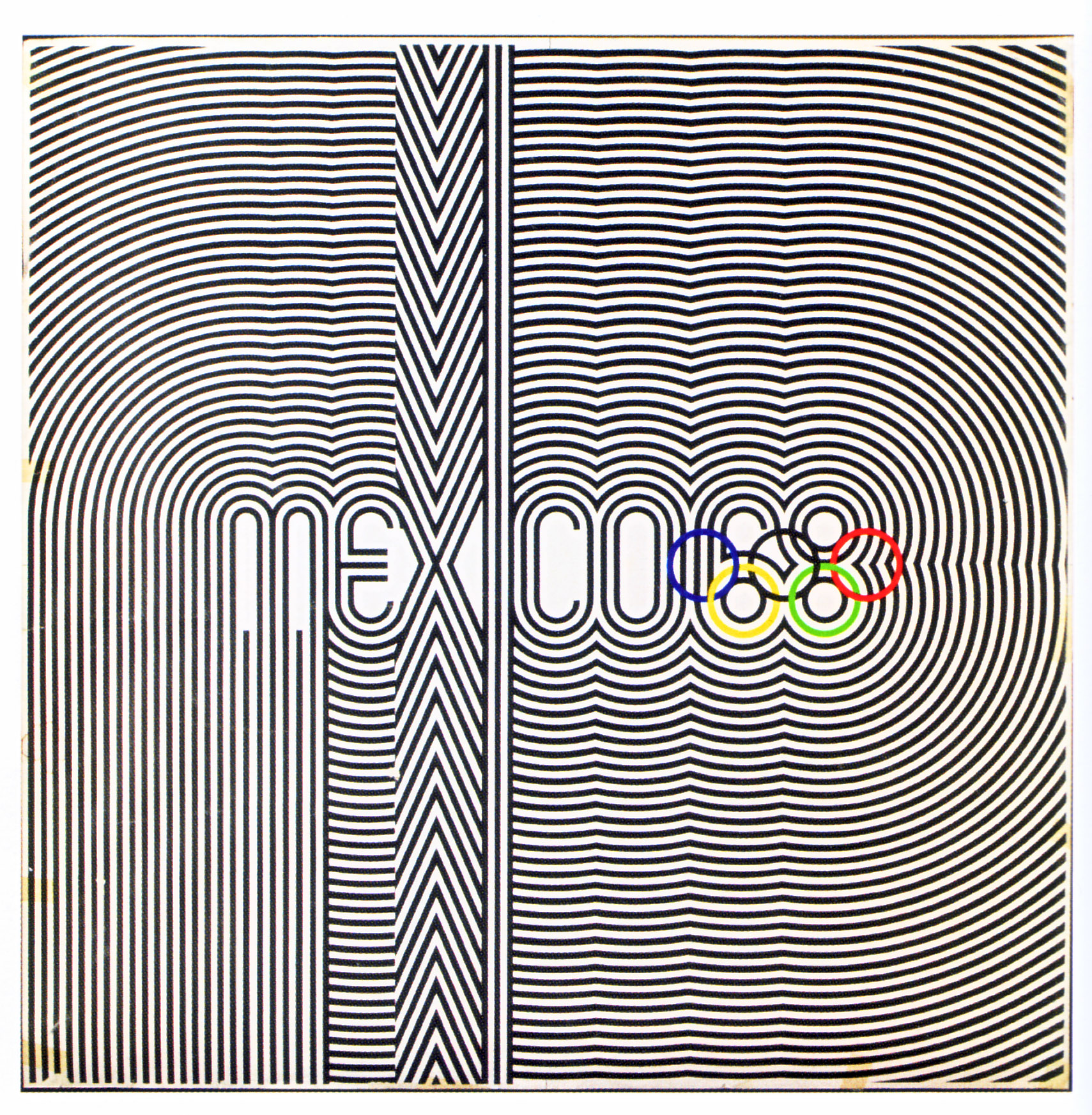
One of the contenders who flew down for a trial period was Lance Wyman, a 29-year-old graphic designer from New York City. He and his design partner, Peter Murdoch, could afford only one-way tickets. They went down in November of 1966, to try to make a design that would represent Mexico.
….And neither of them had ever been to Mexico before.
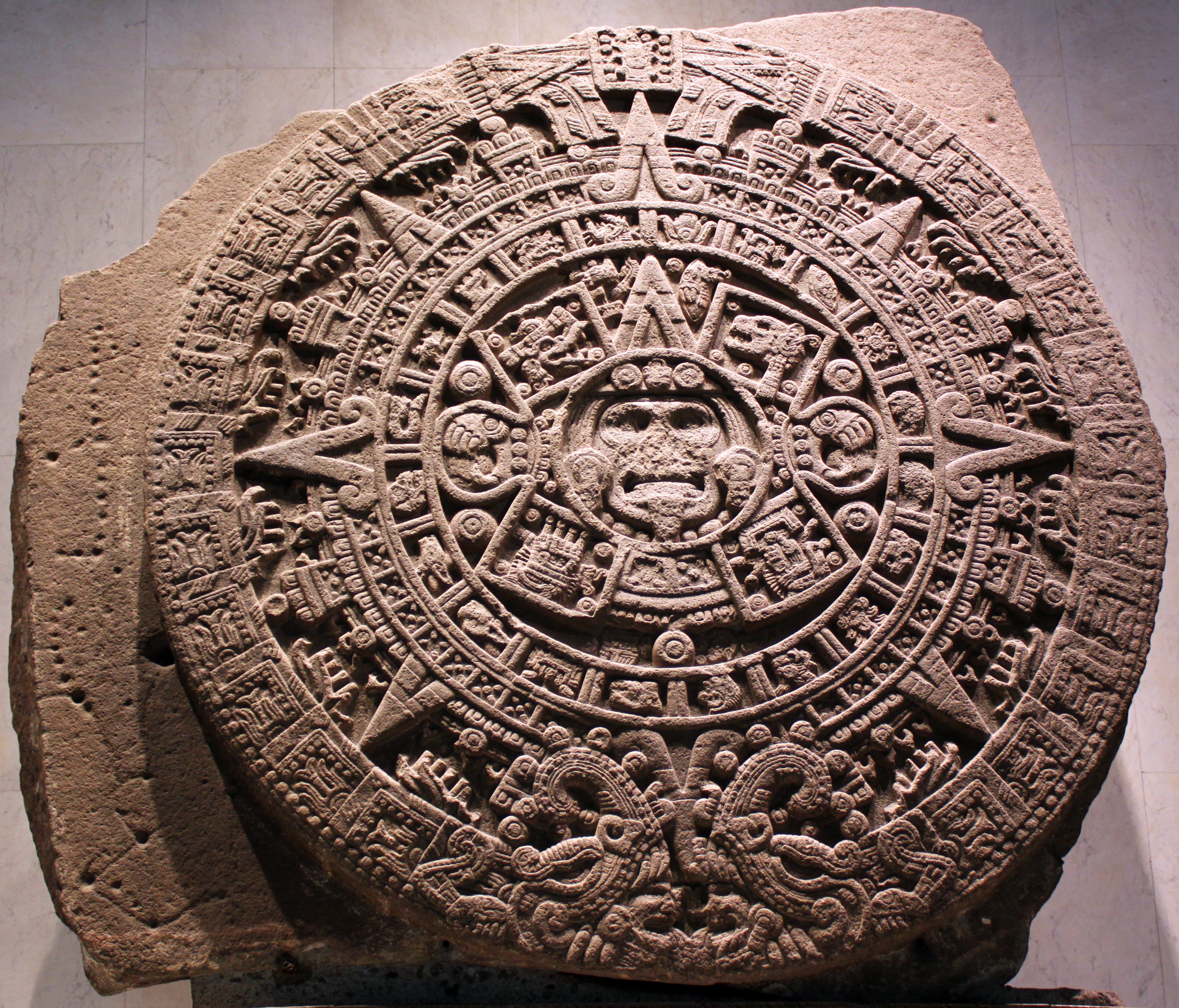
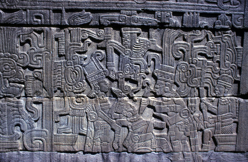
The pair started where most tourists start: visiting museums. They spent a lot of time at the Museum of Anthropology, where they studied artifacts from pre-Columbian Mexico, like the Aztec Sun Stone and ancient Mayan murals.
“I actually was floored by some of the early cultures,” says Wyman, “because they were doing things that we were doing in a contemporary way with geometry and with graphics.” The bold lines and bright colors and geometric shapes reminded Wyman of the kind of Op art that was popular among contemporary artists back in New York.
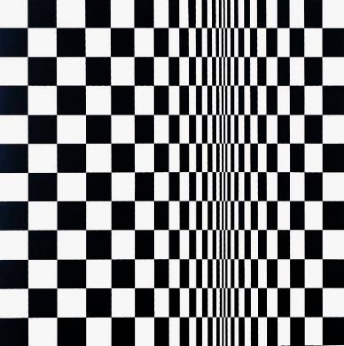
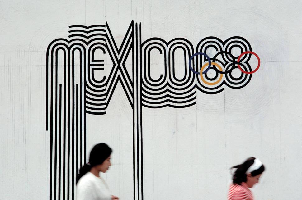
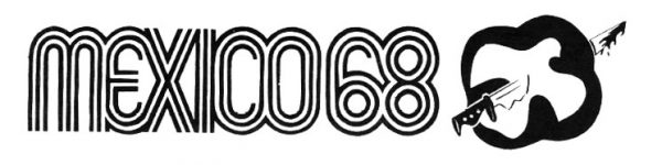
OP art, or Optical art, uses contrast, geometry and other tricks to give the viewer the impression of movement. And so, informed by both indigenous artifacts and modern OP art, Wyman came up with a hypnotic logo that riffed on the five rings of the Olympic symbol.
Wyman won the competition, and that was just the beginning.
Wyman took that logo, and turned it into a typeface, and then used that typeface to make more materials. But choosing this young and inexperienced American who had never been to Mexico before was a bit problematic. At the time, Wyman was “very much unproven as a designer…he’s very young and he hasn’t had much time to do much much yet,” explains Luis Castañeda, author of Spectacular Mexico: Design, Propaganda, and the 1968 Olympics. “And yet somehow he’s given this very high degree of responsibility.”
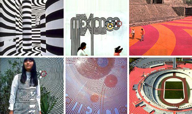
Wyman and Murdoch ended up staying in Mexico for two years to work on the campaign. They, along with a team of designers, many of them Mexican, came up with ways to use their typeface, logo and other designs all over the city. The hypnotic stripes were turned into striped uniforms for the events workers and volunteers. The patterns and colors used in the logo ended up on hats, postage stamps, balloons, and all sorts of products to hype the impending Games. Stadiums across the city were painted with radiating Op art patterns. Bright colors decorated sidewalks and walls and plazas.
 These bright, hypnotic designs gave the Olympic Games a visual coherence… but they also helped people find their way around. The graphic design language of the Olympics expanded into an entire system that helped visitors navigate the massive metropolis.
Wyman made simple color-coded icons to represent every sporting event. These were different from the gestural figures often associated with the Olympics. “They were not stick figures,” says Wyman — “they were focused more on a part of the body or a piece of the equipment or combination of the two.”
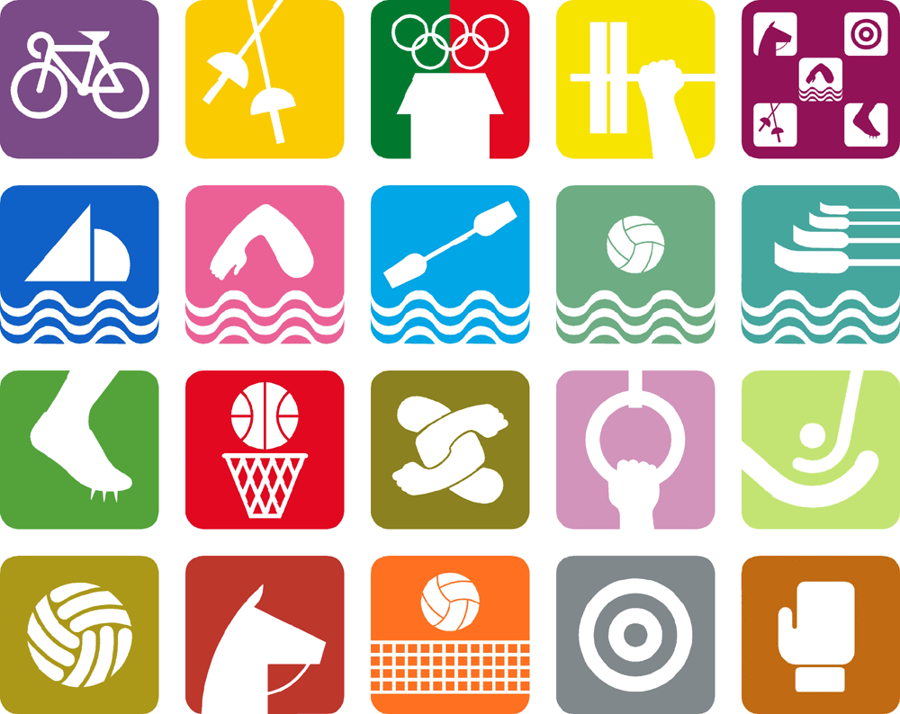
Visitors from other countries could use the icons and color schemes to navigate between gaming events, as well as cultural happenings, around the city. Following these signs, visitors could continue to entertain themselves and explore the city after the sporting events were over.
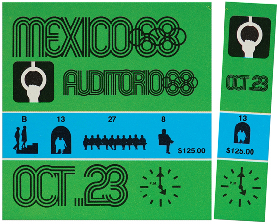
Between the logo, the typeface, the colors and icons, Wyman created a visual identity that saturated the whole city. It was everywhere. “It was a total design campaign,” says Castañeda: “every single thing, idea, place, object associated with the Olympics is immediately and powerfully recognizable as part of a whole.”
The completeness of the campaign would set a precedent for years to come. “I think it’s safe to say that although design and architecture and the arts in general had been very powerfully associated with Olympics before Mexico 68,” Castañeda says. “It’s after Mexico 68 that it becomes a kind of standard expectation of design campaigns associated with these kinds of events.”
The Games of Peace?
The 1968 Olympics were decreed “Los juegos de la Paz” (“The Games of Peace”). So Wyman designed a little outline of a dove, which shop owners all over the city had been given to stick in their windows.
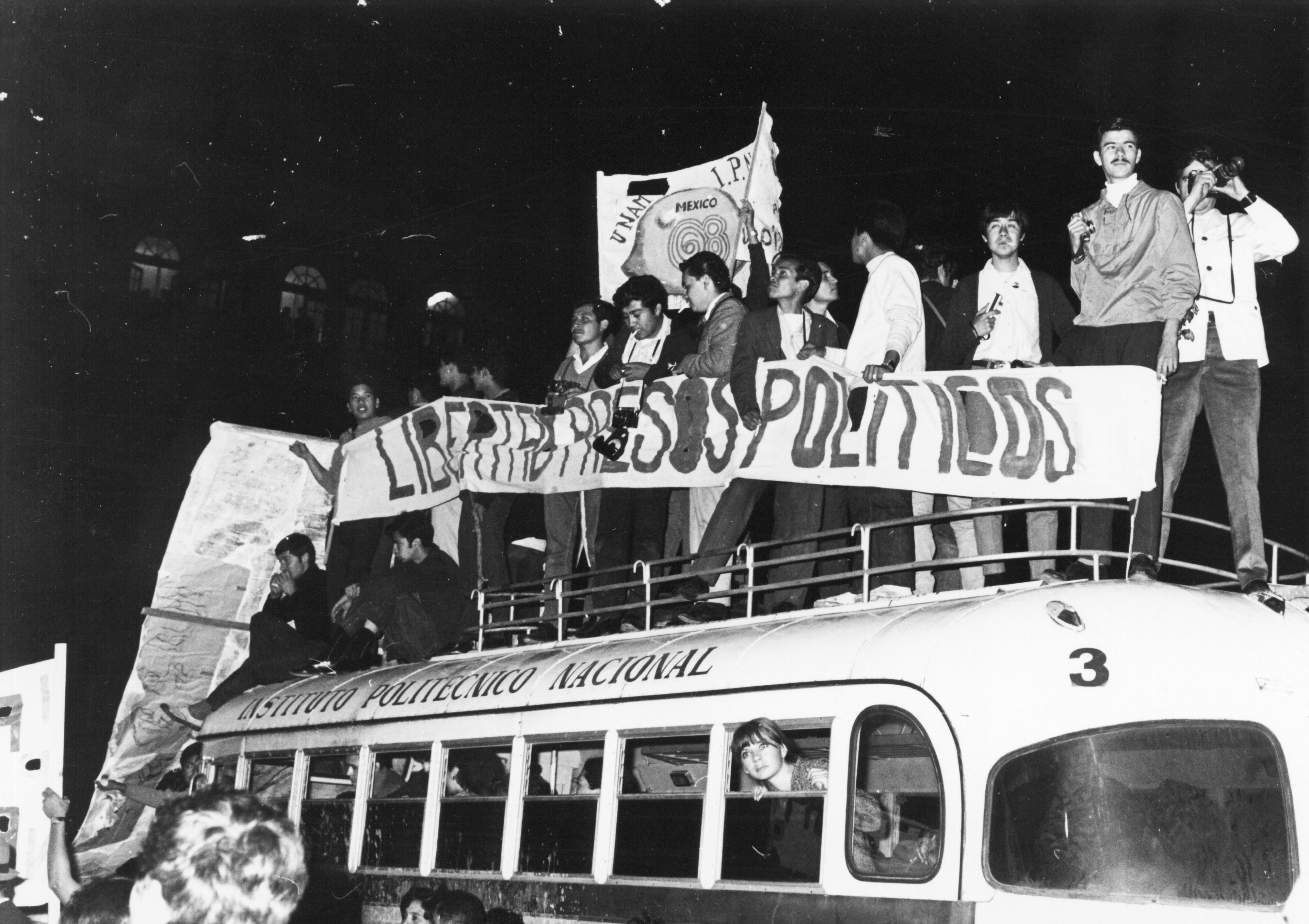
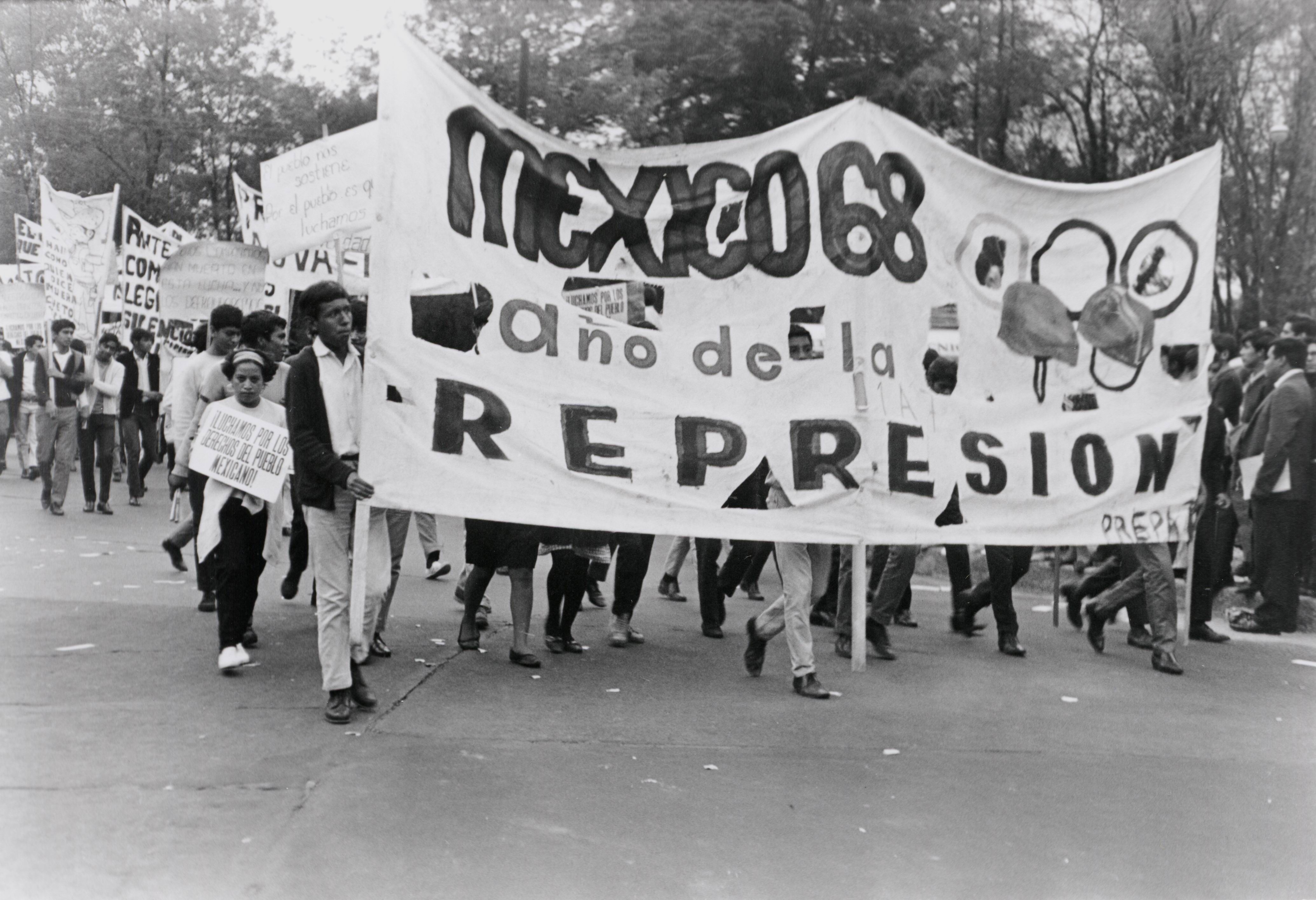
But while Wyman was working hard on this graphic design vision, a protest movement, led by students, was growing in the city around him. These protestors believed the long-ruling Institutional Revolutionary Party (PRI) catered to wealthy Mexicans rather than the poor, rural and working class. Although the country had been experiencing huge economic growth, millions of people had still been left behind. The “Mexican Miracle” hadn’t reached everyone.
Tens of thousands of protesters took to the streets, repeatedly, throughout 1968. Again and again police violently dispersed them, increasingly desperate to keep unrest from interfering with the Games.
Then, on October 2nd, just ten days before the “Games of Peace” were set to begin, thousands of students gathered at Tlatelolco square in the northeast area of Mexico City to demand the release of people who had been locked up at a previous protest. It was a quiet gathering of people with signs walking slowly around the plaza.
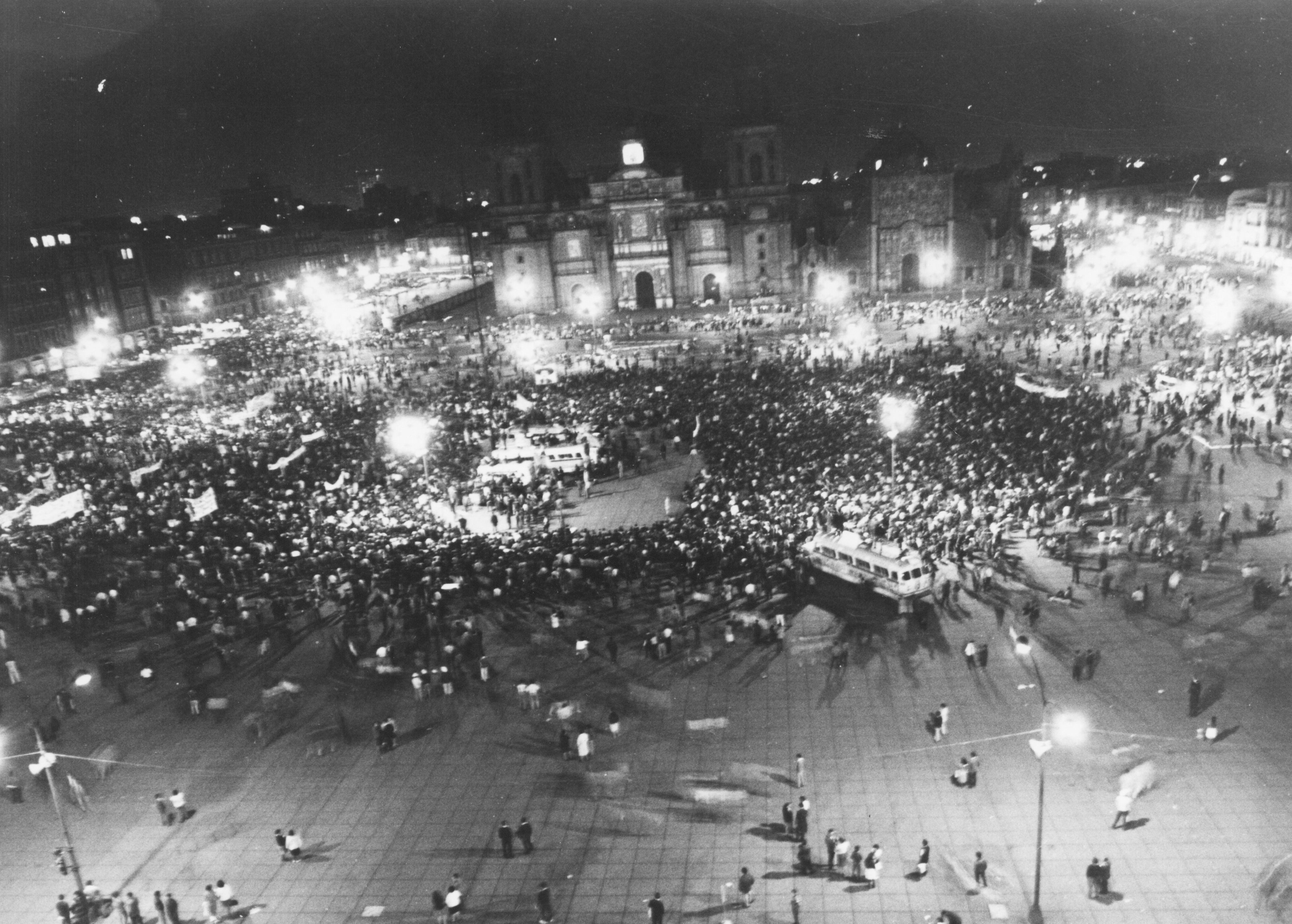
Suddenly, shots rang out. Soldiers opened fire on the students. The scene was cleared before there could be an accurate body count, but estimates range up into the hundreds. The blood was washed away. Thousands of protesters were arrested and locked up. The government took great pains to cover their tracks.
The government claimed that the students had fired first, to provoke the military. Evidence has since come to light that disproves that claim. “It’s an extremely shocking event for a long time kind of suppressed in Mexican national memory,” says Castañeda. “And in many ways it is the crux of the crisis that sets the stage for the very very dramatic sense for the Olympics themselves.”
Despite his relative isolation at work, Wyman heard about the massacre. “When I heard about it and how severe it was it was a very difficult situation because I was working for the government and I couldn’t do anything about it,” he says. He empathized with the students and had mixed feelings about continuing his work. But, in a way, he didn’t need to choose between the government and the protesters. His designs found a way to serve both sides.
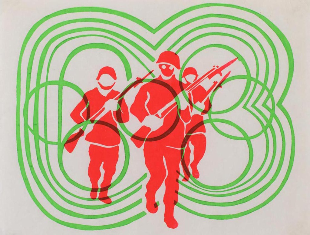
Students began imitating Wyman’s images and co-opting them. They took a poster he made, with a silhouetted image of runners racing, and turned it into silhouettes of troops beating people with batons. They used his signature typography to create anti-government posters.
Students went around the city spraying a small burst of bright red paint over those doves in all the shop windows, to make it look like the dove had been shot. They were playing with the propaganda of the Olympics and hinting at a darker political reality.
Mexico City Metro
Mexico 68 set a new precedent for how governments would use design to promote their country’s image to the international community — for better or for worse. And beyond the Games, the event also left a permanent mark on Mexico City’s infrastructure.
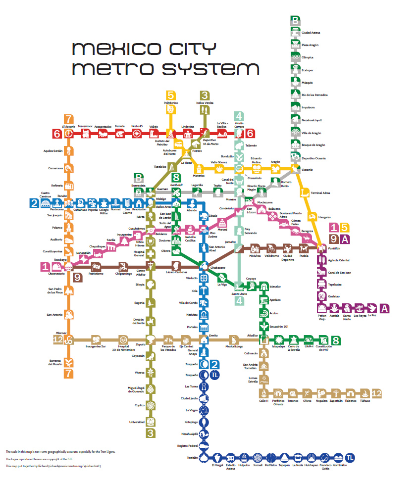
Mexico City is one of the largest cities in the world. It’s the largest metropolitan area in North America. Around 4.4 million people ride on Mexico City’s Metro system every day. It is incredibly crowded and very extensive but it is often also recognized as one of the easiest rail systems to navigate, partly because of its iconography. And those icons are there thanks in part to Lance Wyman.
![]()
The Metro was supposed to make its debut during the Olympics, but excavators kept unearthing ancient architecture in the path of the tracks, and the opening was delayed. But as their construction progressed, Wyman was still involved in its design — specifically its map. He employed the same visual system he developed for the Olympics to help international visitors navigate the trains.
![]()
“In the Olympics,” recalls Wyman, “we relied on the graphics and I thought: well, why can’t a city do that?” So he color-coded each line of the Metro, and created a unique icon for every single stop, allowing visitors to navigate graphically without reading words or characters.
![]()
These icons were generally derived from something about the station or its location, “like the station that stopped at Chapultepec Park,” explains Wyman. “Chapultepec means grasshopper hill in the Nahuatl Aztec language so I used a grasshopper.” In other cases, specific historical or architectural features of the place informed icon designs.
Again, some Mexicans took issue with this young foreigner coming in to design something that would be such a huge part of their city. But eventually, Mexican designers took up the project and made it their own, designing additional Metro lines after Wyman left.
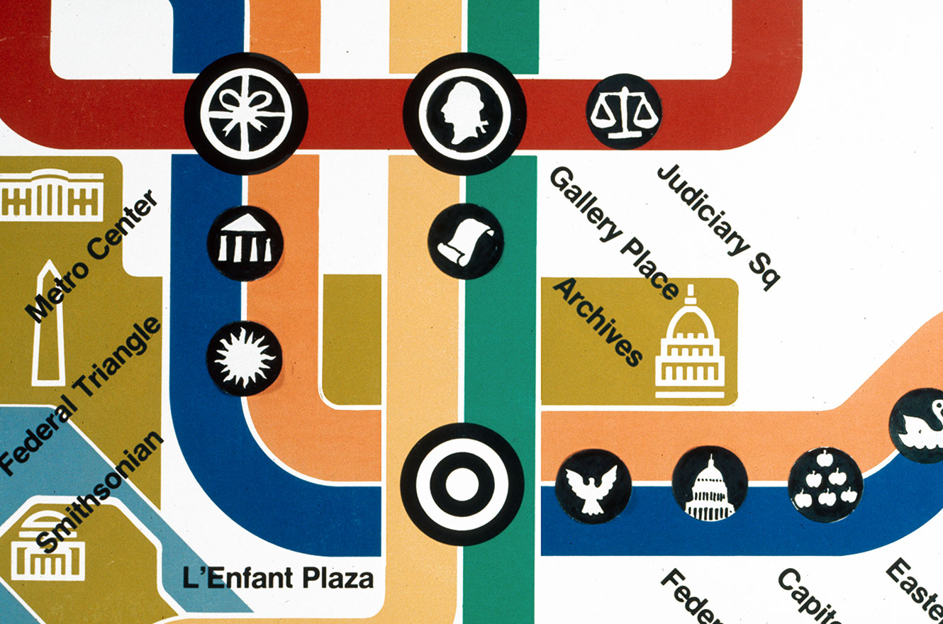
After the Olympics and Metro, Wyman did some more work for Mexico, like the design for the 1970 World Cup. Then he went back to the United States and went on to design more maps for places like the National Zoo and the Washington DC Metro system.
The clear iconography of the Metro system is a reminder of a complicated and sometimes terrible period in Mexico City’s history. It’s a simple design that invites you to explore the massive and complex metropolis. It is a graphic design system that assures that, if you get lost, no matter where you’re from, or what language you speak, you can find your way around, and see the city for yourself.


Comments (14)
Share
LOVE this episode!
One of the best yet.
Language independent signage was common before Mexico 68.
Canadian designer Paul Arthur created a similar system of language independent signage for navigation at Expo 67 where the now ubiquitous Men/Women washroom sign also debuted.
Here is a good book on him:
http://www.mitpressjournals.org/doi/abs/10.1162/07479360152383804?journalCode=desi
You manage to capture a bit of Mexico often difficult to convey, and do so in a beautiful way.
As a Mexican I can only say thank you for this episode.
It’s incredible to see how well Wyman’s design has aged. As a former Mexico City inhabitant and designer, his style of abstraction and refinement are a standard I always pursue.
Kudos on a fantastic episode and for being a continuous source of inspiration.
Excellent episode.
As I searched for subway maps while listening, I found this helpful English site by a citizen subway-map enthusiast, Richard Archambault
http://mexicometro.org
the official subway site is
http://www.metro.cdmx.gob.mx
That’s me! Thanks for mentioning me; I created the map on my site and featured in this article because, shamefully, the official map does *not* use the logos! I have never understood why. You can read more about it Mark Ovenden’s Transit Maps of the World book; the 2nd edition includes my map in it too. :)
Yes! Thank you, Roman Mars – just started living in Mexico City a half a year ago and nice to have my home podcast of the Bay Area extend to my new home here. I’ve always wondered about the Metro icons… didn’t realize there was that American connection until hearing this.
A great episode that feels classic 99PI!! Love how everything is seamlessly combined into one episode. Thanks Roman and the team!
This is a great episode – thank you!
Very interesting episode; however, I feel it is reconstructed from a narrow perspective. The preparation for the Olympic Games, 1963’1968, certainly had an impact on the political participation in Mexico. The graphic designers´ work was fundamental to promote a different image of Mexico with the Games, and was co’opted to communicate resistance. Nevertheless, the crafting of the nation went beyond Wyman´s and Murdoch´s work. There was a whole team behind the ´Project of Olympic Identity´, and the protesting students used other elements to criticise the government and the IOC. The episode is interesting because it helps in the reflection of the politics of sport in society.
Axel elias comment is real it was a team of designers who created the logo
I’m learning so much about how to think about the logic and aesthetics of design – and I’m learning history. I love your podcast – it’s a highlight of my day every time I tune in. Thank you for this episode in particular. I can’t stop thinking about how Wyman changed how we navigate places we tour – and also, how design can be so cultural and versatile.
Your work matters – so much!
This was such a great episode, I was reminded of it while watching this mini-special NBC is showing during the final day of the 2018 Winter Olympics. It’s a nice complimentary piece on the 1968 Olympics, narrated by Serena Williams. Maybe they even listened to the 99PI episode when doing their research!