To help celebrate its 60th anniversary, the Guggenheim Museum teamed up with 99% Invisible to offer visitors a guided audio experience of the museum.
Even if you’ve never been to the Guggenheim Museum, you probably recognize it. From the outside, the building is a light gray spiral, and from the inside, the art is displayed on one long ramp that curves up towards a glass skylight in the ceiling. It’s a one-of-a-kind building designed by architect Frank Lloyd Wright. When Hilla Rebay, co-founder and first director of the Guggenheim, commissioned this building, she said she wanted a “temple of spirit.” And Wright designed one for her.
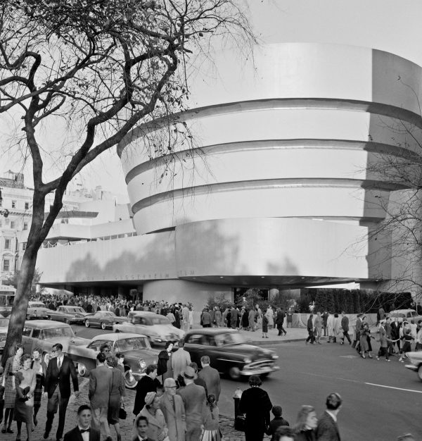
Frank Lloyd Wright was the originator of a concept called “organic architecture,” and for Wright, the idea was that a building should be a metaphor for a living organism. In 2019, UNESCO selected eight buildings designed by Wright, including the Guggenheim, to be a World Heritage site. UNESCO sites are considered vital to the collective interests of humanity. Yellowstone is a heritage site. So is the Grand Canyon. Of the World Heritage properties in America, twelve were made by God. Eight were made by Frank Lloyd Wright.
Even though this building is composed of pure forms like circles and spirals, the top of the parapet isn’t perfectly rounded or finished with a crisp right angle. It’s bumpy and uneven. The reason why the parapet is kind of lumpy is that the paint is touched up every day when the museum is not open. It’s touched up here and there, and for that reason, everything kind of has a texture. You have an effect on this building. By being here and touching the railing, you’ve changed it. It’s changing texture is part of its evolution as an organic structure.
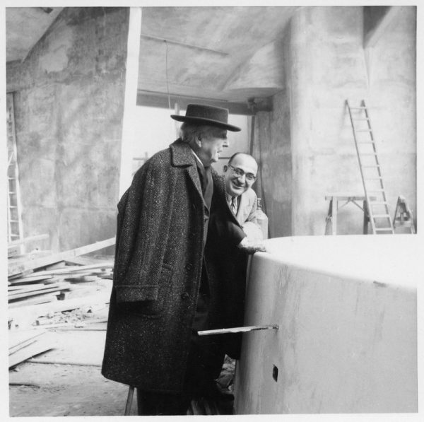
Constructing Frank Lloyd Wright’s vision of a spiral museum was not an easy feat to pull off. Wright oversaw the work, but a local architect named William Short was in charge of the project on the ground and George Cohen was the general contractor. In the three years it took to build the Guggenheim, they came to the realization that some of Wright’s ideas were not going to be doable.
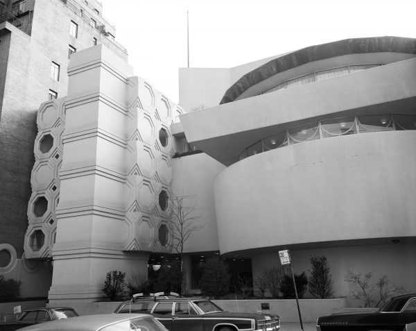
They had to solve the problem of making a curving, spiral building no one had even imagined before, much less built, and they did it with gunite. Gunite is concrete that is shot out of a hose at high velocity. You spray it against a mold, it dries quickly and takes on the shape of the mold. It was Wright’s idea to use this pretty novel technology when the building was constructed. If you look closely, and the sun is just right, you can see an angled checkerboard pattern of lines that betray the form of the plywood molds that created the shape of the outer wall.
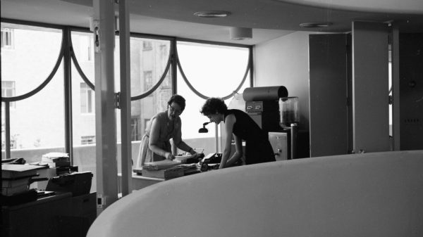
Originally, Frank Lloyd Wright wanted all of the Guggenheim staff to work in this building. He called this space “The Monitor.” Although nobody’s entirely sure why. The offices were kind of like railroad apartments – there was no hallway, so if you had a desk at the back window, you had to walk through everyone else’s office just to go for lunch. Today, the museum staff mostly work off-site, in a location downtown. And the Monitor has become public gallery space, and home to the Guggenheim cafe and gift shop.
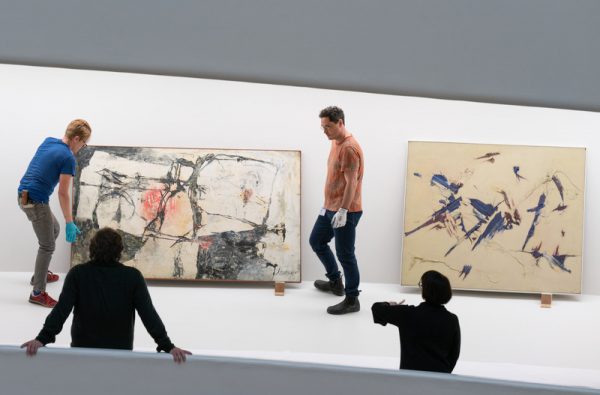
The ramp floor of the Guggenheim causes an interesting problem: how do you hang a picture when the floor is slanting upward? Would you make it straight? Or would you try to hang it to match the angle of the floor? Frank Lloyd Wright designed a third option. He made bays throughout the building, which slope backward, where you can hang paintings. Wright really thought about a bay as a comprehensive display system. So the back wall is at an angle approximately one hundred and five degrees which is really similar to an easel.
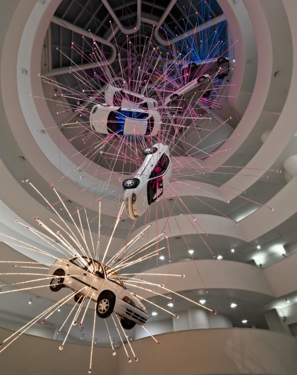
Christopher George and Richard Avery are part of the team that installs new exhibitions in this building. They’ve hung full-sized cars and over-sized cat skeletons to fill the center void. In this unusual space, each exhibition is a feat of engineering that has to be planned perfectly, but there’s only so much planning that can happen.
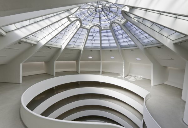
When you reach the final revolution at the top of the spiral ramp, look down at the terrazzo floor. You’ll notice that the pattern changes. Most of the floor on the ramp has a repeating circular pattern, but at this point, the pattern turns to a square. In the early days of the Guggenheim, you could not go past this line. There’s some debate as to what Frank Lloyd Wright wanted, but, as best we can tell, this part was not supposed to be gallery space. In the early days, this space was used for storage. But here it is now, open to the public. And you have a lovely opportunity to transgress and trespass into what was once forbidden territory.


Comments (6)
Share
I love this and I haven’t even finished the episode yet.
I hope you can do episodes like this for all the museums in New York City, if not across the US. I’ve had to play this role when showing friends around museums. Even if they’re not interested in what the museum might have to offer, I try to get them interested in the architecture and it always works!
Great episode!
Just a thought, the monitor section of the building when seen from above is a very similar shape to the civil war ship The Monitor. From the right angle, it looks like a tiny ship being sucked into a whirlpool. Just a thought, and thanks again!
The ending genuinely made me smile! Great job
I loved this episode! Came to see the photos as I have never had a chance to visit the museum.
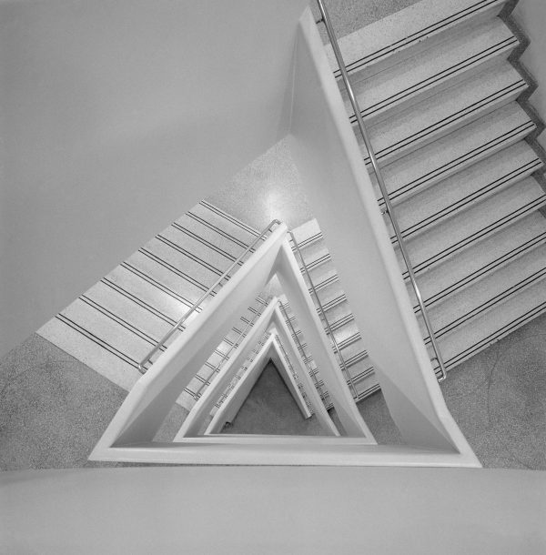
Great episode. I wish the photos on the website had more relationship to the info on the guide, e.g. an actual photo of the parapet, of the “forbidden” terrazzo floor line, and so on. (And was that triangular staircase mentioned??) I did find that this page written by Ashley Mendelsohn had some helpful photos: https://www.guggenheim.org/blogs/checklist/wrights-living-organism-the-evolution-of-the-guggenheim-museum
I have what I think is a reasonable explanation for why FLW referred to the 3rd floor Admin space as the “Monitor”. The space is captured by raising a section of the elevated plinth which also serves as a roof over the garage. A popped-up section of roof, often glazed as is the Guggenheim’s admin wing, is commonly called a ‘monitor’.
https://en.wikipedia.org/wiki/Monitor_(architecture)