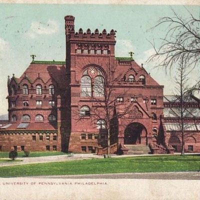
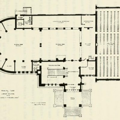
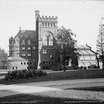
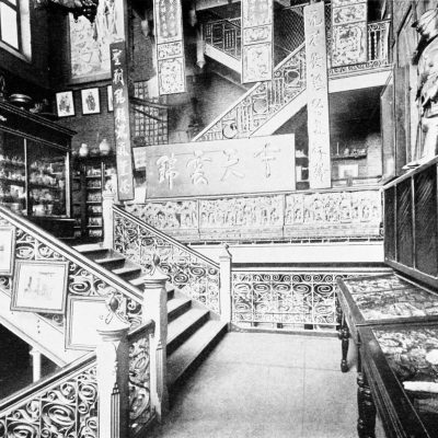
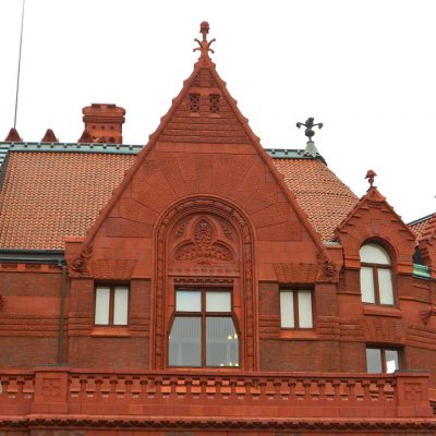
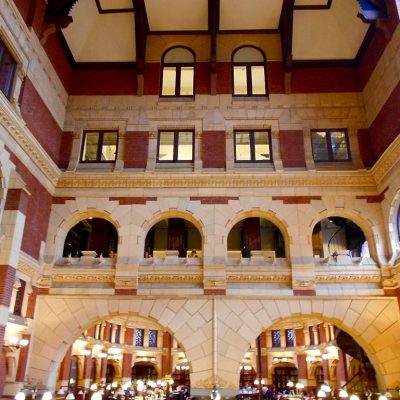
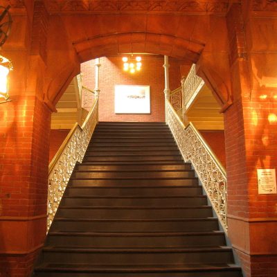
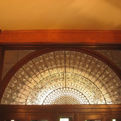
On the University of Pennsylvania Campus, the Library of Fine Arts is a richly ornate and eclectic structure belonging to the School of Design. Completed in 1890, it is currently designated a National Historic Landmark. But in the late 1950s and early 60s, there was serious discussion of tearing it down altogether. Denise Scott Brown, then a new faculty member at Penn, was very much against the demolition proposal.
In the early 60s, a lot of architects were very into tearing down old frilly buildings, and replacing them new, sleek modernist buildings. The dean wanted the historic library gone — “it was what a Modernist would do, you see,” explains Denise.
Denise herself wasn’t against all of Modernism — she liked the look of sleek glass and steel buildings themselves. The thing is, she was getting tired of paternalistic Modernist ideology. Many Modernists thought they knew better than other people did how a building (or city) should function. They were building for people without asking people what they wanted. Still, Denise saw value in some of aspects of the Modern Movement. “Yes, I am a Postmodernist, but,” she clarifies, “also a Modernist, an admirer of the principles of early Modernism of the 20s and 30s and of their ‘New Objectivity.'” Although she rejects the “Modernism of the 50s and 60s, and also today’s Neomodernism,” she sees “Postmodernism as updating Early Modern principles for today.”
So while Denise wasn’t strictly opposed to Modernism, she also didn’t like the way some Modernists sought to devalue and supplant other styles of historical architecture. And in 1960, at her first faculty meeting at Penn, Denise took a stand against the dean on the subject of demolishing the historic campus library. After a long argument, she convinced the rest of the faculty the building should be saved — that there was value in observing and appreciating historical architecture.
After the meeting was over, Scott Brown says, “this young man came up to me and said ‘I agree with everything you said. And my name is Robert Venturi.’ And I said ‘well why didn’t you say something then?'” Robert, already something of an outsider at Penn, hadn’t wanted to stick his nose out.
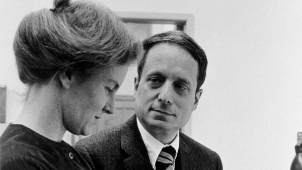
But in Denise, Robert found a kindred spirit — they were both into Mannerism and other kinds of decorative architecture with fun and elaborate visual expressions. They began to share ideas and research, even teaching theory courses in conjunction with one another. One colleague, Scott Brown remembers, told her “you should marry Robert Venturi.” But it wasn’t like that. Scott Brown was actually a young widow at the time. She had recently lost her husband in a car crash and wasn’t interested in Venturi romantically …at least, not yet.
Denise did, however, want to take her friend Robert to a very special place: an anti-Modernist mecca. A place that most of her colleagues in architecture and urban planning looked at with disdain. Las Vegas.
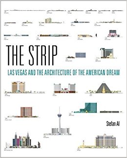 To this day, architects tend to turn their noses up at Las Vegas, or simply dismiss it as irrelevant to serious design theory. “From an architecture perspective, its a city that’s known for neon, a city known for kitsch,” explains Stefan Al, a practicing architect and author of the book The Strip: Las Vegas and the architecture of the American Dream. “It’s exactly the opposite of what conventionally trained architects would like.”
At the same time, it’s hard to argue with the fact that people love Las Vegas. The stretch of highway attracts tens of millions of visitors a year, often more than famous urban destinations like Paris.
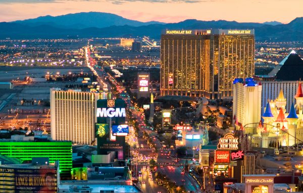
Flanked by casinos, the strip technically sits outside of the city limits, and is thus unaffected by Las Vegas zoning laws. This legal flexibility allows the strip to change and build new structures almost every decade. Old casinos are imploded to make way for newer, more profitable ones, perpetually redesigned to attract new tourists with each new iteration. The Strip is designed and redesigned, over and over again, for its visitors.
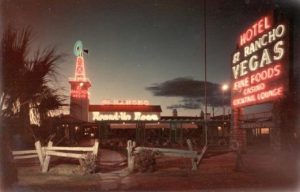
The very first casino-hotel complex on the strip was called El Rancho Vegas, and it had a Western theme. In the 1940s, Western movies were popular, so it functioned a bit like a dude ranch. In addition, the western theme made gambling seem a little more patriotic and rugged, since gambling was a key part of a Wild West town experience. In reality, there were never any cowboys in Vegas at all. The Strip was fake from the start.
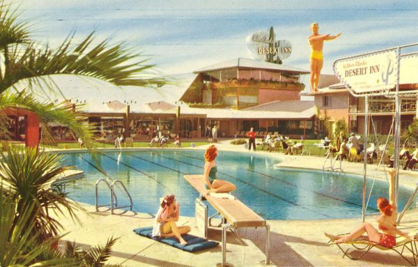
In 1950s, as the fake Western fad got tired out, bales of hay and wagon wheels were traded in for fake mid-century suburban glamour. Casinos with fancy bungalows and kidney-shaped pools started to pop up along the strip. But these glamorous hotels were all starting to look more or less the same.
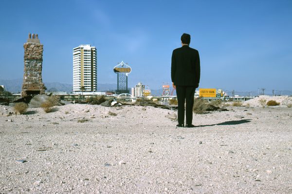
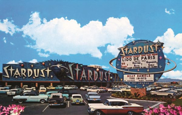
So then came signs. The sign for the Stardust Hotel and Casino was over 200 feet long, and it upped the ante for Strip competition. More and more big hotels with even bigger and more elaborate signs popped up.
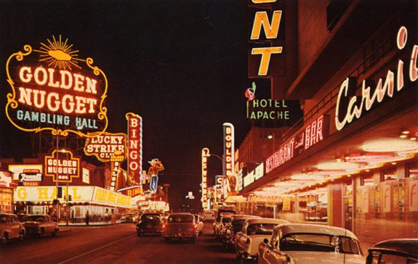
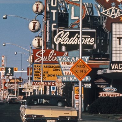
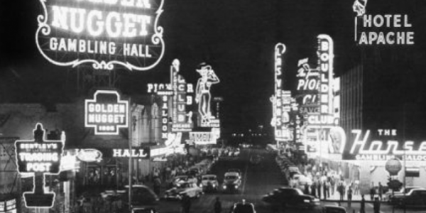
By the 1960s, the Las vegas strip was a cacophony of competing neon signs, all calling out for attention over each other. And that’s what the Strip looked like when Denise Scott Brown first encountered it in 1965.
Upon her arrival, she felt a cold shiver. “‘Is this love or is this hate?'” she recalls asking herself. She wasn’t sure, but she did know she needed to photograph it before it disappeared.
At the time, Denise had taken a job at Berkeley. And unlike most modernist architects, who would have ignored a place like Vegas, Denise was fascinated by it. “Las Vegas was a place people voted for with their feet,” she explains, and “they went there in droves. They really showed they liked it.” The 1960s Strip was the exact opposite of what Modern architects thought the world should look like. Vegas was loud, garish, dazzling — full-blown populism. Denise was fascinated, and she knew she had to show Robert Venturi. So she invited him out to see it. In 1966 they spent four days there together.
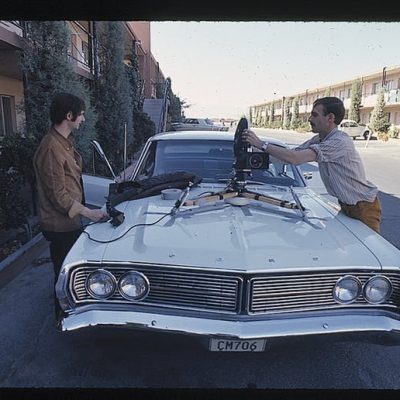
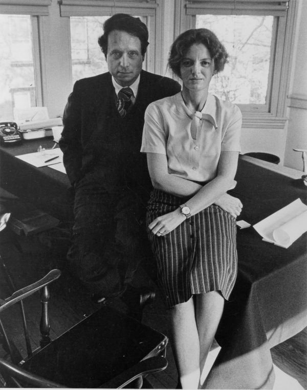
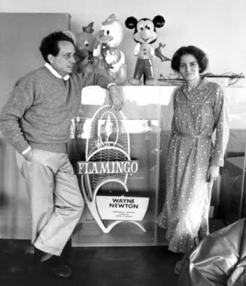 “When Bob and I went to Las Vegas and had this wonderful time together,” she remembers fondly, “suddenly he became a much more relaxed human being! We took photographs. We drove the strip. We had music on. We stopped in the desert and we took pictures of each other. We fell in love.” After five years as colleagues, it all happened in four days in Las Vegas. “We were in a bar,” she recalls “and suddenly we held hands. That’s about all that happened. And then we began to get more and more fond of each other.”
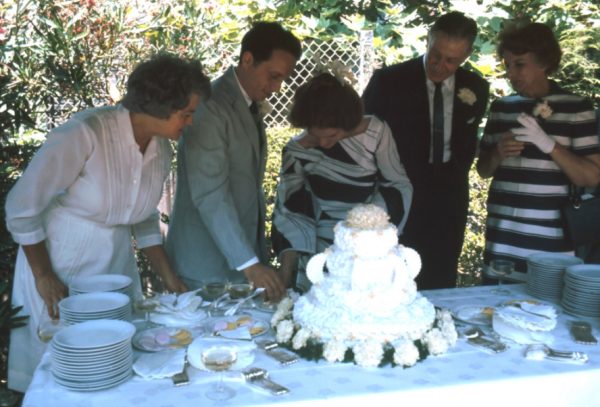
Denise Scott Brown eventually moved back east. ” And then one day in a taxi I just said to him: “Will you marry me?” and he said yes and yes and yes!” They got married in 1967, and together went to teach at Yale. But even back east, neither Venturi nor Scott Brown forgot their experience in Vegas, a place that epitomized sprawl, advertising, shopping centers. A city that was American culture on steroids.
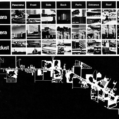
Denise and Robert planned a twelve-week-long studio in Las Vegas for thirteen Yale students. Ten days of this studio would be spent on the Strip itself. They were given free rooms at the Stardust and spent their days in the field, drawing sketches, taking photos and making notes. They even managed to get access to the the grand opening gala of the Circus Circus Casino, for which all the students dressed up in clothes from the local thrift store.
In the midst of all the fun, the students were still really engaged with the labor of truly looking at a place. They observed traffic patterns, conducted interviews and made maps and diagrams. Basically, they did all the things architecture students would normally do to observe a famous subject of study, like Athens or Rome, except in this case they were sitting and drawing sketches of parking lots and neon signs.
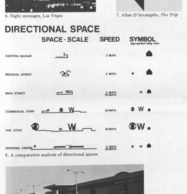
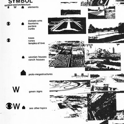
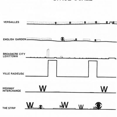
Students were encouraged to compare, contrast, and figure out how people, activity and architecture were distributed here versus other places. They compared The Strip to conventional cities but also bazaars and marketplaces. In some ways, the strip was like a bazaar, but on a scale built for cars, with wide roads and big signs of various types to draw people in.
And in observing the strip, and the way cars and people navigate it, they realized that Las Vegas worked. The place might seem filled with bright and colorful chaos to an outsider, but the signs served their function.
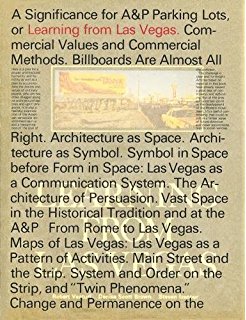 In the end, Robert Venturi and Denise Scott Brown took all the maps and notes and observations that they and the students had collected, then, together with their teaching assistant and co-author, Steven Izenour, they put it all in a book. Published in 1972, it was called Learning from Las Vegas, and it would go on to be hugely influential.
The book forced architects to consider design in the age of American car culture, and the kinds of everyday places people occupy (and love). Even now, decades later, it is still regularly assigned in architecture schools.
“Why did it catch on?” asks architecture critic and author Alexandra Lange. “Because people we searching for a way out of the dead end of Modernism. And this book, written by kind of the coolest kids in architecture, seemed like it might be that way out. By 1980, Learning from Las Vegas becomes a text assigned in every architecture school.”
Robert Venturi, however, got most of the credit– in 1991, he was awarded the prestigious Pritzker Prize and Denise was left out.
Venturi and Scott Brown also went on to practice together — they loved recognizable historical elements of architecture, like gables to indicate houses and columns to signal important buildings like banks. So they began incorporating those kinds of signifiers into their work.
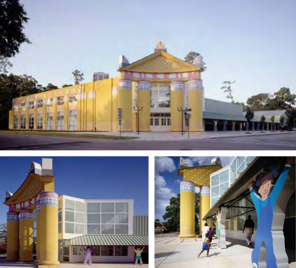
In their design of the Children’s Museum of Houston, for instance, they put these oversized classical columns in the front, because it is a children’s museum, the columns are bright canary yellow. And the columns hold up a massive sign that says “MUSEUM” in big red letters. Visitors don’t have to wonder if they’ve made it to the right spot.
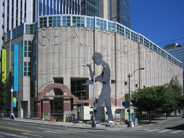
And they did this for adult museums, too, like the Seattle Art Museum, which features historical decorative motifs, but also supergraphics etched into the building that say “SEATTLE ART MUSEUM” in big letters.
Not every structure needed a sign, of course, but the point is that the duo didn’t shy away from signage or color or historical ornamentation. Their architecture and writing were about making buildings legible, though it also led to one of the most controversial movements: Postmodernism.
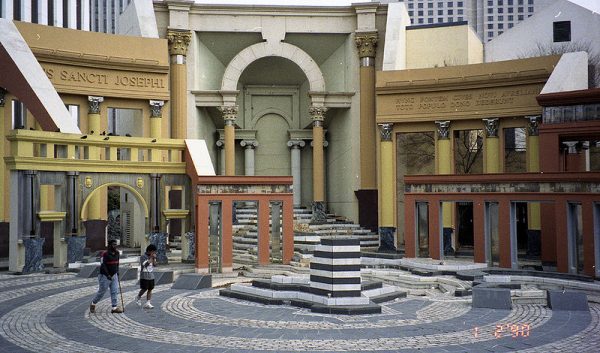
In theory, Postmodernism was a way for buildings to be communicative and deeply meaningful but also fun — but a lot of designers just focused on that last part. Many so-called Postermodernists took the colors and neon of Vegas, but arguably took them too far, which dovetailed quite well with the extreme aesthetics of the 1980s and its bold shapes and colorful craziness. And as Postmodernism became sillier and sillier, it strayed further and further from what Denise Scott Brown and Robert Venturi were originally trying to do. It became hard for clients to see how deeply intentional and thoughtful their work was, which also led to lean years for their architectural practice.
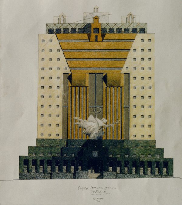
In the end, Postmodernism’s peak was relatively short-lived. It started to gain some steam in the early 1960s, but really hit its stride in the 1980s and early 90s, then fell back out of fashion. Some new directions were spawned, like Deconstructivism, but a lot of clients and architects went back to Modernism, with its glassy simplicity and vertical repetition.
And if people want it, Las Vegas will deliver it.
As Postmodernism was gaining traction elsewhere, Vegas was actually leaving it behind. In 1967, the state of Nevada passed the Corporate Gaming Act, which allows big corporations and hotel chains to own and operate casinos. In the wake of that rule, companies like Hilton began building big corporate Modernist structures.
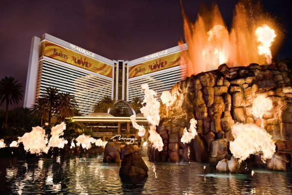
And the Strip continued to reinvent itself, responding to what consumers want. The big glassy towers continued to rise until Steve Wynn stuck a giant erupting volcano in front of the Mirage Hotel in 1989. This ushered in a kind of ‘Disneyland’ era with crazy expensive new attractions, like Treasure Island and its big sinking pirate ship and Castle Excalibur.
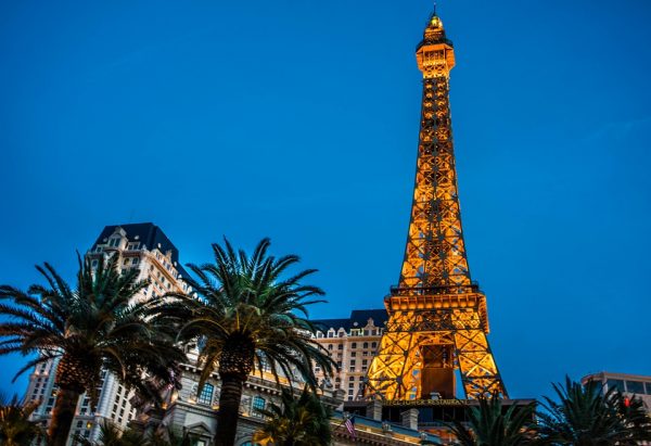
The next phase of The Strip were replicas of real places: fake Venice, complete with canals and singing gondoliers, as well as a fake Paris and a fake Eiffel Tower.
Then in the 2000s, Vegas welcomed a batch of new casinos designed by big-name prestigious architects, trying to appeal to urban-oriented millennials. Soon, without a doubt, the Strip will shift shape again.
In short: the Vegas strip is in such a constant state of flux and renewal, that it only barely resembles that city that was chronicled in Learning from Las Vegas. But it almost doesn’t matter that Vegas has changed, or that Postmodernism, as an architectural movement, was a short one. As Denise Scott Brown herself has often said, Learning from Las Vegas is not about Las Vegas itself. The book is about applying the same critical processes and tools architects employ elsewhere to everyday spaces –reserving judgment and learn from places people go and enjoy. And if one wants to observe the ever-shifting state of the American landscape, there’s still no better place to see it than the Las Vegas strip.
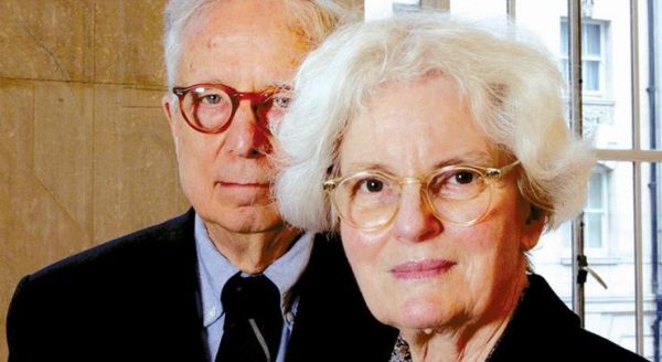
Denise went to Vegas a few more times, and witnessed many of these changes. But it’s been a while now. “I haven’t been there recently,” she says. And she and Robert never designed a casino — that wasn’t at all the point for them. But they are still together, currently living in Philadelphia, just thirty minutes away from the design library at Penn. In fact, in 1968, Robert Venturi and Denise Scott Brown worked on the masterplan for the restoration of that library — the very building that brought their lives and their ideas together.



Comments (21)
Share
Just a question I’m curious about based on at the end of the show. Is the famous Pizza Hut restaurant design a Duck Building? You can slap a new sign on these buildings but they still never lose their Pizza Hut identity. Examples abound: https://www.reddit.com/r/FormerPizzaHuts/
I came with the same question (by the way, this is a 99PI episode—https://99percentinvisible.org/episode/u-t-b-a-p-h/), if a building’s design becomes iconic in and of itself—Pizza Hut, HoJo’s, Wendy’s, McDonald’s, etc.—does it make the jump from shed to duck?
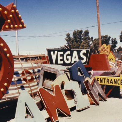
I loved this episode. I was born and raised in Las Vegas and have lived here all my life. It is an ever changing town, always evolving and trying to find its new identity. However, the down side to always changing is that Las Vegas does not have a good sense of it’s history. Older buildings are not saved and valued like in other cities. Las Vegas is a very transient town where new comers can find it hard to find a sense of community and don’t know the history. Natives like me were very rare in the generation before me, but there are more in my generation (I’m 39). People are always moving further towards the outskirts of the city to nicer and newer areas, leaving older, historic, areas to decay (or completey torn down and rebuilt). I know this happens in a lot of cities, but it is much faster because Las Vegas is such a new city with a history of just over 110 years and tremendous population growth. When I say newer areas, I mean areas where everything has been built in the last 3-5 years – the houses, roads, stores, infrastructures, everything. It’s an interesting town to grow up in and live in. Locals stay away from the strip and the crowds, and you can find good neighbors and communities when you look. One of my favorite spots in Las Vegas is the Neon Museum. It’s a small, outdoor neon sign boneyard. The organization’s mission is to keep and repair neon signs to preserve a little bit of Las Vegas history. Thanks for the great listen!
this was a great episode. made me miss LV. grew up and parents both worked in the casino back in the day, til dad passed away and i moved to Cali. But i still go back to LV especially during holidays.
Is it just me or do Denise and Robert have a serious Mulder and Scully vibe going on?
Yeah, you are right. Especially in the last 2 photos. Anyway i liked this episode.
They are SO FANTASTIC. And the Neon Museum mentioned above sounds awesome!
Recognition FYIs: In 2013 the Pitzker Prize committee refused to retroactively award the honor to include Scott Brown. But in 2016 the AIA awarded the both of them the Gold Medal.
My favorite example of duck building is a… chicken from Marietta, GA in the Atlanta metro.
https://en.wikipedia.org/wiki/Big_Chicken
Florida has another example of a “pure duck” from the end of the episode: Twistee Treat. The ice cream company build 90 stores shaped like soft serve cones, about 45 of which are still standing today: http://www.roadarch.com/food/twistee.html
I’m kind of blown away. But this this brings to mind another question. If we are no longer in a post-modernist era in art/design/thinking, and in some ways, it seems like we still are, then where (or what) are we as a society? People enjoy modernism, but we clearly aren’t a modernist society. So what ARE we? And is there disagreement about this? Roman, please, help clear this up! :-)
I really thought that the origin of the ‘duck’ terminology would be the saying “If it looks like a duck, swims like a duck, and quacks like a duck, then it probably is a duck”, ie that the building has all the traits of what it does!
Thank you all for the great episode! I’m going to be looking for ducks now. It occurs to me that churches may be ducks. It doesn’t matter if they are converted into houses or stores, their architecture still screams “Church!” I’m looking forward to seeing if I can find others the next time I’m in Portland.
Sadly they learned from a place which is mainly used for vacations. they didn’t try to learn from the places where people are the happiest on a daily basis.
Very sad that she went all for the automobile oriented planning. Modernism was a dead end but “Learning from Las Vegas” made things worse. its directly opposed to the other major planning trend that came about a few decades latter, ‘New Urbaniasm’ which reaffirmed planning for people.
Pure duck from where I grew up!
https://www.christchurchdailyphoto.com/2011/07/28/burger-shaped-cafe-blenheim-road/
I never saw it in its heyday. But always loved it as a kid. It was the first thing I thought of when I listened to the end of this podcast.
Hi there,
Please could you append that she was educated in South Africa as well. She did her undergraduate degree at the University of the Witwatersrand during a very important time in South Africa’s political history. When you say that she “spent her childhood in South Africa, and was educated in the UK [and then in the US]” you erase this intellectual history in South Africa and perpetuate a perception that important intellectual figures are only from and of the West.
For anyone interested in the Long Island Duck in Flanders,
As of last summer, its use is as a Museum OF the Duck Building. Inside you’ll find a kind of roadside kitsch shop of historic photos of the Duck, written histories of the duck farming business in Flanders, and Duck souvenirs. Cared for by a perfectly wonderful old man who will talk your ear off about his Trump support.
In other words, a little slice of tourist Vegas, and It’s so Duck at this point it’s gone METADUCK.
i think gehry’s buildings are ducks. why? because not matter where you see them, in NY, CA, bilbao or weil am rhein (vitra campus), when you see a building by gehry, it says “GEHRY”.
loved the podcast! (i first read Learning from Las Vegas in 1973 or ’74 – i now understand it much better. thank you!)
what is the name of the song that plays right before the commercial break at 24.52? It is so pleasing and sentimental. A perfect transition.
It is an original piece from our talented composer, Sean Real.
Another Duck; The Big Apple Ontario. If you have ever driven on the 401 in Ontario Canada between Toronto to Kingston/Ottawa/Montreal, you would have driven by The Big Apple, that is shaped like a bright red apple and sells apple pies (along with a billion other touristy stuff.) You can even climb the stairs to the top of the apple which is a handful of stories high to a view of the Highway – LOL.
http://www.thebigapple.ca/
To be honest Vegas looks much better on movies than it is really. Maybe back in days is was something special.