When a new movie comes out most of the plaudits go to the director, the producer and the lead actors, but there are so many other people involved in a film, and a lot of them are designers. There are costume designers and set designers, but also graphic designers working behind the screens on all of the designed objects that shape a film’s aesthetic and help tell its story.
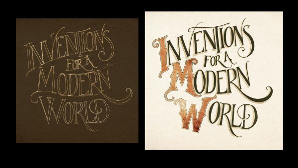
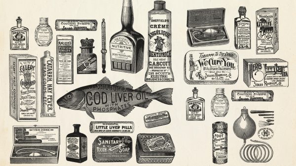
Annie Atkins specializes in graphics for filmmaking, including lettering, illustrations and more — she has designed all kinds of graphic props, including “telegrams, vintage cigarette packaging, maps, love letters, books, poems, labeling, passports [and] fake CIA identification cards.” All of the small design decisions she makes contribute to the creation of a cohesive visual world, establishing a film’s period and place.
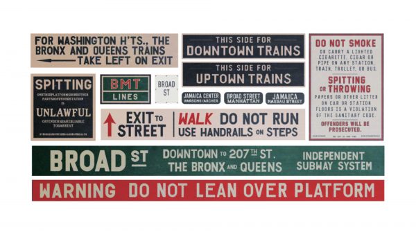
These graphics can also tell subliminal stories of their own, she explains. “For example, if you see a sign in the background of a New York subway scene that says ‘Walk, Don’t Run’ you can bet [that] the characters are actually going to start running.” All of these little details are carefully designed to help move stories forward.
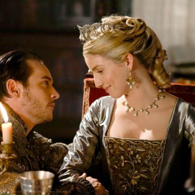
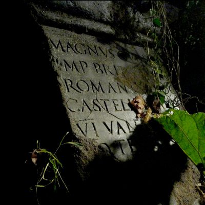
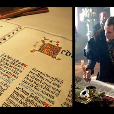
Atkins’ first job was on a television show, The Tudors, a Showtime series about the rule of King Henry VIII. In that period, of course, there was no “graphic design” profession, but there were graphic designers. If the king needs a death warrant, for instance, he would need a calligrapher “who was responsible for the layout of the royal scrolls and documents and also the style of the lettering.” So part of her work is to “try to imitate what the craftspeople [of the period] would have done, whether that’s the ironmonger or the glazier or the stonemason.”
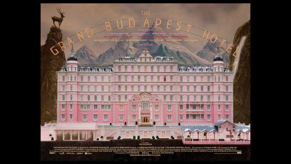
In films like The Grand Budapest Hotel, written and directed by Wes Anderson, the aesthetic is critical. And getting into a historical period can be difficult. Atkins often starts on the web, but finds that “looking things up on the internet can be misleading for a couple of reasons.”
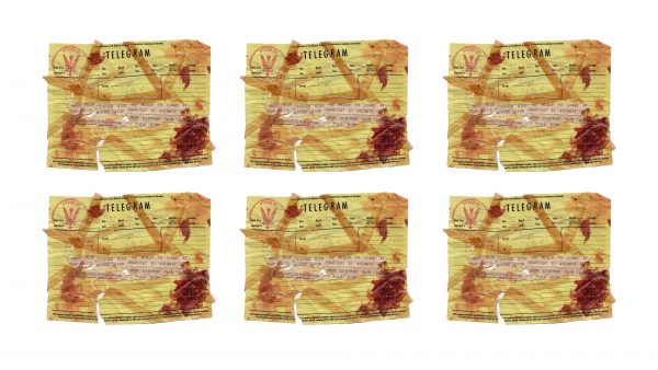
People don’t label things properly. Also, it can be hard to tell the dimensions of something like a vintage telegraph from a flat photo. She often goes to flea markets to find actual vintage objects she can hold in her hand and measure.
For period pieces Atkins often needs to create new objects that look old. In some cases, “we need to see the cracks in the canvas of the oil painting because that’s how we see it in the gallery,” Atkins explains. Similarly, sometimes “we need the paper to be off-white or slightly yellowed because that’s how we look at old documents now.”
But all of that varies by project and director — “one of the reasons why it was so wonderful working for Wes Anderson because he really embraces the colors of the period,” Atkins says, rather than making things look aged simply because the story is set in a time gone by.
At times, authenticity can conflict with reality, though, for designers to find a compromise between an audience’s expectations and the historical reality.
Newspapers, for instance, can be a “really good storytelling device,” says Atkins. “If you need to tell the audience that there’s a war being fought … you can show a newspaper headline saying there’s a war on” rather than spending millions on a battle scene. But in reality, those headlines may not really match the approach of the period. “In the beginning of the 20th century, [English] broadsheet papers didn’t actually have newspaper headlines on the front pages at all — the front pages were covered in small ads advertising local businesses.”
But even when they deviate from historical accuracy, designers can learn a lot from the past. “My imagination can’t compare to the collective imagination of hundreds and thousands of craftspeople that have gone before me over the last hundreds of years.”
Atkins also believes well-executed design should support the storytelling in subtle ways, rather than becoming the focus of a scene. “The attention of the audience should really be on the drama that’s unfolding between the characters,” she says, not graphic design. “I think you should notice it but only subconsciously. We are building a world and we’re using graphic design to do that. But the pieces are so fleeting I don’t think you should really register everything consciously.”
Still, building those relatively invisible design elements helps set the stage for dramatic activity. Background graphics, like shopfront signs and street posters, not only give audiences a sense of time and place but also actors, who show up on set and get transported to a different period and location. “I hope that maybe our work as film designers contributes … to them really getting into their roles,” says Atkins. Even things that don’t make it into the final cut can contribute to this aim.
Sometimes, too, graphics can play a key role right in a script, like the prison escape map in The Grand Budapest Hotel. “I remember when I read that script page being really excited,” recalls Atkins, “because it’s very rare that characters in the script admire a piece of graphic design — I knew this was going to be a big one for the graphics department.” It was also unique because it was to be an object crafted by a character in the film itself, forcing the designers to get into character as well. “You know what would they have had access to,” explains Atkins, like “pens or charcoal or crayons” and what kinds of paper and so forth, and have to work with that and their personality to create the prop.
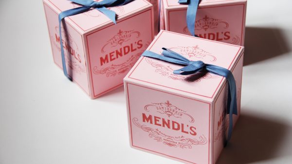
But even with careful planning, mistakes are made. In The Grand Budapest Hotel, there’s a fictional bakery called Mendl’s. Halfway through the shoot, the director noticed an error. He called and “said ‘there’s two t’s in patisserie’ and I looked at the box and I realized that he was right,” remembers Atkins. And she had hand-lettered that text, so it never went through a spell check. It was fixed in post-production.
Not every designed object gets this kind of attention, but the Mendl’s boxes are “what we call a hero prop, [which] gets a bit [more] screen time or has a kind of character of its own,” Atkins explains. “You can generally tell what a hero prop is because it will have a description in the script,” as opposed to objects and graphics forming a backdrop.




Comments (10)
Share
This is my dream job. Thanks for this episode!
I just wanted to say thank you for all of the great, great podcasts you produced over the last years. 99pi has become my absolute favourite! I loved this episode and am looking forward to part two. I wouldn’t mind having more than two parts, either! :)
Graphic design in SCI-FI movies is the theme of the blog “Typeset In The Future”.
https://typesetinthefuture.com/
Deep analysis (frame by frame) of all graphic design content on Alien, Blade Runner…
Well documented also.
This was such a great episode! I love getting these type of insights in a longer interview format.
This is an awesome episode and refreshingly absent was politics. The discussion on calligraphy and how she does research on her designs is very inspiring.
I just want to write in and say how much I loved this episode!
It’s delicious!!!!
99pi has also become my favourite podcast, since I discovered it in the past year.
I also loved to discover the relationship between Alvar Aalto and skateboarding.
it’s just sooooo cool.
Keep it up!
Fascinating! I’ve often wondered how graphical props and set pieces are researched and designed for film and TV, so thanks for this episode. As an archivist by profession, it did make me wonder whether Annie Atkins ever uses archives or library special collections in her research. These places are like the flea markets and grandma’s attics she visits, except they specialize in historical written, printed, visual, and graphical materials of all kinds. What’s more, items are cataloged, accurately described, and preserved —
specifically to be used for all types of research! We are in virtually every locality (and online) and, no, we generally won’t make you wear white gloves!
I guess this doesn’t quite cover costuming, but I was reminded of the Minnesota Museum T-shirt that appeared in Stranger Things, and the fan demand for it.
What is the overlap in the costuming and graphic design groups when it comes to creating or finding these kinds of props?
So I just want to add, I just watched episode 2 of the new season of The X-Files and there is a scene in it with a QR code… and the QR code is legit scannable from your TV screen, and leads to a fake URL with the name of the newspaper published by The Lone Gunmen. And all I could think about was this episode of 99pi, because someone put some serious thought into that tiny little prop.
Such a great episode! And now I’m committed to finding a TT Mendl’s box (without breaking the bank).
Just found this one (with one T!) on ebay for $177: http://www.ebay.ca/itm/grand-budapest-hotel-mendls-meringue-box-w-card-wes-anderson-movie-promo-rare/131167322319?hash=item1e8a2e80cf
You pay 600-800 pounds for a TT box. https://propstoreauction.com/view-auctions/catalog/id/44/lot/9478/