Today there are thousands of vacant homes all throughout Detroit. The Motor City has been shrinking since the 1950s, but many of these vacancies stem from a decade ago when the financial crisis devastated the city. And so, in 2014, Detroit started a city-wide demolition program, to take down the houses that couldn’t be fixed. The city estimated they had about 40,000 homes that would need to be demolished. Houses were coming down all over the city, but for a lot of residents they couldn’t come down fast enough.

A lot of Detroit residents were pulling their hair out hoping that the vacant home next door would come down sometime soon. Sometimes they would call the city looking for answers, but there just wasn’t any information available about when a particular building was scheduled to be demolished. And so they just had to wait.
Waiting is something that we all do every day, but our experience of waiting varies radically depending on the context. And it turns out that design can completely change whether a five-minute wait feels reasonable or completely unbearable. The city of Detroit eventually tried to design a solution for the residents waiting on a demolition, and to do that they turned to a body of research that offered insights into the strange psychology of waiting. The research didn’t come from studying city government; it came from studying the particular frustration that people feel when they’re waiting for a computer to load.
The Slowest Fastest Machine
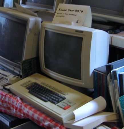
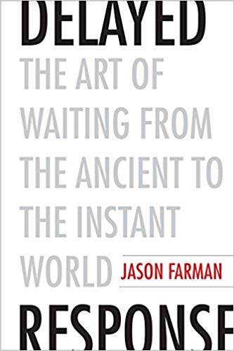
In the early 1980s, computers were just starting to become popular in offices for the first time, and companies like Xerox were making work faster. In 1981, Xerox came out with its latest, quickest, top of the line machine — an office computer called the Xerox Star. Jason Farman is a professor at the University of Maryland and wrote a book about waiting called Delayed Response: The Art of Waiting From the Ancient World to the Instant World. He says that even though the Star was one of the fastest computers of its time, it didn’t feel fast. “Overwhelmingly, people felt that it was a slow machine… overwhelmingly, the sentiment was that it took forever. It took forever to load. It took forever to exchange files.”
That perception of slowness may have had something to do with the design of loading icons. These early computers like the Star were the first to use them. On the Star, the mouse cursor would turn into a static hourglass icon. Macintoshes from the same time had a wristwatch icon that was stuck at 9 o’clock, and every single time you saw the hourglass or the wristwatch, you knew you had to wait again. The problem with the watch icon was it gave you no sense of how long you would be waiting for. It could be seconds, minutes, hours, or might not even finish at all.

Eventually, computer programmers started designing loading icons that were more pleasing to stare at. Apple took their simple wristwatch icon and animated it so that the hands would spin. But this wasn’t fixing the underlying problem — the feeling of powerlessness of waiting for something you have no control over.

Making Progress
Around this time Brad Myers had just finished his bachelor’s degree at MIT, and he was working at a tech company. And while he was struggling with these new loading icons he remembered that older computers from the 70s had had a very simple way to let users know that the computer was working… dots. “It was not unusual for programs in the 70s that ran a while (like a compiler or whatever) to print out a dot on the screen or on the printer every now and then. So you would know that it’s at least making progress,” says Myers. And Myers says that having that little bit of information about the progress the computer was making, made the experience of waiting more bearable. He reasoned that new computers needed a way to let the user know how long something might take: a progress bar.

Myers says the first progress bars were a huge improvement. Just by seeing how quickly the bar filled up, users could guess how long the computer would take to finish the job. “You can say okay, well it can take five minutes — I’ll go get a coffee,” he recalls. Myers started programming progress bars into everything he did, then when he went back to graduate school to get his Ph.D., he actually studied progress bars and found that people really like them. They made people less anxious.
Myers published his findings in 1985, and people took notice. Pretty soon, progress bars started popping up everywhere — but there was one problem. The progress bars gave the user an accurate depiction of how much of a task had been completed at any given time. So if the first ten percent loaded in ten seconds, then you would think — well this whole thing will take 100 seconds. Except it didn’t always take a hundred seconds. Sometimes the computer would slow down over some computational speed bump, and you’d end up feeling completely betrayed!! This revealed something really key about the psychology of waiting and why things often feel slower than they really are. It’s all about our expectations.
“This is true on our computers and it’s true at lines at Disneyland. You look at it and it tells you how long it’s going to take and you set an expectation,” explains Jason Farman, “And when you get to the front of the line faster than you thought you were going to (or when that particular piece of software loads faster than you thought it was going to), you leave the encounter feeling positive.” And that realization about expectations led designers to new idea — a loading bar that had nothing to do with how much work the computer had done. Instead, it was designed just to make the wait feel better. It would always start off slow, to set your expectations for a fairly long wait, and then speed up at the end, so that you end up feeling pleasantly surprised.
This “front-loaded loading” bar tricked you into feeling like you were waiting for less time than you actually were. In the early 2000s, that idea of trying to manipulate the users’ experience of time really took off, especially with big online retail companies whose profits depended on keeping customers on their website. Farman says that a study had been done that showed that when customers using Amazon.com had to wait for an additional tenth of a second on the website, they could lose up to one percent of their revenue, which is a massive amount of money. Google and Amazon started pouring millions of dollars into speeding up their websites and engineering them so they would run faster. But they also started looking at new ways to do what the front-loaded loading bar did -– trick our brains into thinking things were going faster than they were.

But there are some companies that just couldn’t keep up with the internet’s rapidly accelerating pace. Travel websites, for example, needed their customers to wait several seconds while they searched for tickets. That might not sound long, but a few seconds can feel like an eternity online. For comparison, search engines like Google were loading results in less than a second. But one travel website designed a solution to waiting that would have impacts outside the world of digital loading times, and would eventually find its way into the offices of the city government of Detroit — Kayak.com

Ryan Buell is a professor at the Harvard Business School. He says that Kayak couldn’t avoid making its customers wait because they need to do a fresh query every time a customer searches for a new ticket. Kayak was trying to figure out what they could show their customers while they waited. Buell says that the solution they came up with completely changed the way he understood waiting. “They just said, hey look, why don’t we just show them what we’re doing?” explains Buell. Instead of a progress bar, Kayak designed an animation that showed the user not only what percentage of the job had been completed, but exactly what the search algorithm was doing as it was doing it.
This little animation gave the user something that none of the other loading designs could… transparency. Instead of thinking of waiting as robbing you of your time, suddenly you are spending your time on something worthwhile. In this case, users could see all of the work that Kayak’s algorithm was doing and they could imagine that if they tried to do all that work themselves and check every single one of those airlines on their own individual site, it would take forever.
From Kayak.com to Detroit, MI
Buell had been publishing his research on transparency for a few years when it found its way into the hands of a man named Brian Farkas. Farkas is the director of special projects at the Detroit Building Authority — the agency responsible for managing the city’s demolition program. He started the job in 2014 and he says that at the time, residents were constantly calling the city with the same question: how long am I going to have to wait for the city to demolish this abandoned home on my block?
Farkas’ job was to communicate with the public and answer these questions. The problem was that there was no system to actually get that information to people, and no way to explain why things were taking so long. He says Detroit residents would get really upset on the phone, and it quickly became a burden for his department. But then one day Farkas stumbled upon Ryan Buell’s research about radical transparency. And he thought — we need something like this for Detroit.

With Buell’s mentorship, Farkas began working on something he calls the Neighborhood Improvement Tracker. It would be a window into all the work that was going into the city’s demolition program, and a way for people to track which houses were going to come down and when. Farkas hoped that this kind of transparency would transform the relationship Detroiters had with the demolition program, lead to a better workplace for his employees, and a better city to live in.
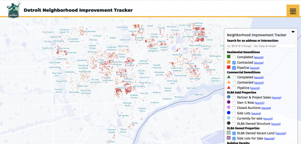
One of the first people he reached out to was Orlando Bailey, a community organizer in Detroit. He wanted Orlando to help him test the tracker, and make sure that it was working. “My reaction was one of joy,” says Bailey, “It was because we finally have something that can track things in real-time. Something that was readily accessible.”
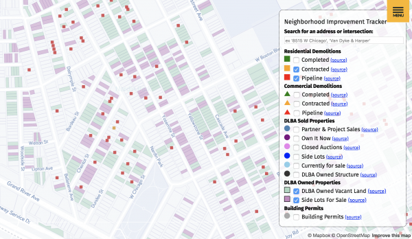
Orlando says it felt like the city was finally being honest with residents – and showing that they were committed to making the demolition program transparent. The tracker launched in 2016 and it’s basically an interactive map of Detroit. All over the map are different colored pins that show houses that are scheduled to be demolished. Orlando says the tracker didn’t always give people the answer they were hoping for, but it was a relief just to have any information at all. “Whether they liked the answer or not, they had the answer,” explains Orlando.
It’s not perfect, but Ryan Buell says the tracker is a good first step towards a more transparent dynamic between the city government and its residents. “Revealing the progress and the work that’s going on perhaps will give people the confidence to invest in their own homes, in their properties, and… help bring this city back to life. Maybe you won’t move away. Maybe you’ll stay here,” imagines Buell, “and we won’t lose even more residents.” And Buell hopes that others can learn from Detroit and Kayak, and design little windows into the processes that are so often opaque to the people who depend on them. Because we all depend on companies, and governments and other institutions just to live our lives every day. We’re all waiting for something.


Comments (13)
Share
Interesting. Did you listen to the Crimetown Podcast about Detroit and its many corrupt politicians? In the last episode of the season, they also talk about the demolition project and how it is looking like once again there was some collusion and kickbacks for contractors. Because as they said in the podcast as well: “that’s a lot of demolitions”.
https://www.crimetownshow.com/episodes-detroit/2019/03/11/s2e19
I thought about kayak and how people enjoyed the transparency of the loading screen. I wondered why more websites did not utilize such transparency, and then it hit me: who wants to see a loading screen on their website showing that you’re waiting for your content because “waiting for ads to load.”?
Interesting that you trace the explanatory loading bar back to Kayak as the origin. I’m fairly sure that it had become common in videogames years earlier than that. I don’t have a good enough memory of 1990s videogames to name a specific example, though, so I will just throw that out there and hope someone else can back me up.
Sim City 2000 was one. When you generated a new map, it showed what it was doing, complete with the famous “reticulating splines” audio clip.
I’m surprised there’s no mention of the regression of the progress bar in Windows. It has what looks like a progress bar at first glance; however, it is actually a simple animation that shows a colored bar move from left to right on the screen (fairly quickly), only to repeat itself, with no actual indication of progress.
Yes, and also surprised that nobody mentioned the famous “Microsoft minutes”, when a process would routinely take longer (and sometimes much longer) than the number of minutes promised on the screen. It would have been interesting to hear something in this episode about the counter-examples – why companies like Microsoft have not learned the lessons discussed here.
when i heard this part of the cast, i immediately thought of the jokes as part of the loading screen for (EverQuest.)[https://www.giantbomb.com/humorous-loading-screen-messages/3015-8655/]
As a software nerd, this was an interesting listen, thank you. The discussion around manipulating progress bars reminds me of a paper I came across years ago that laid out equations for creating different kinds of “progress bar movement” for the sake of studying how the user perceived the amount of time passed: http://www.chrisharrison.net/index.php/Research/ProgressBars
I remember reading something about some apps making their progress indicators slower. It is a way for them to make their users think that they are doing the processing properly, probably comparing it to how long it takes for humans to do the same tasks.
https://www.theatlantic.com/technology/archive/2017/02/why-some-apps-use-fake-progress-bars/517233/
Well this is only peripherally related, but it definitely relates to waiting (and effective responses). I’ve often reflected on how through the ‘80’s, and into the 90’s the airline-using public was constantly outraged by the poor on-time performance of airlines. Everyone was super frustrated and airlines had horrible approval ratings.
Then it all changed when someone somewhere had the brilliant idea to just include typical delays in flight times. Now flights are much more rarely late (it seems), and even delays at departure can result in flights that are early by a few minutes.
And often flights land early(!)
Not a solution to flight delays but a simple, brilliant solution to a perception problem. I always thought it would be interesting to find the person who figured that out.
i thought of this too. I saw it on EverQuest, released in 1999.
and this link agrees, https://www.giantbomb.com/humorous-loading-screen-messages/3015-8655/
Don’t some sites use phony, elaborate progress bars these days? If you search for a phone number or a person’s name, you get lots of links to sites that display long (animated gifs?) listing all sorts of databases they’re allegedly searching … only to end up a a screen that offers minimal info but urges you to pay for more. I have always assumed these things rely on a combo of the pretense of intensive work behind the scenes with the sunk costs fallacy — I’ve put in so much time waiting, I should pay rather than have to wait all over again somewhere else. Maybe I’m too cynical, but these days when I see a progress bar accompanied by explanations ala kayak, whether online or in an app, I automatically assume it’s fake.
Great piece! Too bad about the mention of the pizza tracker, though, since it’s (at least in one place) totally phony. https://melmagazine.com/en-us/story/i-staked-out-my-local-dominos-to-see-just-how-accurate-its-pizza-tracker-is
Fully-tracked shipping is much less frustrating than barely tracked shipping, for sure, in what is definitely a corollary to (or example of) the thesis of the episode.