Icons and symbols and signage are all around us, and nowhere more so than on the open road. So for this latest set of Ubiquitous Icons: hop in the car with Roman and Kurt for a crash course in roadside signage. We’ll learn about the history of the stop sign, those iconic rural mailbox, and the signs that tell you what you’ll find at highway exits.
Red Stop Signs
Our first point of interest is the classic American stop sign — you know the one: octagonal, red background, white print. But a fan wrote in after spotting a strange blue stop sign in Hawaii. The reason some stop signs are blue was a neat little story in itself, but the exception also got Kurt wondering: why are the rest red?
Blue Highway Signs
Along freeways and major highways, there is another common sign where blue is the norm rather than the exception. Pull off the road with us to discuss ‘specific service signs,’ the signs near highway exits that tell you what businesses you’ll find there. Learn what it takes to get on these signs, and how you can decode them along your way.
Red-Flagged Mailboxes
While technically not a graphic icon as such (at least not until the digital age), there is a certain kind of iconic rural mailbox that dates back over 100 years. But to understand how this classic design came to be, we have to go back even further. It all started in the 1800s, when the United States Postal Service introduced Free City Delivery.
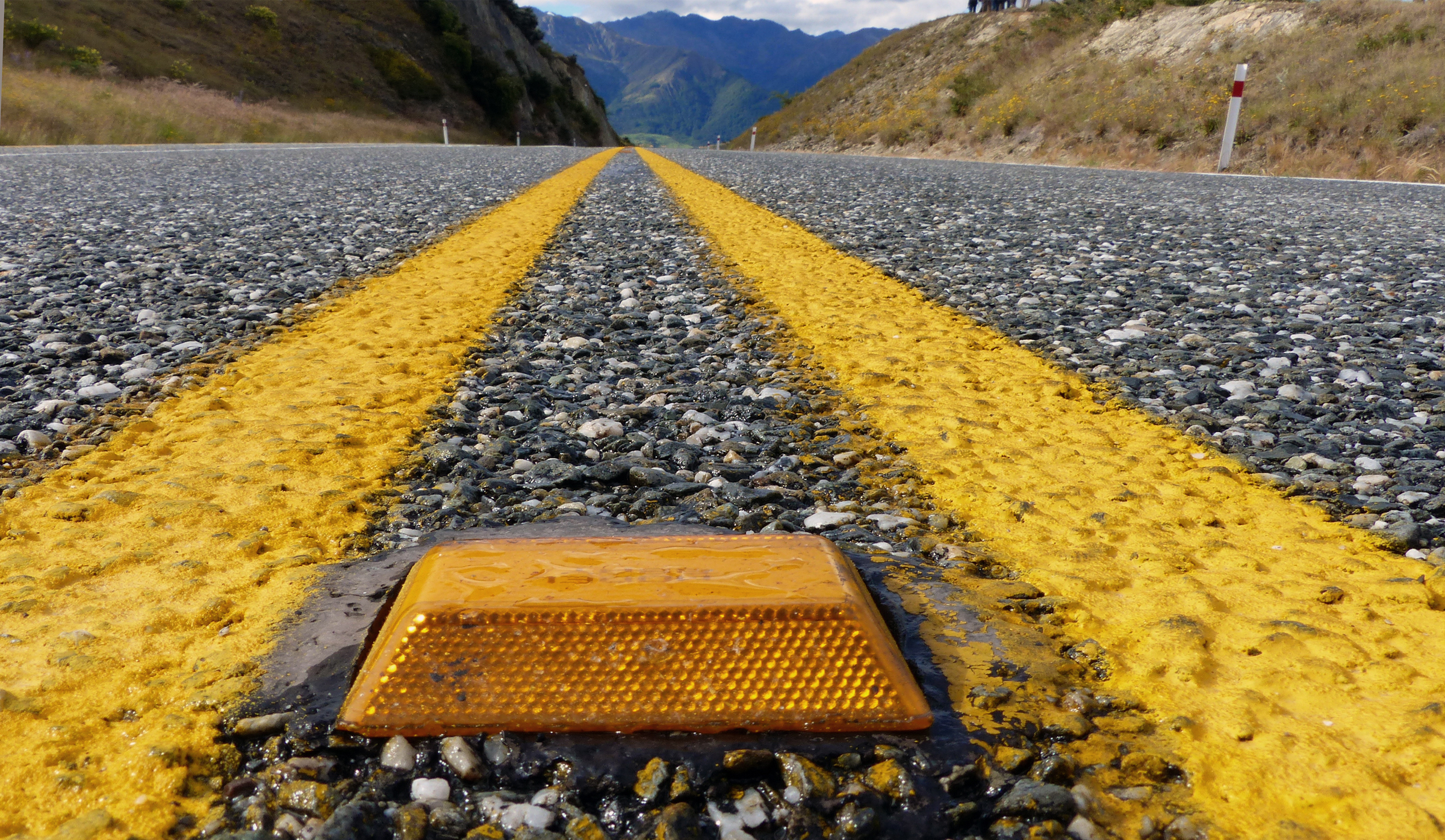
Yellow Cat’s Eyes
No matter where you travel along roads, you’re bound to see some retroreflective studs. The specific design varies from place to place. Some are relatively simple, but others are surprisingly complex and have fascinating origin stories, like Percy Shaw’s “Cat’s Eyes.”
That last story is something we pulled from the pages of our upcoming book, The 99% Invisible City, which is about everyday designs. In our research, we looked both globally and locally for compelling stories and characters, like a pavement expert from Halifax and the cat that inspired his life-saving invention — a device that went from being one man’s hobby to a mechanism for national defense during WWII.


Comments (6)
Share
A red stop sign might be “bright” to most people, but to the colorblind, like myself, it is a bad color to use because it tends to blend in with foliage that might be near it.
I’m more than a little surprised to hear your astonishment that the shape of road signs corresponds to the type of information they provide. This is a standard lesson in any driver’s education course and license test
The surprise wasn’t about there being uniformity/repetition (connecting shape to meeaning) but about the specific theory of ‘more sides = more danger’
I once heard the story, that the shape was chosen simply to distinguish it from other signs even when, for example, it is covered with snow. The other sign that has a shape that is unique (at least here in Germany) is the “respect the right of way” sign (sorry, don’t know the exact translation), being a triangle pointing downward. These are the two signs that can lead to serious accidents when you cannot recognize them. I find this quite convincing and have great respect for this kind of foresight.
The grand geometric theory to the shape of signs seems quite aligned with Flatland’s (Edwin Abbott) order of shapes. The larger number of sides represents the level of importance of the that shape in society with circles (infinite sides) being the the priestly leaders. https://etc.usf.edu/lit2go/5/flatland/26/part-1-section-3-concerning-the-inhabitants-of-flatland/
I really enjoyed the piece on stop signs, but I was a bit disappointed on the history of the color red. “While red was often associated with stop and thus a logical choice…” Why was red associated with stopping?! if yellow was the common color for stop signs, why didn’t yellow become associated with stopping?
Anyway, I’m interested in knowing how red and stopping came to be associated together. Thanks for any insights you can add!