Peter Dörfell lives in Dresden Germany where he works in elder care, visiting clients at their homes, and to do that, he usually takes the bus. But one morning last September, he noticed something unusual as he boarded. “When I got on the bus, I see that the bus driver had put up a sign inside of the bus that said in German, ‘Diesen Bus Steuert ein Deutscher Fahrer,’ which means ‘this bus is driven by a German driver.’” This was not the kind of message Peter was used to seeing on his daily commute, but to Peter… the meaning of the message was pretty clear.
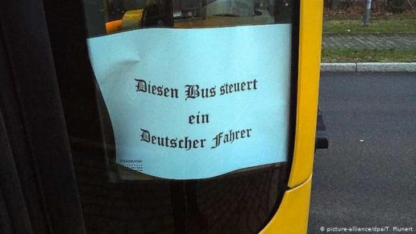
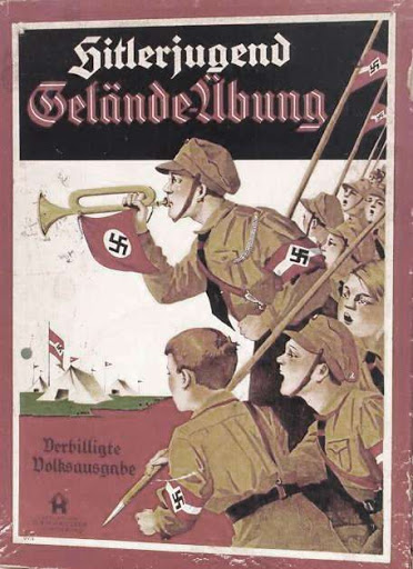
“The implication to me was […] I am one of the good ones and not, a ‘foreigner.’” But what really drove the message of this sign home, was not just the words, but the typeface it was printed in. A typeface from a family of German typefaces once used throughout Germany which are known collectively as Fraktur which in English goes by a different name: blackletter. Blackletter is the type of old-timey Gothic typeface that you often see used for the bold front titles of newspapers like the New York Times or Washington Post, or on the T-shirts of Heavy Metal bands. But for many people, especially in Europe, blackletter is most closely associated with one thing: it’s the “Nazi Font.”
𝕱𝖗𝖆𝖐𝖙𝖚𝖗
If you have ever caught even one minute of the History Channel… or really any documentary about World War II, you have seen this type. You’ve seen it on Nazi posters, on Nazi office buildings, on Nazi roadwork signs. Today in Germany, blackletter typefaces are frequently used by Neo-Nazi groups and for many Germans, they bring to mind the dark times of the country’s fascist past.
Florian Hardwig is a graphic designer and the editor of a website called Fonts in Use and he says that in Germany, any blackletter typeface is used to signal German nationalism. Using blackletter is a statement and sends a signal of emphasizing the “Germanness.” Today, depending on one’s perspective, blackletter can either represent German culture’s rich and proud heritage or alternatively, symbolize everything that is wrong with it. But to understand how people’s feelings about a simple typeface got to this point, we need to go back to the moment of its birth.
𝕺𝖓𝖊 𝕿𝖞𝖕𝖊𝖋𝖆𝖈𝖊 𝖙𝖔 𝕽𝖚𝖑𝖊 𝕿𝖍𝖊𝖒 𝕬𝖑𝖑
Once upon a time in that bygone era of knights and castles and feather quills, blackletter was used all across Europe. Blackletter may seem incredibly ornate and definitely does not seem like a conventional style of writing, but back in the Middle Ages, blackletter was actually considered practical. Dan Reynolds is an American type designer and historian who has been living in Germany for the last two decades, and he says today we’re used to letterforms with perfectly rounded curves: think of our O’s, U’s, P’s, and C’s. But while these shapes look easy enough to draw, if you’re using a quill to draw out thousands of them, page after page, it becomes difficult.
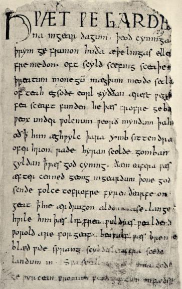
Back then, just as now, readers valued standardization in a text. Every letter, even the rounded ones, had to look exactly the same. It was hard for a monk copying out a text to consistently draw perfect circles over and over again, and if you were a scribe it was a lot easier to produce all those Os and Us and Cs out of a series of short straight lines. The technique of using straight lines instead of curves gave the letters a fragmented appearance. Which is actually how Germany’s most common form of blackletter would get its name: Fraktur.
Blackletter was first developed in France in the 12th Century, but within a few hundred years it had become standard throughout Europe. So much so that it wasn’t really a type choice, it was just what words looked like. Susan Reed is head of Germanic Studies at the British Library, and she says that blackletter became so ingrained in the culture that even after it stopped being needed, people kept using it. As with so many big leaps in technology, the printing press started off by borrowing heavily on the design conventions that came before it, even though the new operating principles made those conventions unnecessary. 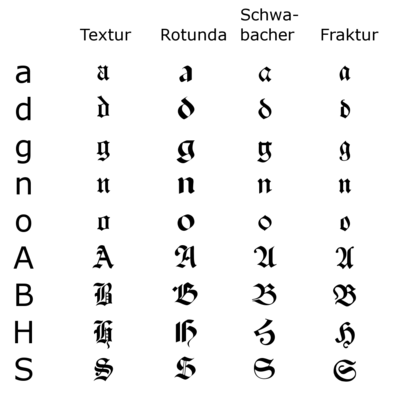
The Domination of Roman
The printing press appeared to only further cement blackletter’s status as Europe’s typeface, but then blackletter was challenged by different typeface: Roman. This was the typeface associated with Imperial Rome. Just like the letters chiseled onto the side of an ancient marble column, Roman letters are sparer and more vertical than their blackletter counterparts. You’d also probably find them a lot easier to read because they look like the letters that we’ve been reading our whole lives.

Today, almost all major western typefaces are Roman. From Times New Roman to Arial, every time you open up Microsoft Word or Google Docs, you’re using Roman type. It’s just what writing looks like.
Roman typefaces might have stayed lost to history, but right around the same time Gutenburg was printing blackletter bibles in Germany, Renaissance scholars in Italy began to rediscover ancient Latin texts. “You had this rediscovery in the renaissance of classical literature and the classical world and classical letterforms were being brought back,” says Reynolds. Italian scholars began consciously developing their own Roman-style writing styles which drew heavily on the classical forms they encountered.
An Island of Broken Script
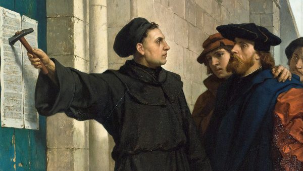
By the end of the 16th century, Roman type had become common in the typed vernacular languages of France and Spain. England followed suit in the 17th century, then the Netherlands and Sweden in the 18th. Eventually, it had become the very same thing that Fraktur had been before—ubiquitous and unquestioned. But even as Roman became the western world’s dominant form of writing, Germany and the German language stayed resolutely committed to blackletter. An island of broken script in a sea of curves, mostly thanks to Martin Luther. Luther was a prolific writer of the German language and wanted to distinguish German writing from the Catholic writing coming out of Italy, so he made sure all his texts were printed in blackletter.
At first, blackletter typefaces remained popular in many parts of Protestant Europe, but one by one, the other Protestant countries began to give in to the temptations of Roman type. Until finally Germany was the lone holdout, particularly the specific typeface known as Fraktur, which eventually became a shorthand term for all German blackletter type.
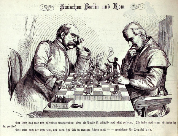
Part of the reason why Fraktur remained popular in Germany was because, unlike the people in other Protestant countries, Germans had no cohesive state until late into the 1800s. One of the only things unifying the German identity was its language, and Fraktur came to be seen as a central part of that. Fraktur’s connection with nationalism only got stronger in the 19th century when Germany was invaded by Napoleon—the occupying French had their Roman letters, and the Germans had Fraktur.
In 1871, when Germany finally unified and became a nation-state, Fraktur became the official government typeface. Otto Von Bismarck, the first chancellor, was such a staunch supporter that he said he would refuse to read any German book not set in German type.
But right around the time they finally got their own country, a growing contingent of Germans began to wonder if they really needed their own typeface. Liberal, cosmopolitan and future-facing, these Germans came to feel it was silly to keep using a type from the Middle Ages, especially in this new age of industry. They began pushing for Germany to drop its beloved Fraktur and move to Roman type. The rest of Europe had moved on to Roman type, and it became increasingly hard for scholars to read German texts.
As the world became more international, Roman also started seeping in. It began to be taught in schools alongside Fraktur so that by 1891, about 40% of German books were being printed in Roman type. But Fraktur’s proponents held their ground. In 1911, they defeated legislation that would have had Roman replace Fraktur as the official government typeface.
The country was now split into two camps, pro-Roman and pro-Fraktur. Even by the end of the 1920s—in the era of telephones, radios, refrigerators, and jazz—traditional Fraktur street signs could be seen hanging next to arc deco advertisements, featuring sans serif Roman typefaces. It was as if there were two separate typographical realities representing two different Germanies. Fraktur would end up on the losing side of this typeface battle, but it wasn’t the liberal, freedom-loving, over-educated cosmopolitans who finally broke the impasse. Instead, it was the most ardent German nationalist of all time… Adolf Hitler.
The Nazi Font
In 1933, the Nazi Party rose to power on a wave of German chauvinism. And at first, this seemed great for those in favor of traditional blackletter typefaces, which Nazi Party officials promoted heavily. Most printers and publishers began opting for Fraktur, and Nazi propaganda often used the typeface.
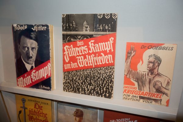
But blackletter’s resurgence wouldn’t last long, because it turned out that Hitler didn’t particularly like Fraktur. It wasn’t that Hitler wasn’t into traditional German values, he just didn’t think that should mean being old-fashioned. Hitler knew that if he wanted to rule over the world, he would have to use a typeface that the rest of the world could actually read, so he chose Roman.
In 1941, an edict was circulated to all publishers and printers, decreeing that Roman type become the standard type throughout Germany. Effective immediately, neither Fraktur, nor its cursive counterparts, were to be taught in schools, used in government documents, or appear on street signs. All magazines and newspapers were likewise expected to change over to Roman script. The explanation in the letter was that they had found out that blackletter was actually a Jewish invention and that it had to be dropped immediately. This wasn’t true, but it was an unassailable argument and was impossible to come back from that.
The Nazis put an end to Fraktur’s use as an everyday typeface, so it’s ironic that the typeface Hitler banned and personally disliked remained stubbornly associated with him. The Nazis were German nationalists, and Fraktur was a traditional German typeface. It shouldn’t be surprising that they found it hard to shake the connection.
By 1945, when Germany was finally defeated, no one wanted anything to do with the “Nazi font,” and by the 1950s it had died out. Today, where blackletter typefaces can and can’t be used, especially in Germany, is complicated. It depends on the context, and it doesn’t always make sense. When it’s on a restaurant sign or beer label, it’s invisible. Consumer items and commercial ventures that want to evoke a more innocent sense of tradition and quality often use blackletter without any trouble. The same goes for heavy metal and bands and other people that want to play up its medieval qualities. But there are also contexts where its use is not innocent and can’t be forgiven as naive.
Once a Nazi Font, Always a Nazi Font
When Peter Dörfell, the bus rider in Dresden, saw the sign that read: “This bus is driven by a German driver,” it was printed in blackletter. People like Peter knew exactly what it was meant to communicate. In fact, the sight of the sign and of the typeface was so alarming, there was no way he would just let it go. Peter snapped a photo and posted it to Twitter at the Dresden Public Transit Authority. A little while later, a journalist got in touch with him, and soon the story became big news.
Alt-right nationalism remains on the rise in Germany, especially since the refugee crisis and controversies surrounding the use of the typeface seem to be happening with more frequency. No mainstream conservative politician publicly uses Fraktur, but in 2017, a police anti-terror unit in the state of Saxony was sanctioned for using a logo on the interior of their vehicles that featured a blackletter typeface. Mostly though, the only people to openly use Fraktur are neo-Nazi groups promoting a hyper-traditional version of German nationalism. Apparently, most of them still don’t realize that Hitler considered the typeface hopelessly tacky and provincial. But if Peter’s story about the bus driver and his blackletter sign demonstrates anything, it’s that no matter what the real historical facts are, Fraktur will never return to the mainstream. For better or worse, it’s going to keep being the Nazi font.
Even if Fraktur can never again be used in everyday life, those who study it don’t want to see it completely forgotten either. Most of Germany’s older texts are written in Fraktur, and in order to access those words, knowing how to read blackletter is necessary. Hanno Blohm is a 76-year-old retired teacher, who is the president of the Bund für Deutsche Schrift und Sprache. The organization teaches students how to read and write old Fraktur-style cursive, not to invoke nationalism, says Blomn, but so that they can read historical texts and gain access to the past. Today, blackletter may be dead as a usable typeface, but it remains a valuable historical artifact.


Comments (16)
Share
I’m not a sports guy, but I first thought of the Detroit Tigers blackletter “D” logo, which I am just finding out was first used in 1904, went in and out of use several times since then. This may just be an unfortunate affiliation.
https://www.michiganradio.org/post/where-did-iconic-detroit-d-come
There’s a craft pub in Dublin, the Beer Market, which has some strange artworks upstairs. A reproduction of the Laughing Cavalier with “Laughter is the best medicine” across it, Déjeuner sur l’herbe with “Silence is one of the fine arts of conversation”. And the writing is in one of these style fonts. It’s slightly unsettling, and I guess the juxtaposition is intentional. But I wonder if people who don’t know the history don’t see it and the whole thing is an accident. My mother grew up reading this script in that Germany, and was not sorry to see the back of it.
I would like to point out that Fraktur is very common as a folk art style, especially in Pennsylvania Dutch areas. For an explanation, see http://www.welcome-to-lancaster-county.com/fraktur.html.
This comment is not to dispute the contemporary appropriation of Blackletter by right-wing nationalism and Neo-Nazi groups. That cannot be contested.
Rather, I wonder about the conclusion that Blackletter’s persistence into the 20th Century comes down to a Protestant act of resistance-cum-nationalism.
If this were a rebellious act against Roman Catholicism, what Blackletter’s status was in Catholic Bavaria? What about (mostly) Catholic, Germanophone Hapsburgia? Was it less secure and more variably applied there compared to the northern, protestant regions (Prussia, Saxony, Thuringia, etc.)?
Conversely, what was Blackletter’s status in German-speaking, (mostly) Protestant Switzerland?
I’m posing these questions because I know enough to wonder, but not enough to know.
I was wondering the same thing. I get that 99pi is mostly for american listeners but as a european it is a bit frustrating that these things are often generalised.
Hi, loved the episode! Does anyone know where I might find a picture of that 1941 edict that banned Fraktura?
https://lmgtfy.com/?q=1941+edict+that+banned+Fraktura%3F
Image of the Bormann edict (German) of 1941: http://ligaturix.de/bormann.htm
I like the article (didn’t listen to the podcast yet), but I’m not sure, if the Bund für deutsche Schrift und Sprache is the most trustworthy address for information about Fraktur, especially concerning it’s political implications, as the Bund für deutsche Schrift und Sprache has been linked to a right-wing movement (the Bund für Gotterkenntnis) itself.
See: https://daserste.ndr.de/panorama/archiv/2019/Steuer-Vorteile-fuer-rechtsradikale-Vereine,gemeinnuetzigkeit102.html
(sadly in German)
Unless I am mistaken, the font the bus driver used isn’t actually a Fraktur, but one of the generic Textura usually known as “Old English”, probably because the bus driver did it using the first (or only) font that came to hand. If it had been done correctly, it would also have used the long form (ſ) for non-terminal ‘s’, as in “Dieſen Bus ſteuert ein Deutſcher Fahrer”, and the ‘ch’ would have been a ligature. Ignorance will often betray those who seek to fool people.
Peter Flynn, near the end of the podcast piece on Fraktur, Roman Mars does point out that, as you correctly spotted, the font is actually Old English.
I see “Irish Driver” signs in taxis in Dublin…. I don’t get in those taxis
I have an 1862 French / Danish dictionary book that is Danish in Fraktur and the French in Roman font
I’d like to comment on the last bit. I think this topic would make a good full length episode… Please consider this as a pitch ;)
I’m a member of a few ‘classical architecture’ groups but I’m not a diehard classicist myself. I find it upsetting that many others are and despise everything ‘modern’. That being said, I think hardcore modernists, especially those in the academia are more to blame here. It’s different in the US, as there are quite a few classical architects and revival-style buildings being built, but in Europe the hatred towards everything non-contemporary is still standing strong. I read an interview with one of the prominent architects and architecture professor last year. She was mocking a student proposing a tympanum in his design, labeling it as hideous and pointless. Hatred breeds hatred and polarizes people, even in such a field.
Curious where the continued use of Fraktur for things like the mast-head of the Frankfurter Allgemeine Zeitung (https://www.faz.net/aktuell/) or Aftenposten (https://www.aftenposten.no/) fit into this history.
Given this history, these seem tragically insensitive.
Yeah let’s cancel fraktur