At a glance, the overall pattern formed by these first 25 polar histograms (or: rose diagrams) is clear: orthogonal grids, mostly aligned with cardinal directions in orientation, dominate American cities. There are exceptions, but most streets run north, south, east and west.

Geoff Boeing, an assistant professor of urban informatics at Northeastern University, recently moved from the more linear Bay Area to a more chaotic Boston. Upon arrival, he created this series of data visualizations to explore how American city grids shape urban legibility in 25 major cities. He explains that in his diagrams “each bar’s direction represents the compass bearings of the streets … length represents the relative frequency of streets with those bearings.”

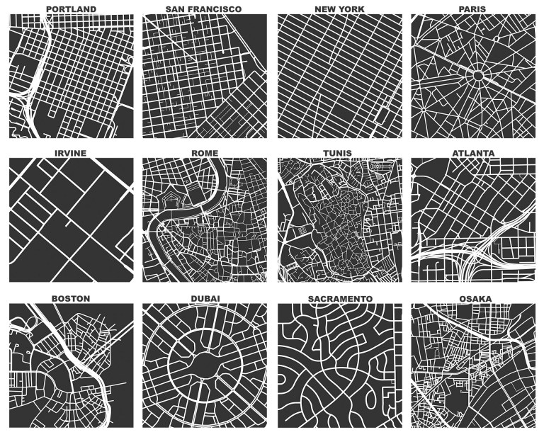
A combination of factors, from winding streets to the cobbled-together nature of the city, have resulted in Boston’s unusually complex grid. “It does not adhere to a straightforward north-south-east-west pattern (or any other consistent, predictable pattern) that our brains adjust to in most places,” writes Boeing. He clarifies, though, that this is “not because Boston apocryphally paved over its cow paths, but because of its age, terrain, and annexation of various independent towns.” Still, the city arguably makes up in part for what it lacks in clear directionality with other features, including familiar “paths, edges, districts, nodes, landmarks” — its long history works both for and against its legibility.

In between confusing-looking grids in places like Charlotte or Boston and rigorously linear ones like Chicago’s are hybrid cases — San Francisco and New York City, for instance, have grids partly or mostly tilted due to geography. Manhattan’s streets are aligned with the overall orientation of the angled island (northeast/southwest).

There are also places with conflicting grids — in the case of Detroit, for example, four key factors shaped the city over time: its early role as a trading hub, the intervention of a destructive fire, the allocation of farming real estate and, finally, the imposition of a modern grid.
Around the world, meanwhile, a set of 25 international cities paints a very different picture. These global histograms show angled grids cutting across orthogonal ones (in Barcelona or Budapest) as well as misshapen lumps that seem to defy any logic (in Rome and Paris).
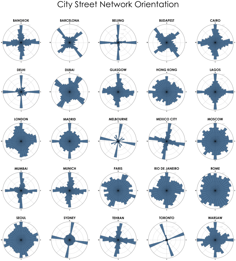
Like any single data set, grids alone do not tell the stories of cities. Still, they can be useful in comparing, contrasting, and helping establish patterns across continents and countries. Visualizations of these phenomena can help urbanists share findings with the public, too.
More about Geoff Boeing, who received his Ph.D. in City and Regional Planning from Berkeley in 2017: “My research broadly revolves around urban data science, urban form, and complexity. This includes studying street networks, affordable housing, and the relationship between the deterministic nature of urban design and the emergent characteristics of urban form that arise out of complex systems.” These polar histograms were created using using OpenStreetMap data, Python and OSMnx.


Comments (1)
Share
Hey! Anyone who enjoyed this should also check out this project. https://mourner.github.io/road-orientation-map/#10.61/39.7852/-104.897
Which makes it interactive.