A while back, we took a look at how the design of the W4-2 (Lane Reduction Transition Sign) has been improved over time while also asking: could its message be further clarified? A set of alternatives was proposed based on the visual language of other W-series signage.

We polled 99% Invisible fans about these design concepts (final tallied results are above). Naturally, too, a number of people wrote in with even more intriguing ideas. Among others, a designer, an artist and a municipal sign shop lead each sent us some compelling variants.
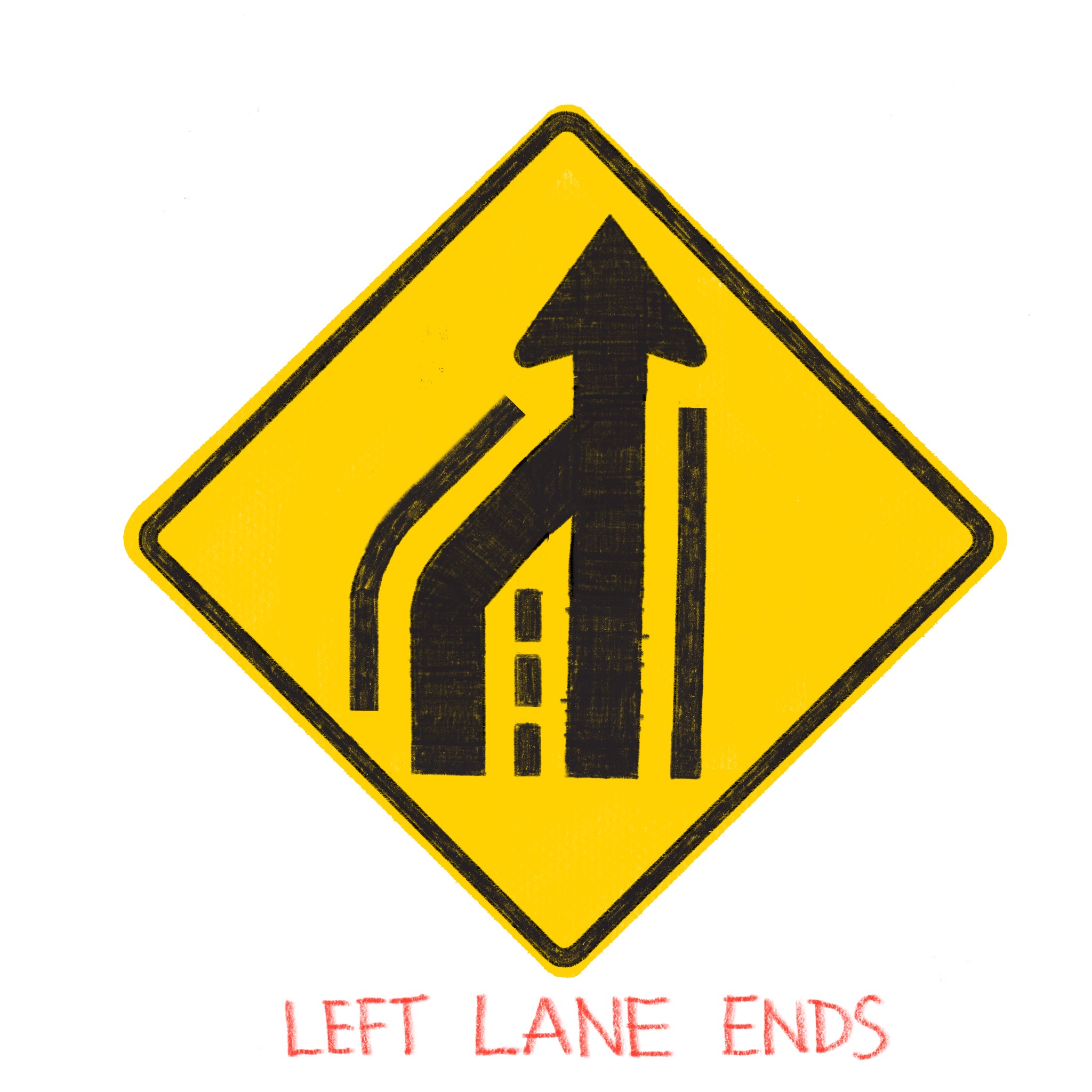
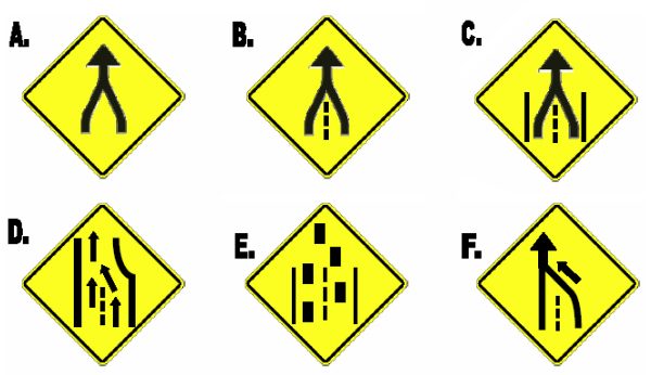
Designer David William of Dutchess & the Queen submitted a series of solutions involving directional route arrows wrapped by guiding lines.
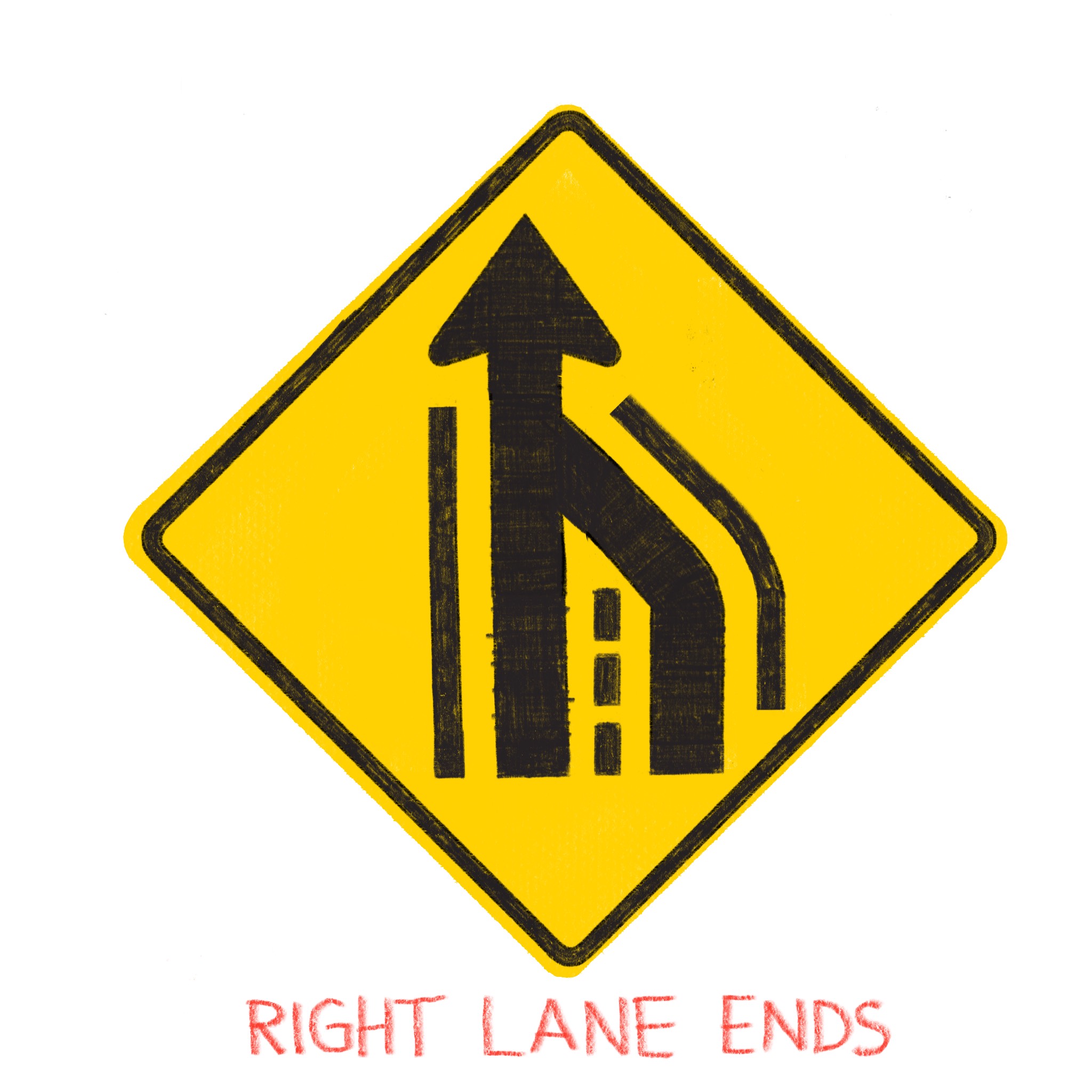
In each case, thick arrows clearly show the path of travel while thin lines serve to mark lane edges and central divisions.
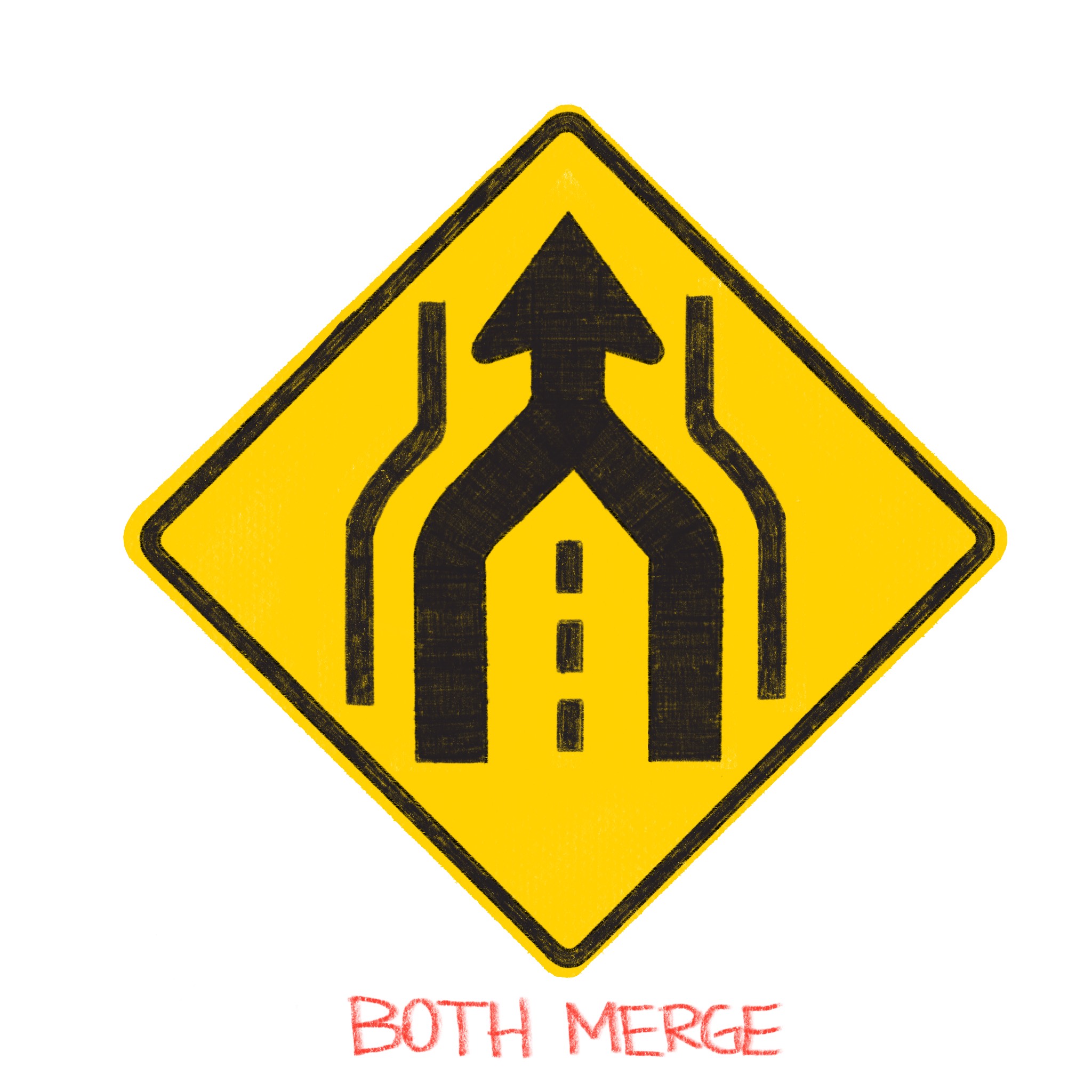
Dual (left and right) merges are accounted for in this last sign for cases in which two lanes are joined into a new central one.
Brooklyn artist cyanidekid doesn’t drive much but does have an idea for a simple W4-2. Playing with figure and ground, his design turns the arrow into pavement then uses negative space to create a dividing line, closely echoing the width reduction and dark/light balance of a road.
![]()
Tyler K works on signs and based his design on insights gleaned from professional experience. “In my view,” he says, “the problem with warning signage being less intuitive occurs when the designers leave out key road identifiers that we all are used to seeing.”
Part of the issue, he believes, is that the W4-2 “doesn’t mimic what you see on the actual road.” He notes that the angled lines are unrealistically tapered and actual on-road merge arrow is missing from the sign. In short: his sign is designed to be realistic, reflecting what people will actually see on the road more accurately to improve clarity.
Another NYC designer, Brandon Jameson, posted not just potential solutions but also iterative steps as he analyzed different possible approaches. Design, after all, is a process.

Other 99pi fans sent in merge signs already in use around the world, though not all of these would be suitable for American roads (most would fail to fit in the visual language of other local signage).
W4-2 for Alternating Merge Patterns
But some international solutions do deal with a problem that the existing W4-2 does not really address: merges in which cars from different lanes are supposed to alternate access.
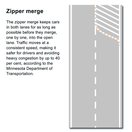 For instance, the Swedish “Zipper Rule” and British “Double Lanes Merge” signs (below) each show two equal lanes converging. And the issue they address has been on radar of some U.S. transportation professionals for quite a while. The W4-2 tells drivers to merge, but implies priority right-of-way for the lane that continues. Alternative solutions show not only new possible directions for the W4-2 but also give insight into the actual sign design and testing process.

Back in 2005, Eric G. Feldblum of the Connecticut Department of Transportation (Bureau of Engineering and Highway Operations) completed a study evaluating different ways forward for lane-merging signage. Along the same lines as the British and Swedish examples above, the specific focus in this case was to encourage alternating merges, with vehicles from each lane taking turns.
 Feldblum and his team developed and tested a series of prototypes around that central idea. They then compared the results in the field against the extant W4-2, recording and reviewing 384 hours of road use video (approximately 28,000 merge events) in the process.
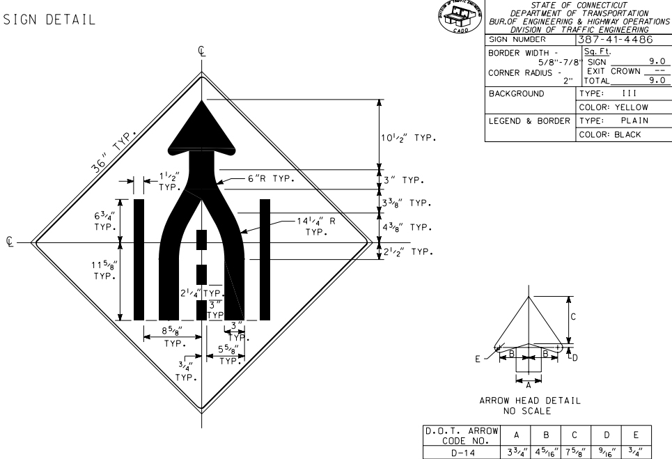
 His report, Alternative Merge Sign at Signalized Intersections, examined both field results and survey answers, ultimately concluding that the sign below would work best (which, if you recall, looks a lot like a prototype proposed by David at the top). “There are two main parts of the sign,” the report explains, “the arrow and the roadway display. The arrow, which warns to merge ahead, was designed to encourage an alternating merge pattern.”
Other alternating merge designs have also been explored by the Human Factors Laboratory of the Federal Highway Administration.
Solutions aside, the variety of designs studied spans an impressively broad range. Among other things, these diverse variants illustrate the myriad possibilities for rethinking a seemingly simple problem. The report further highlights a critical component in developing new signs, W4-2 and otherwise: testing proposed solutions out on real roads.


Comments (4)
Share
Polish version: https://upload.wikimedia.org/wikipedia/commons/thumb/8/81/Znak_D-14.svg/120px-Znak_D-14.svg.png
I’m a fan of New Zealand’s straightforward “merge like a zip” signs:
https://i.pinimg.com/originals/db/c6/c8/dbc6c81d26628a569a416712176e0fdc.jpg
This is article is an example of 99PI at its best.
Thanks Kurt and team for your tenacity on this topic.
So while I agree that for someone who has never seen a merge sign before the intent may be confusing, I think you’ve kind of lost the ball here with a lot of these alternates. The intent of the sign is not to tell someone how to merge, it’s to warn them in a standardized way that a merge is imminent; additionally it needs to do that in a variety of situations, many of which include poor visibility at high rates of speed while a person may be approaching task saturation. By making the sign more complicated to communicate the how of merging you also make it less distinct, you make it harder to figure out at a glance what the sign is and in the process somewhat defeat it’s purpose.