It is one of the most familiar and widely used character sets in the world, but it also looks dated or retrofuturistic, like something originally designed for use in a vintage science fiction film. The numbers are indeed old and have in fact inspired lookalike fonts used in computing and futuristic settings, but the original characters were never meant to be harbingers of space-age aesthetics. Their distinctive shapes were in fact grounded entirely in an everyday problem: cashing checks at banks.
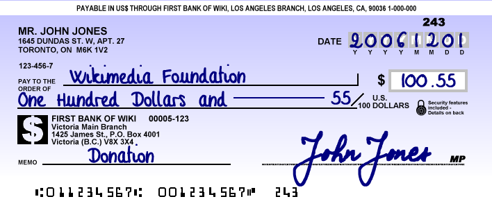
In the early 1900s, checks were still being processed manually by bank workers, which took a lot of time and consequently cost a lot of money. As people wrote more and more checks, the banking industry became increasingly interested in a way to automate the process — in particular: a standardized solution that would function across institutions.
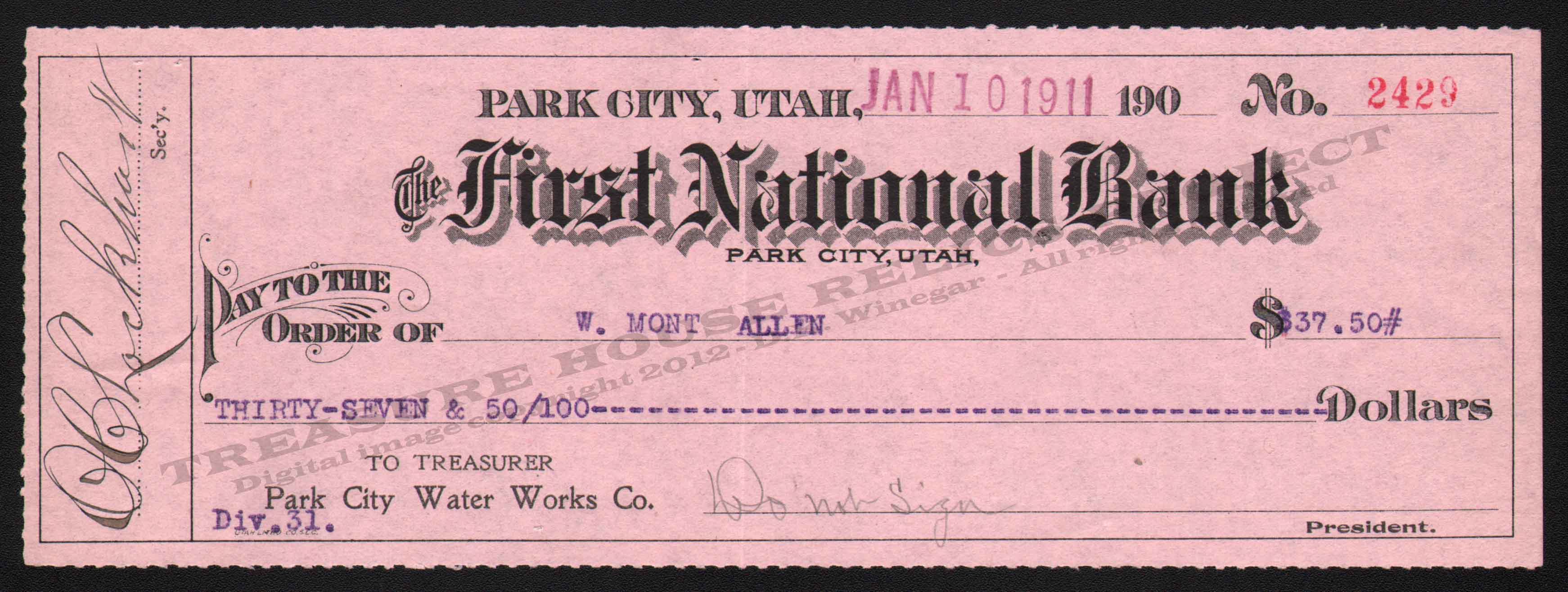
By the mid-1950s, the Stanford Research Institute and General Electric Computer Laboratory had come up with just such a system using MICR (magnetic ink character recognition) along with that now-familiar font that is still in use today. The resulting E-13B was rapidly adopted by American banks and then spread to countries around the world.
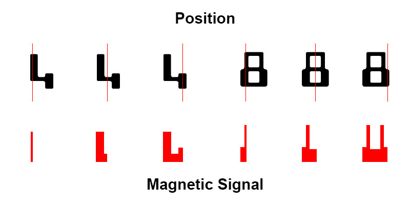
 In this designation, the letters E and B refer to design iterations while the number refers to the underlying 0.013-inch grid. The key to this solution was a combination of machine and human readability — if a magnetic scanning device failed, a person would need to check the numbers manually. To the machines, however, what mattered wasn’t the shape of the numbers as such but rather the magnetic waveform sensed when the checks were scanned. Essentially, each character communicated the same information but in entirely different ways for its target audiences of machine and human readers. Unlike a barcode, where the same data has to be presented in two formats, all of this information was wrapped up into a single set of legible numbers.

As Digital Check dot com explains it, “since the magnetic reader is measuring signal strength in a straight line – not capturing pixels like an ordinary camera – it’s not important where the magnetic ink is; what matters is how much ink there is in a vertical line at any given point.” To a machine, the numbers “look” entirely different, per the image below.
MICR came with other advantages, too. Its printed numbers were durable and remained machine-readable even if scuffed up or stamped over. MICR-readable checks could be printed using existing technology. The E-13B font was a parallel success and would go on to become a standard in most English-speaking (as well as many other) countries.
A competing standard, the CMC-7, was developed around the same time in France and is used across parts of Europe and elsewhere. This font was also designed to be readable by both humans and machines, though it operates like a bar code with vertical slats and gaps.
Today, check-scanning machines use both MICR and OCR (optical character recognition) to add redundancy and further reduce errors. For the most part, this second layer of machine reading is sufficient, but every once in a while (reportedly less than 1% of the time) a human still needs to step in and double-check things, so to speak.
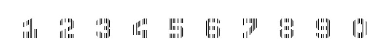
E-13B is also not limited to checks — it has since come to be used on coupons, credit cards, transportation tickets and more. The original character set contained only numbers and a few symbols, though, so any letter variants seen in films, advertisements or other media actually evolved from this original and much more mundane creation.
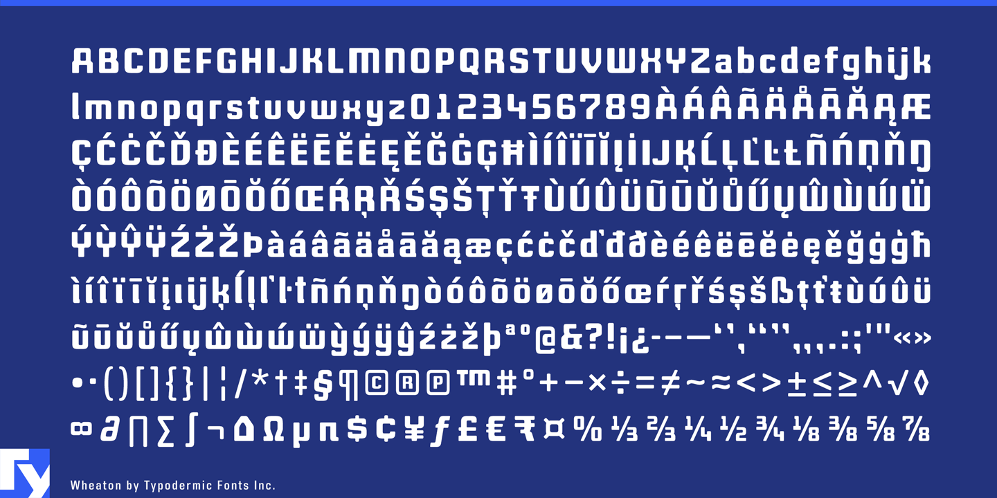
Take for instance the Wheaton Font shown above. Its developer, Raymond Larabi, explains that “when you see an alphabet done in MICR E13B style,” like this one, it’s an “interpretation” based on the original set of numerals. In this case, he crafted “a font with just enough MICR E-13B flavor for the nerdiness to flow through but not so much that it impairs headline readability.”

The geeks behind E-13B presumably never imagined that their humbly functional here-and-now font would become so beloved, a source of inspiration for both type designers and fictional futures.


Leave a Comment
Share