Could one person start a whole movement behind a new logogram and/or punctuation mark based on a momentary flash of insight‽ The Bay Area’s Doctor Popular had just such an exclamatory question about his “andorsand,” a hybrid character combining “and/or” into one glyph. A play on “ampersand,” the clever name doesn’t hurt, either.
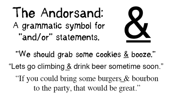
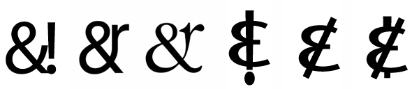
“My original idea,” Doc explains, “was to take the underscore that we’d find in mathematical statements (such as to represent ‘greater OR equal to’) and combine it with the classic ampersand.” Then, much like the interrobang’s publicized debut in the 1960s, the concept sparked other design ideas from fellow online typography nerds. Some designs may be better than others, but the general idea of incorporating the letters “o” and “r” (2nd and 3rd below) seems like a solid one.
Still, even assuming the design itself were to be finalized, a problem remains. As the (still relatively obscure) interrobang has demonstrated, the real key to success lies in banality. It is one thing to go viral, and another to get people using a glyph. Practically speaking, users have to employ a glyph without really thinking about it or going out of their way, as they do with dollar signs and other common characters. Short of getting the andorsand added to a physical keyboard or screen interface, though, how would one possibly go about increasing usage‽
One option is to employ auto-replace functionality, which is used to turn things like pairs of dashes (- -) into an en dash (–). Some word processing programs, including Microsoft Word, do this automatically on the fly. Similarly, a program might take and convert “and/or” into a symbol by default (unless manually disabled in the text editor). If that combination simply autocorrected, the results would become familiar and could spread to other programs and platforms over time.
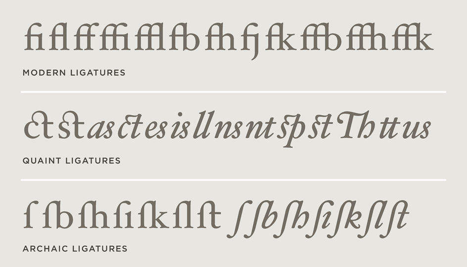
A more subtle possibility would be to follow the path of ligatures, traditional typographic tool for joining two or more graphemes or letters into a single hybrid glyph. Notably, the ampersand itself evolved from a ligature in which the handwritten letters “e” and “t” (Latin for “and”) were combined graphically into an “&” symbol, which can be traced back nearly 2000 years to Old Roman cursive.

On modern devices, ligature implementation has evolved. Typed inputs can be set to display differently without actually changing the inputs themselves. For example, a combined “!=” (“does not equal”) can be printed, shown and/or sent digitally as a “≠” glyph in unicode.
Some content management systems, like WordPress, do this already for things like en dashes, visually combining characters on public-facing pages. Meanwhile, in the interface, the double-dash remains as it was typed. A character set like “&or” can thus be converted into a new symbol for display without actually changing what the typist sees, obviating the need to instantly (and distractingly) autocorrect.

Similar approaches could also be used to popularize other glyphs, too, like this series of novel marks (shown above) developed in 1966 by French author Hervé Bazi, and/or the “question comma” and “exclamation comma.” Designed in 1992, this pair employs commas (,) instead of the period-shaped bottom points (.) in each mark. Typing the constituent characters in sequence (?, or !,) could produce these hybrid marks, for instance, either using autocorrect or as a digital ligature.

For much of history, new marks, signs and symbols depended on adoption by scribes in a less-literate world. Then, with the rise of printing and typewriters, technology was a limiting factor — each new character or glyph required another physical object. Recently, however, such obstacles have largely fallen away. Popularizing a new logogram like the andorsand today might be as straightforward as getting it incorporated into digital technologies people on a regular basis.


Comments (3)
Share
One punctuation mark (in a sense) that seems to have actually caught on in certain online circles is the use of “/s” at the end of a sentence to denote sarcasm. It’s common enough in Reddit comments that the average user seems to understand its meaning.
It’s not a standalone glyph of course, but it has the makings of one. It’s a minimized reference to HTML code, where blocks of content are formatted: content . There have certainly been other attempts at making sarcasm marks, but this is the one that seems to have caught on for the internet.
Haha the site actually parsed the HTML tag example in my comment so it doesn’t show. It was supposed to be (tag) content (/tag), but the () are .
It’s interesting to note the difference between how a glyph like the ampersand came about organically in a world of handwriting and how one might be made possible today. There may be a good case for an “and/or” replacement glyph, and I recently heard a talk about a someone’s search for a non-gender-specific pronoun (his/her) glyph, which could also have merit. I think any such new glyphs will be most successful if they come about organically and are built with the same DNA other typographic characters are made from.