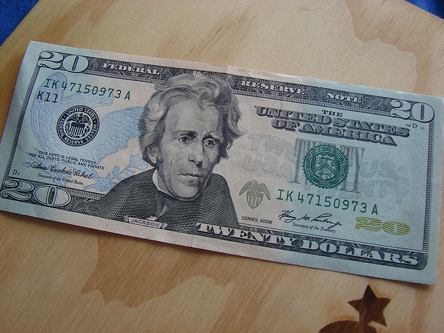
United States paper currency is so ubiquitous that to really look at its graphic design with fresh eyes requires some deliberate and focused attention. Pull a greenback out from your wallet (or look at a picture online) and really take it in. All the fonts, the busy filigree, the micro patterns…
It’s just dreadful.
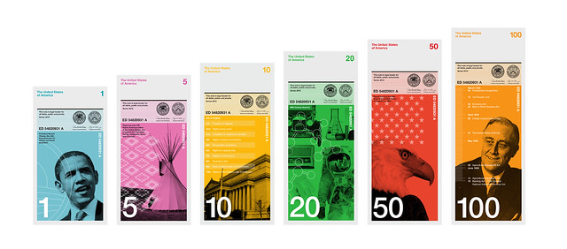
Even though paper currency itself—the idea of money—is a massive, world changing technology, the look and feel of U.S. paper money is very stagnant. Richard Smith is the founder of the Dollar ReDe$ign Project and in an article in the New York Times, he pointed out five major areas where the design of US currency could improve: color, size, functionality, composition, and symbolism.
The worst aspects of the design of the greenback are illustrated in this video by Blind Film Critic Tommy Edison.
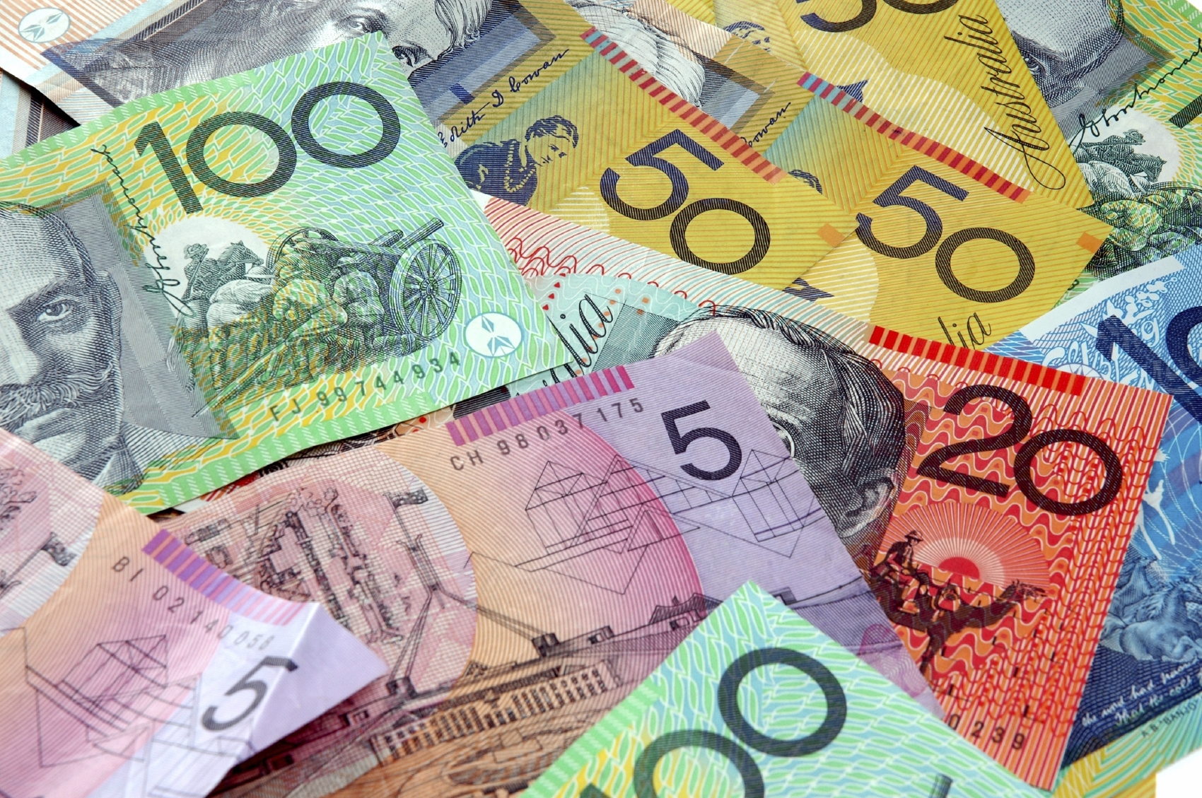
It just so happens that Australian currency addresses each and every one of the points Richard Smith makes. Tristan Cooke and Tom Nelson of the blog Humans in Design are big fans of all the design innovations in Australian money. Aussie polymer notes are varied in color, get larger with each denomination, are more durable and are generally considered better and easier to use than US currency.
But there are some interesting reasons why the greenback is the way it is. David Wolman, author of The End of Money, explains that the legacy features that make US paper money look stale and anachronistic are meant to convey stability and timelessness. Since the U.S. economy is so important in the world economy, why mess with it? Some fear that changing the design of the currency significantly (or eliminating the penny) could undermine the faith in the Federal Reserve note.
Even though Tristan and Tom are fans of the Australian polymer bills, they share Wolman’s view that the more interesting future innovations are not going to have anything to do with physical cash. Clever user interfaces that help us manage our money better, while providing even greater convenience, are getting more refined and accepted. So that ugly $20 in your wallet may never actually get prettier and more functional, it’ll just be gone.
This episode was a re-broadcast of an episode from 2012. We are all still recovering from TED, which was awesome.
Please fill out our survey from Survey Nerds! Thanks.


Comments (23)
Share
I love the Aussie money I have been a few times and while I have been to many places in the world I only carry one foreign note in my wallet as a reminder of my travels and it is the 10 dollar Aussie. The color is great the clear window makes it memorable and never fails to put a smile on my face.
Great show as always. I like the idea of redesigning currency. I think it’s WAY overdue. But you’re right about the fact that we took so long to fundamentally change our old-timey looking paper money makes it much, much harder to do. But can you imagine the convulsion of hate if this idea were to be done during the “Evil Rein of Barack Hussein Obama-Nation!”? Maybe a ‘real conservative’ like Ted Cruz could do it, but if Obama so much as proposed getting rid of the penny, he’d be impeached by this weekend. That said, I think our coins also deserve a re-think. They should be sized based on value. The dollar coin should be, um, good for once. And, yes, the penny should R.I.P..
Great episode. That (R) by the title takes me back to the days of TV Guide (rerun). I don’t know if that was intentional or not.
Digital currency; Problem solved.
I moved to Australia 6 years ago, and love the money here.
This is a design there have proven to be great outside the design studio.
Great work!
Australian money about to become more tactile for visually impaired – http://www.businessinsider.com.au/australia-will-produce-tactile-banknotes-to-help-visually-impaired-people-2015-2
No need to go all the way to Australia… Canadian money has all of these features as well!
We don’t have different sizes of currency like Australia. We do, however, have $100 bills that smell like maple syrup.
There is a fundamental problem with those new dollar designs, you think the designers would have noticed? The are all the same width. ???? You are still not going to know what’s in your pocket. A blind man still has some work to do with them.
While I’d love the US currency to be better designed, I can attest that it would be an international disaster. When the currency was redesigned in 2000, it was difficult to find currency exchange places in Russia were willing to take our money, as they were sure it was counterfeit. There is also the problem that US currency is used around the world as a more secure cash transaction. I never saw so many $100 bills as when I was in the Republic of Georgia. If the US currency came into doubt, it would be a disaster.
What is the song at the very beginning of the episode? The Tuba thing? I know I’ve heard it before but can’t place it
Great show Mr Mars.
I actually like the hold to the color green, it feels like the dollar has a certain gravitas compared to the colorful playful money used in other countries. I also feel that the presidential portraits create a veneration for our history as a country. To me, US Stamps are the medium of expression and celebration for the wider US experience while the greenbacks represent solidity and permanence.
The size of the US notes has always bothered me. For anyone with vision issues it makes things a lot more difficult. Also for kids, they all seem to have the same value. But kids understand that bigger is better, and would know that a $10 was worth more than $1.
Roman, can you post links for the design blogs mentioned in this show?
The Australian 100$ note is the one I most wish I could eat. It looks like delicious bubblegum.
Didn’t know that Australian dollars look so good :) In 2005, in Romania the bills were changed to polymer instead of paper. Size is different also. Back then, I didn’t understand why the size was not the same. Now it makes more sense. Thanks for this great episode ;)
Great show, I especially appreciated your initial comment about how immoral it is that our currency can’t be used by the visually impaired. Its fascinating to think about how a redesigning of our currency can include and empower more people in our democratic society.
With that in mind, however, I think we should be concerned about the full ramifications of a complete shift to a digital currency and who it will exclude. I think its fun to think about how an app on your smart phone can smoothly perform every transaction you’d ever want. However, if that were the case, everyone would NEED to not only buy a smart phone/mobile device with whatever corresponding app, pay a service/cellular provider a monthly fee, but also and most importantly have a bank account. I think these services are extraordinarily easy for most people – esp. the privileged (read: white male silicon valley software engineers who are dreaming this stuff up) – to take for granted, but there are those less fortunate who are denied these basic services. To demand that everyone be tapped in to the latest technology to conduct the most basic transactions is immoral and will certainly create yet another form of systematic discrimination against the weak and less fortunate.
I agree with Roman that I could rant for many minutes about US currency – but I think the bills is only half the rant. I feel that the coins are an embarassment as well.
When I visit a foreign country, I’m relieved when I rummage through the coins and find a huge “50” or “10” on them. I can’t read Thai or Japanese or Hungarian, but I can certainly put together the right change to make a small purchase. But think of a non-English reader coming to the US. What’s that big coin? If you can read the small “Quarter Dollar”, you might figure it out if you know a Latin-based launguage. Next up the tiny silver coin: “One Dime”. huh? Maybe you can make a connection between “Dime” and “Dec” to get 10, but I have no idea if there is a real lexical connection there. Now the middle size silver coin – can you find the “Five Cents” written on the back? The humble penny fares the best, with “One Cent” on the back – at least visible to most people.
The dollar coin has gone through several failed iterations as well. As a native American, I feel like I can easily identify a quarter – but no — that’s a dollar coin! Why can’t the dollar coin have a unique feature – thicker, flat edges, bi-metal – to easily distinguish it from the others? Think of the Pound, Loonie, Euro coins for good examples of easily-distingushable coinage.
When if comes to our coins, I feel that we’re terribly arrogant – making it very difficult to learn and use our denominations.
This episode is interesting from a content standpoint (as always), but it’s always much easier to listen to over better quality earphones, because there is significantly less ‘boom’ and low end in Roman’s voice on the re-broadcast. To whomever produces this show, the way Roman’s voice sounds in the rebroadcast is a great example that preserves the character of Roman’s voice, but not overpowering in the low end.
There is an app for determining denomination.
The Europeans can keep their euro-trash currency. I hate it. It looks like monopoly money. When I return from a trip I look at it and wonder where I have been. I loved the old currency, since it has a sense of place.
Please tell me the silver and gold euro coin or is that gold on the outside and silver on the inside (or the Canada toonie ) is a “good” design.
Imagine if Breaking Bad was created in Australia. “Eh mate, where’d you get that stack of pineapples?” I’ll take Benjies, saw-bucks, or double saw bucks. Or how getting a seat, “Hmm, you lost my reservation, maybe it was under the name of Jackson?” Do that with some artist name. Yawn.
Take a look at the Real if you want to see the a confused implementation. They look like Euros, but have changed the size of the bills. The old bill are larger than the new bills. An old 2 is 3mm shorter than a new 20. Don’t get me started on the coins, which are virtually indistinguishable by feel. I even see Brazilians fumbling with the coins.
And money is only *one* example of bad design, look at most drivers licenses…
There’s nothing at all wrong with maintaining “legacy features,” i.e. keeping the back green, while making the faces of the money different colors and sizes for each denomination with more diversity in the people portrayed.
I think it’s interesting that in the late 19th century/early 20th century when most of the world had horrendously boring paper money, for instance Great Britian’s white-fiver, just some scribbles on a page with no design what so over and nothing on the reverse, the US had some of the most intricate and well designed banknotes on the planet.
Hey! Maybe a follow up article on the NEW (2018) Australian money?
We’ve revealed a new 5, and 10 – with ALL new features for the vision impaired.