Designing a new logo is harder than it looks. Even when designers come up with something they have never seen before it does not necessarily mean their design is entirely original.
Tech industry veteran Spencer Chen was flipping through the pages of Trademarks & Symbols of the World: The Alphabet in Design, published in 1989, when he found a series of remarkable lookalikes. In aggregate, old logos from the book can look somewhat dated, but design goes in cycles and some approaches and styles have come back into fashion.
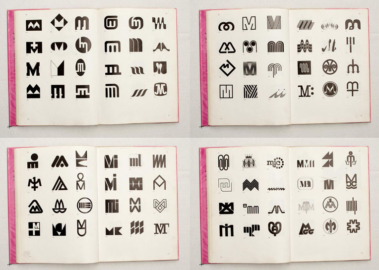
As designers like Michael Bierut of Pentagram know from experience, there are only so many truly unique variations that can be assembled from existing typefaces and simple geometric manipulations.
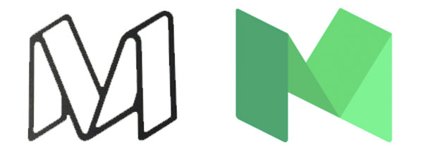
It is perhaps no surprise, then, that Medium’s ‘M’ looks a lot like the 1977 logo for Metrocraft, a US publishing company that likewise created a three-dimensional letter by folding a flat plane.
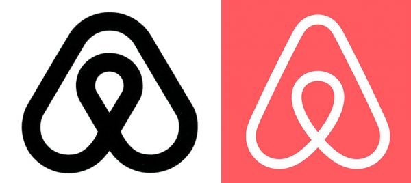
Airbnb’s current curvaceous logo, meanwhile, resembles one designed for Japan’s Azuma Drive-In from 1975, though the redesigned Airbnb one drew a lot more criticism than its lookalike ever did.

Flipboard shares Frisol Oil’s 1981 ‘F’-shape, both assembled from a grid of squares, though the predecessor is somewhat simpler (no gradients) and features lines separating each square.
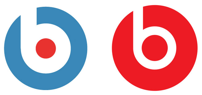
Meanwhile, the Beats ‘b’ looks a bit like a record or headphones but it also closely resembles the icon of Stadt Bruehl, developed for this German city back in 1971 (both are basically a Bauhaus letter in a circle). Nor are they the only two to follow the same general format:
All of these similarities are presumably accidental, but they do illustrate the remarkable difficulty of creating something that looks entirely new and different in the limited space of logo design. Perhaps the real surprise in these cases is not the similarity itself but the fact that a huge company could spend so much time and money developing a logo without tasking someone to check for close antecedents.


Comments (2)
Share
Great article. In general I’m very happy to see these old logos becoming common knowledge to all designers. My old design director had several of these rare trademark books from the 70s, and never shared them with the rest of the design team, as he was extreamly precious about them. But these logo design concepts are timeless, and I would argue that they are not trend based.
The reason that Airbnb could use the old Japanese logo, was not because the logo was originally bad, or a trend at the time, it’s because the original company went out of business, and I suspect that the trademark is then up for grabs?
The success of a brand is not only down to the company logo, Airbnb had an insanely successful business built on a terrible logo, now they have a nice logo, but unfortunately, it is not original. Although, nobody really knows it’s not original, as the original company went out of business 30 years ago.
A successful logo usually goes hand in hand with a successful company. I would say that some of the best logos I have ever seen have been for small independent businesses, but these logos will never be accepted as great logos, as the business that they are attached to might never become a globally recognised company.
If you have not seen the new logo design archive website called Logobook, I highly recommend you visit it:
http://www.logobook.com
Allowing designers to see what has been done before, will only push us harder to come up with something original, or at least evolve what has been done before.
I don’t think companies should worry too much if it spends a lot of money to come up with a logo that hasn’t been used before. A logo is effective when it has both a universal appeal and a contextual relevance. I think Michael Bierut actually said something to the effect of “it’s ok if someone says ‘My five-year-old can come up with that.'” Simplicity is a sign of a good logo and if that means coincidentally using something already created, then so be it. That’s just a benign side effect, so long as the old logo isn’t of a competitor or existing company. As long as it’s also relevant to the company’s unique brand/identity, then the logo’s visual resemblance to old things is more a feature, not a bug.